
Click Here
Company
Roadkill Hard Seltzer
Timeline
2025
—
2026
Role
Packaging Designer, Photographer, Editorial Designer, Brand Designer, Brand Development
Project Overview
The goal was to create a brand identity for Roadkill Hard Seltzer that rejects polished, mainstream beverage culture and instead embraces raw energy, chaos, and underground authenticity. Designed for a 21–35 audience rooted in dive bars, skateparks, live music, and alternative culture, Roadkill positions itself as more than a drink, it’s an attitude.
The visual and verbal identity needed to feel loud, rebellious, and intentionally imperfect. Through distressed textures, distorted typography, aggressive contrast, and unapologetic messaging, the brand captures the spirit of the restless and unconventional. Every touchpoint was built to feel visceral and alive, turning the product into an anthem for those who thrive outside the lines.
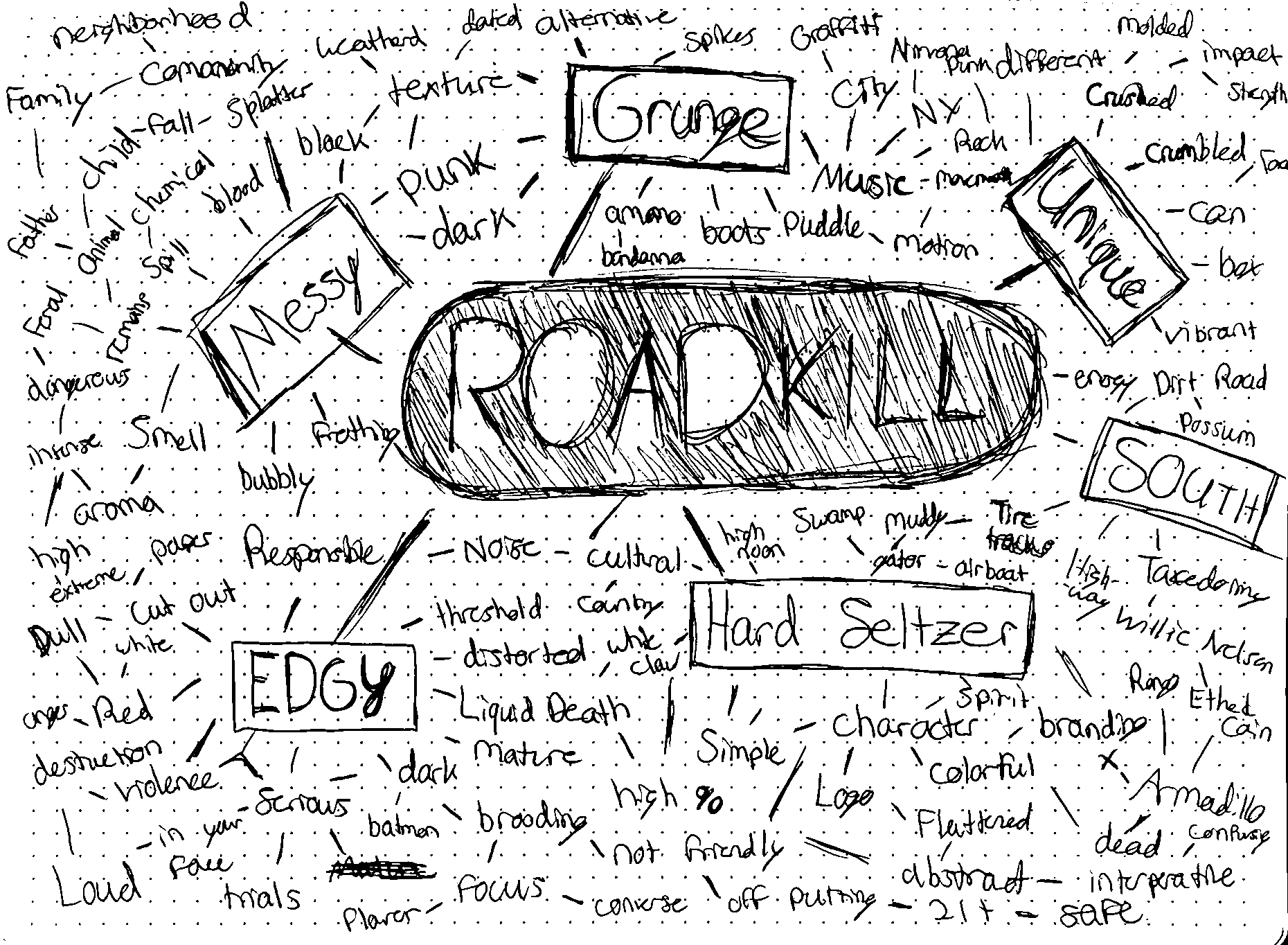
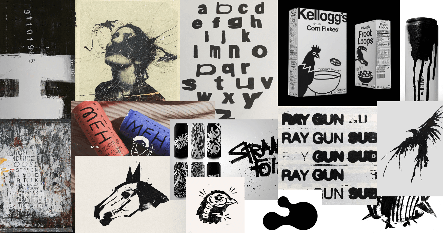
Mindmap and Moodboard
Logo Design and Brand Design
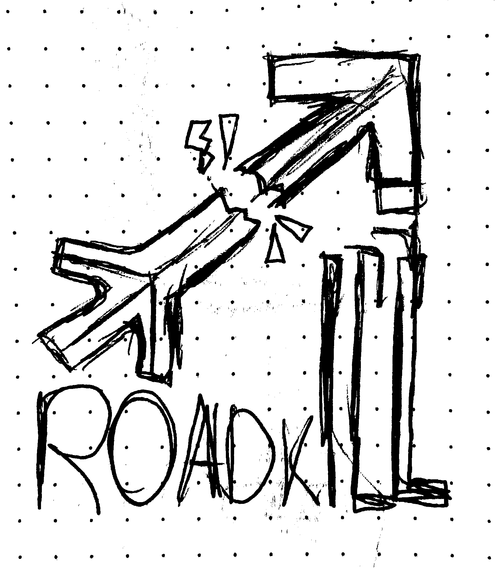
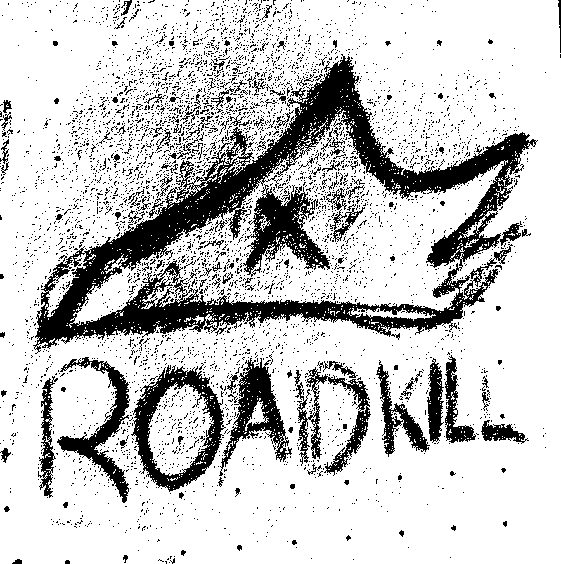
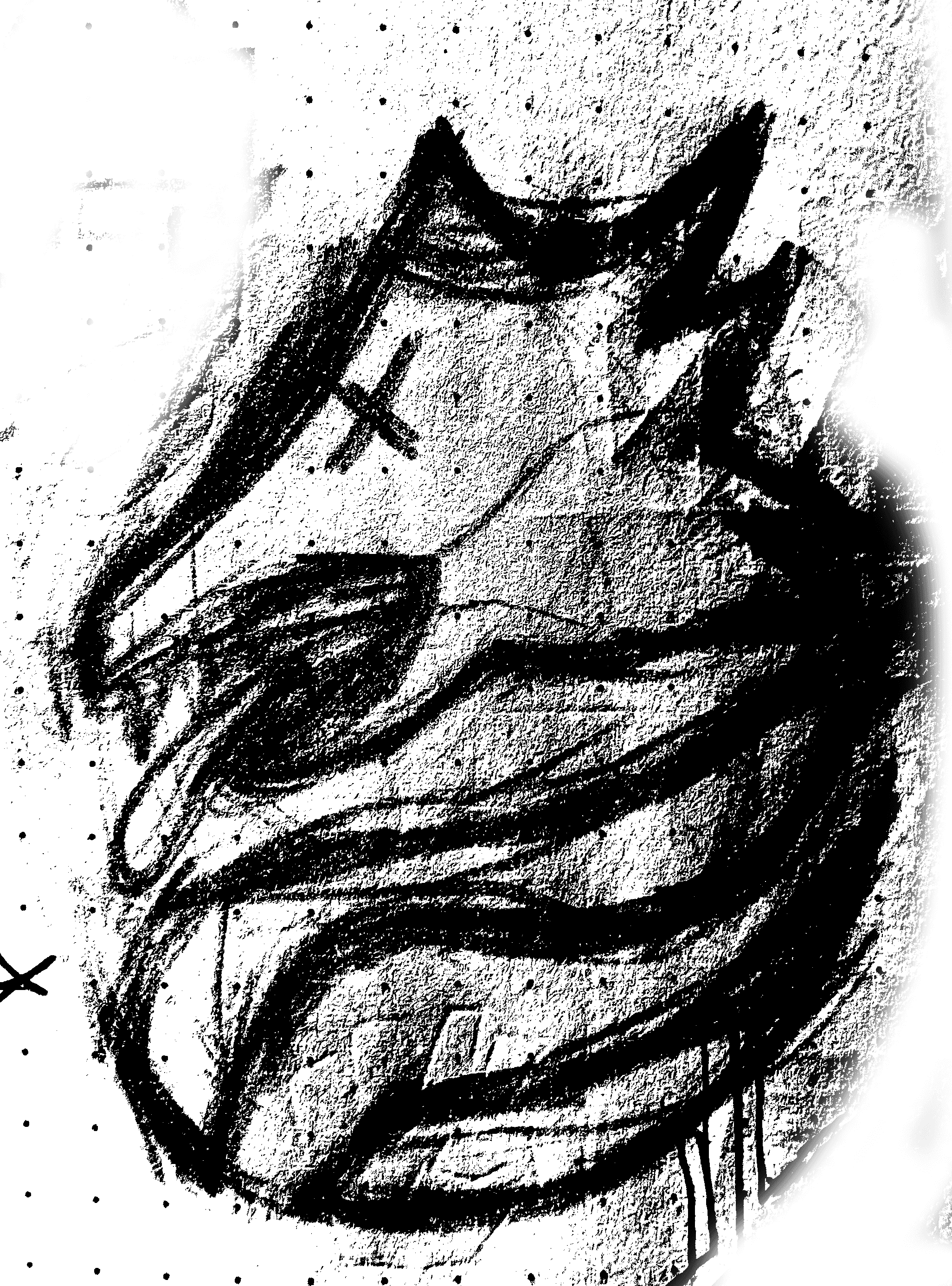
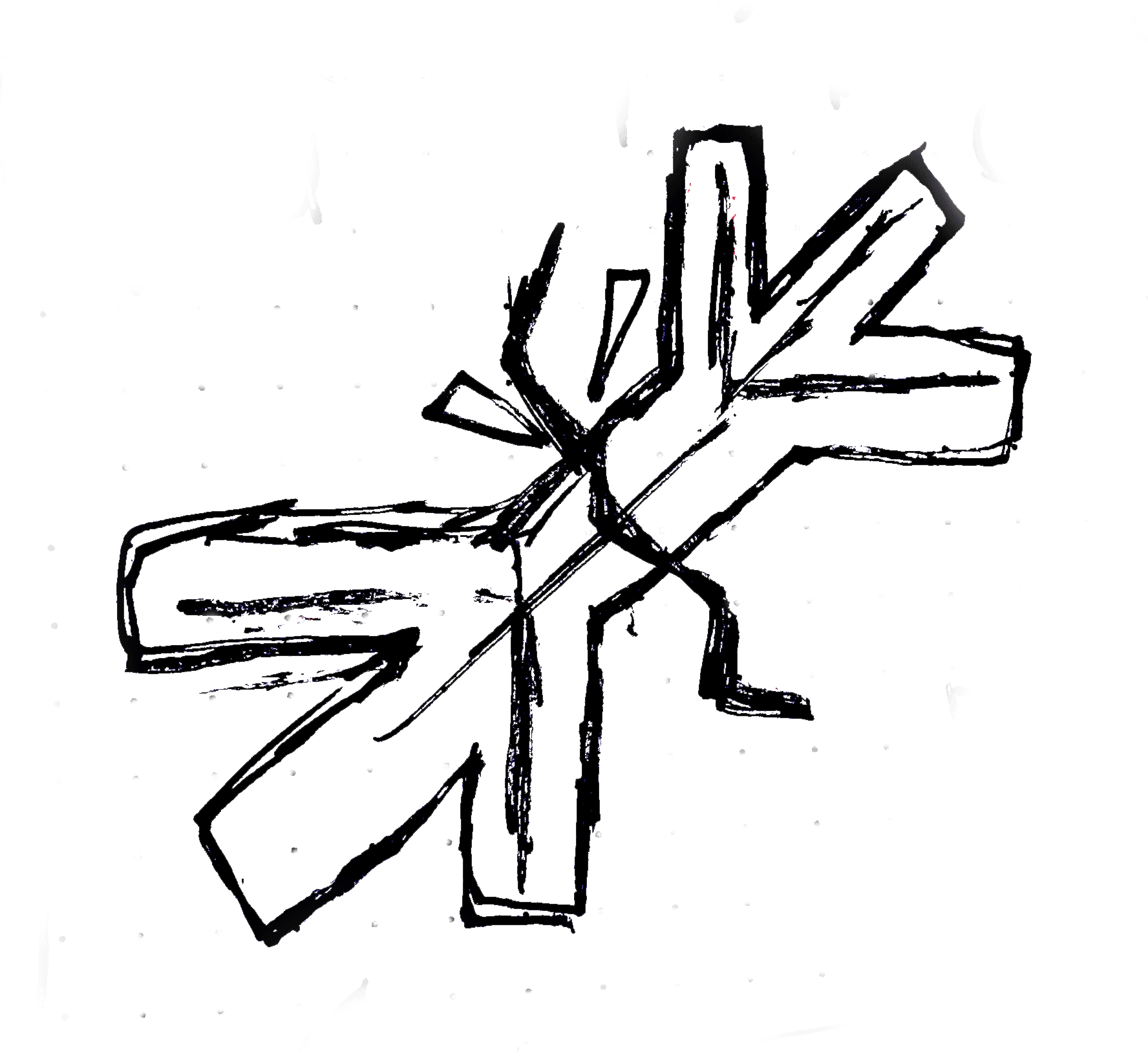
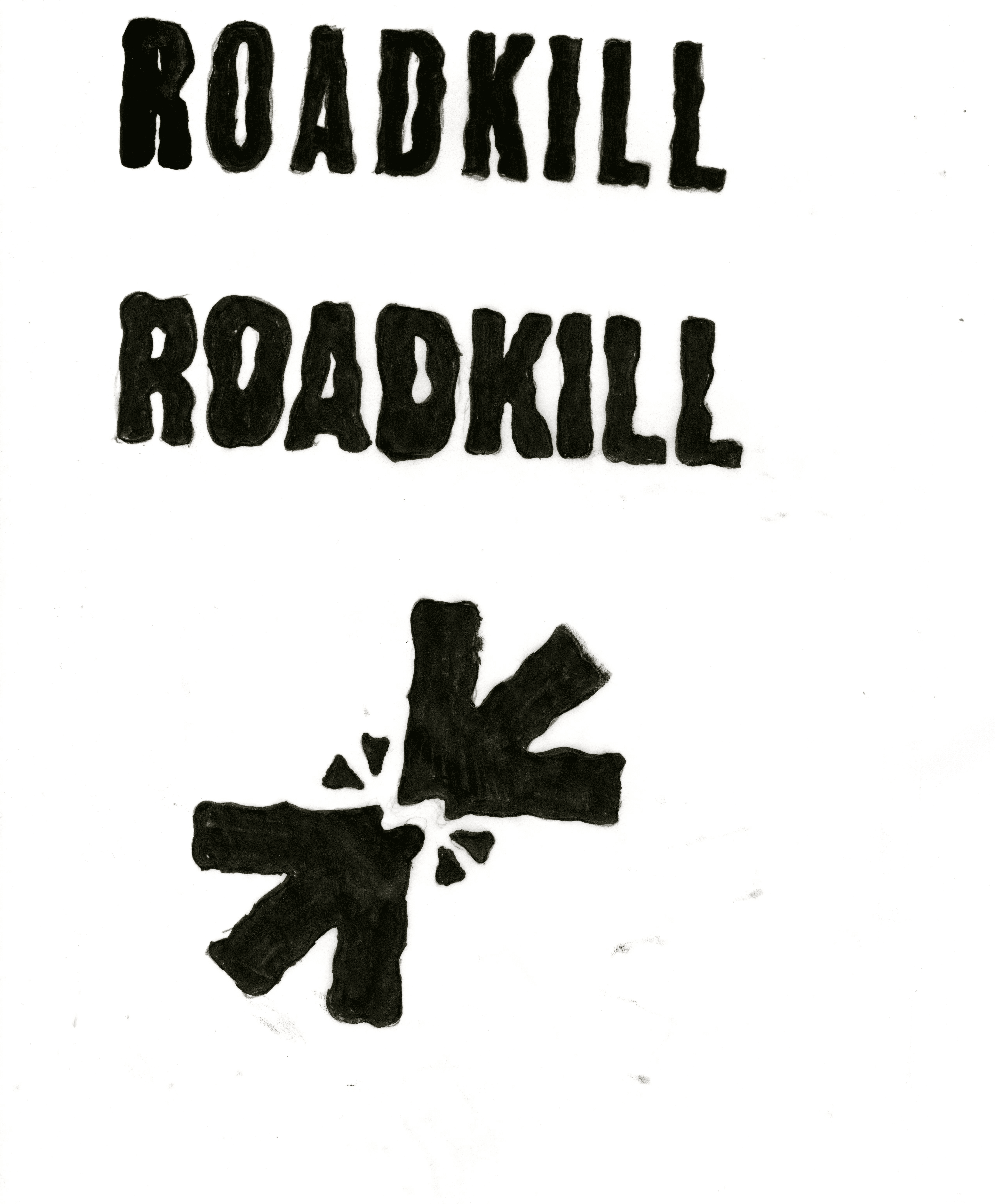
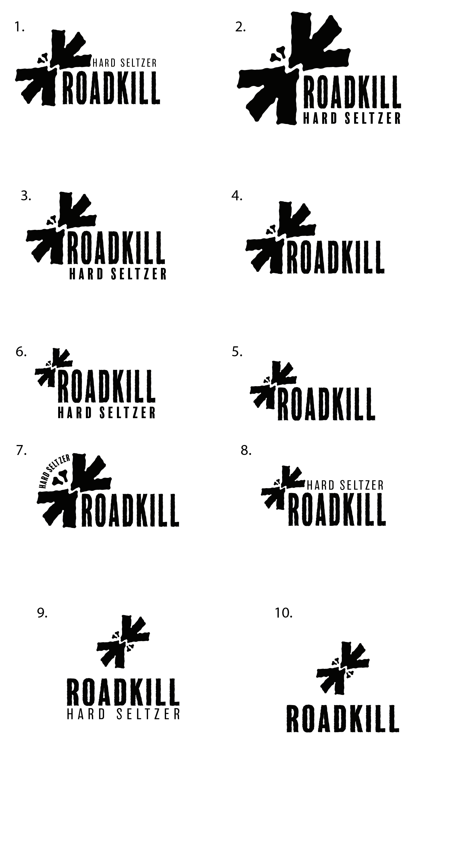
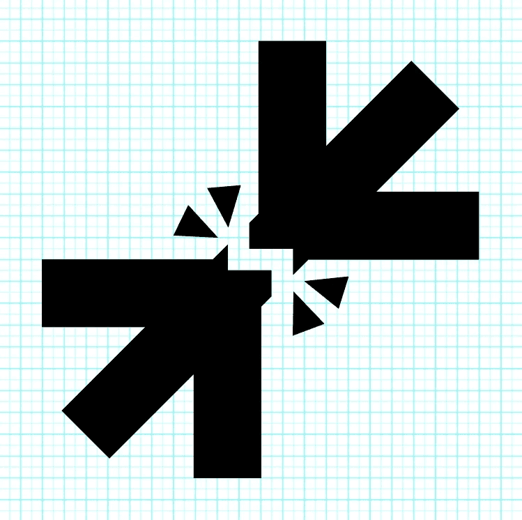
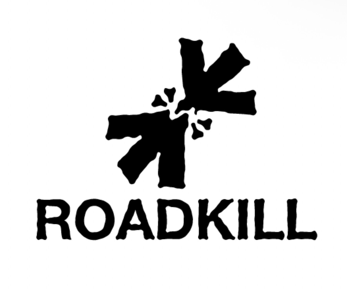
The Roadkill logo was developed to exist somewhere between abstraction and representation, drawing inspiration from iconic marks such as Nike’s swoosh and the Apple logo. At its core, the symbol suggests a flattened animal, while remaining intentionally open to interpretation. Depending on the viewer, it can also read as a breaking bone, two birds colliding, or opposing arrows converging toward one another. This ambiguity gives the mark depth while allowing it to remain simple, memorable, and visually immediate.
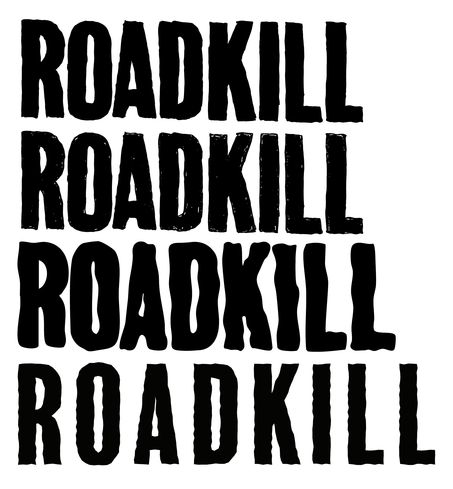
Both the symbol and wordmark were built using precise geometry to create a sense of balance and structure beneath the rawness of the concept. The process began with extensive sketching and experimentation to discover a form that felt both instinctive and refined. Once a direction was established, the logo and wordmark were constructed digitally in Illustrator, printed out, and redrawn by hand to introduce a more human and imperfect quality. Those drawings were then scanned back into Illustrator for further refinement and final development.
Although the finished assets are clean and polished, every element originated from hand-drawn sketches. This process reflects the nature of the brand itself, raw, honest, and rooted in the idea that imperfections and mistakes are an essential part of creation.

Logo Sketches
Logo Process and Development
Animal Icons:
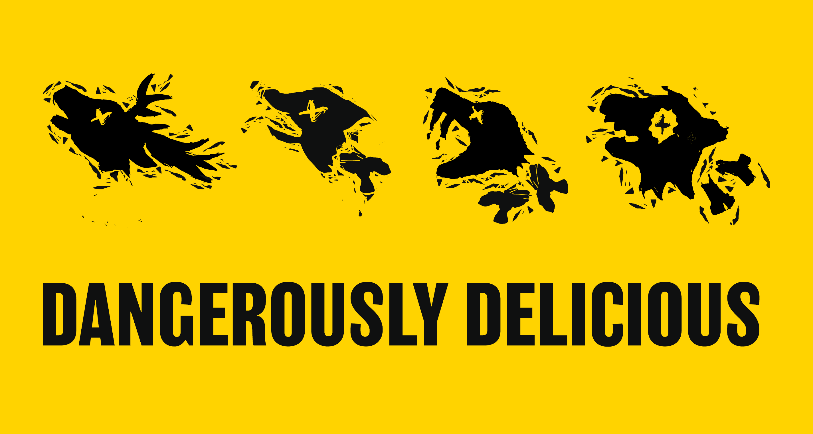
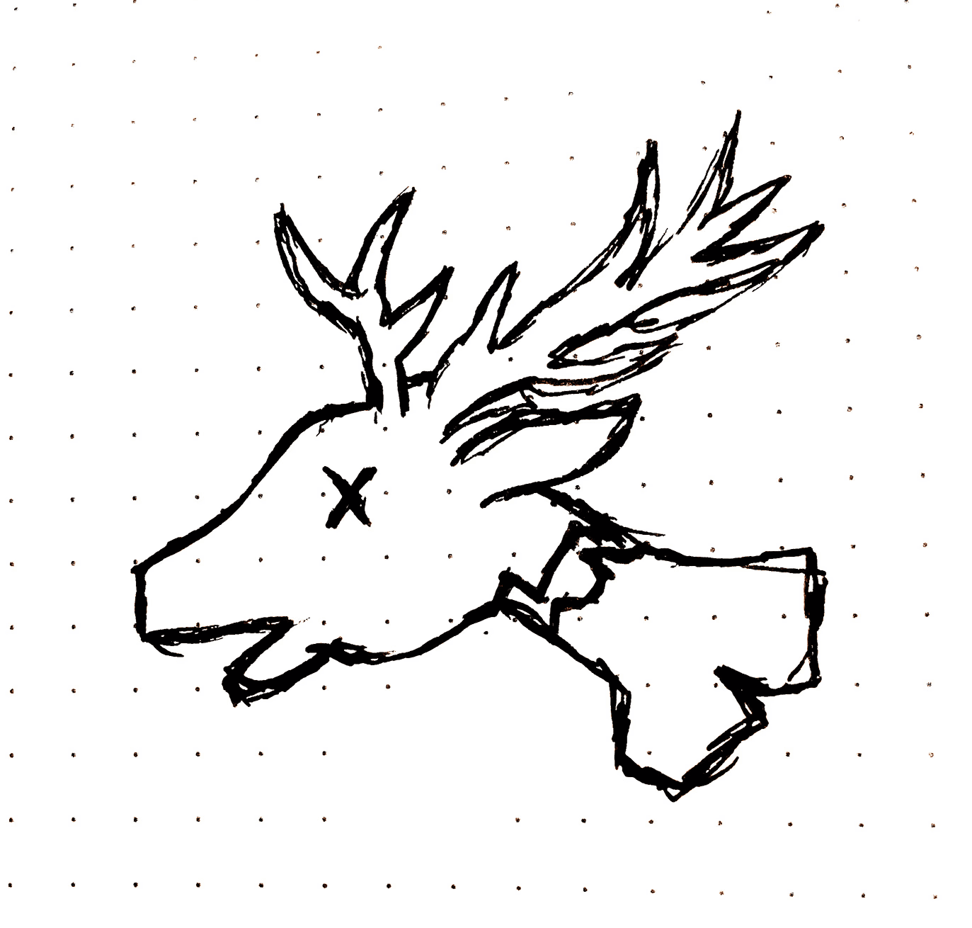
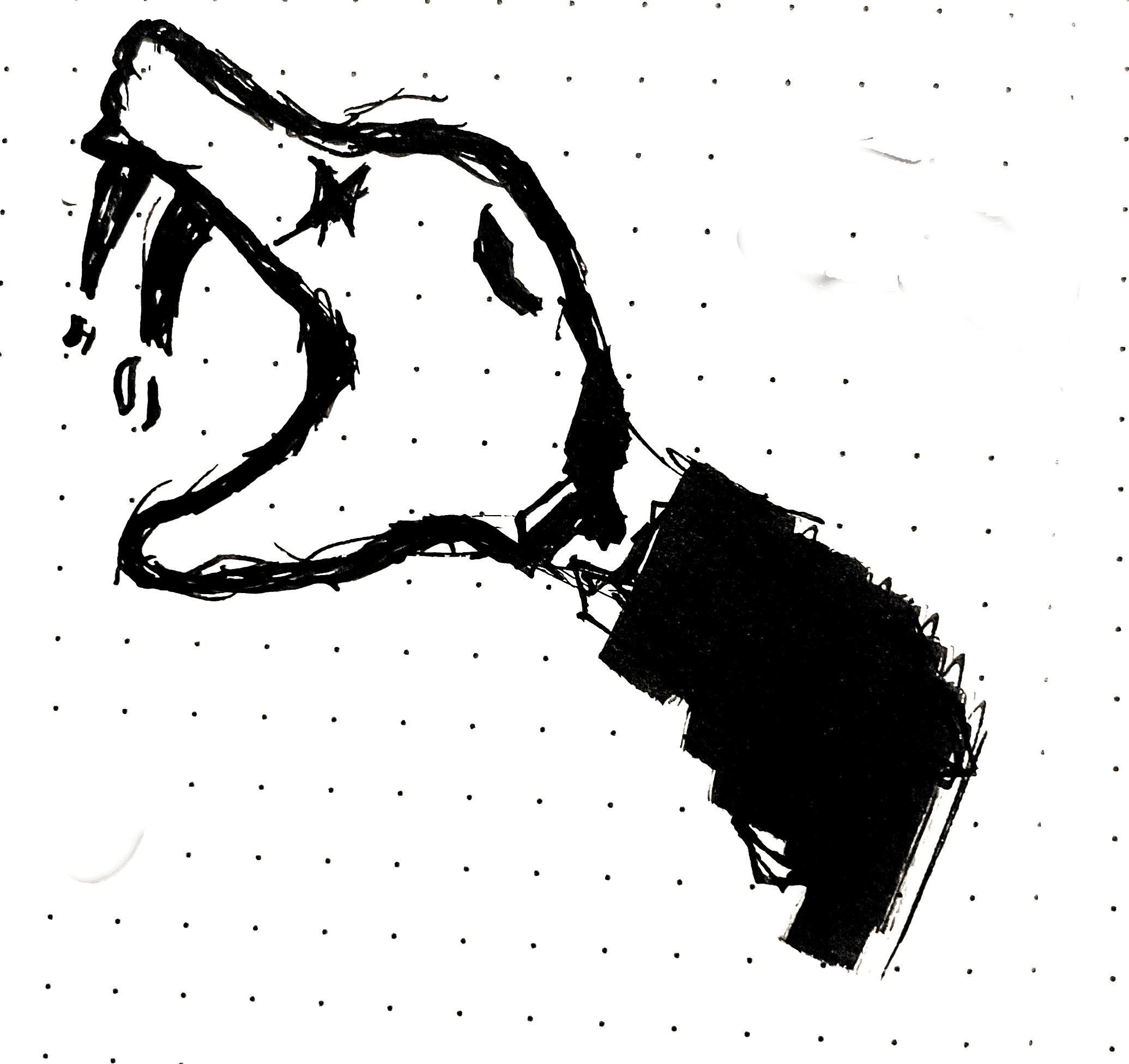
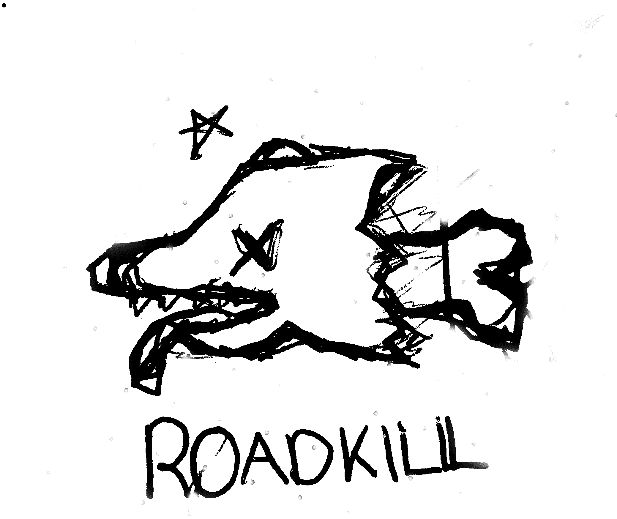
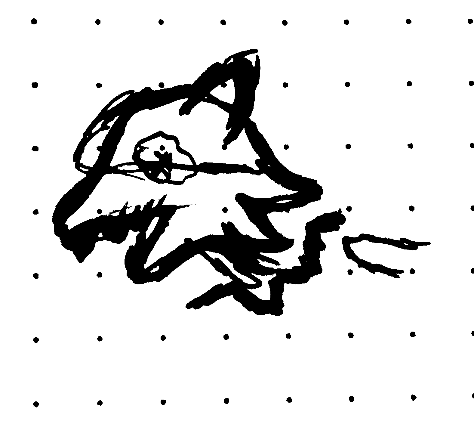
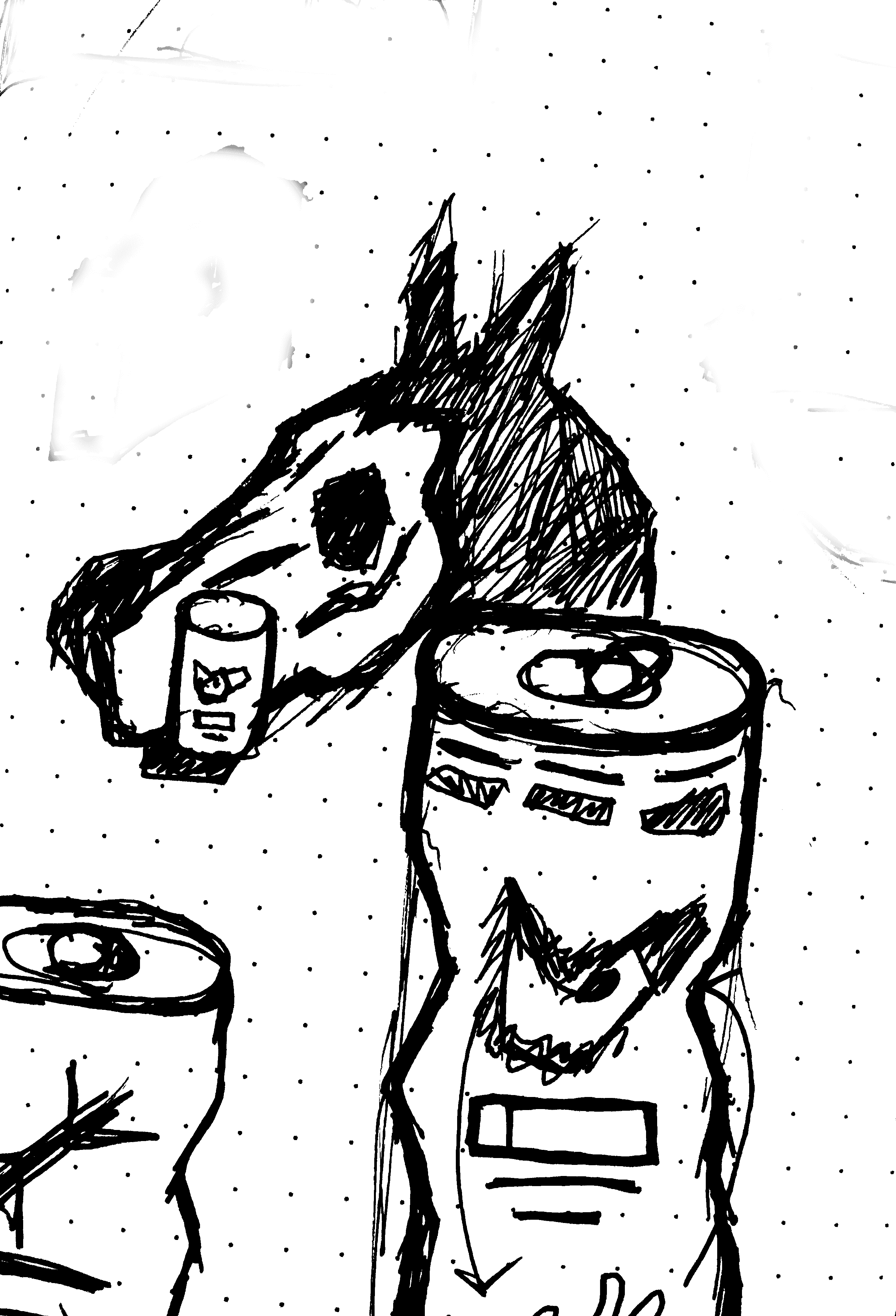
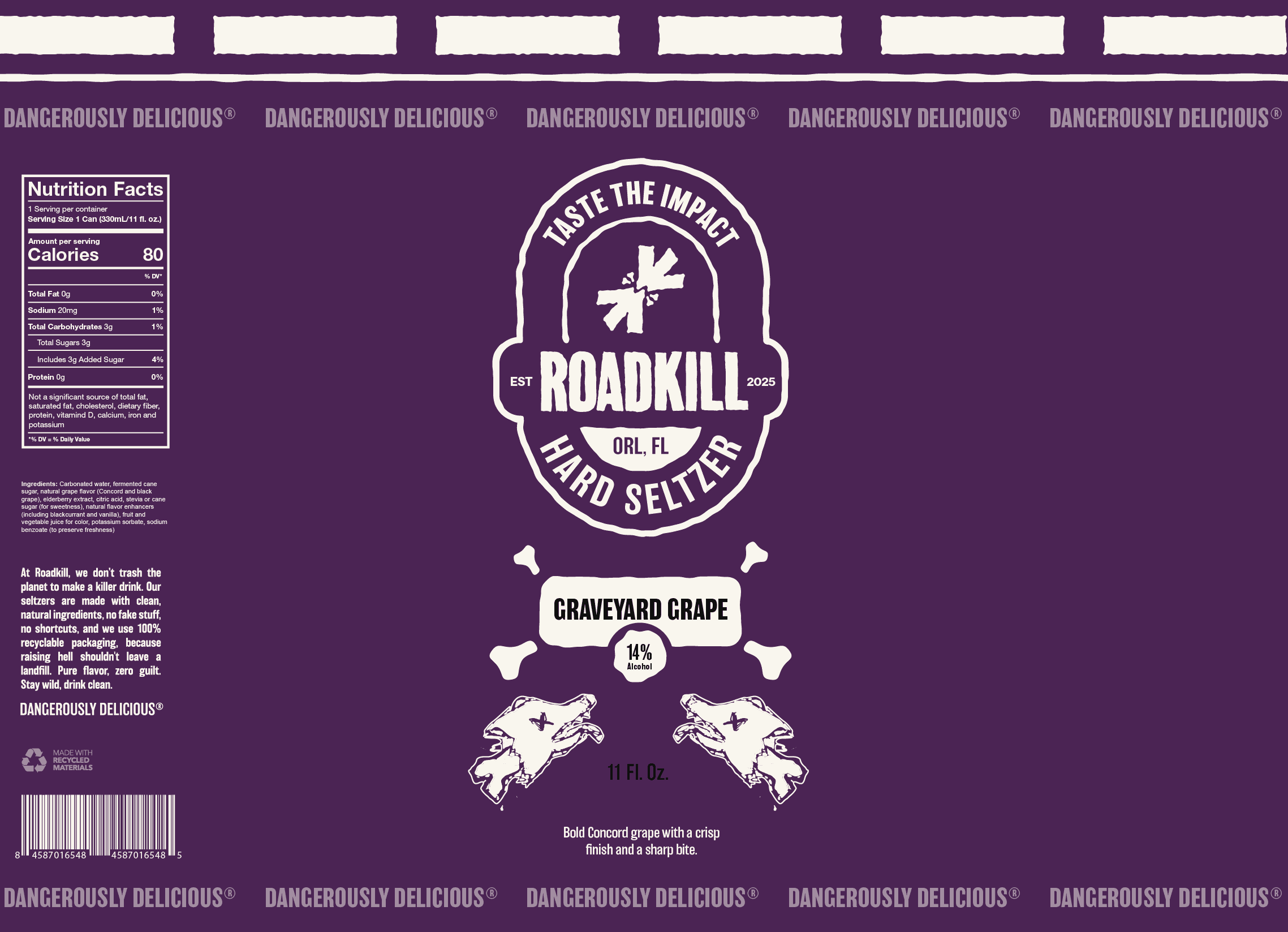
The same philosophy carries through to the animal icons featured on each can. The visual “chatter” within the illustrations originated from an accident during the scanning process, but instead of being removed, it was preserved. These artifacts add texture and authenticity, reinforcing the brand’s embrace of unpredictability and the beauty found in unintended results, they give the brand a hand drawn feel, something tangible.
Icon Sketches
Packaging Design
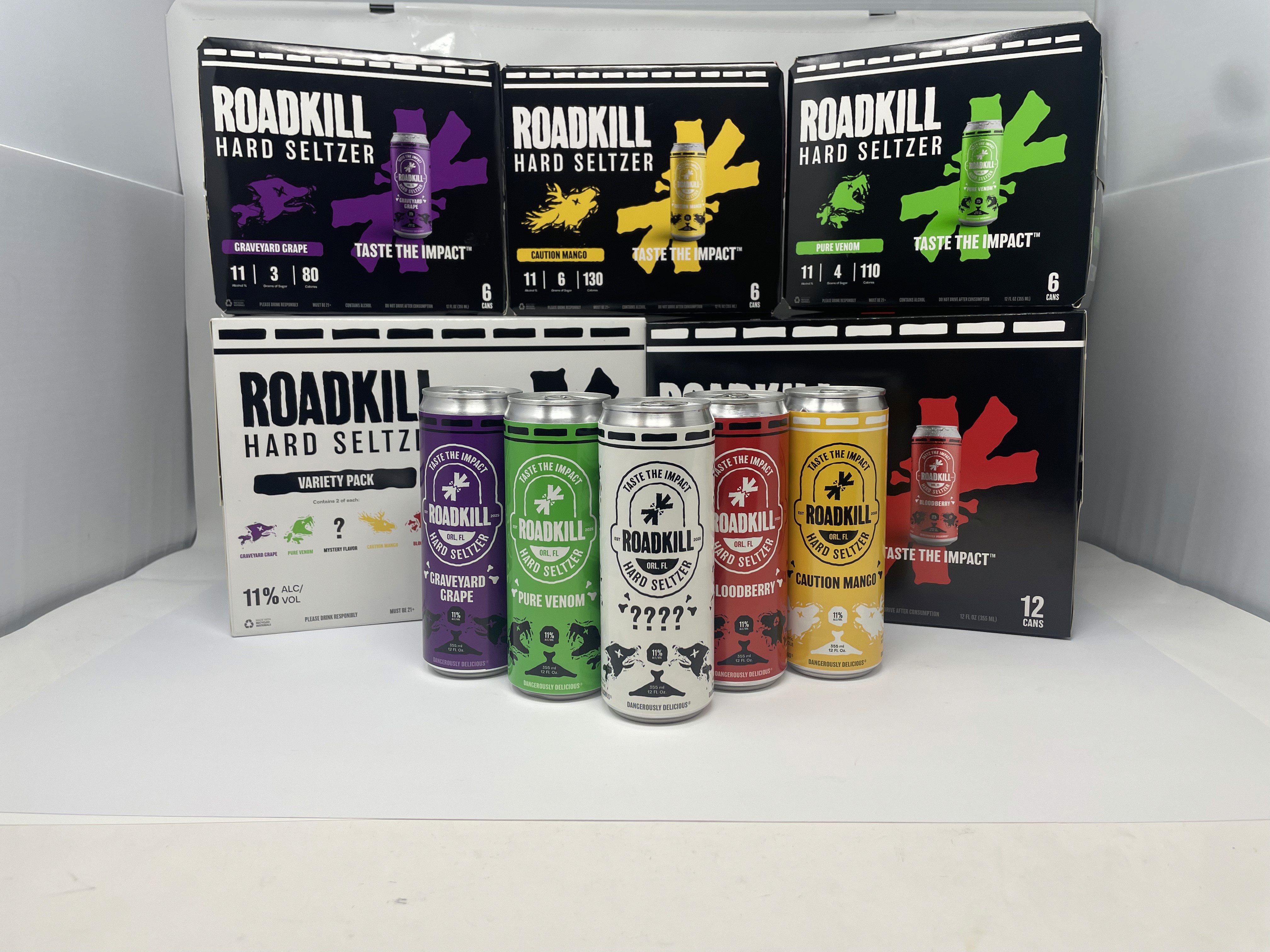
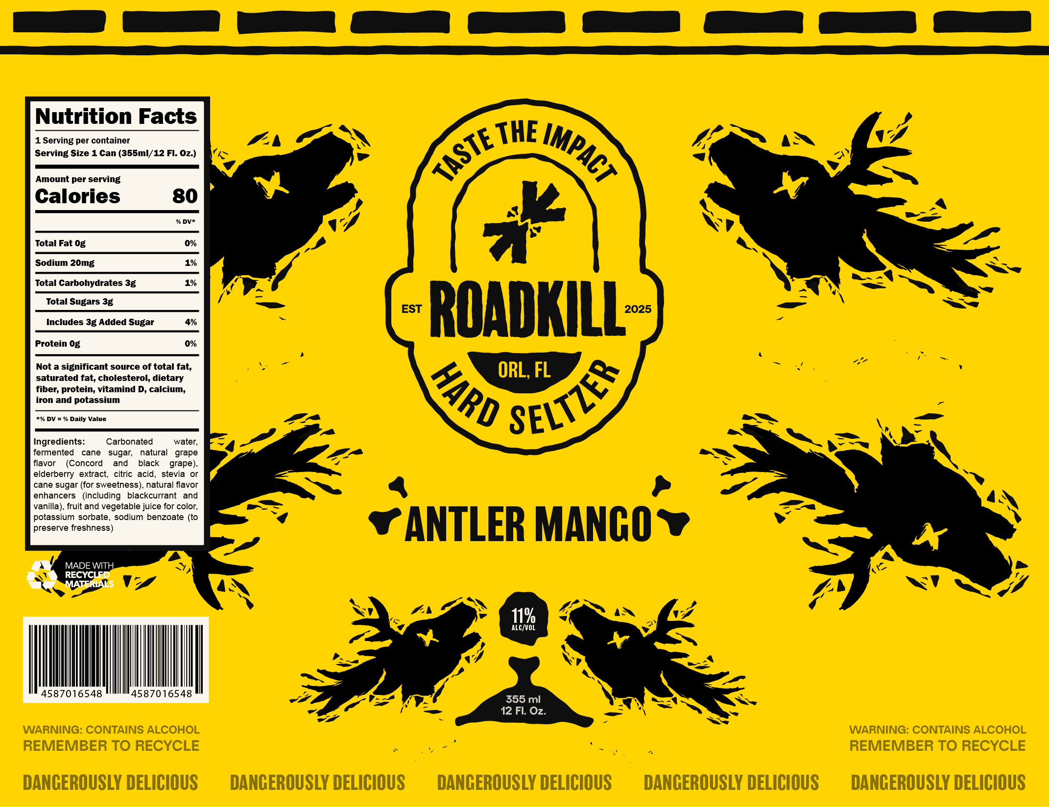
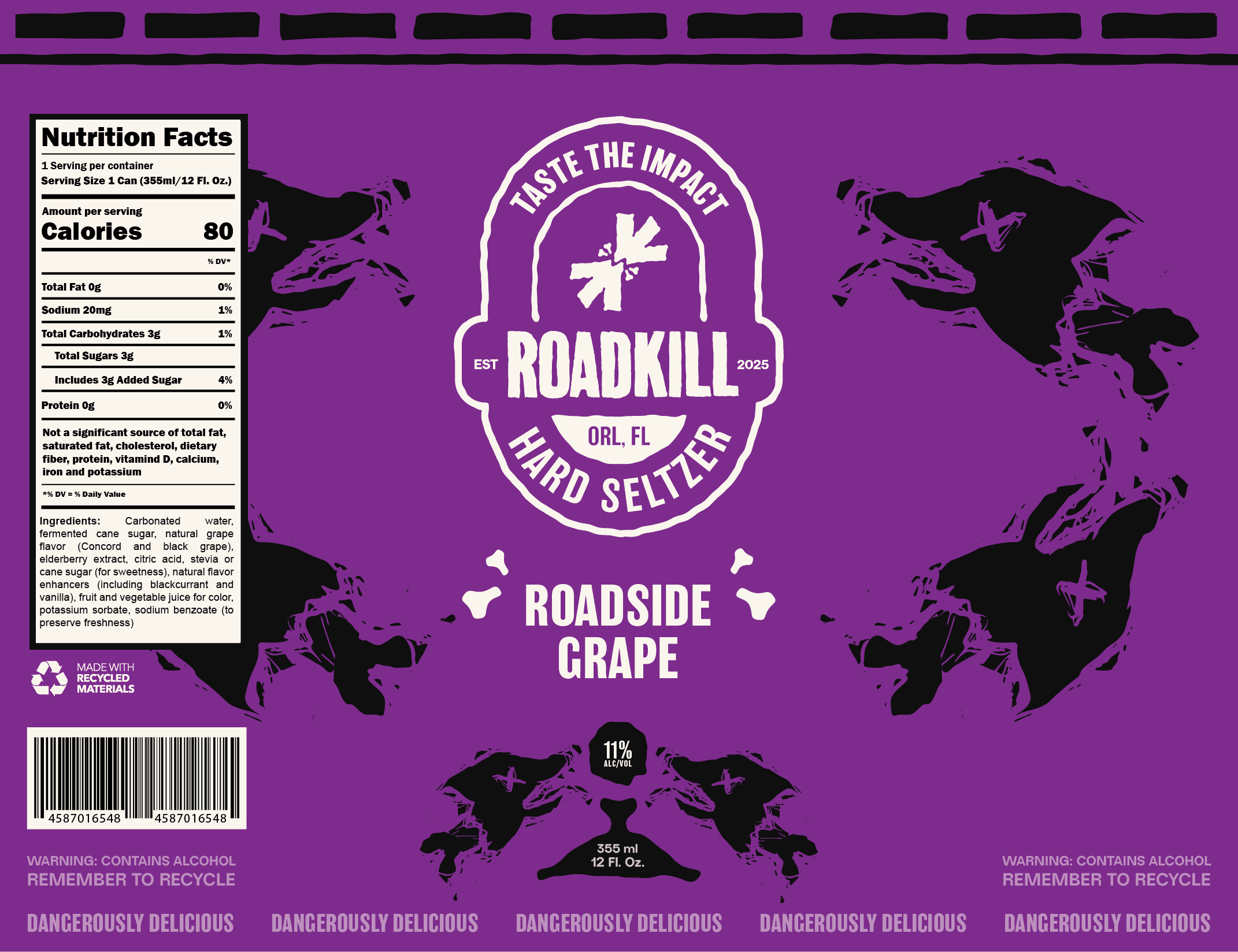
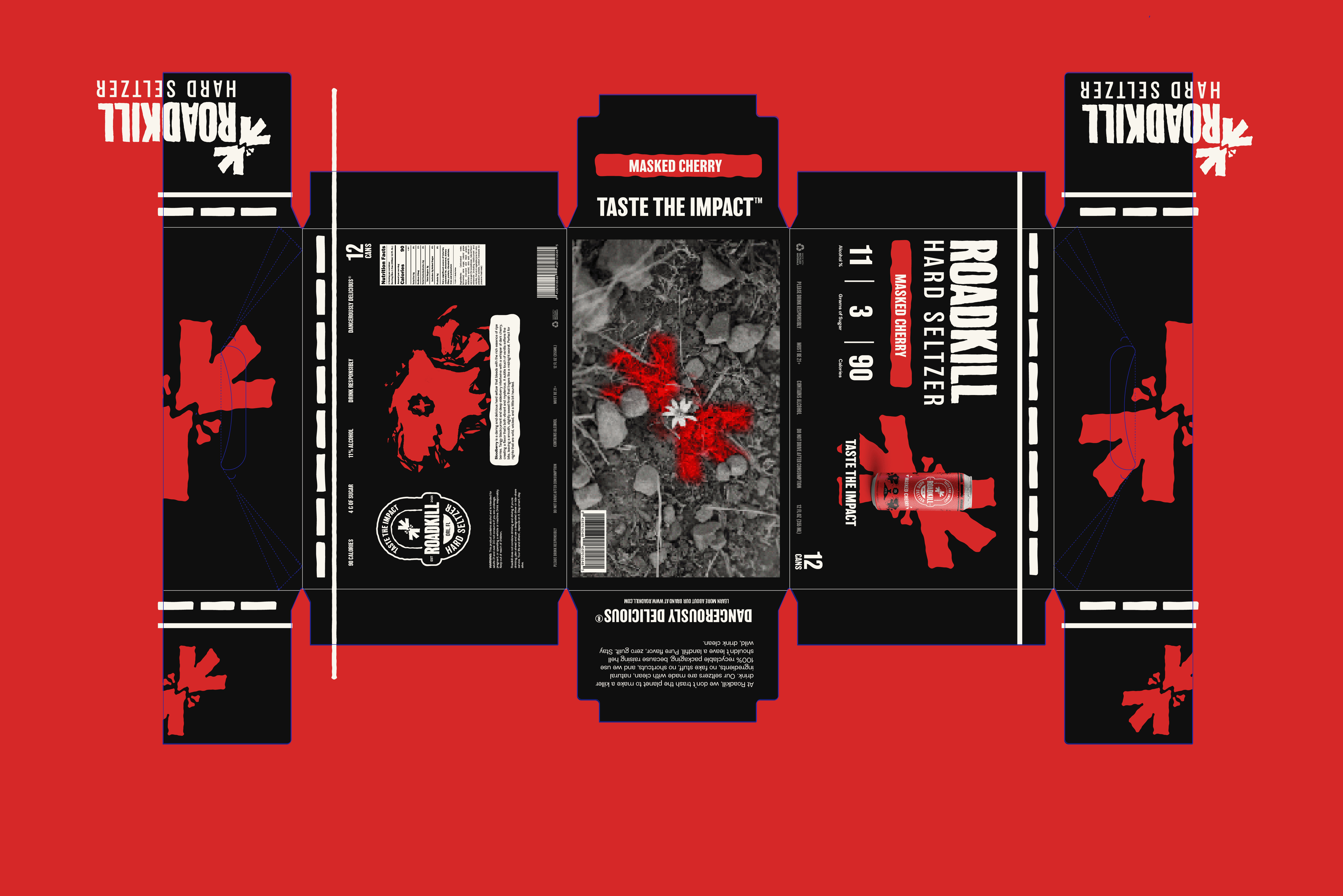
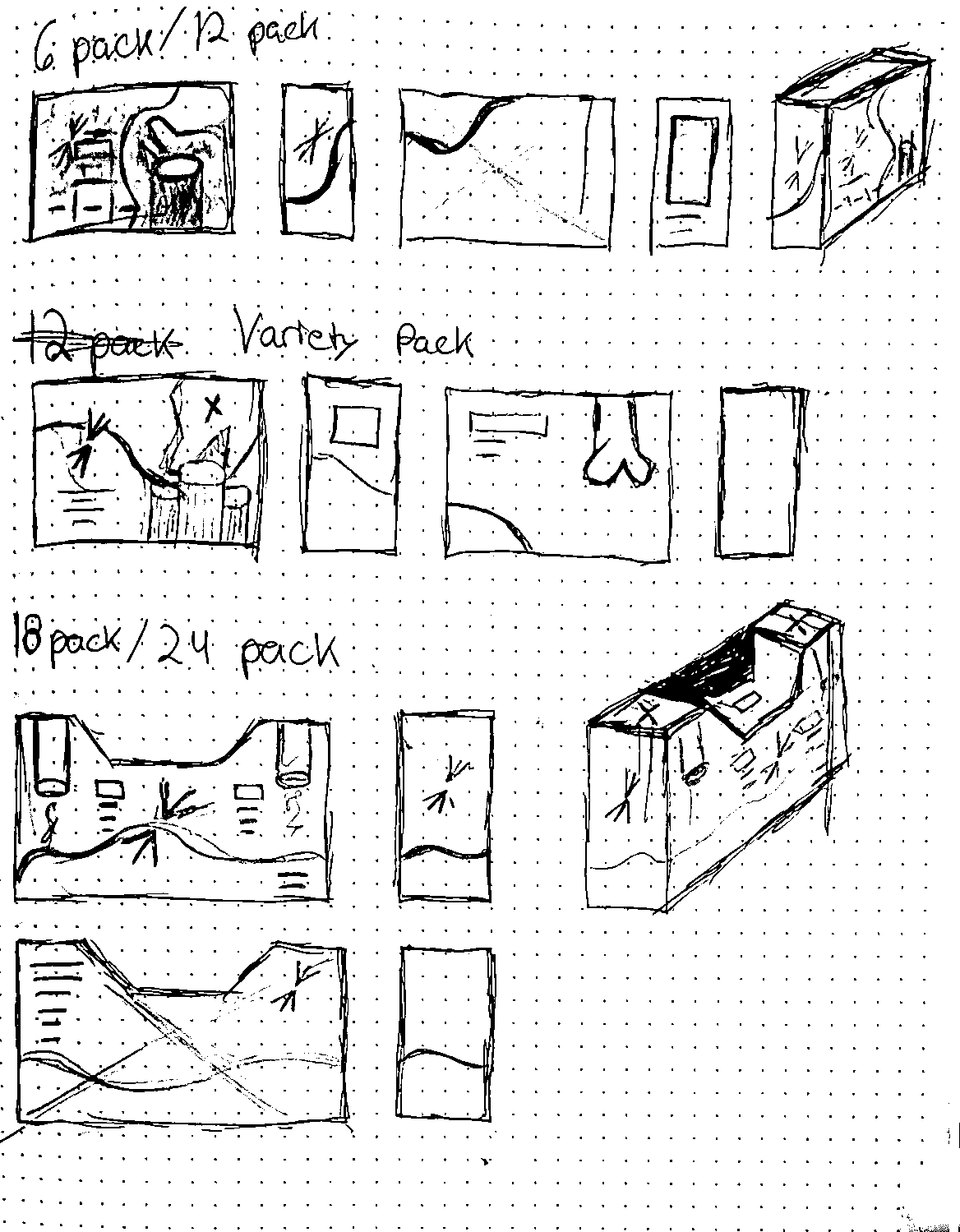
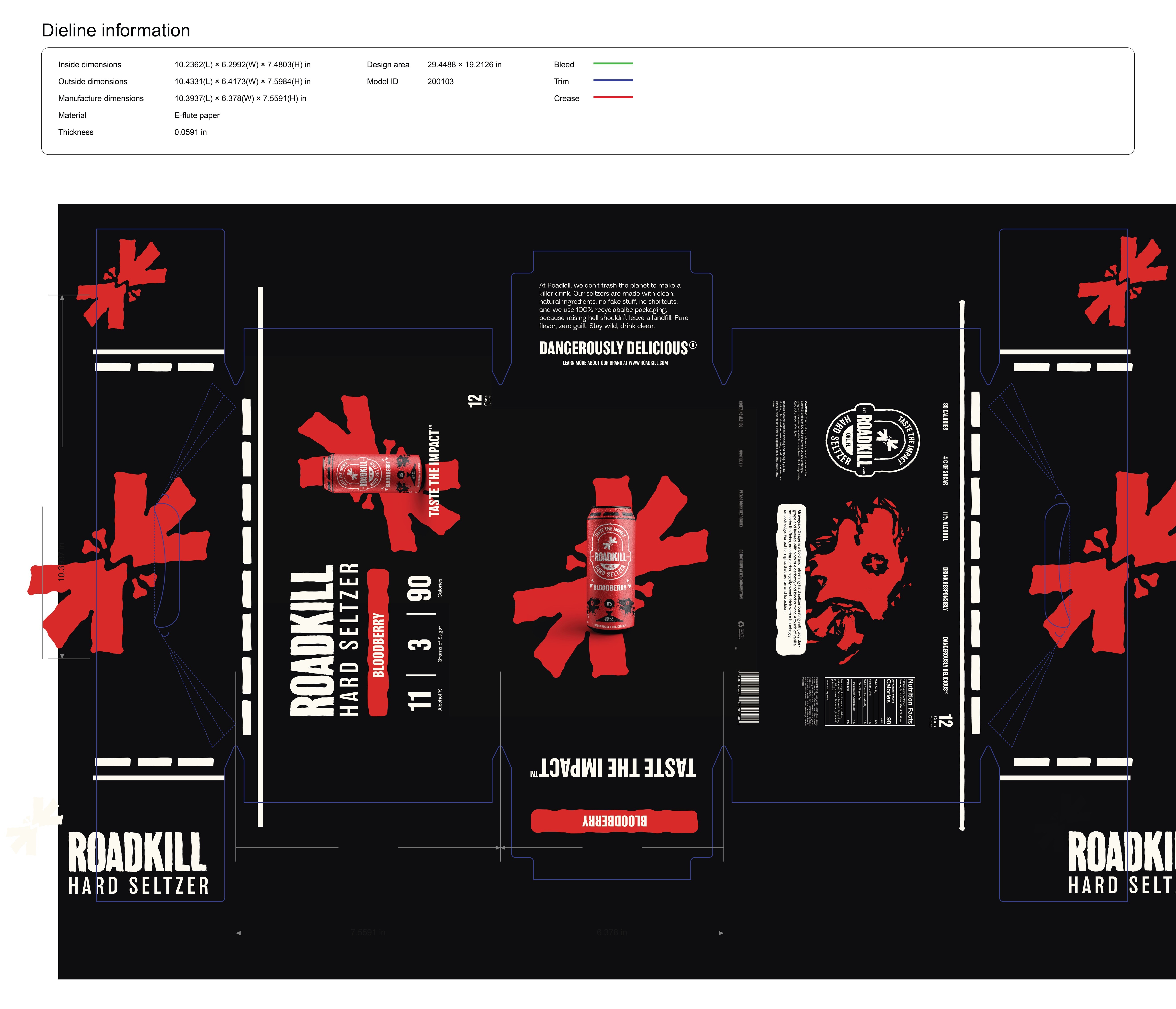
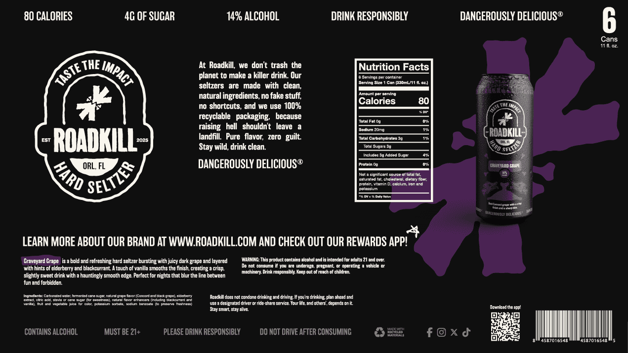
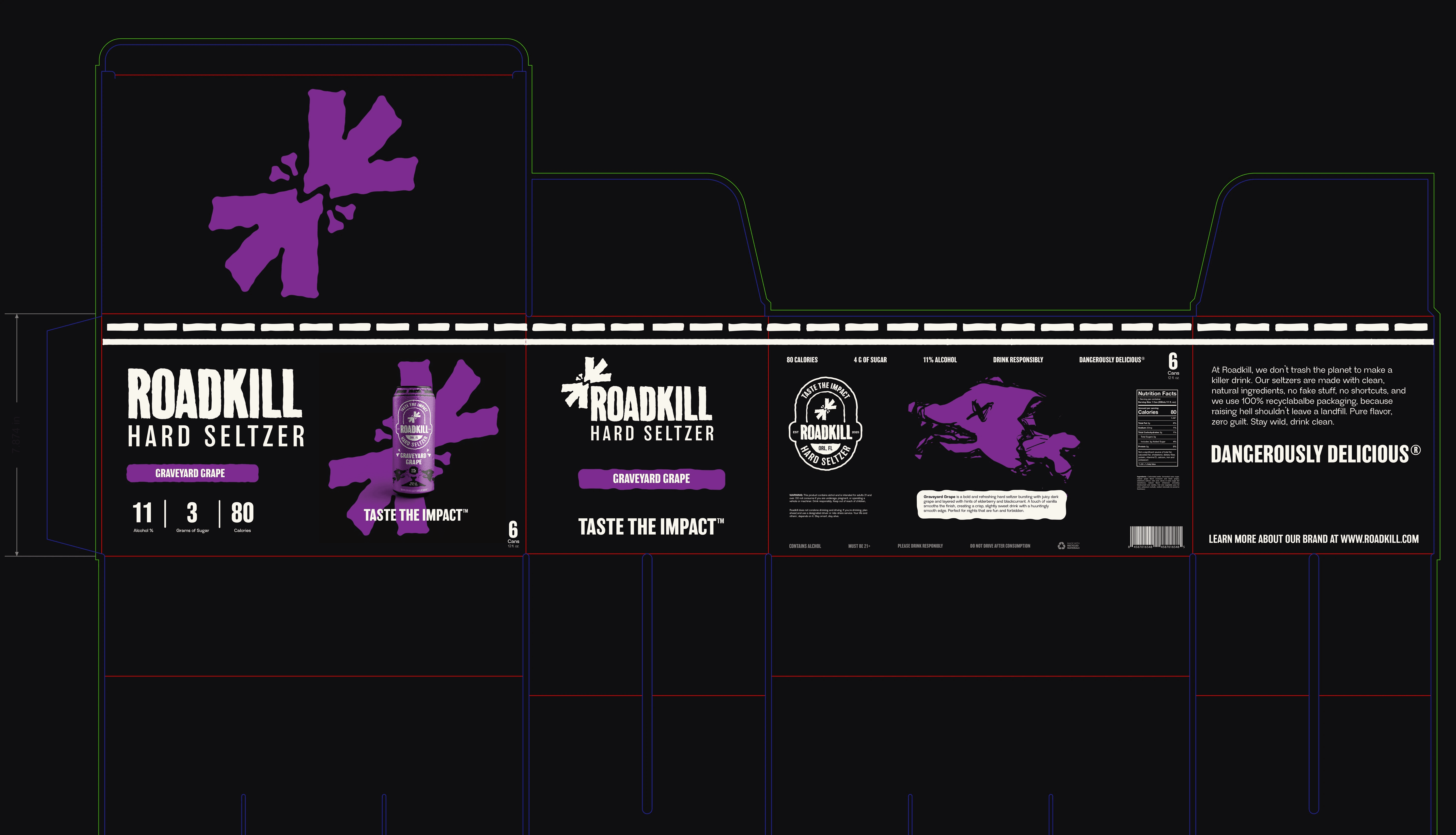
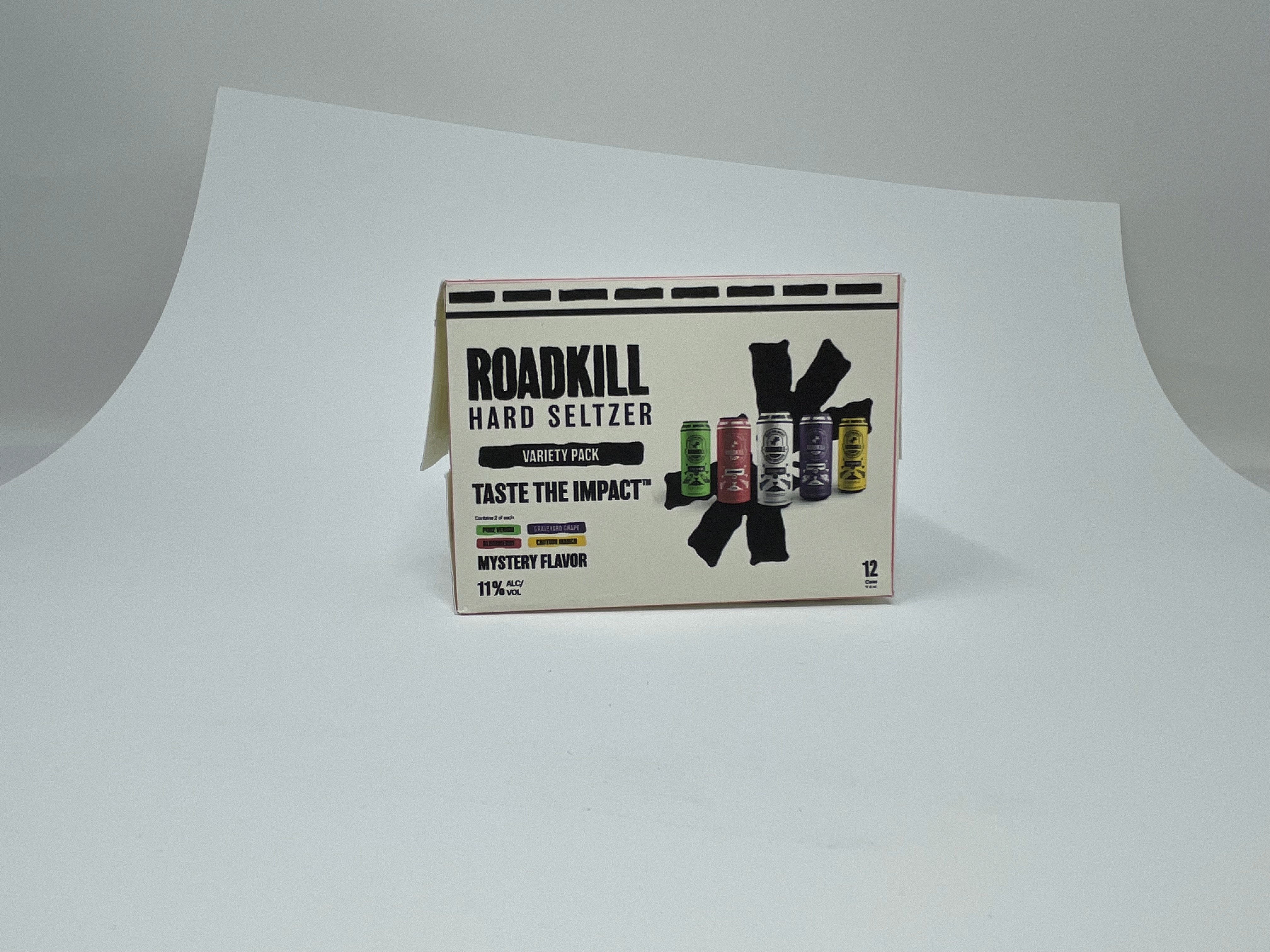
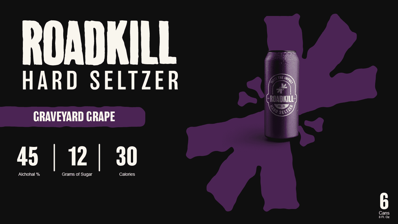

Because the brand is bold, the packaging was designed to support the logo without competing with it. The box bottoms feature dramatic black-and-white photography, adding depth and emotion while keeping the logo as the focal point. The boxes intentionally contrast the cans: cans use strong, flavor-driven color, while boxes remain mostly black and white with color as an accent. Black boxes denote single flavors, white boxes indicate variety packs, and the stacked wordmark maximizes space and flexibility.
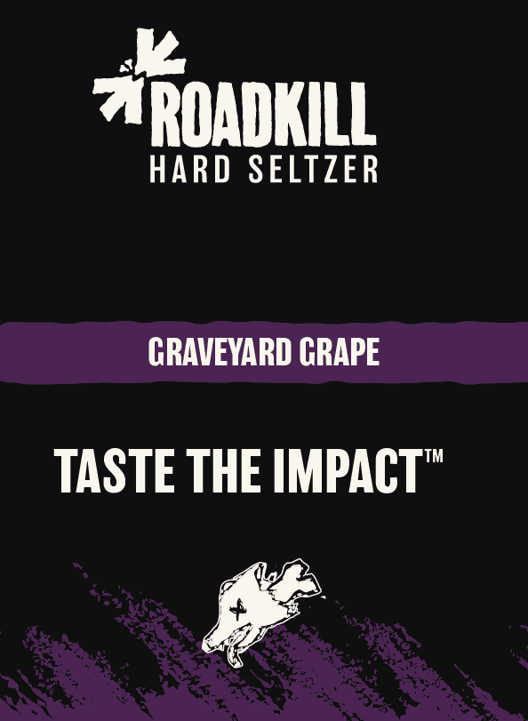
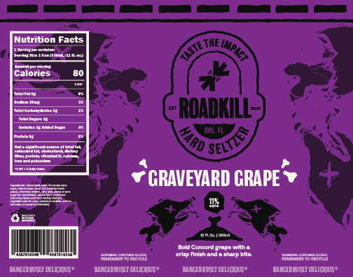
The cans stay flat and graphic, centering a white brand badge on flavor-specific colors. This approach balances clean minimalism with a subtle grunge edge, while the flavor icons add personality and quick visual recognition.
Box Design Sketches
Packaging Development
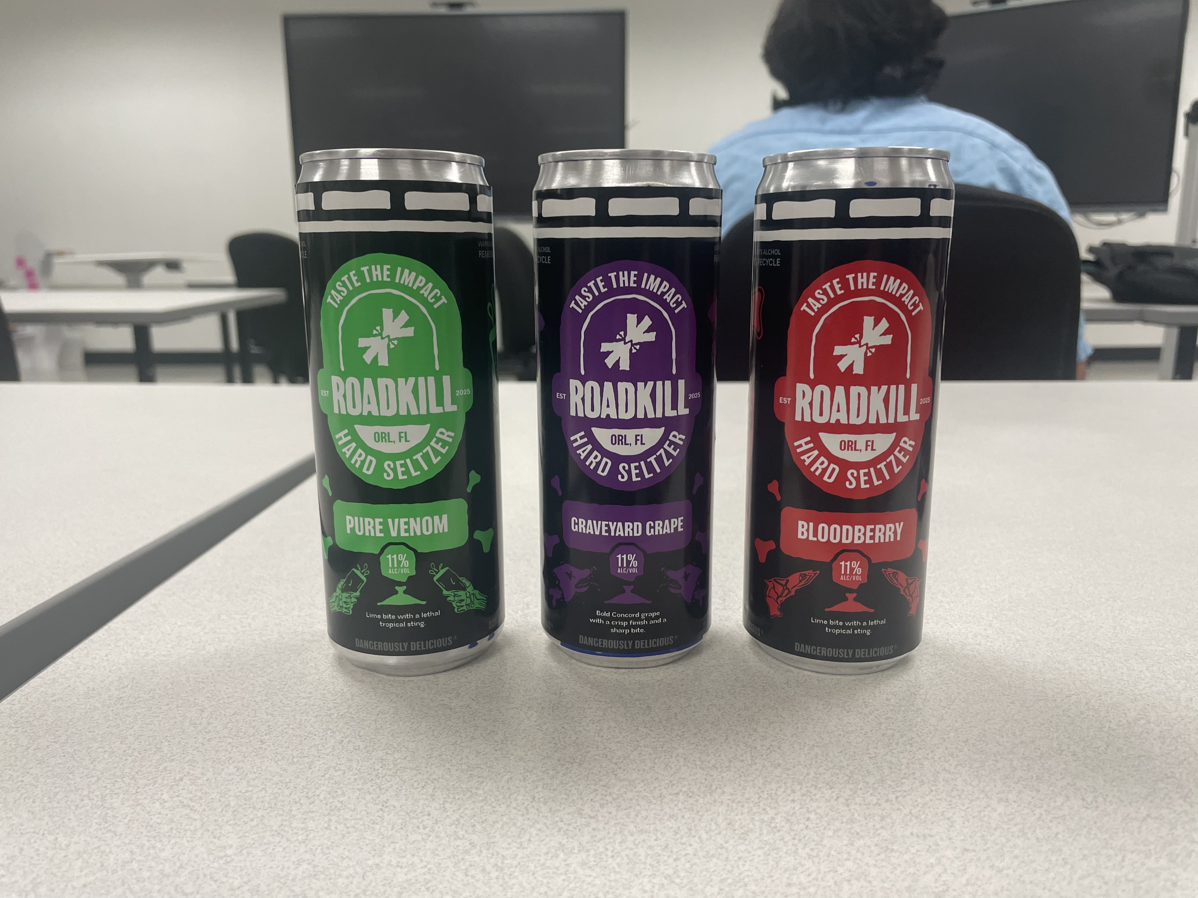
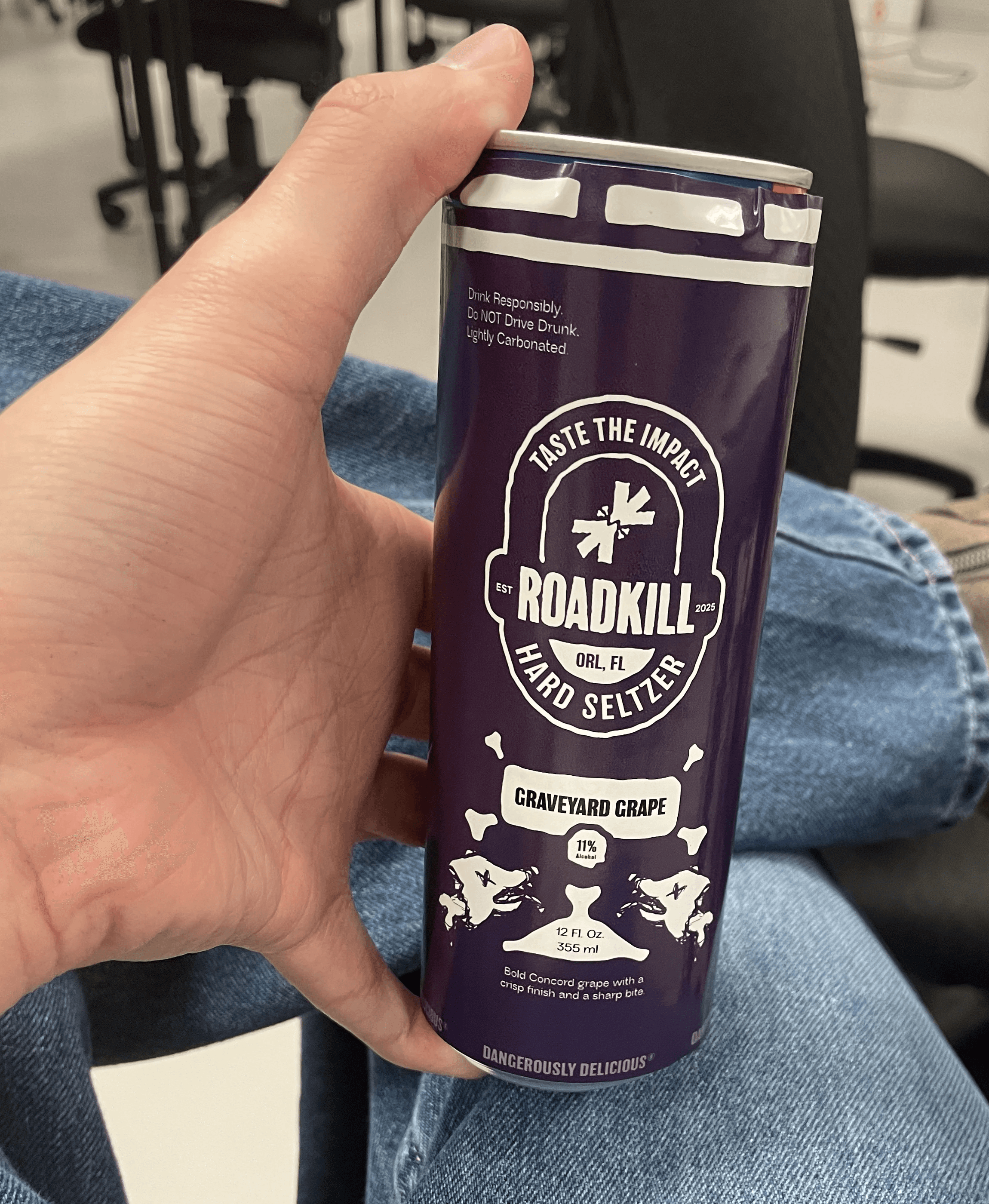
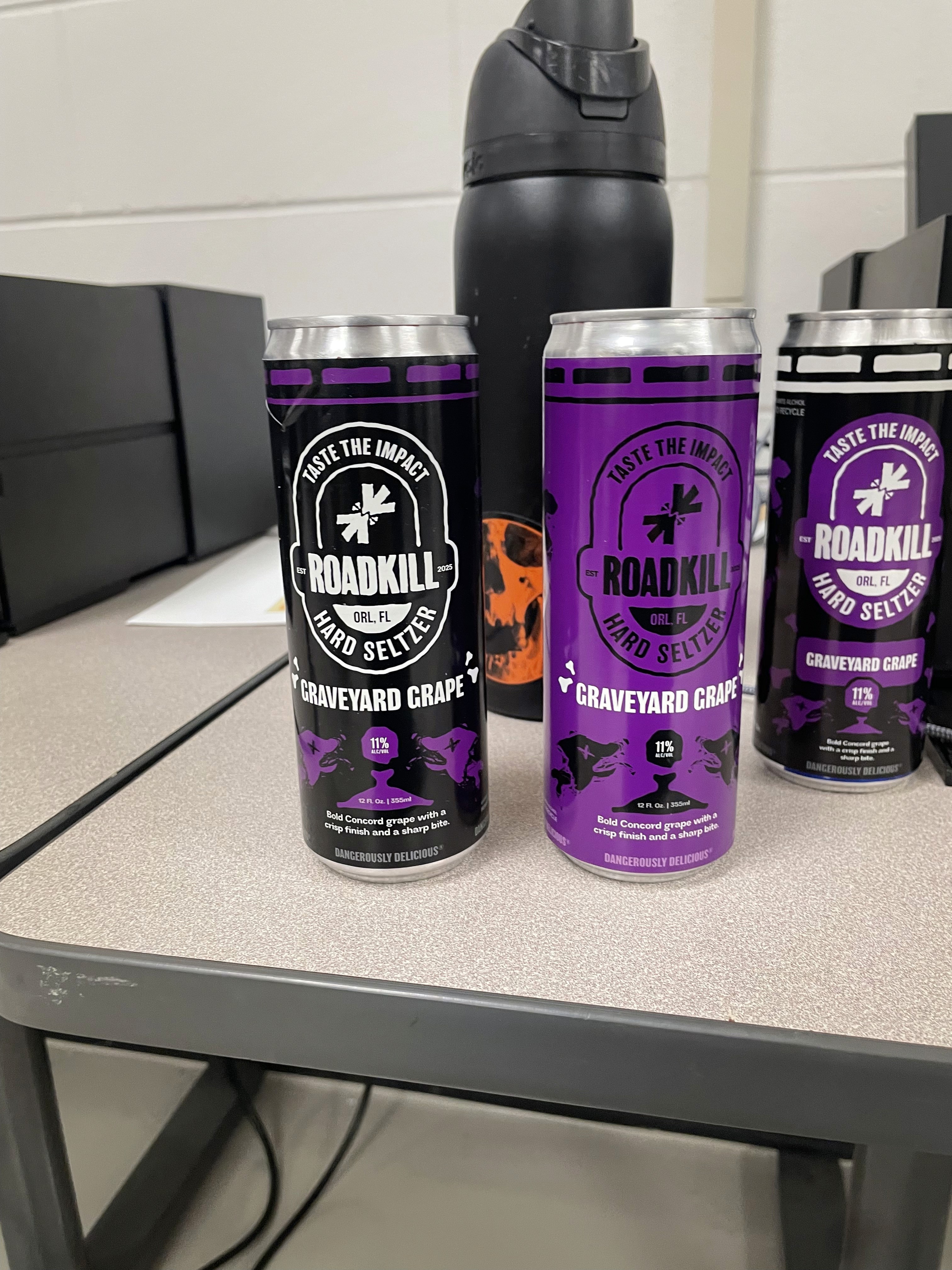
Packaging Construction
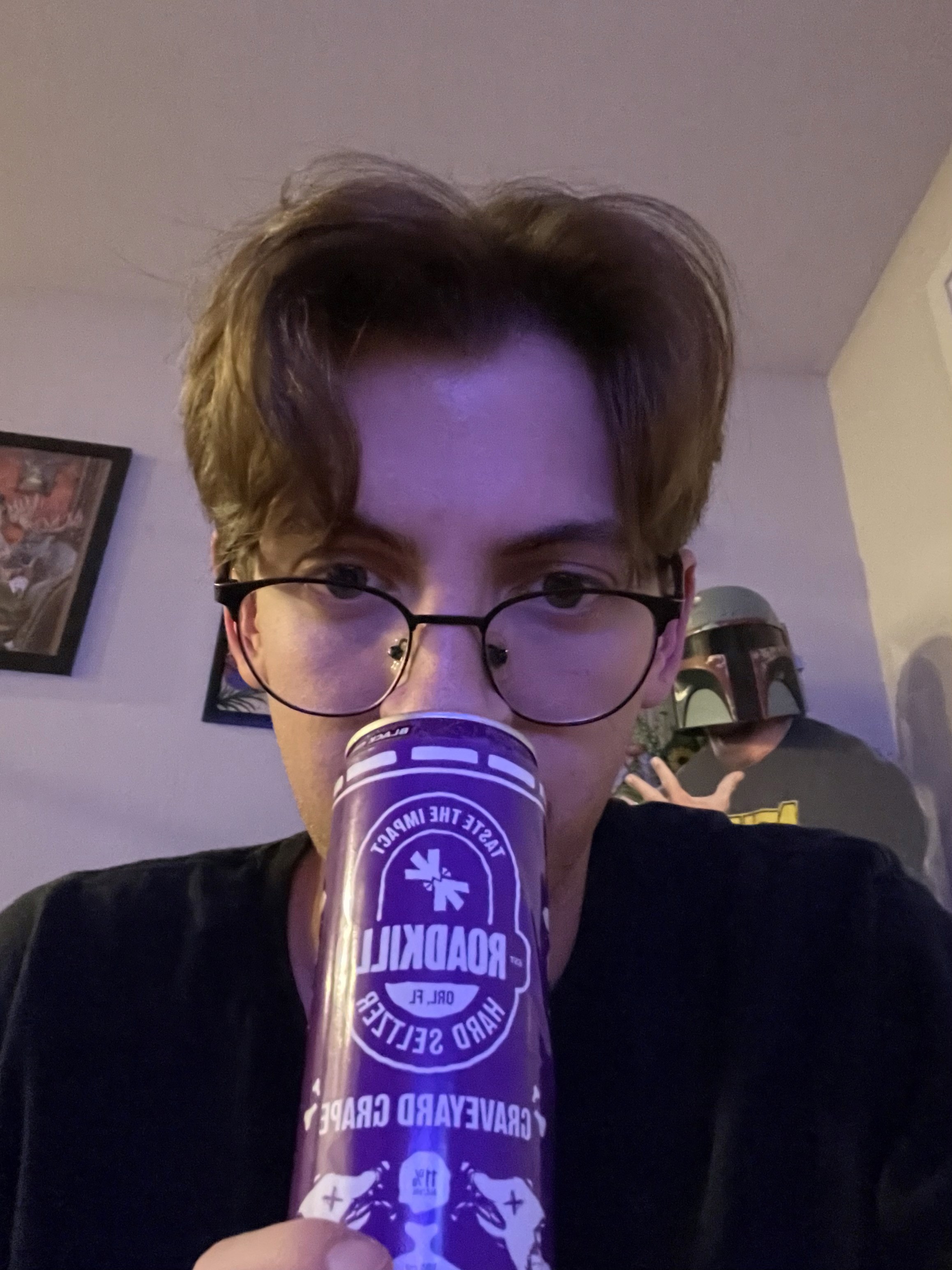
Documenting the packaging through photography was an important part of the project because I wanted the brand to exist physically, not just digitally. Creating tangible packaging helped bring the concept to life and made the overall identity feel more believable and complete.
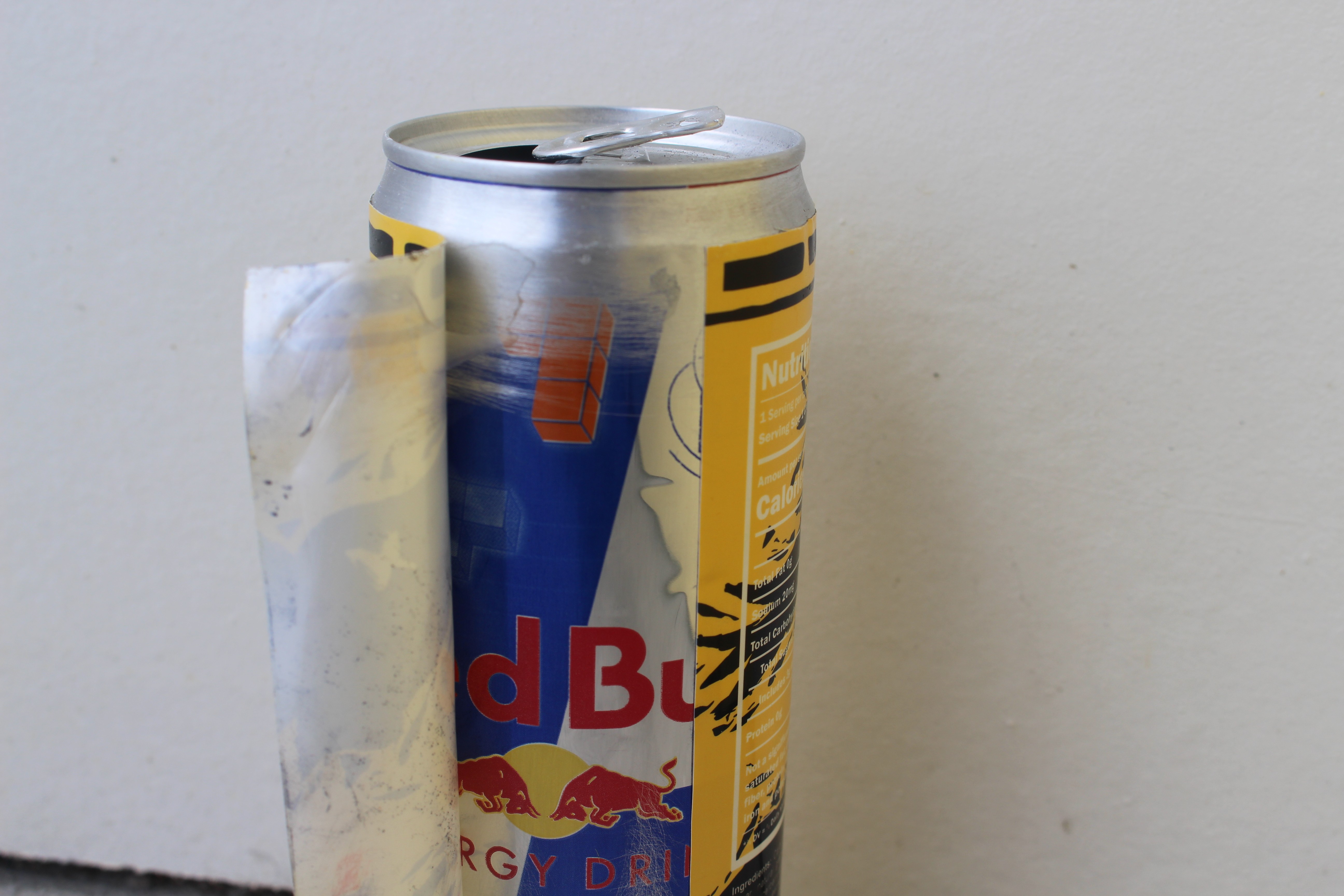
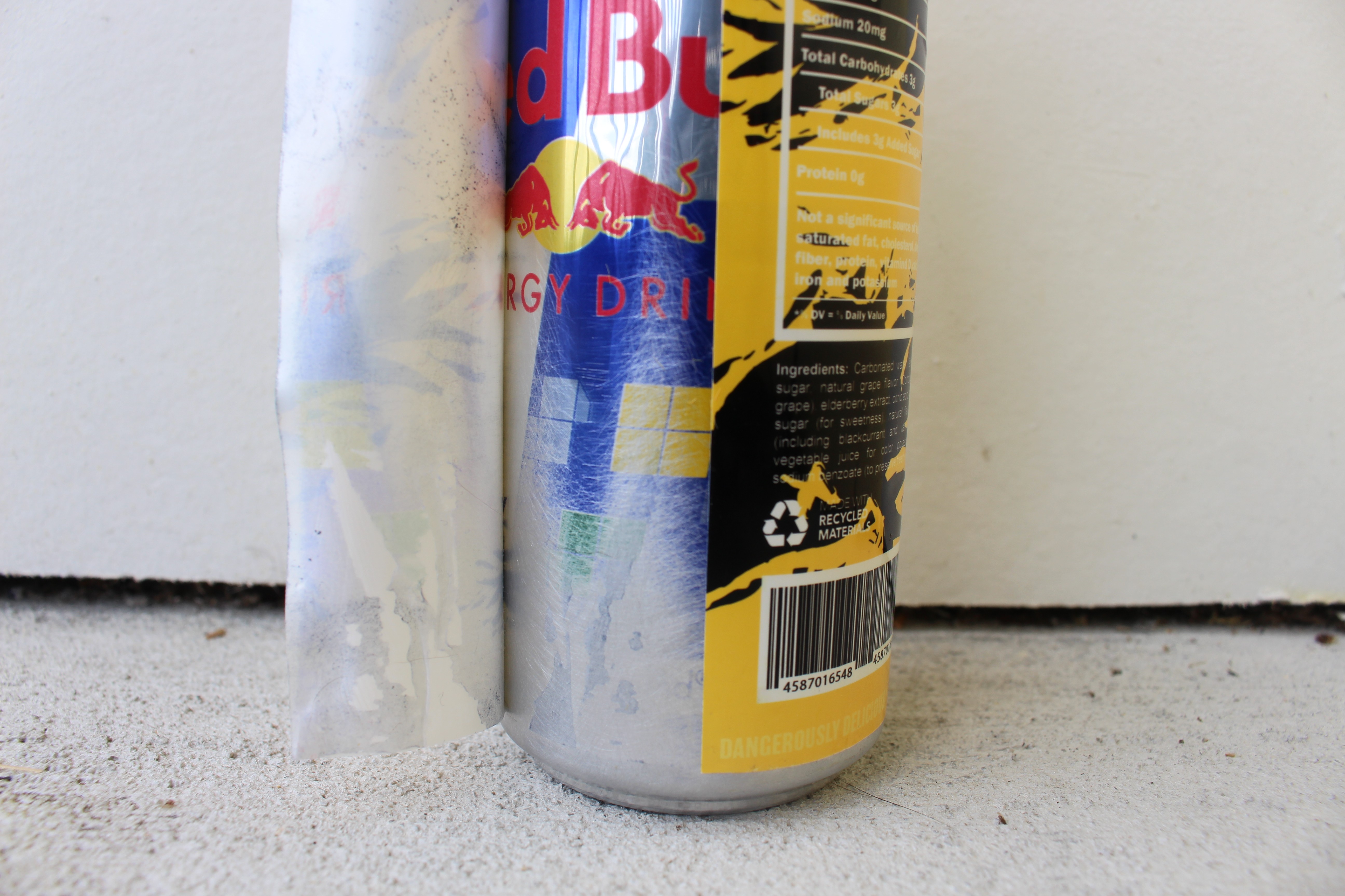
The cans were handmade using repurposed Red Bull 12 oz cans because they matched the exact size and proportions I wanted for the design. To prepare them, I sanded away any exposed areas of the original Red Bull graphics using a sanding block anywhere the custom label did not fully wrap the surface. The final can designs were then applied using printed stickers, transforming the original cans into fully realized product mockups.
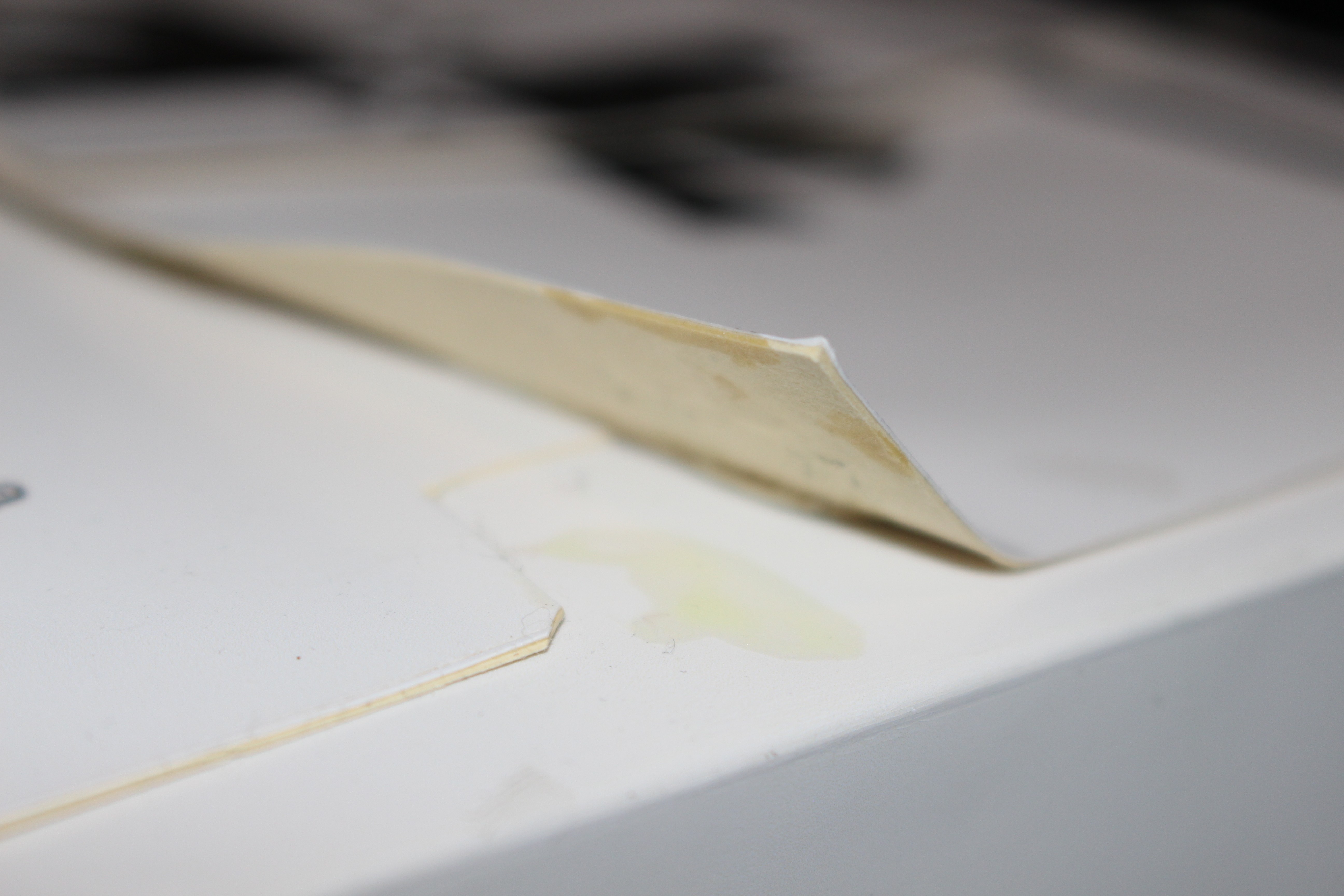
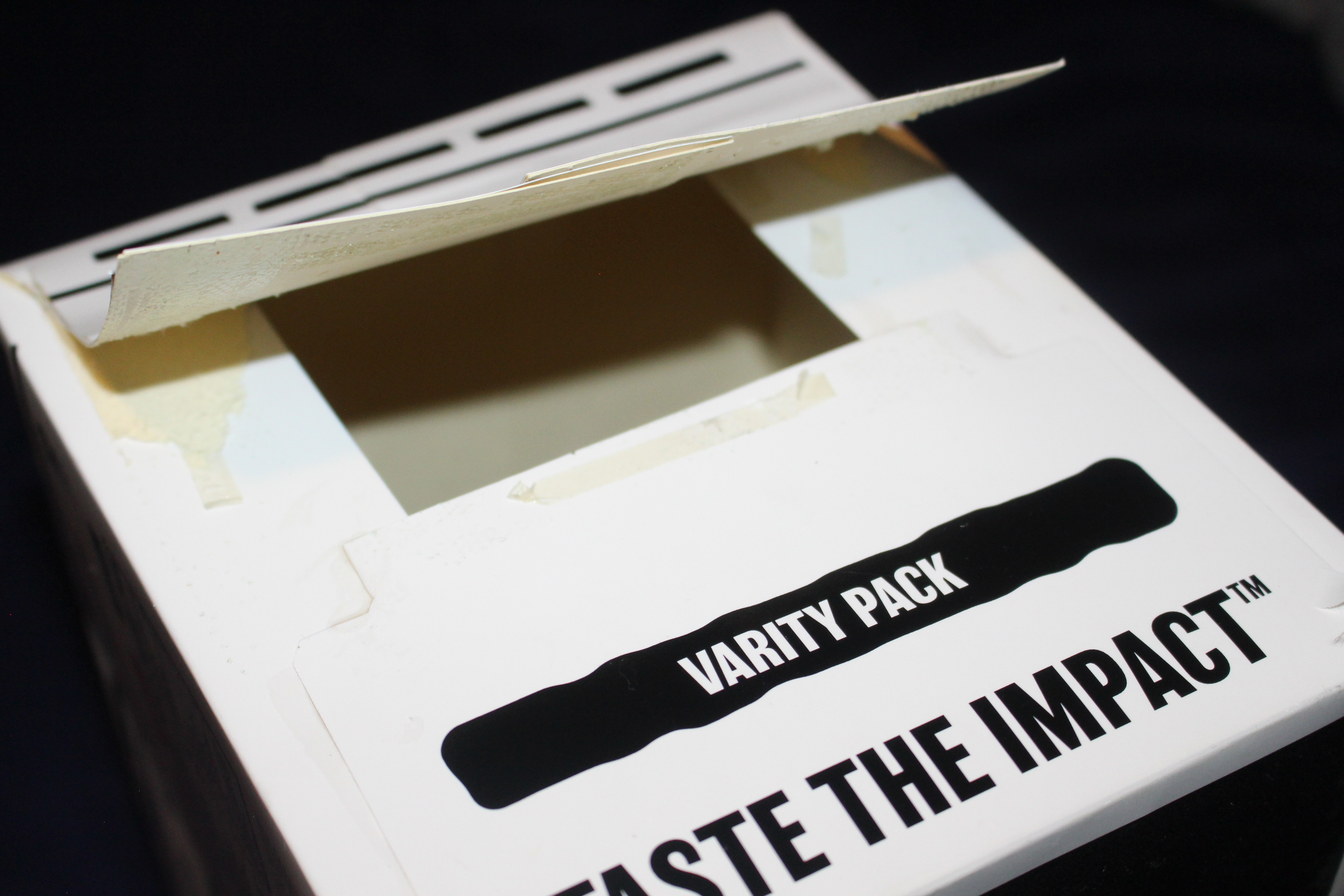
The packaging boxes were printed on an Epson P6000 printer using full-scale dielines. After printing, the flat layouts were mounted onto a thicker stock using spray adhesive to give the packaging more structure, durability, and a heavier, more realistic feel in-hand. Every component of the packaging was produced to scale, allowing the final products to feel authentic and functional rather than simply conceptual.
Physical Construction
Alternate Color Way
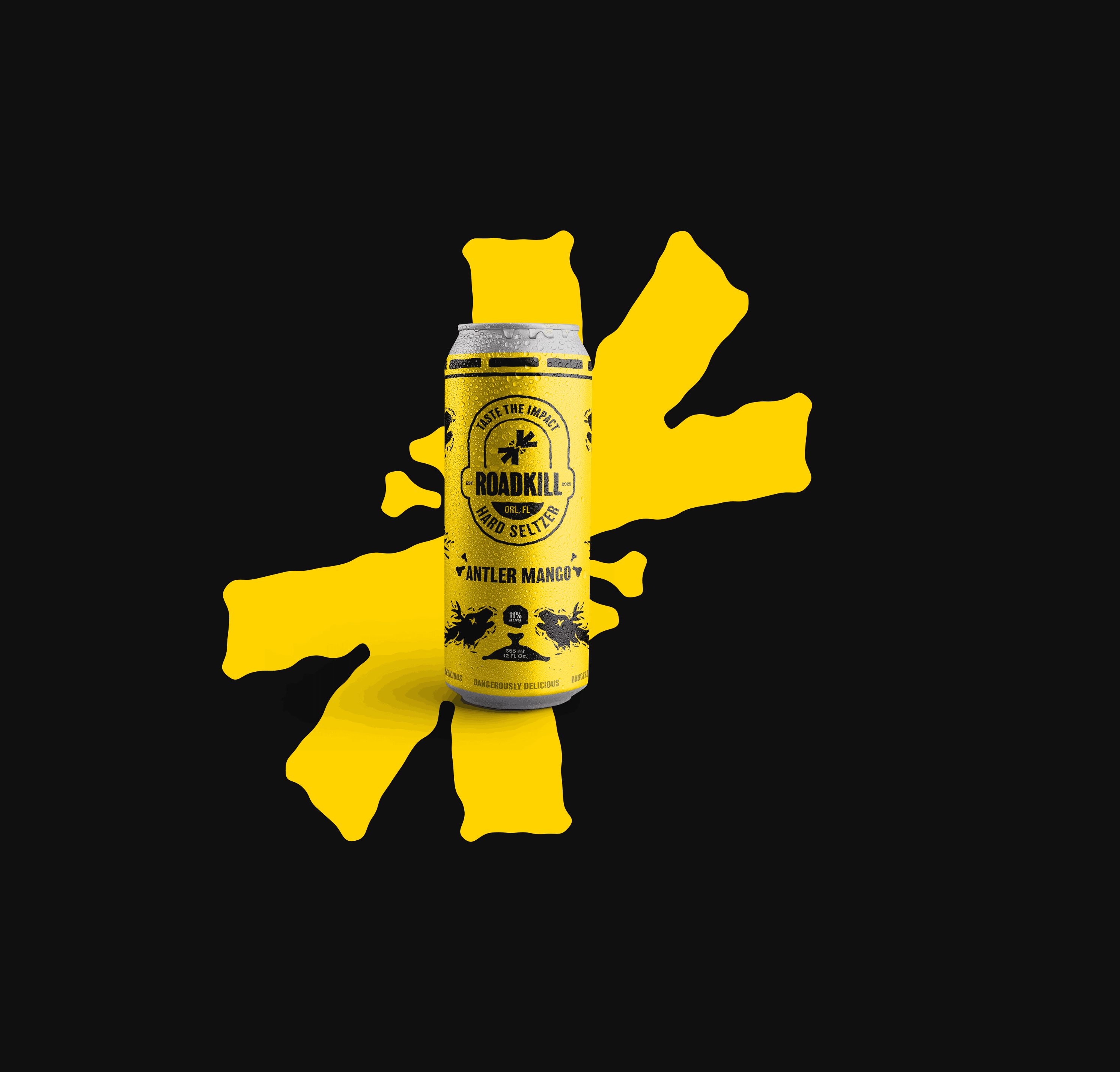
For this Roadkill line, the cans shift to a predominantly black base to immediately signal a harder, more intense product. The black can creates a bold, high-contrast foundation that feels heavier and more aggressive, while also allowing the branding to stand out with clarity and confidence. Instead of fully color-driven cans, flavor colors are strategically applied as accents, wrapping key areas of the can to differentiate flavors without overpowering the core identity.
The existing flavor illustrations are carried over unchanged to maintain continuity across the brand and reinforce quick flavor recognition. Set against the black background, these illustrations feel sharper and more deliberate, giving them added impact while preserving their original personality. This approach keeps the system cohesive with the broader Roadkill lineup while clearly elevating the cans into a stronger, higher-alcohol tier that feels darker, bolder, and more uncompromising.
Printed Materials
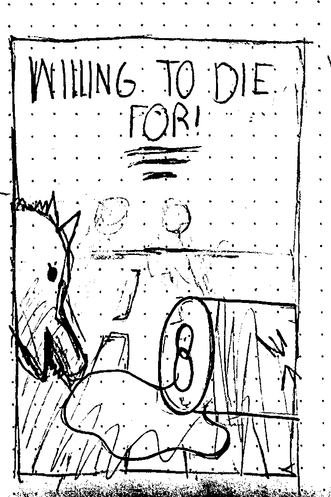
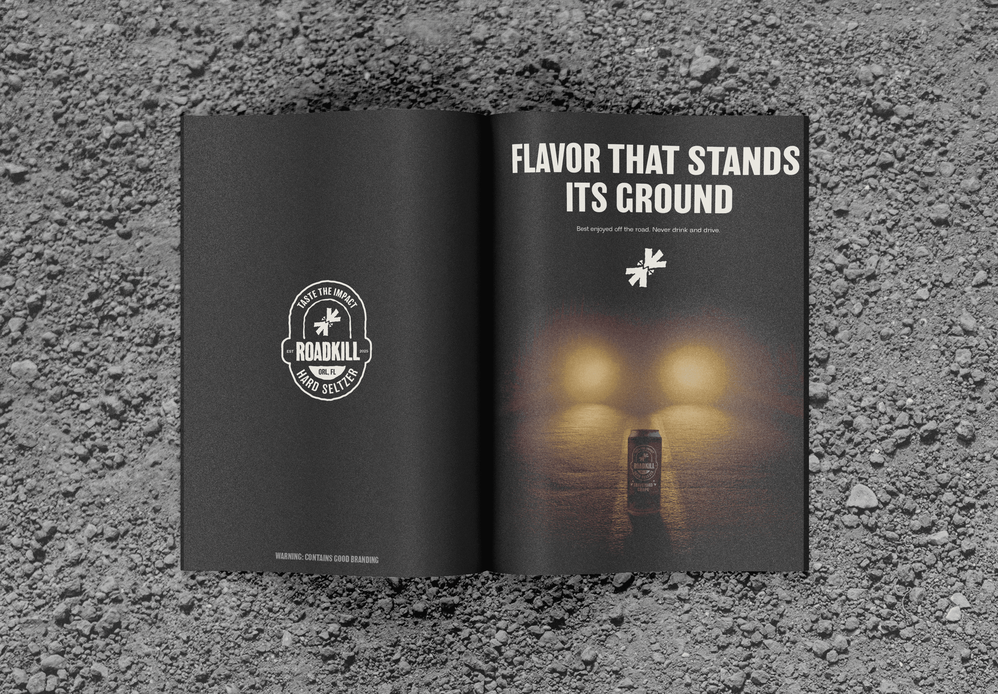
The printed materials were created to reflect the same dark, grungy aesthetic and humor found throughout the rest of the brand. The magazine advertisement especially leaned into the unsettling tone of the project, placing the viewer in the perspective of an animal in the road as headlights approach in the distance, with a Roadkill can positioned directly in front. The piece was meant to feel dramatic, uncomfortable, and visually memorable while still fitting the brand’s exaggerated personality.
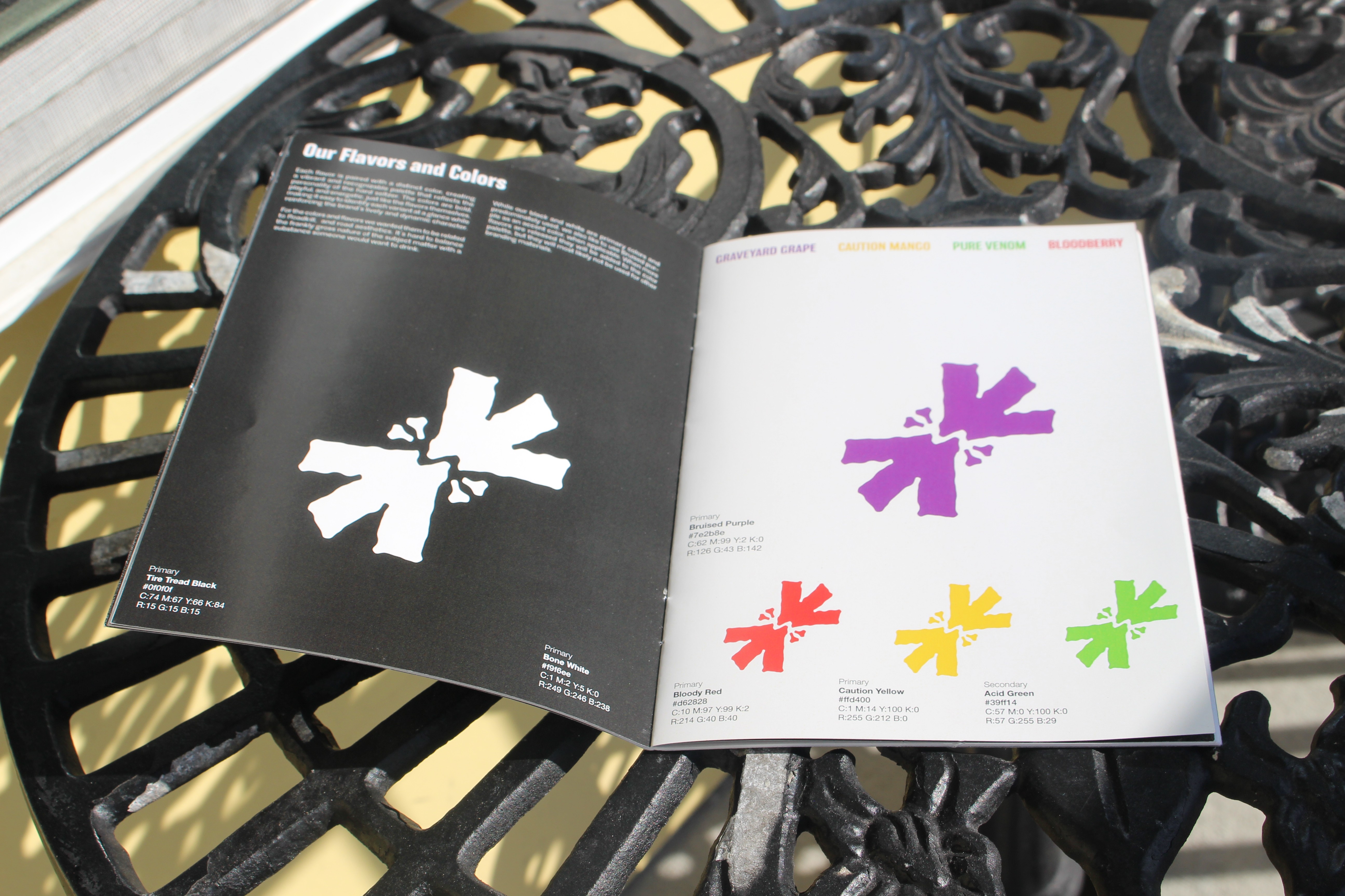
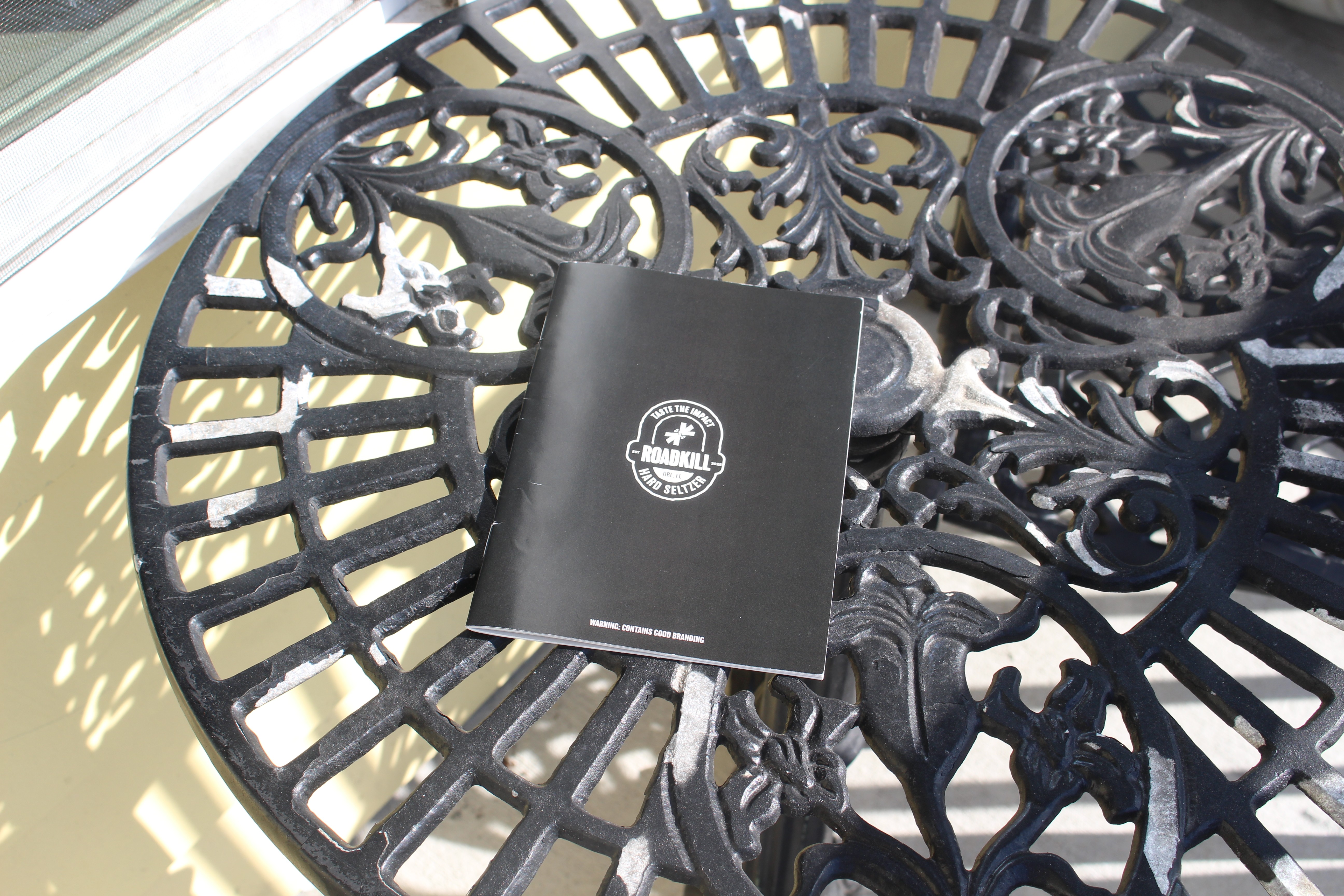
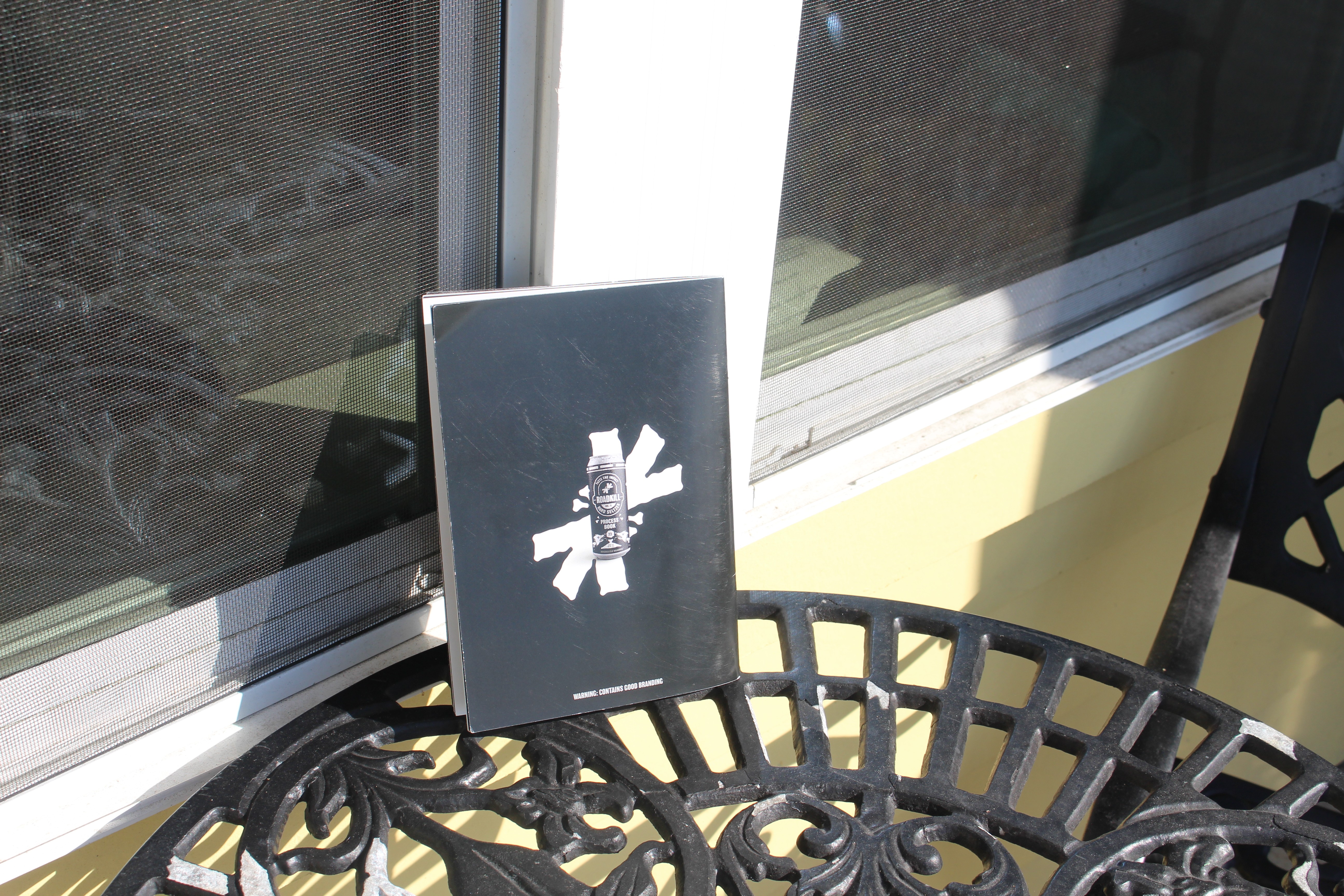
In addition to the advertisements, I also designed a full brand book that detailed the company’s story, visual identity, and branding guidelines. Beyond functioning as a guide, the book was intended to feel like an extension of the brand experience itself, something that could potentially be included with certain Roadkill products to give the company more personality and create a deeper connection to the world of the brand.
Magazine Sketch and Process Book Photos
Display Case
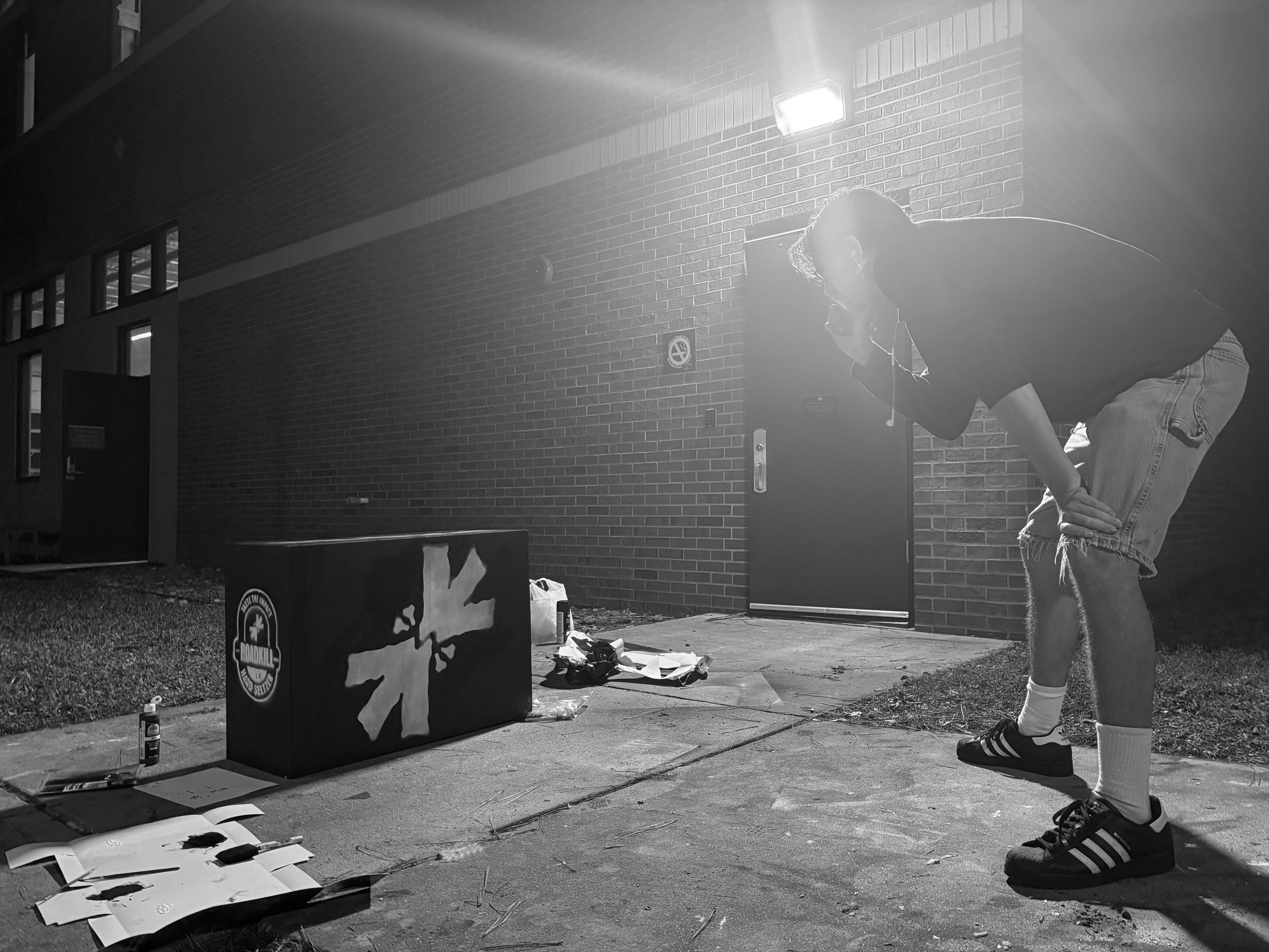
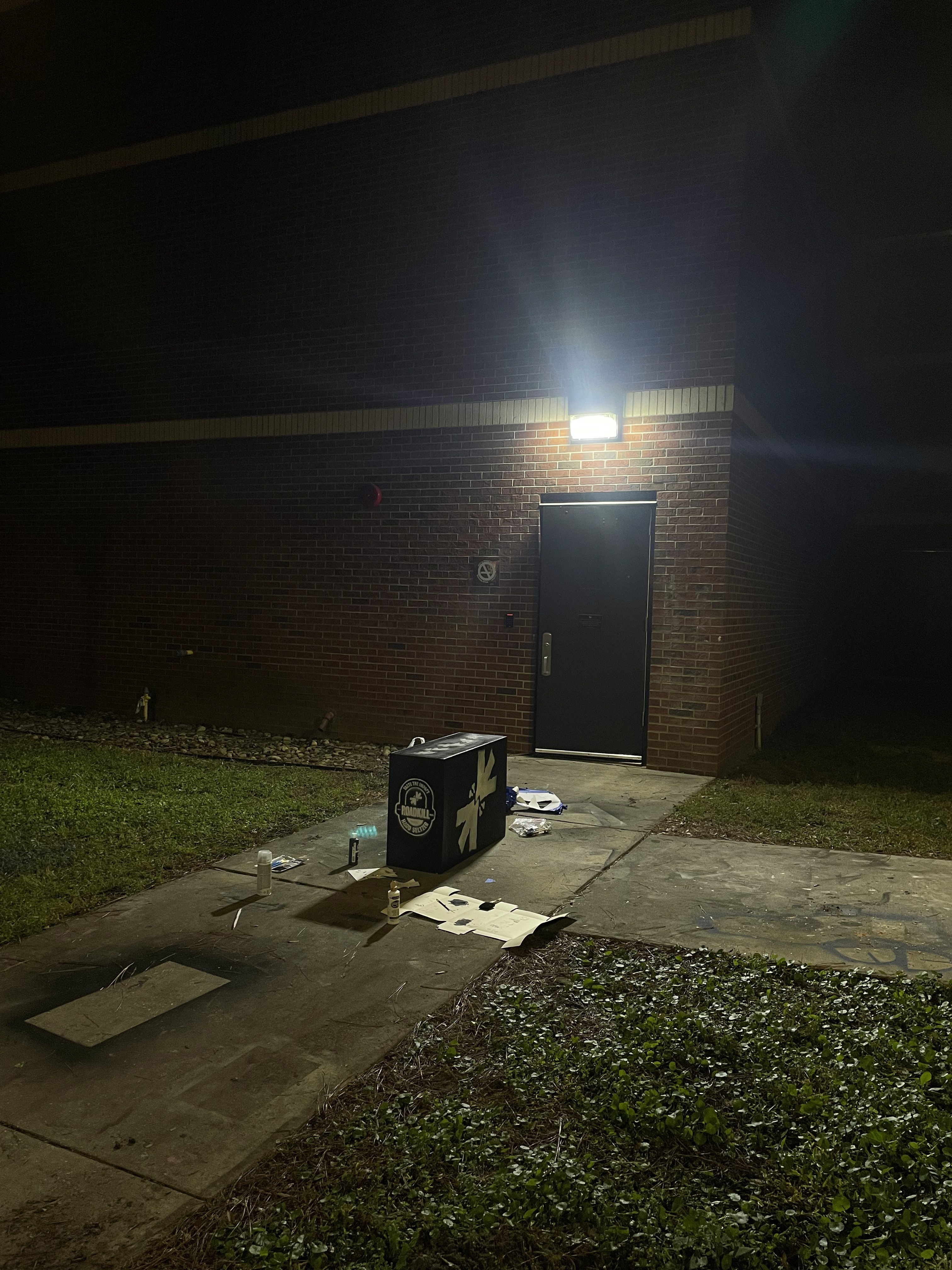
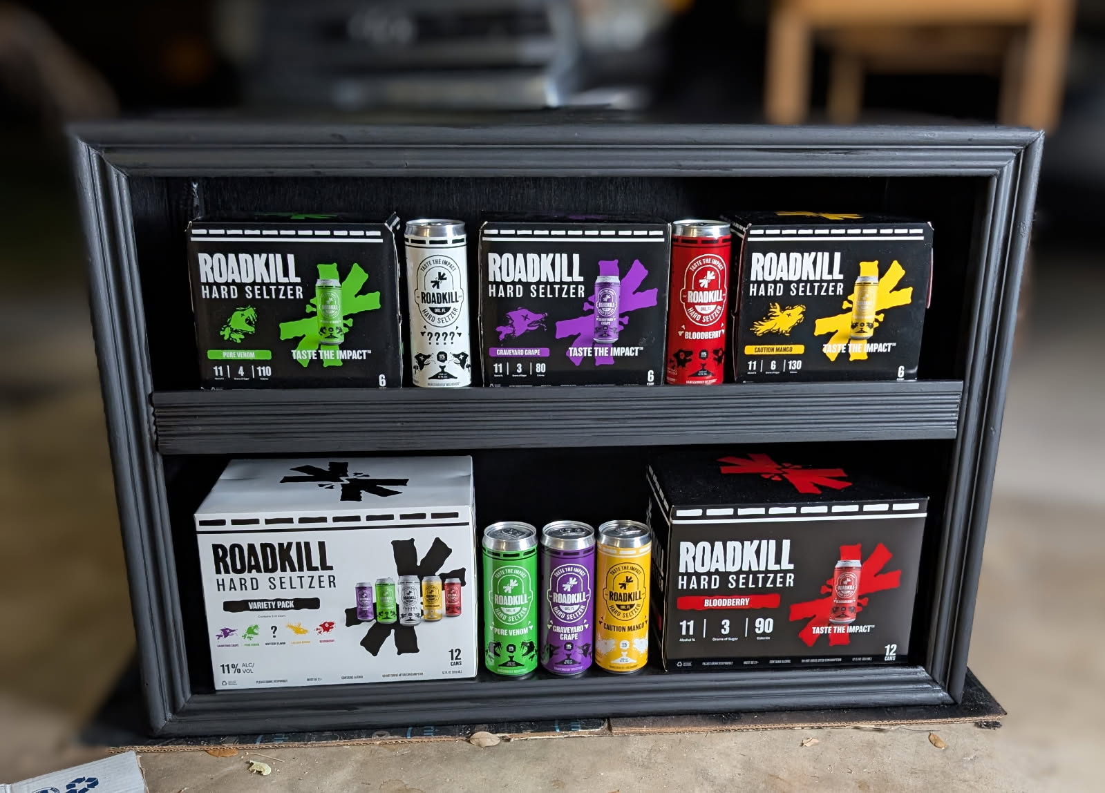
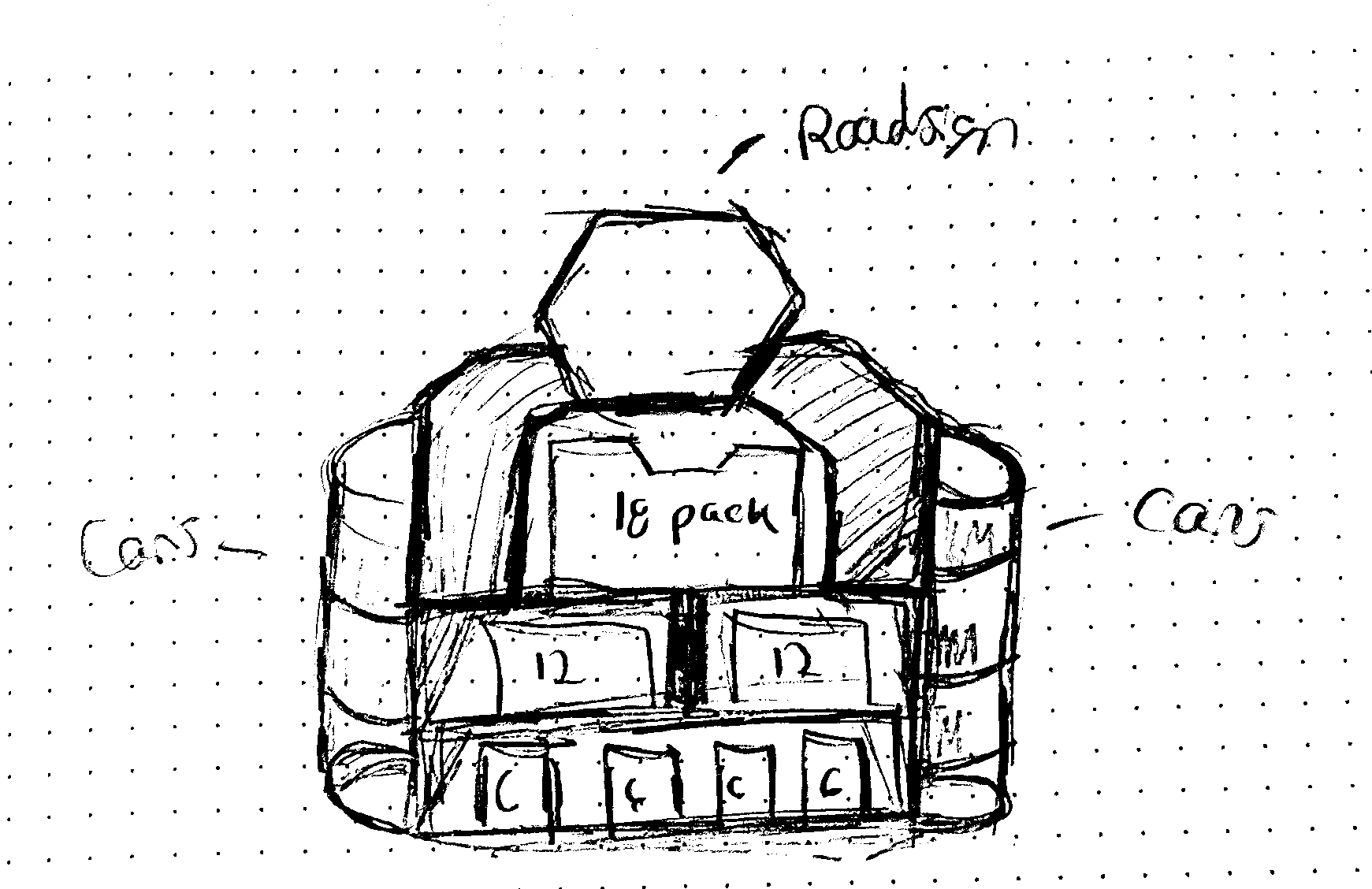
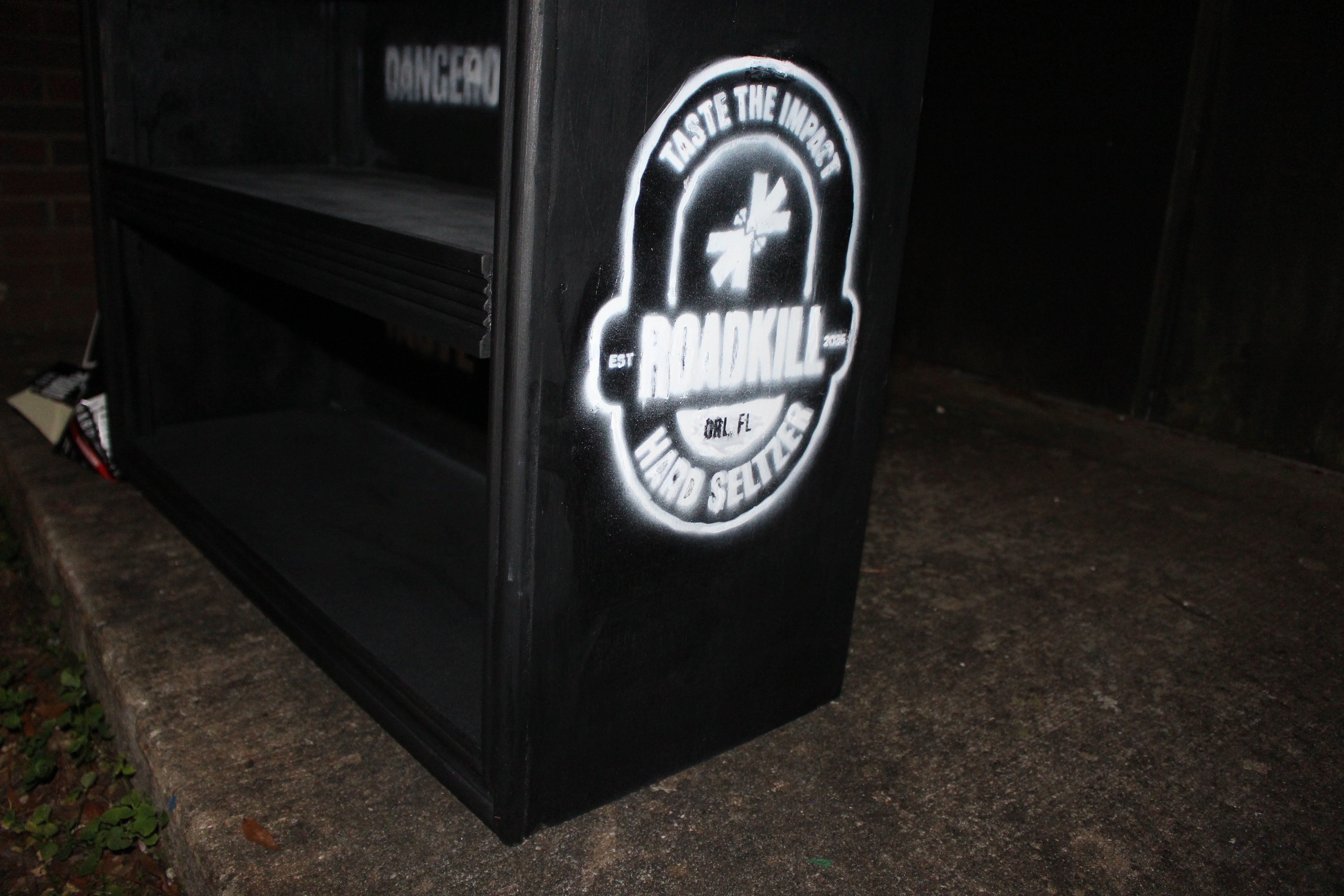
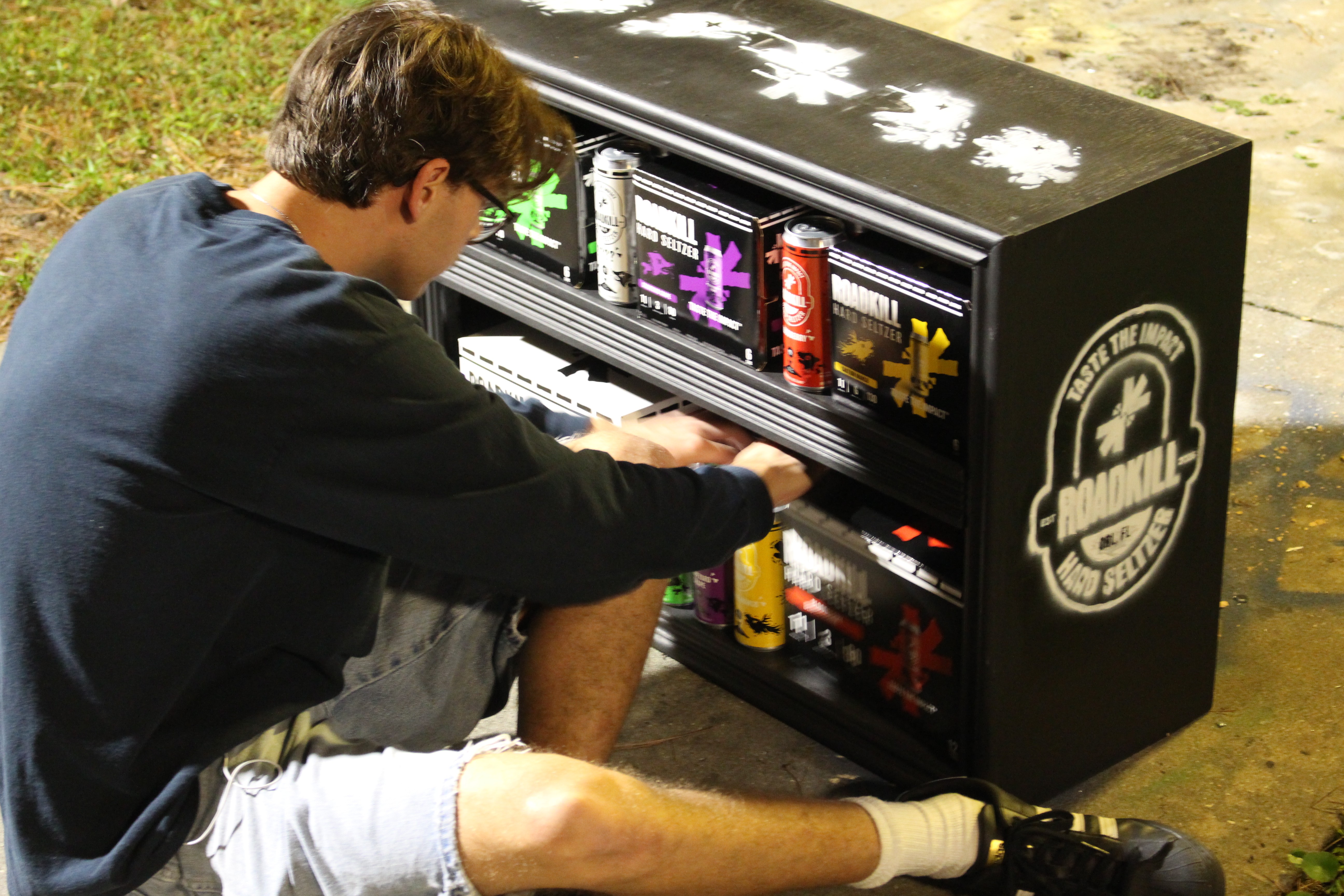
For this project, I wanted to capture the feeling of the brand through something that felt abandoned and repurposed, like an object left on the side of the road that someone found and gave a second life to. To reflect that idea, I designed and built a worn, aged display case that looked weathered and imperfect while still functioning as a strong retail centerpiece.
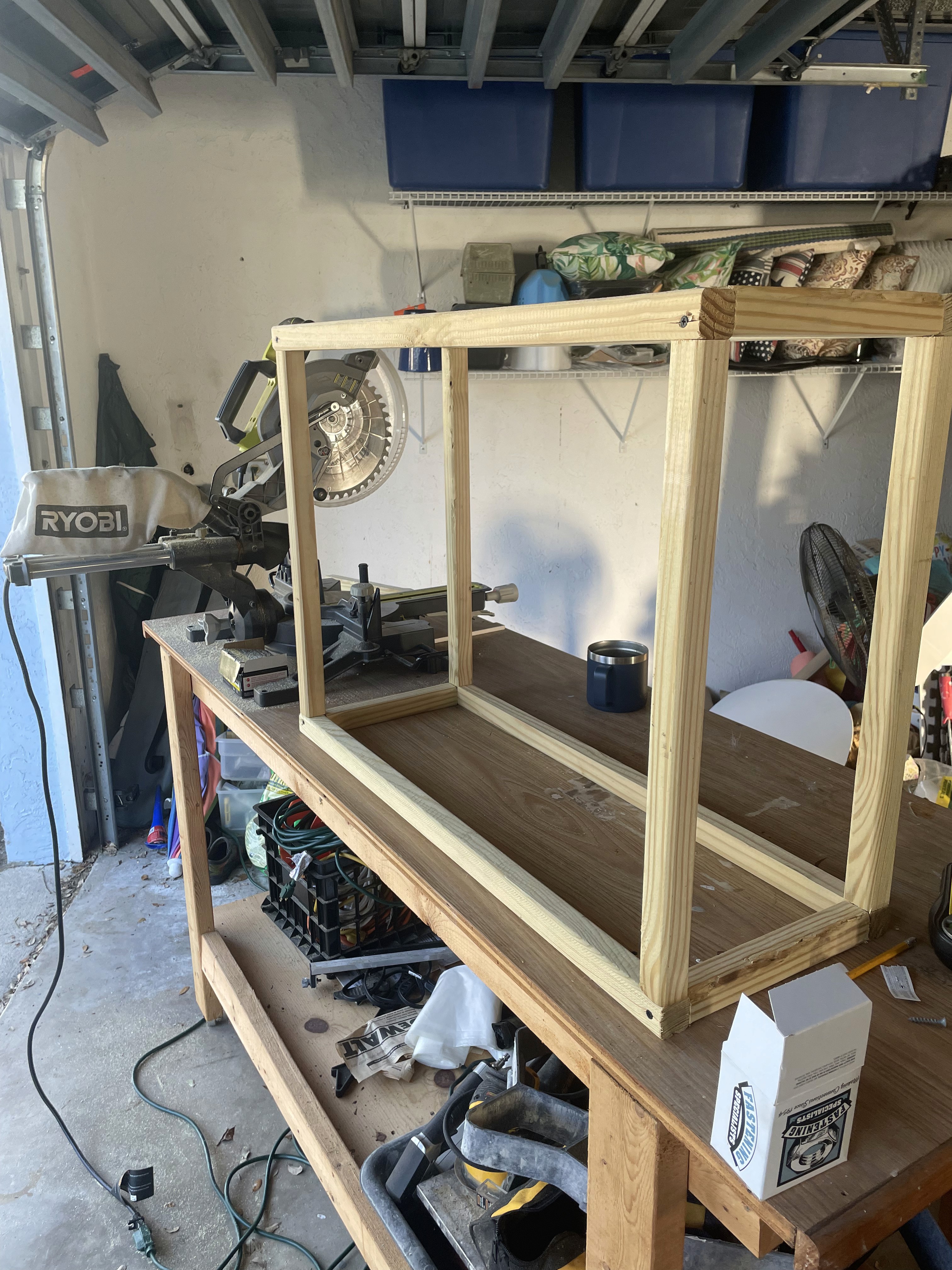
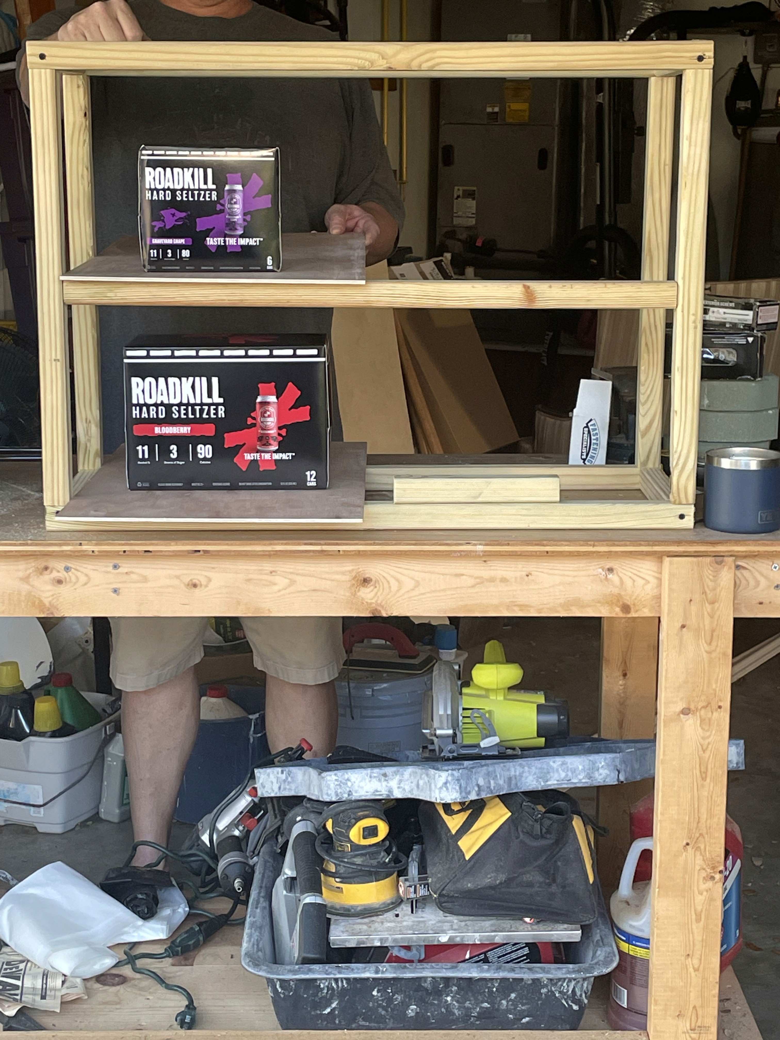
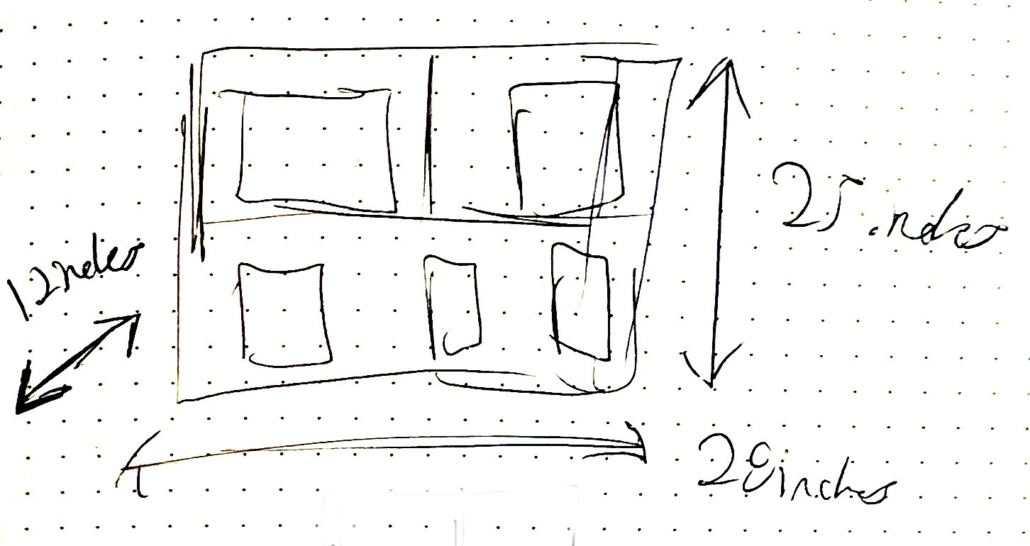
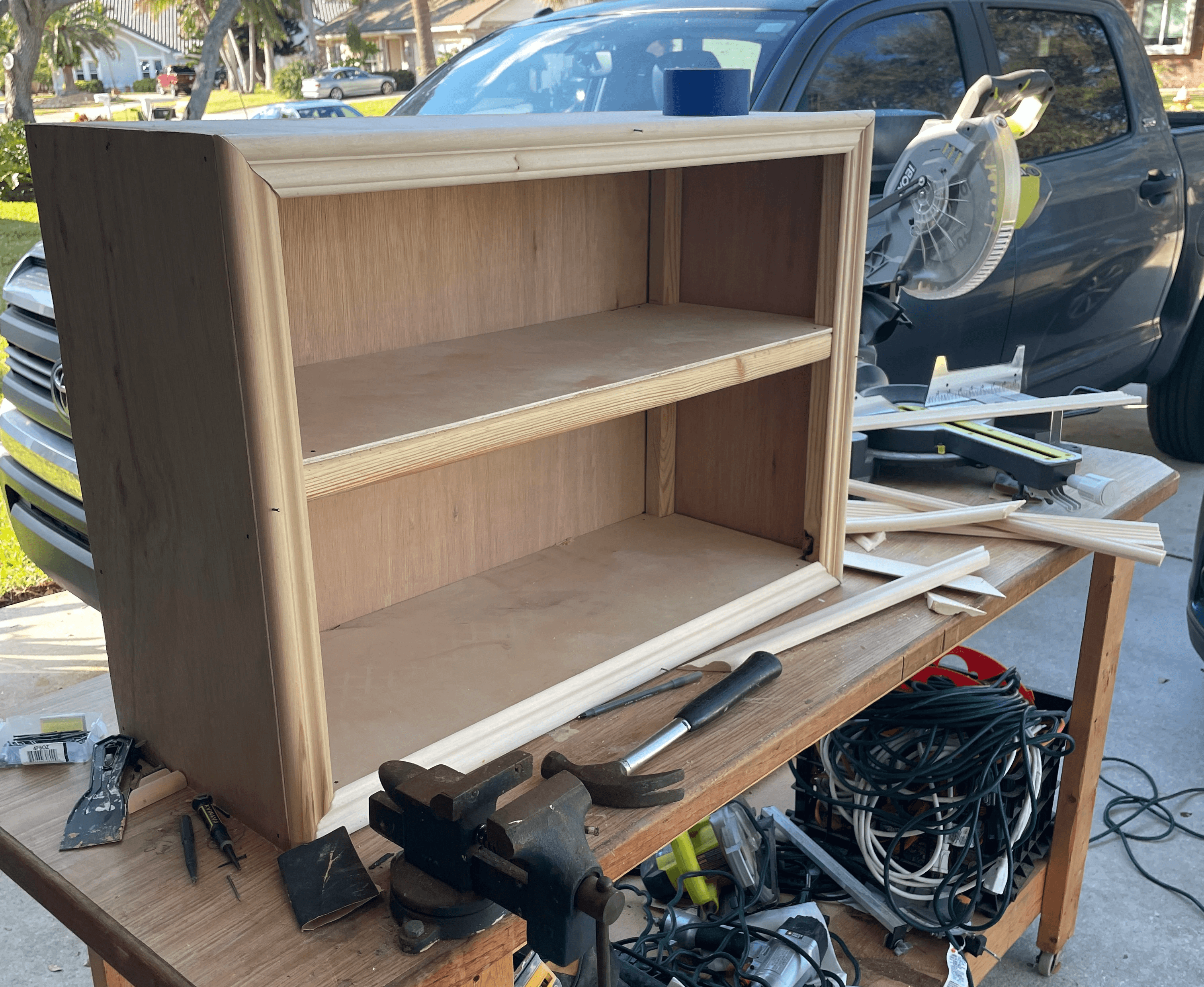
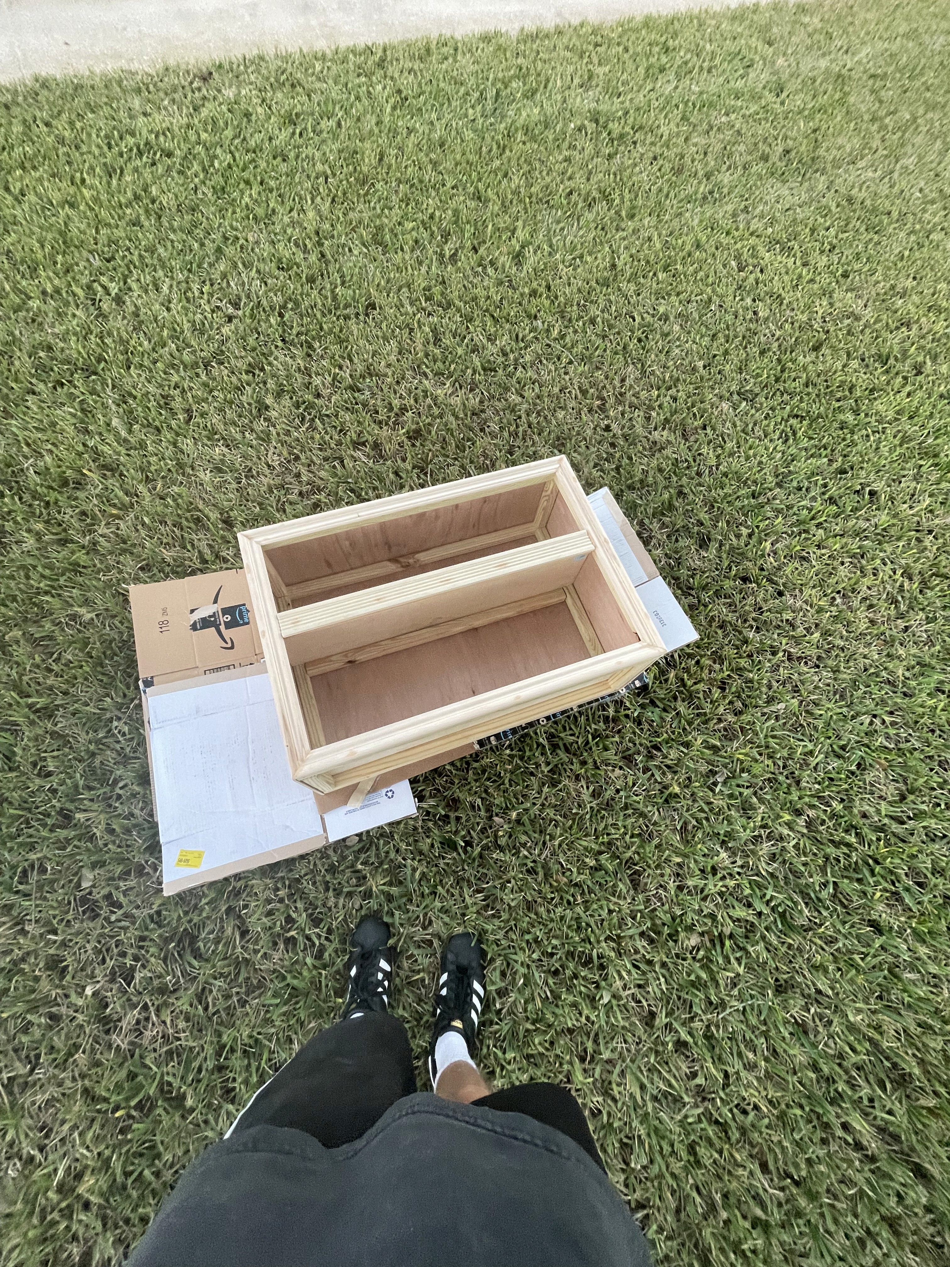
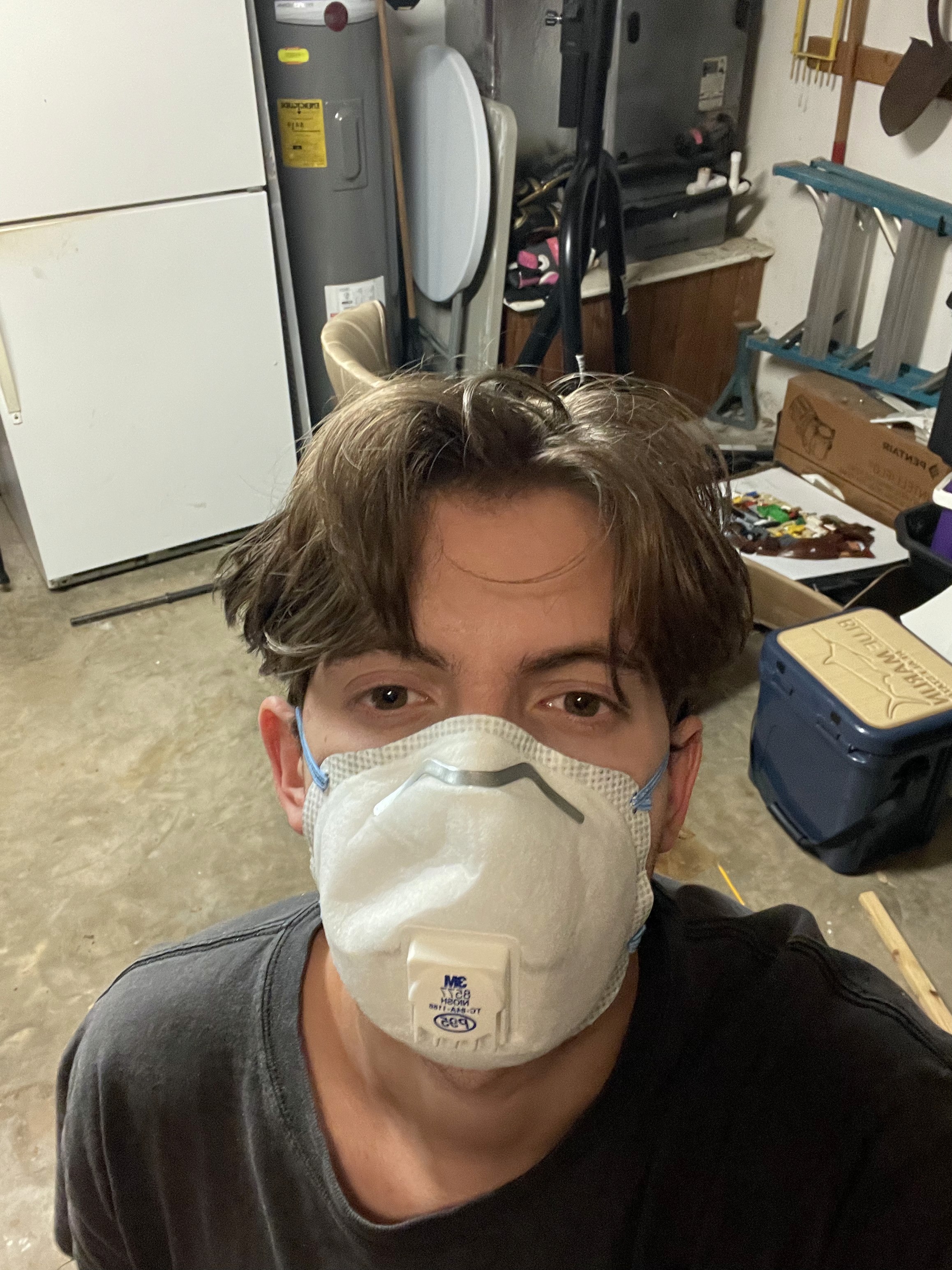
The display case was built over the course of four days. I started by constructing the frame out of 1x1 lumber, creating the overall structure and dimensions of the piece. From there, I used 1/4-inch birch paneling to enclose the case and create the shelving. Once assembled, the entire piece was sanded down and puttied to fill gaps, smooth uneven areas, and make the surfaces feel more cohesive and level.
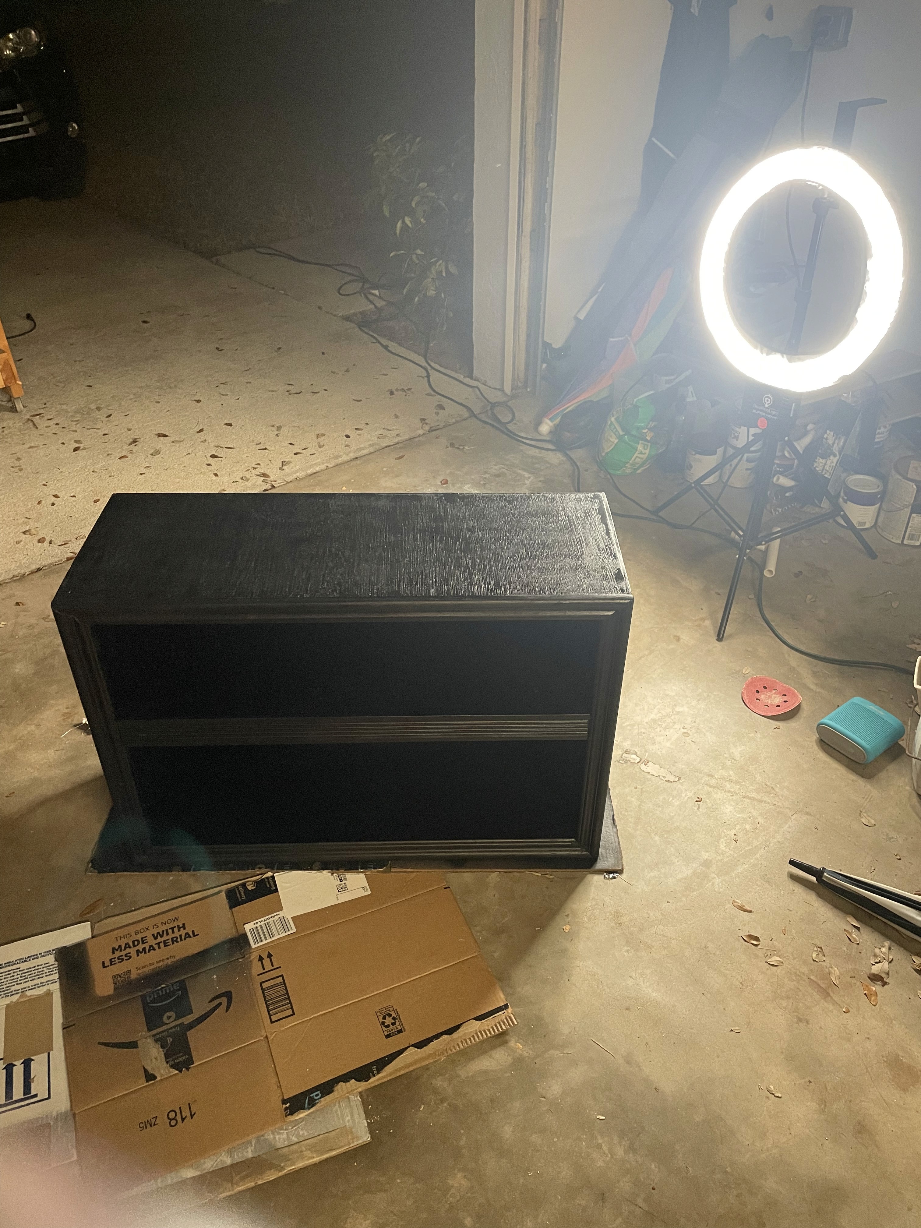
After the structure was cleaned up, trim was attached using finish nails. The nails were countersunk and filled to create a seamless appearance that made the piece feel more intentional and refined despite its distressed aesthetic. The entire case then received a final sanding before being spray painted black.
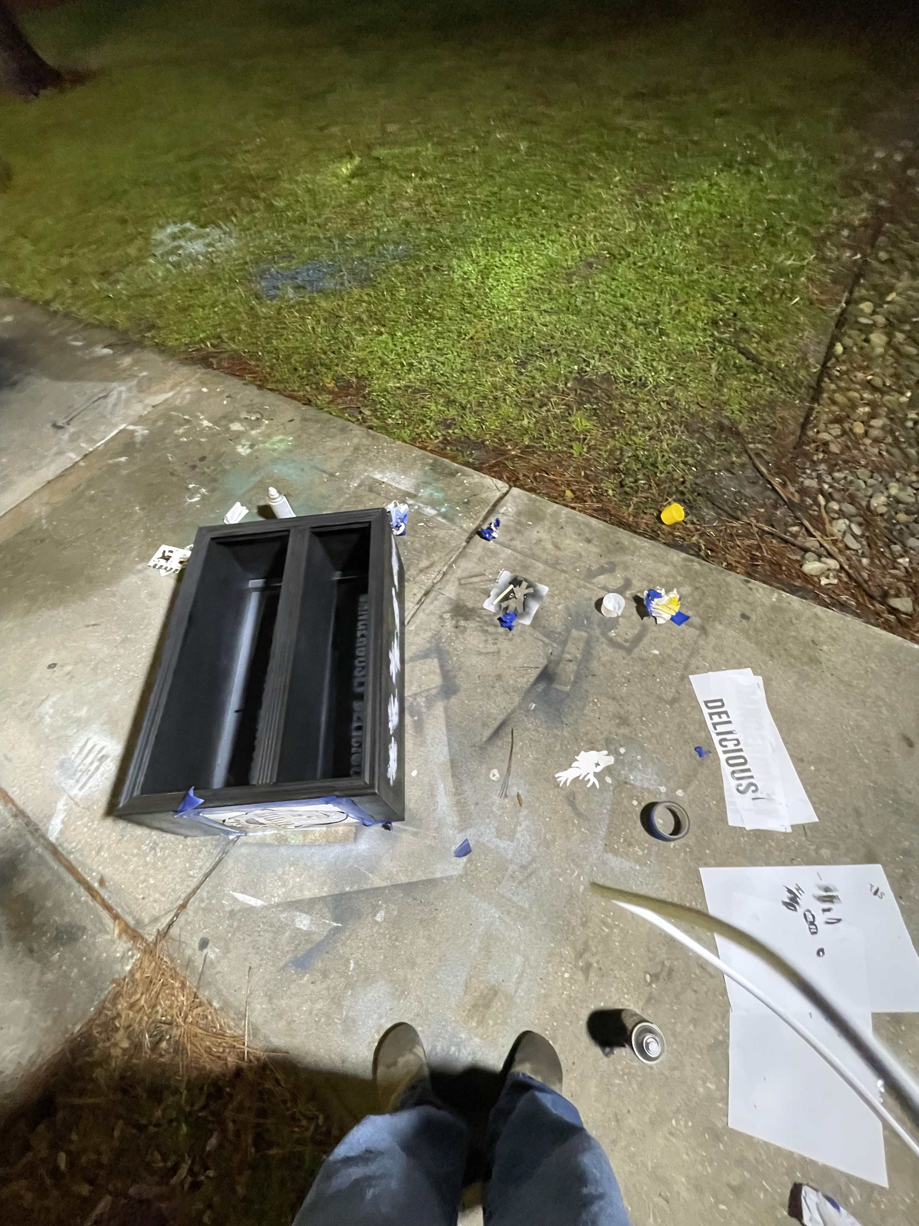
To push the identity of the piece further, I designed and printed custom stencils that were spray painted onto the top and sides of the case. These graphic elements helped reinforce the rough, found-object aesthetic while tying the display directly back to the brand language and atmosphere.
This project was one of my favorite parts of the overall build because it allowed me to go beyond simply making a functional display and instead create something with history, texture, and personality. Even now, I still want to continue adding to it and evolving the piece further.
Display Case Process and Construction
Photoshoot
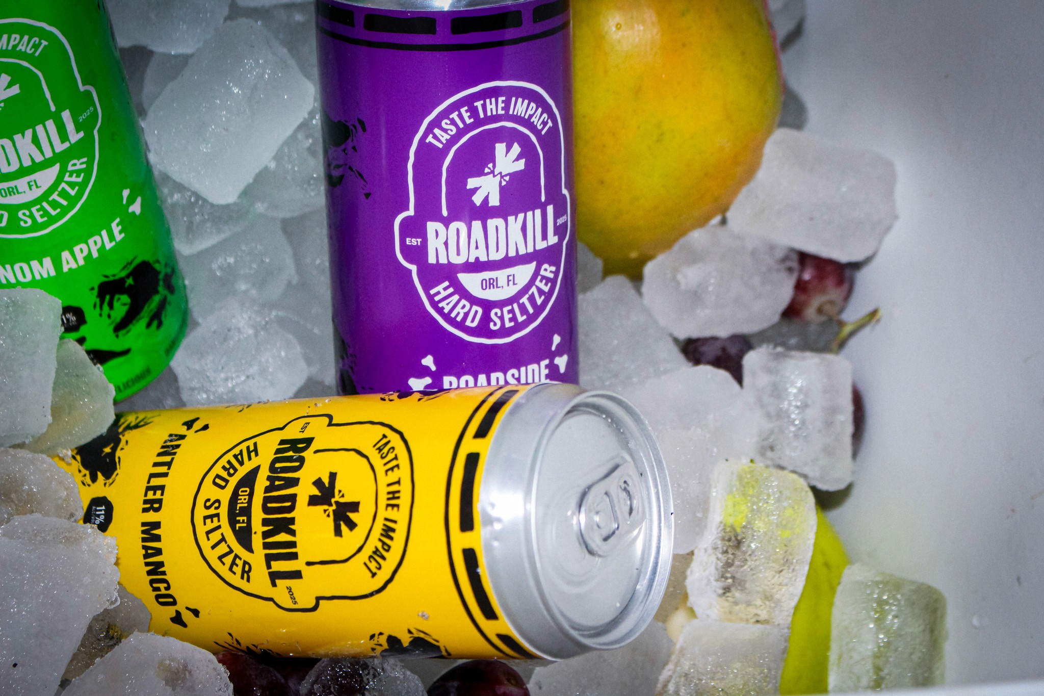
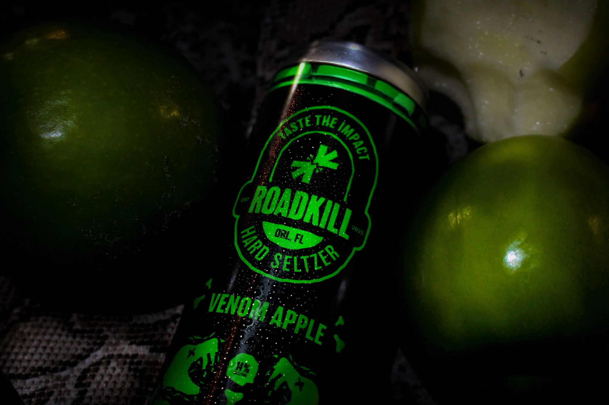
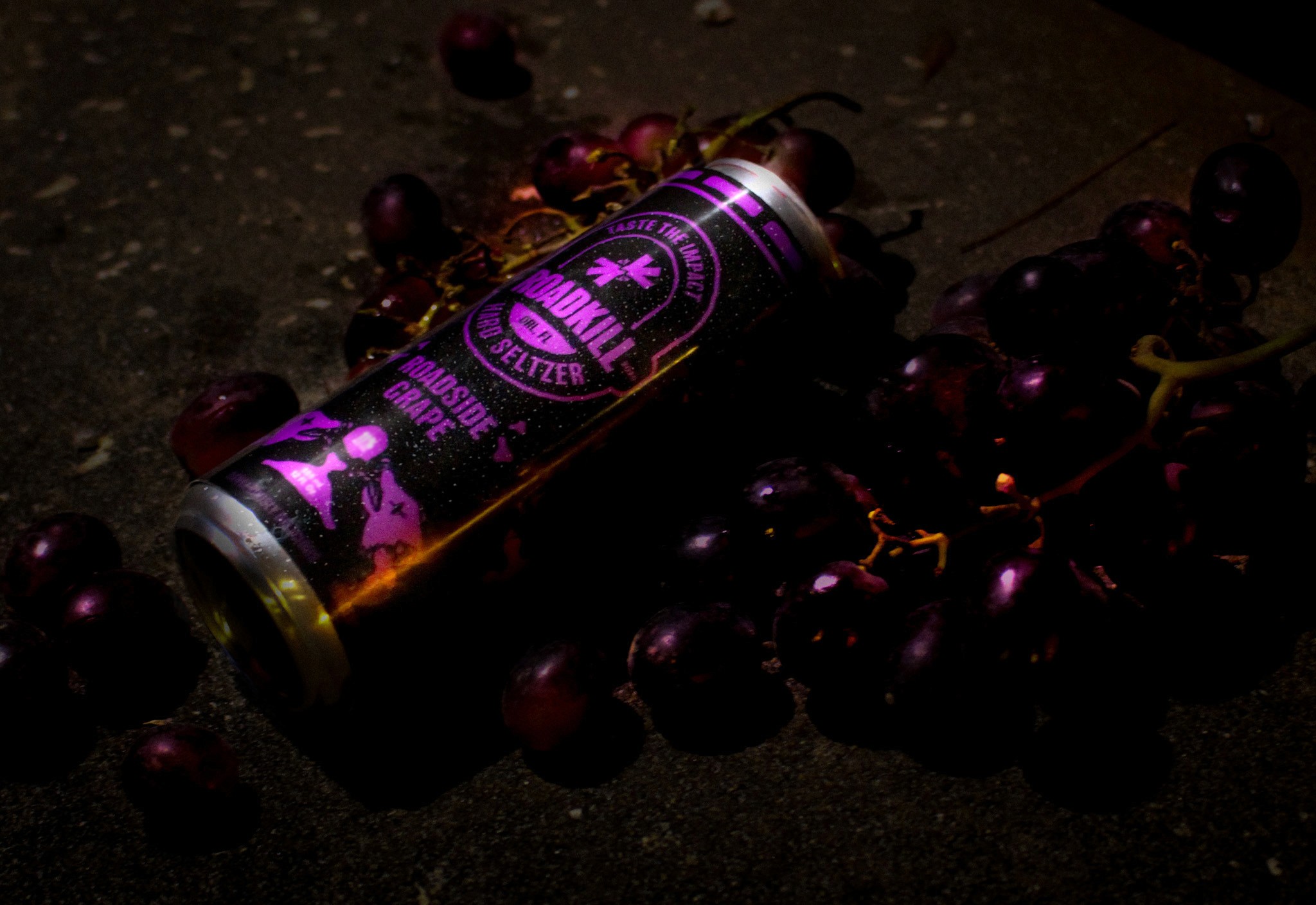
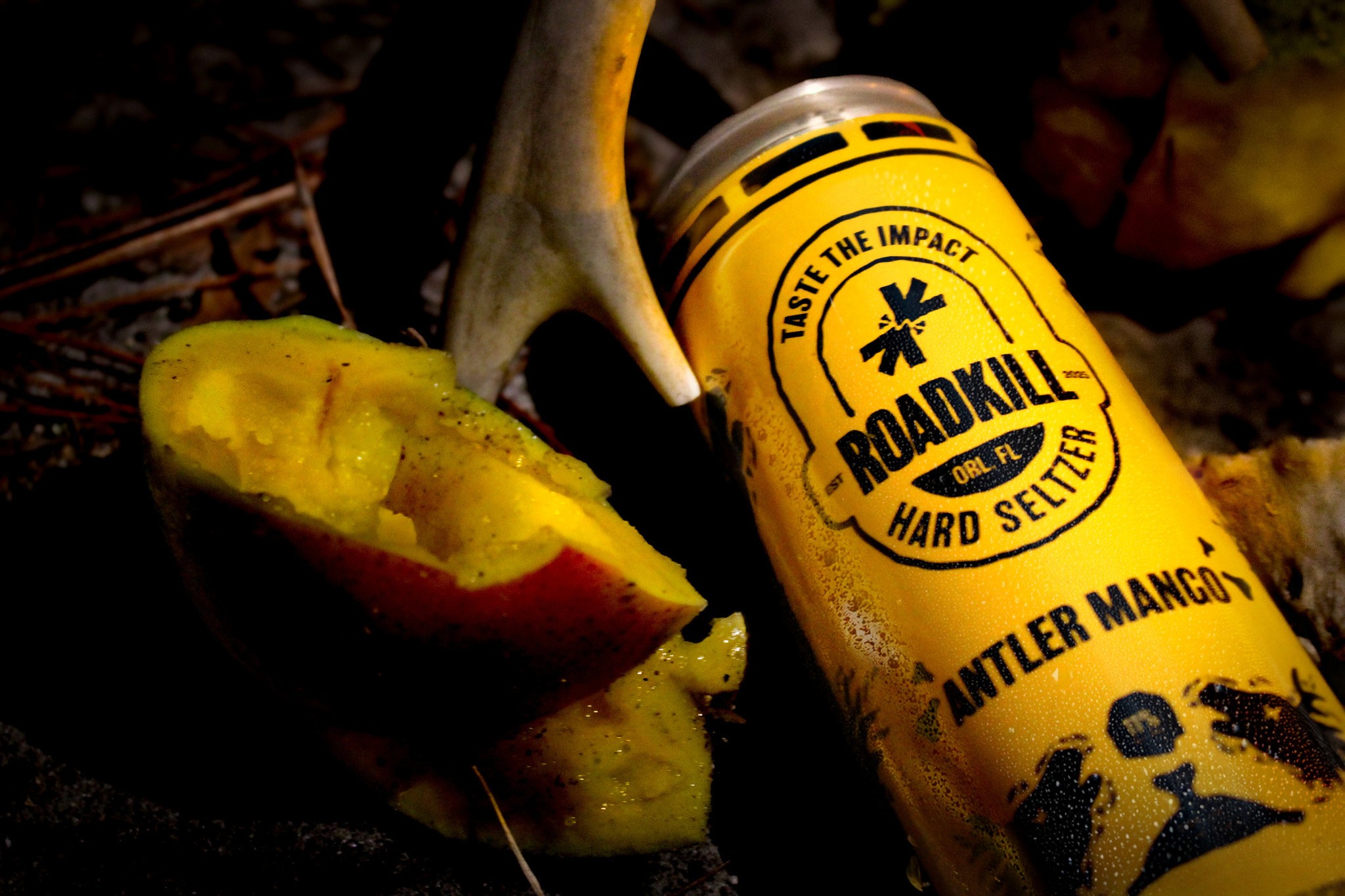
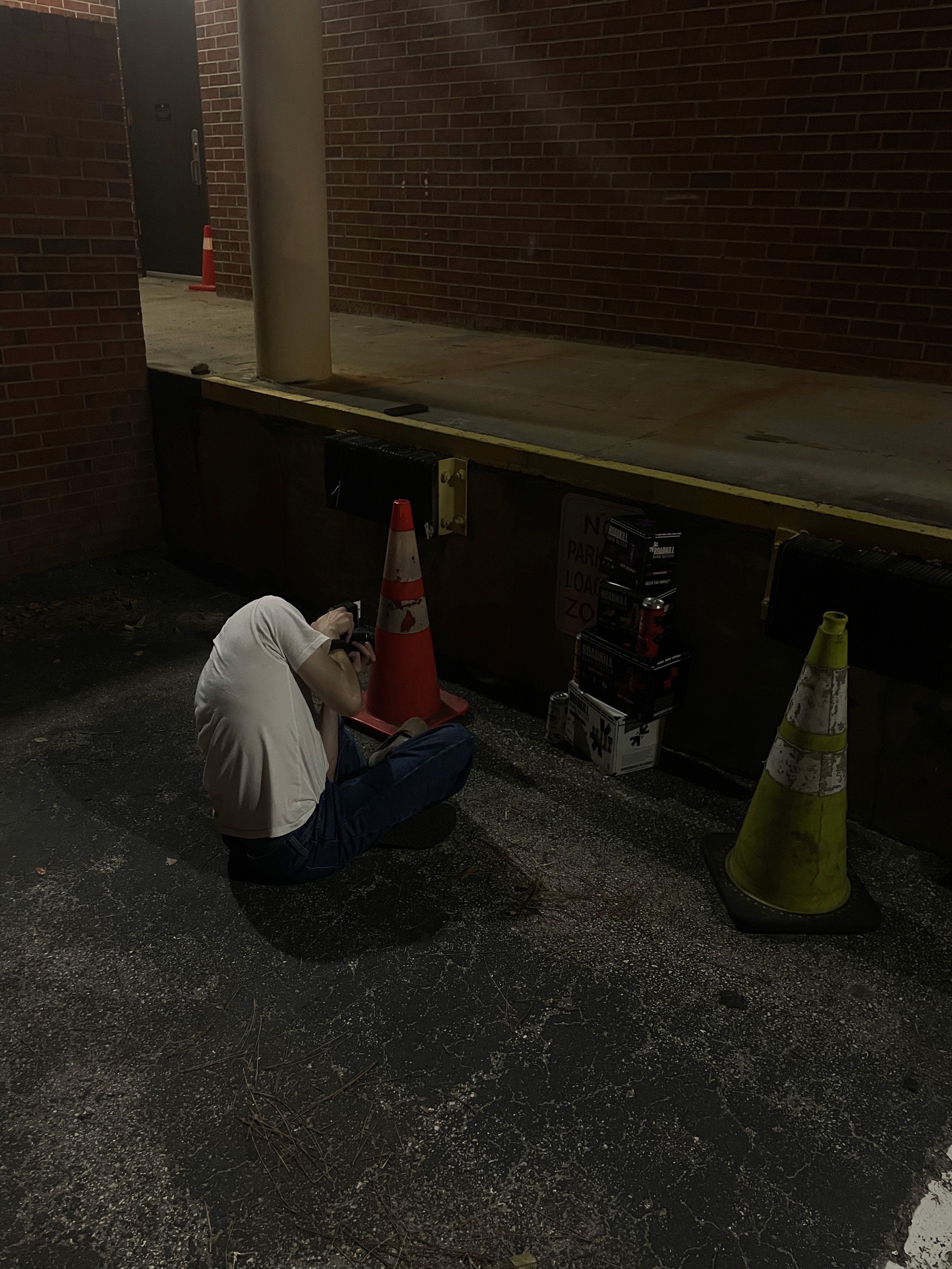
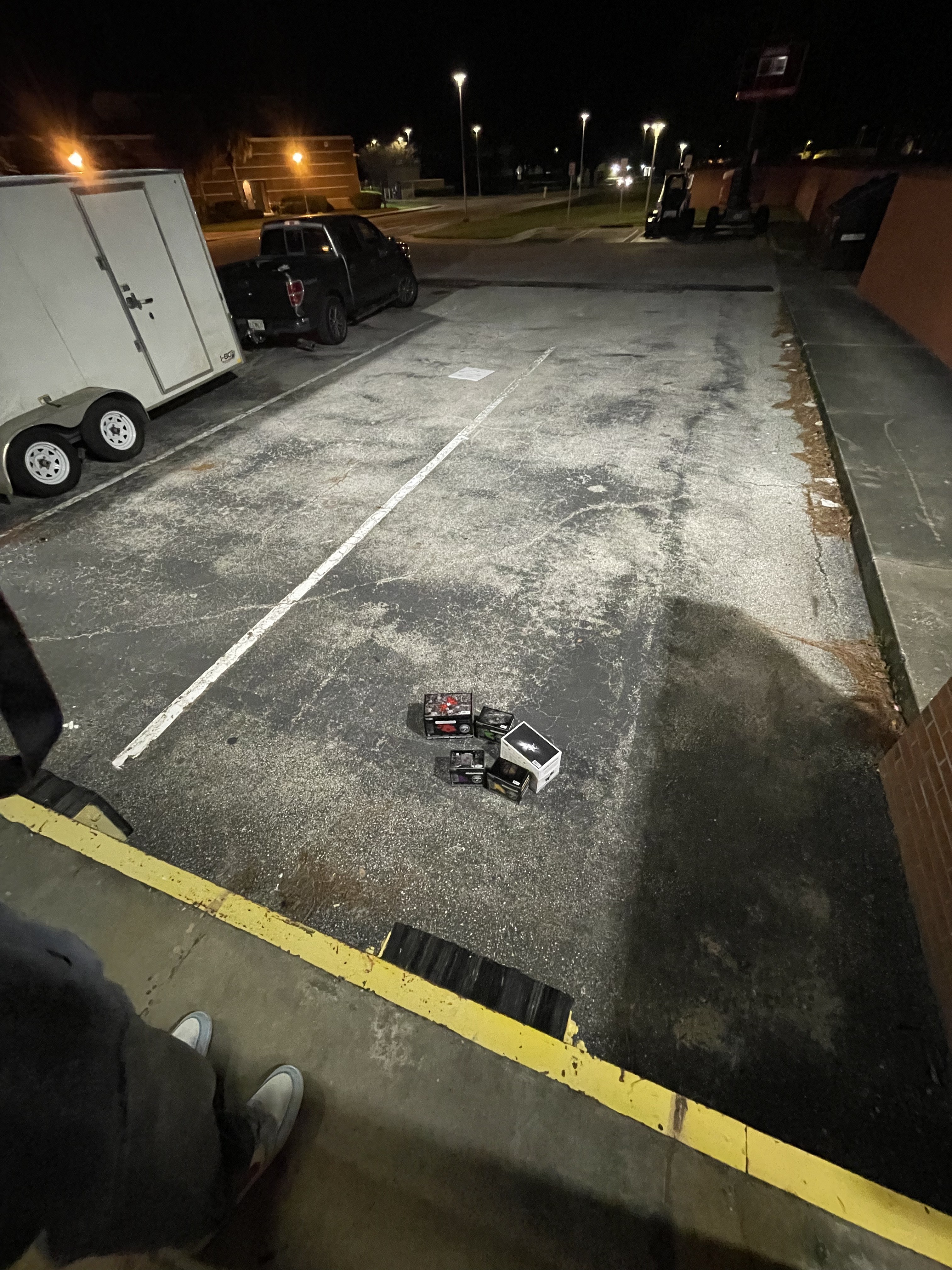
The product photography for this project was entirely shot and directed by me. The concept behind the shoot was to pair each drink flavor with both the featured fruit and the specific roadkill graphic displayed on the can, creating compositions that felt unsettling, gritty, and visually tied to the brand’s identity.
I wanted the images to feel dark, raw, and grimy while still highlighting the product clearly. Lighting, composition, and editing were all approached with the intention of reinforcing the brand’s rough, roadside aesthetic. Each setup was styled to feel intentionally imperfect and atmospheric, helping the cans feel like they existed naturally within the world the brand creates.
I photographed every can myself and handled all of the post-production editing. The editing process focused heavily on mood, deep shadows, muted tones, harsh contrast, and texture were used to give the final images a worn, grungy appearance that matched the overall tone of the company and complemented the physical display work created for the project.
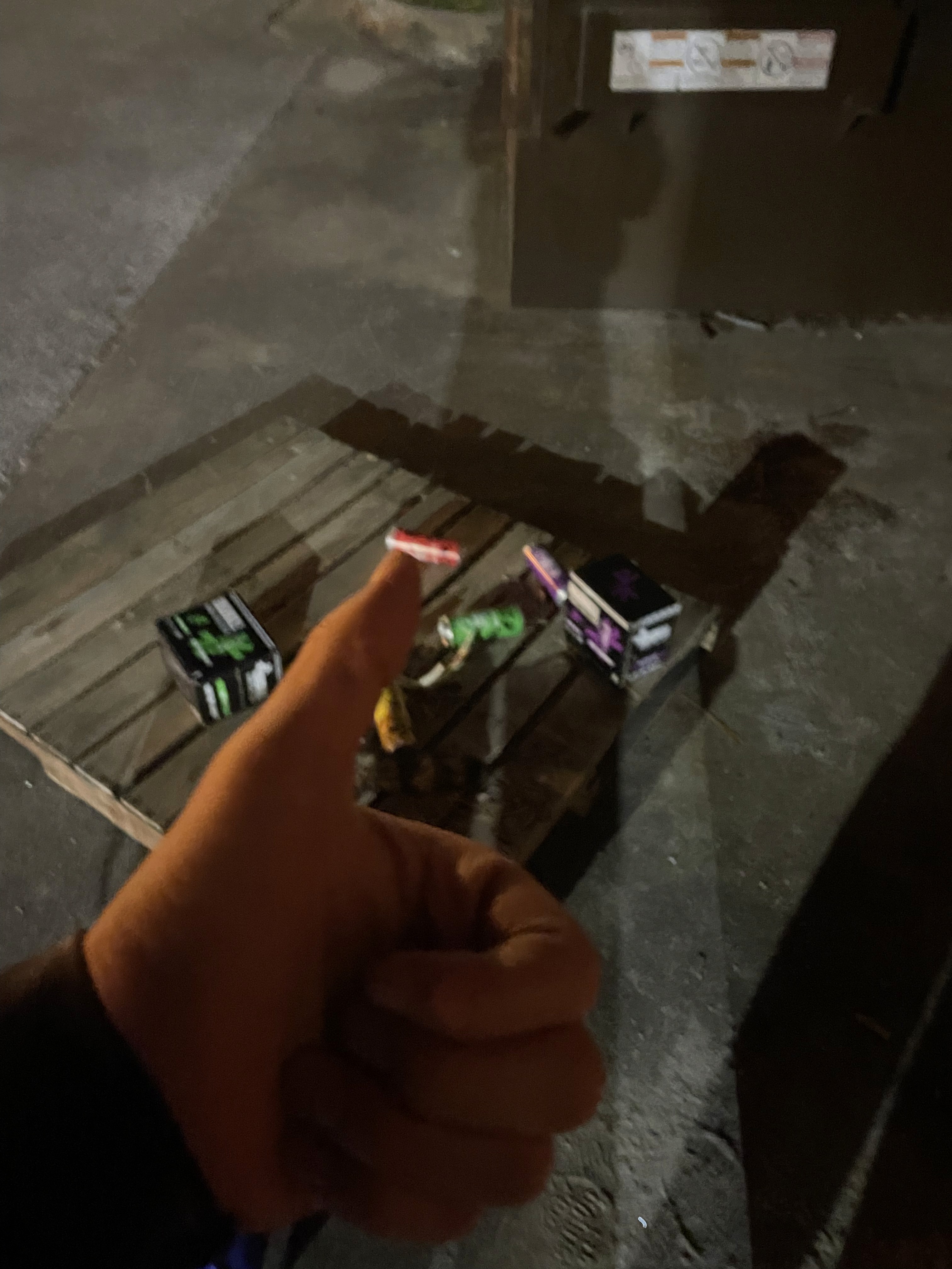
Photoshoot Behind the Scenes
LUKE
SALTER
Click Here
Company
Roadkill Hard Seltzer
Timeline
2025
—
2026
Role
Packaging Designer, Photographer, Editorial Designer, Brand Designer, Brand Development
Project Overview
The goal was to create a brand identity for Roadkill Hard Seltzer that rejects polished, mainstream beverage culture and instead embraces raw energy, chaos, and underground authenticity. Designed for a 21–35 audience rooted in dive bars, skateparks, live music, and alternative culture, Roadkill positions itself as more than a drink, it’s an attitude.
The visual and verbal identity needed to feel loud, rebellious, and intentionally imperfect. Through distressed textures, distorted typography, aggressive contrast, and unapologetic messaging, the brand captures the spirit of the restless and unconventional. Every touchpoint was built to feel visceral and alive, turning the product into an anthem for those who thrive outside the lines.
Mindmap and Moodboard
Logo Design and Brand Design
The Roadkill logo was developed to exist somewhere between abstraction and representation, drawing inspiration from iconic marks such as Nike’s swoosh and the Apple logo. At its core, the symbol suggests a flattened animal, while remaining intentionally open to interpretation. Depending on the viewer, it can also read as a breaking bone, two birds colliding, or opposing arrows converging toward one another. This ambiguity gives the mark depth while allowing it to remain simple, memorable, and visually immediate.
Both the symbol and wordmark were built using precise geometry to create a sense of balance and structure beneath the rawness of the concept. The process began with extensive sketching and experimentation to discover a form that felt both instinctive and refined. Once a direction was established, the logo and wordmark were constructed digitally in Illustrator, printed out, and redrawn by hand to introduce a more human and imperfect quality. Those drawings were then scanned back into Illustrator for further refinement and final development.
Although the finished assets are clean and polished, every element originated from hand-drawn sketches. This process reflects the nature of the brand itself, raw, honest, and rooted in the idea that imperfections and mistakes are an essential part of creation.
Logo Sketches
Logo Process and Development
Animal Icons:
The same philosophy carries through to the animal icons featured on each can. The visual “chatter” within the illustrations originated from an accident during the scanning process, but instead of being removed, it was preserved. These artifacts add texture and authenticity, reinforcing the brand’s embrace of unpredictability and the beauty found in unintended results, they give the brand a hand drawn feel, something tangible.
Icon Sketches
Packaging Design
Because the brand is bold, the packaging was designed to support the logo without competing with it. The box bottoms feature dramatic black-and-white photography, adding depth and emotion while keeping the logo as the focal point. The boxes intentionally contrast the cans: cans use strong, flavor-driven color, while boxes remain mostly black and white with color as an accent. Black boxes denote single flavors, white boxes indicate variety packs, and the stacked wordmark maximizes space and flexibility.
The cans stay flat and graphic, centering a white brand badge on flavor-specific colors. This approach balances clean minimalism with a subtle grunge edge, while the flavor icons add personality and quick visual recognition.
Box Design Sketches
Packaging Development
Packaging Construction
Documenting the packaging through photography was an important part of the project because I wanted the brand to exist physically, not just digitally. Creating tangible packaging helped bring the concept to life and made the overall identity feel more believable and complete.
The cans were handmade using repurposed Red Bull 12 oz cans because they matched the exact size and proportions I wanted for the design. To prepare them, I sanded away any exposed areas of the original Red Bull graphics using a sanding block anywhere the custom label did not fully wrap the surface. The final can designs were then applied using printed stickers, transforming the original cans into fully realized product mockups.
The packaging boxes were printed on an Epson P6000 printer using full-scale dielines. After printing, the flat layouts were mounted onto a thicker stock using spray adhesive to give the packaging more structure, durability, and a heavier, more realistic feel in-hand. Every component of the packaging was produced to scale, allowing the final products to feel authentic and functional rather than simply conceptual.
Physical Construction
Alternate Color Way
For this Roadkill line, the cans shift to a predominantly black base to immediately signal a harder, more intense product. The black can creates a bold, high-contrast foundation that feels heavier and more aggressive, while also allowing the branding to stand out with clarity and confidence. Instead of fully color-driven cans, flavor colors are strategically applied as accents, wrapping key areas of the can to differentiate flavors without overpowering the core identity.
The existing flavor illustrations are carried over unchanged to maintain continuity across the brand and reinforce quick flavor recognition. Set against the black background, these illustrations feel sharper and more deliberate, giving them added impact while preserving their original personality. This approach keeps the system cohesive with the broader Roadkill lineup while clearly elevating the cans into a stronger, higher-alcohol tier that feels darker, bolder, and more uncompromising.
Printed Materials
The printed materials were created to reflect the same dark, grungy aesthetic and humor found throughout the rest of the brand. The magazine advertisement especially leaned into the unsettling tone of the project, placing the viewer in the perspective of an animal in the road as headlights approach in the distance, with a Roadkill can positioned directly in front. The piece was meant to feel dramatic, uncomfortable, and visually memorable while still fitting the brand’s exaggerated personality.
In addition to the advertisements, I also designed a full brand book that detailed the company’s story, visual identity, and branding guidelines. Beyond functioning as a guide, the book was intended to feel like an extension of the brand experience itself, something that could potentially be included with certain Roadkill products to give the company more personality and create a deeper connection to the world of the brand.
Magazine Sketch and Process Book Photos
Display Case
For this project, I wanted to capture the feeling of the brand through something that felt abandoned and repurposed, like an object left on the side of the road that someone found and gave a second life to. To reflect that idea, I designed and built a worn, aged display case that looked weathered and imperfect while still functioning as a strong retail centerpiece.
The display case was built over the course of four days. I started by constructing the frame out of 1x1 lumber, creating the overall structure and dimensions of the piece. From there, I used 1/4-inch birch paneling to enclose the case and create the shelving. Once assembled, the entire piece was sanded down and puttied to fill gaps, smooth uneven areas, and make the surfaces feel more cohesive and level.
After the structure was cleaned up, trim was attached using finish nails. The nails were countersunk and filled to create a seamless appearance that made the piece feel more intentional and refined despite its distressed aesthetic. The entire case then received a final sanding before being spray painted black.
To push the identity of the piece further, I designed and printed custom stencils that were spray painted onto the top and sides of the case. These graphic elements helped reinforce the rough, found-object aesthetic while tying the display directly back to the brand language and atmosphere.
This project was one of my favorite parts of the overall build because it allowed me to go beyond simply making a functional display and instead create something with history, texture, and personality. Even now, I still want to continue adding to it and evolving the piece further.
Display Case Process and Construction
Photoshoot
The product photography for this project was entirely shot and directed by me. The concept behind the shoot was to pair each drink flavor with both the featured fruit and the specific roadkill graphic displayed on the can, creating compositions that felt unsettling, gritty, and visually tied to the brand’s identity.
I wanted the images to feel dark, raw, and grimy while still highlighting the product clearly. Lighting, composition, and editing were all approached with the intention of reinforcing the brand’s rough, roadside aesthetic. Each setup was styled to feel intentionally imperfect and atmospheric, helping the cans feel like they existed naturally within the world the brand creates.
I photographed every can myself and handled all of the post-production editing. The editing process focused heavily on mood, deep shadows, muted tones, harsh contrast, and texture were used to give the final images a worn, grungy appearance that matched the overall tone of the company and complemented the physical display work created for the project.
Photoshoot Behind the Scenes
LUKE
SALTER