Click Here
Company
Minoux Magazine
Timeline
2025
—
2026
Role
Social Media Designer, Editorial Designer, Merch Designer
Overview
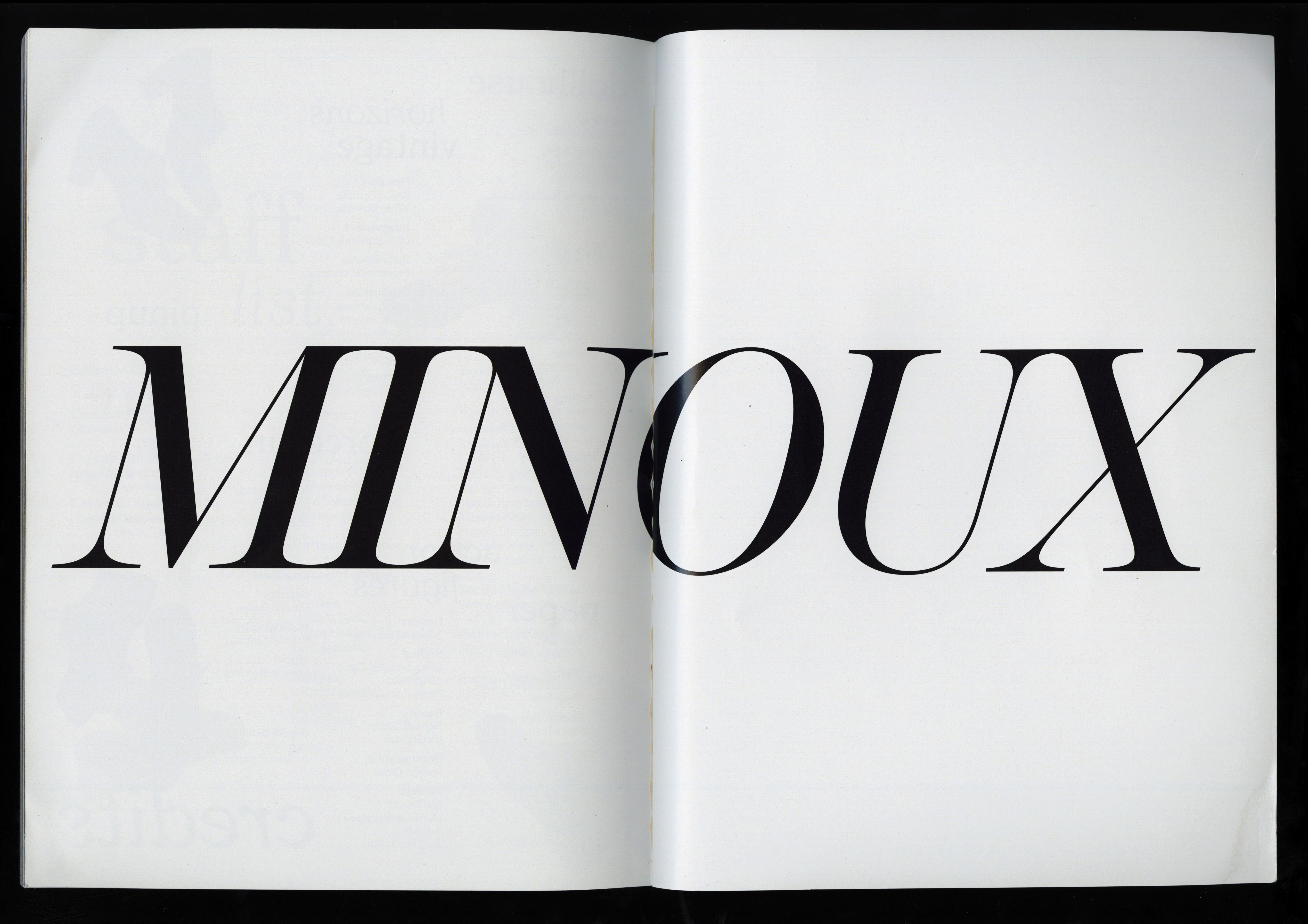
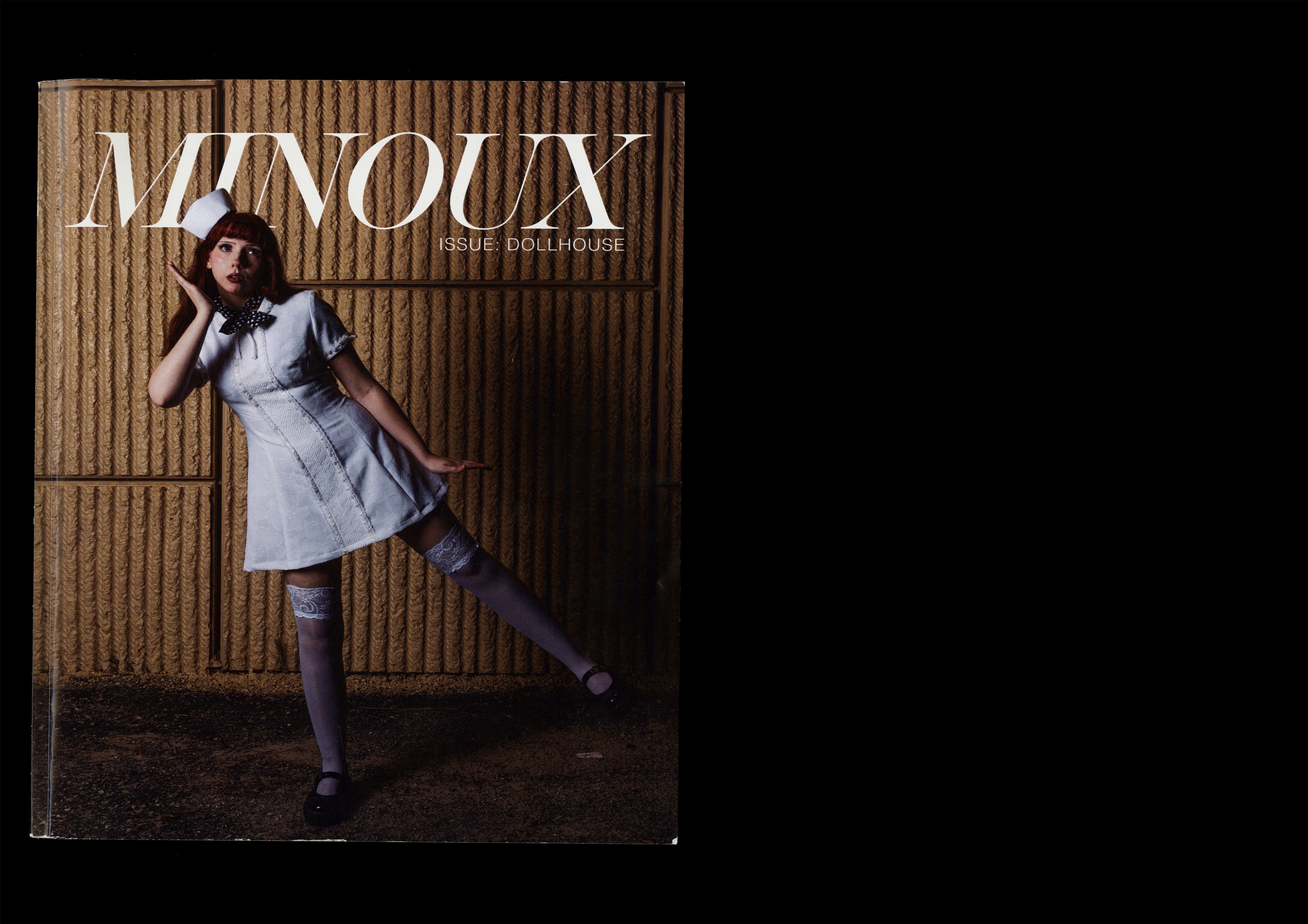
As part of the design team at Minoux, an emerging Orlando-based magazine centered on editorial exploration and fashion-focused storytelling, I contributed to the development of three issues: Debut, Doll House, and Fashionomica. Working alongside other designers, I helped build cohesive layouts and visual systems across each publication while developing assigned editorial sections. The process involved collaborative critiques, assisting with photography on shoots, and creating promotional social media assets that extended the magazine’s visual identity across digital platforms.
Process For Each Concept
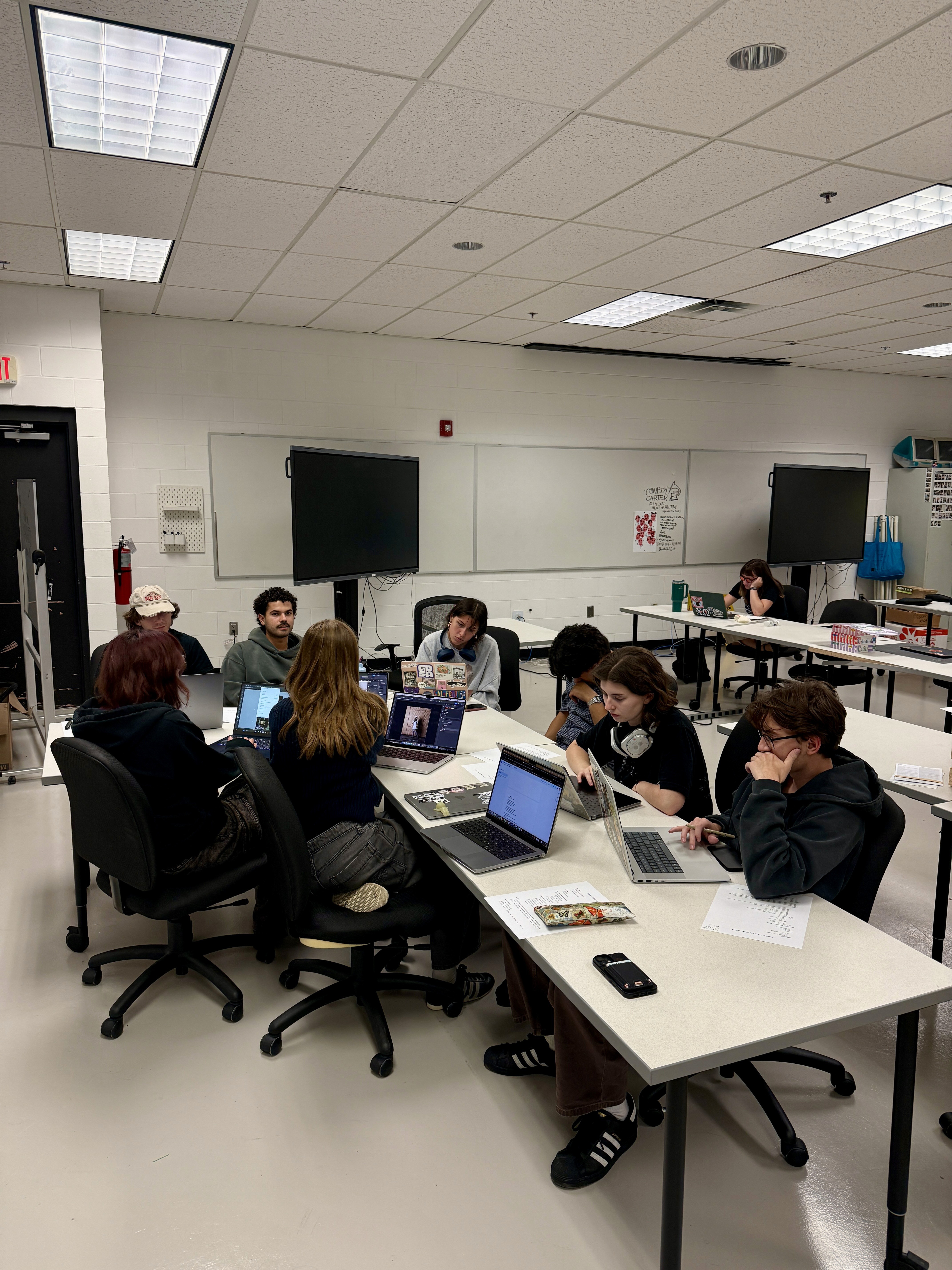
For Minoux, the editorial process is highly structured, typically unfolding over the course of about three months from concept to print. Depending on when my photoshoot is scheduled within the production timeline, I occasionally have additional development time to refine concepts and layouts before final production begins. Every designer working gets 4 spreads with copy and 2 full photo spreads to work with.
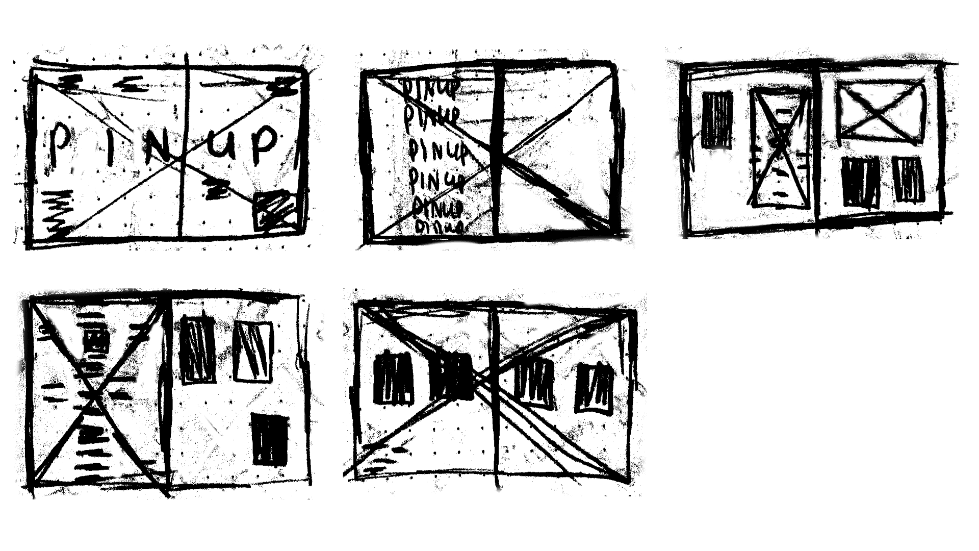
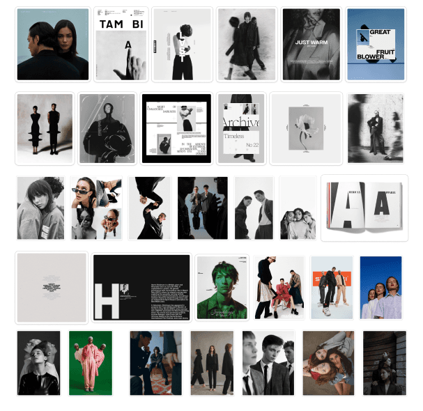
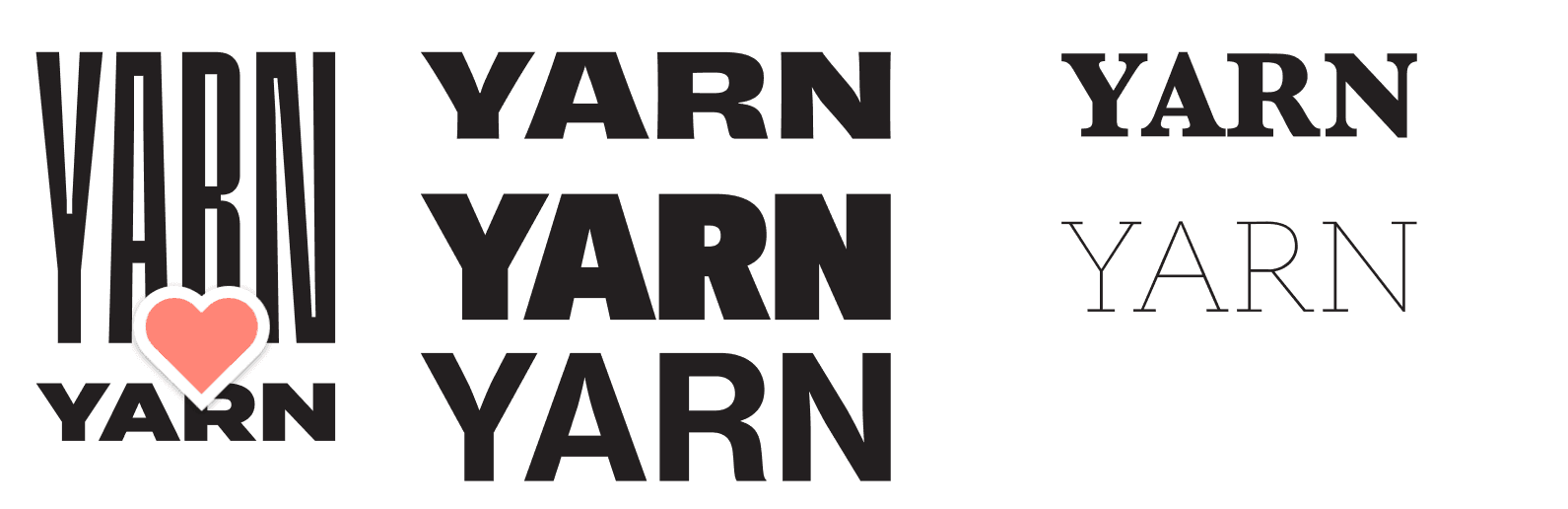
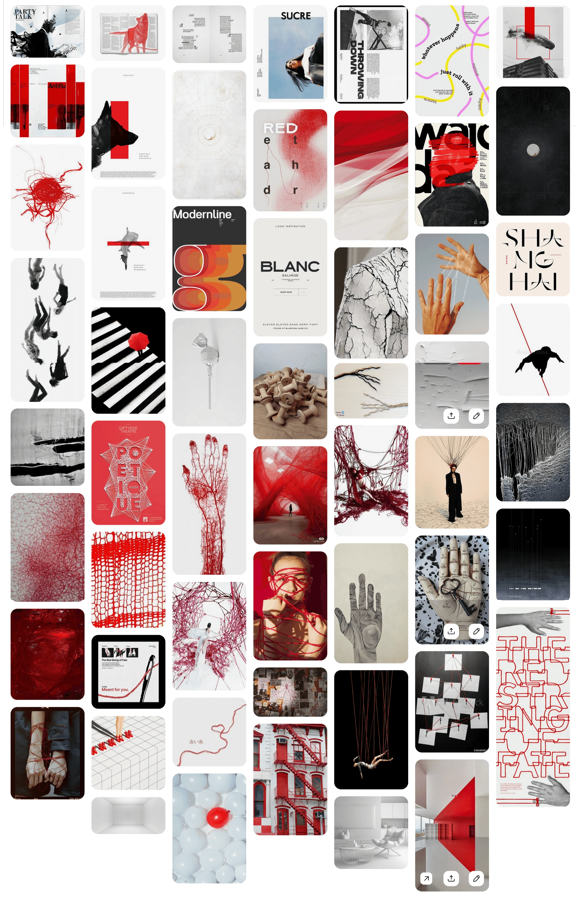
The process begins with developing a strong visual direction. During the first few weeks, I research and select typefaces that align with the issue’s concept while exploring broader conceptual ideas for the publication. From there, I build moodboards to establish tone, visual references, and styling direction before moving into rough sketches and layout planning.
Once the creative direction is established, I gather pose and composition references to help guide the photography. I work closely with the photographer during the shoot itself, communicating the exact mood, framing, and imagery I want for each spread while still allowing room for creative collaboration on set.
As copy and photography begin coming in, I move into layout development in Adobe InDesign, placing text into rough compositions based on my sketches and mapping out where imagery will ultimately live within the spreads. When final images are delivered, they are integrated into the layouts and refined further.
The final month of production is focused heavily on refinement and critique. Throughout this phase, I meet weekly with the creative director and art director to review progress, discuss the evolving direction of the issue, and make adjustments where needed. Before the magazine is sent to print, the team dedicates a full day to live editing and final corrections to ensure every detail is resolved.


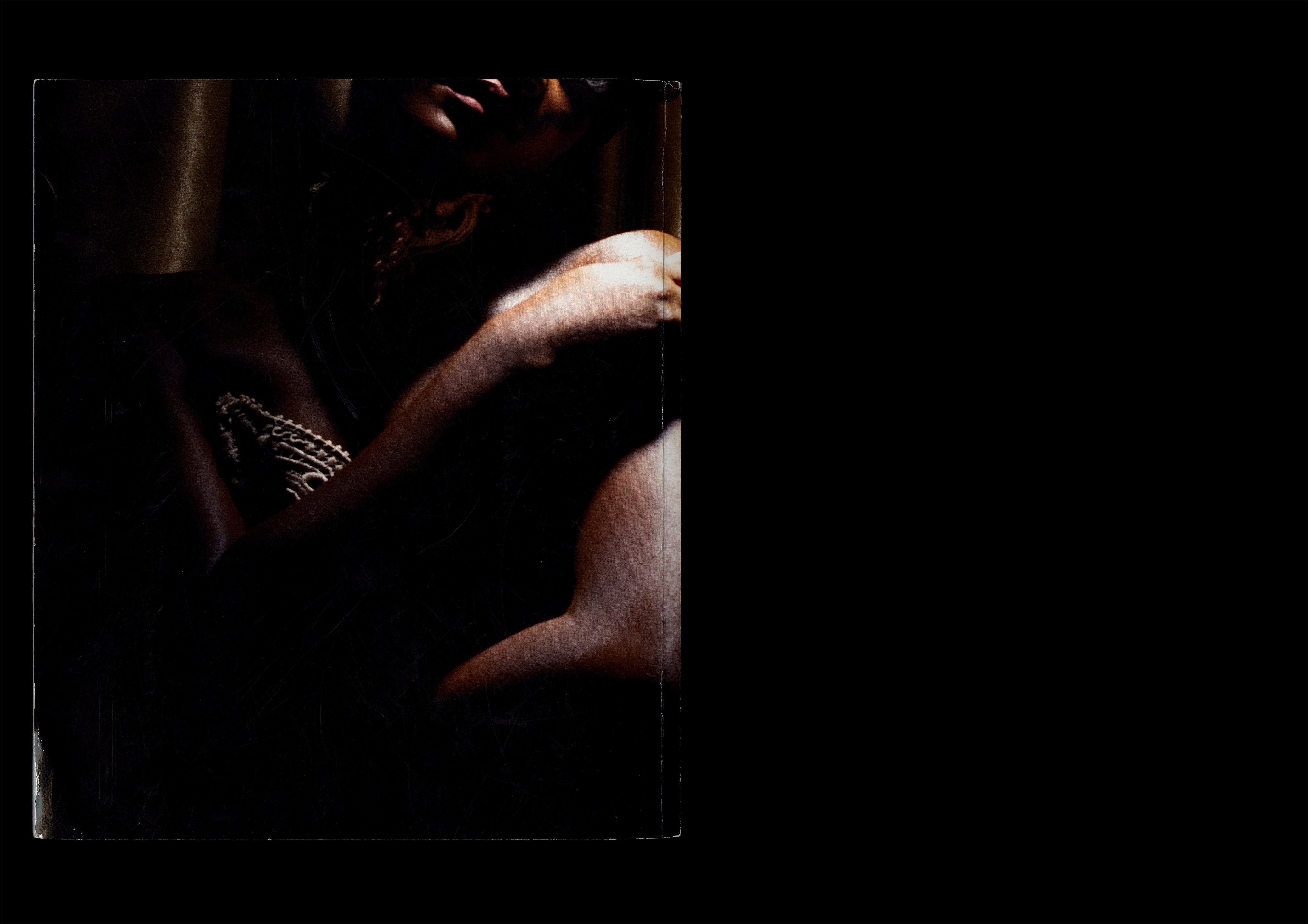
Pinup (Issue 2, Dollhouse)
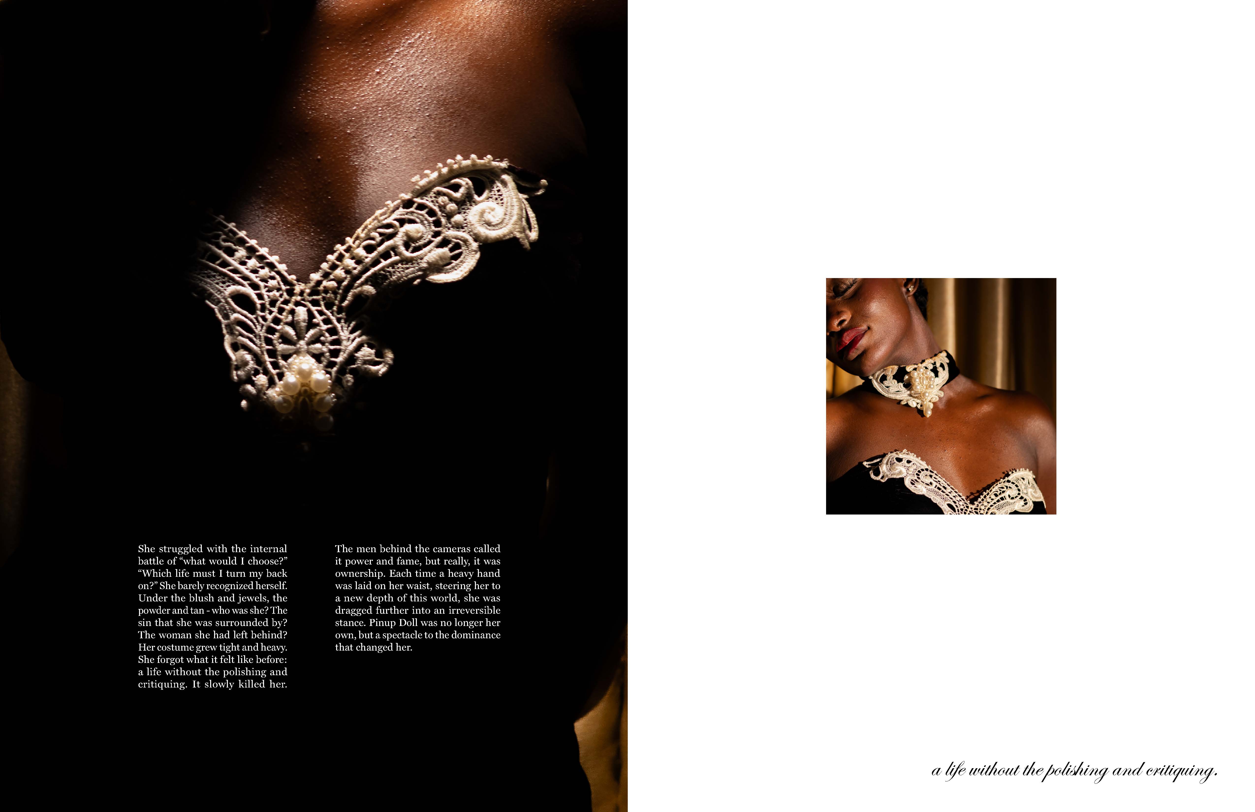
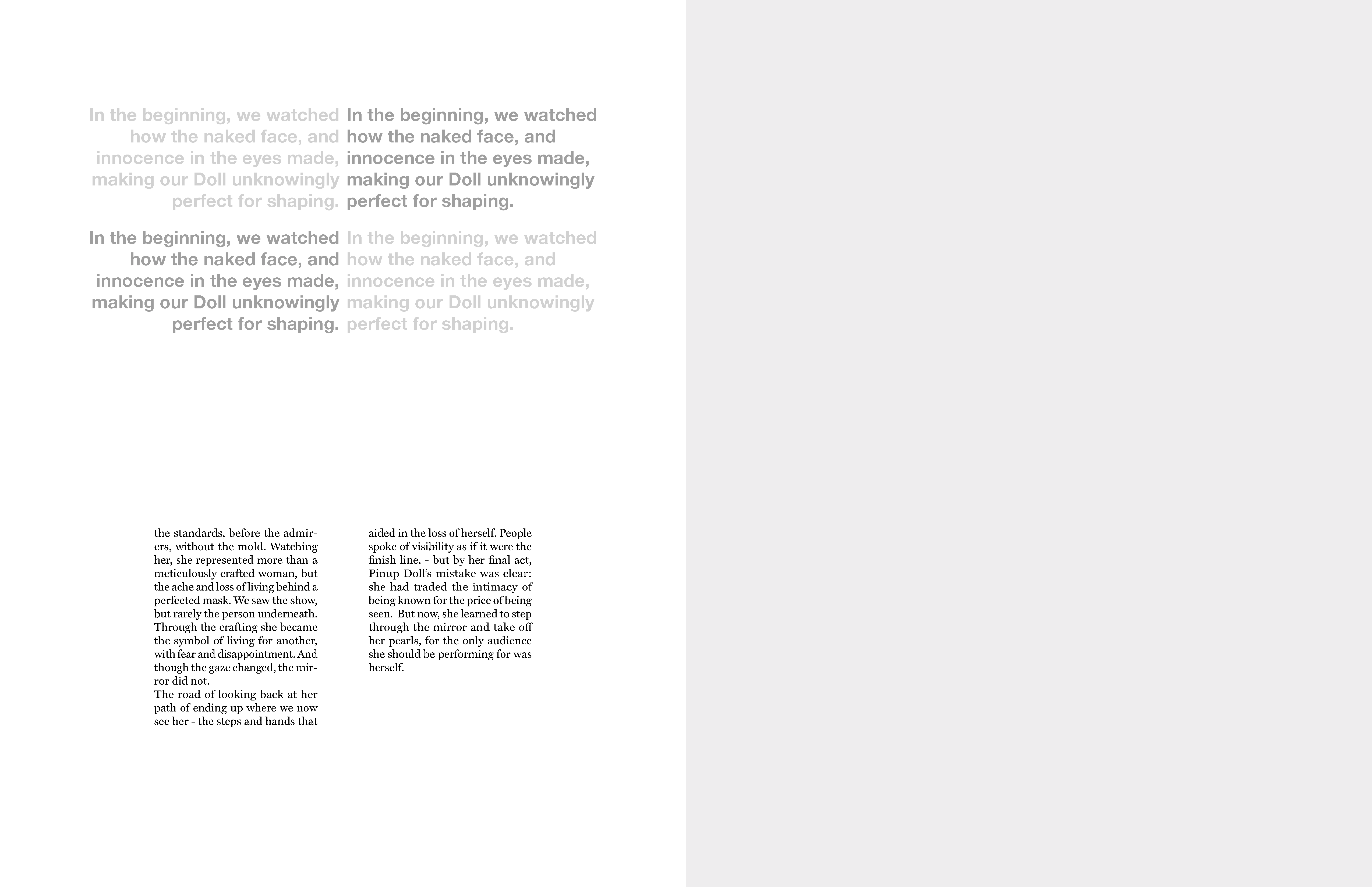
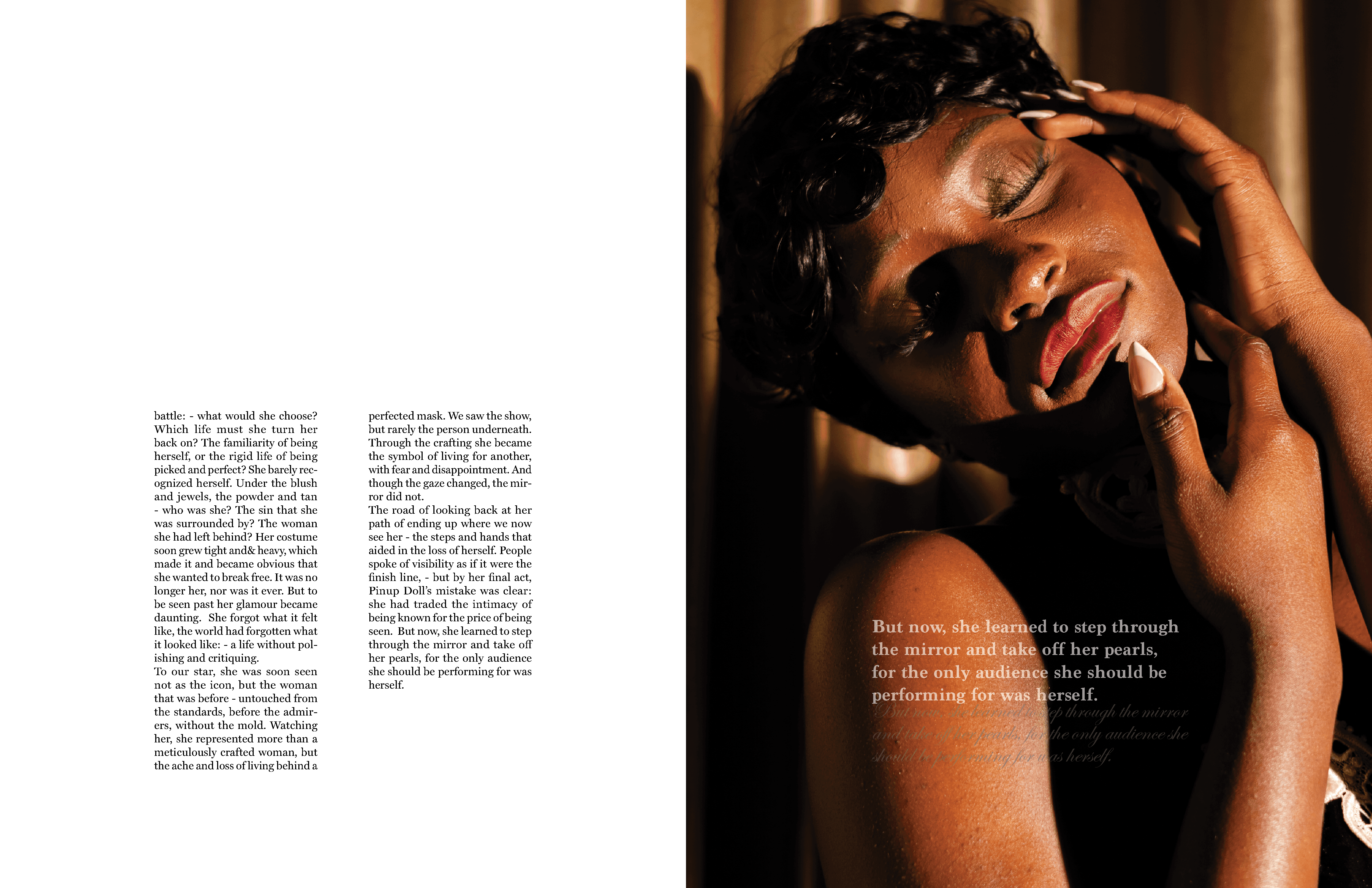
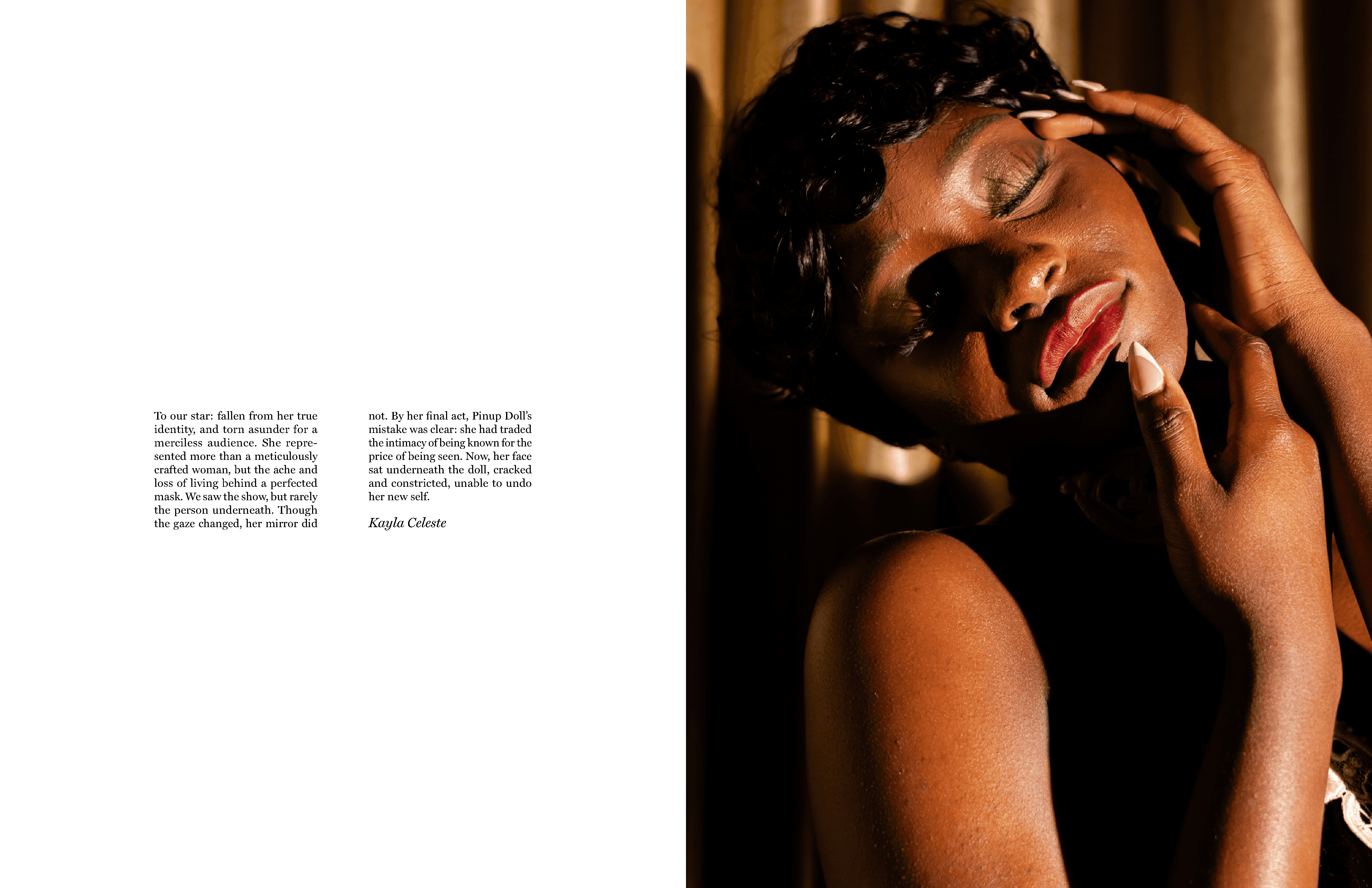
For Pinup, my goal was to explore the dynamic between an overpowering male presence and an elegant female figure through a restrained, concept-driven editorial approach.
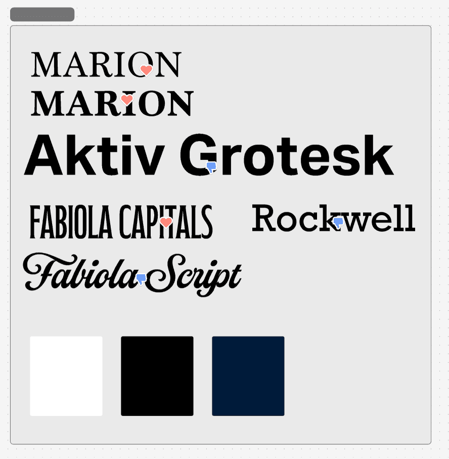
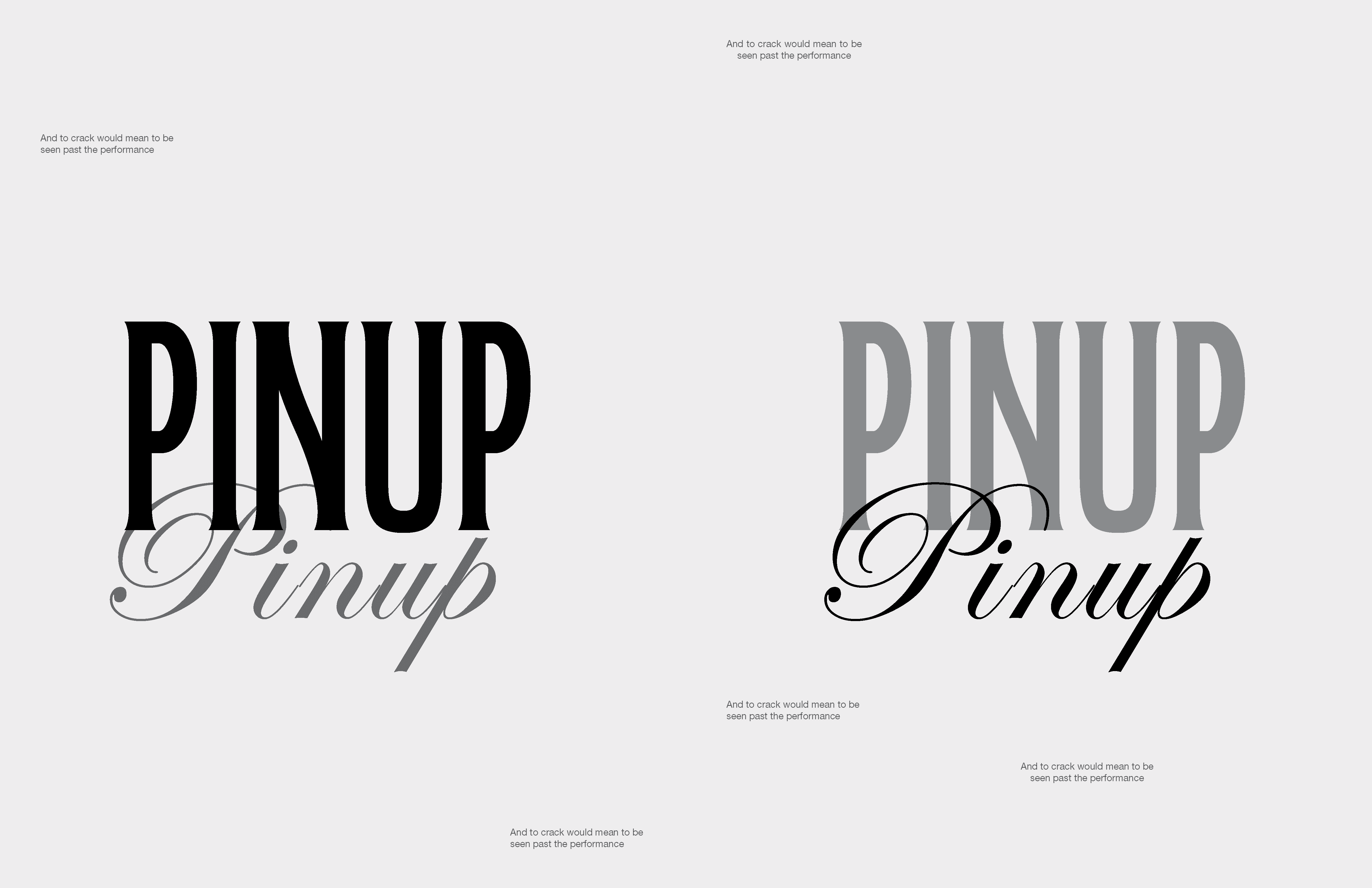
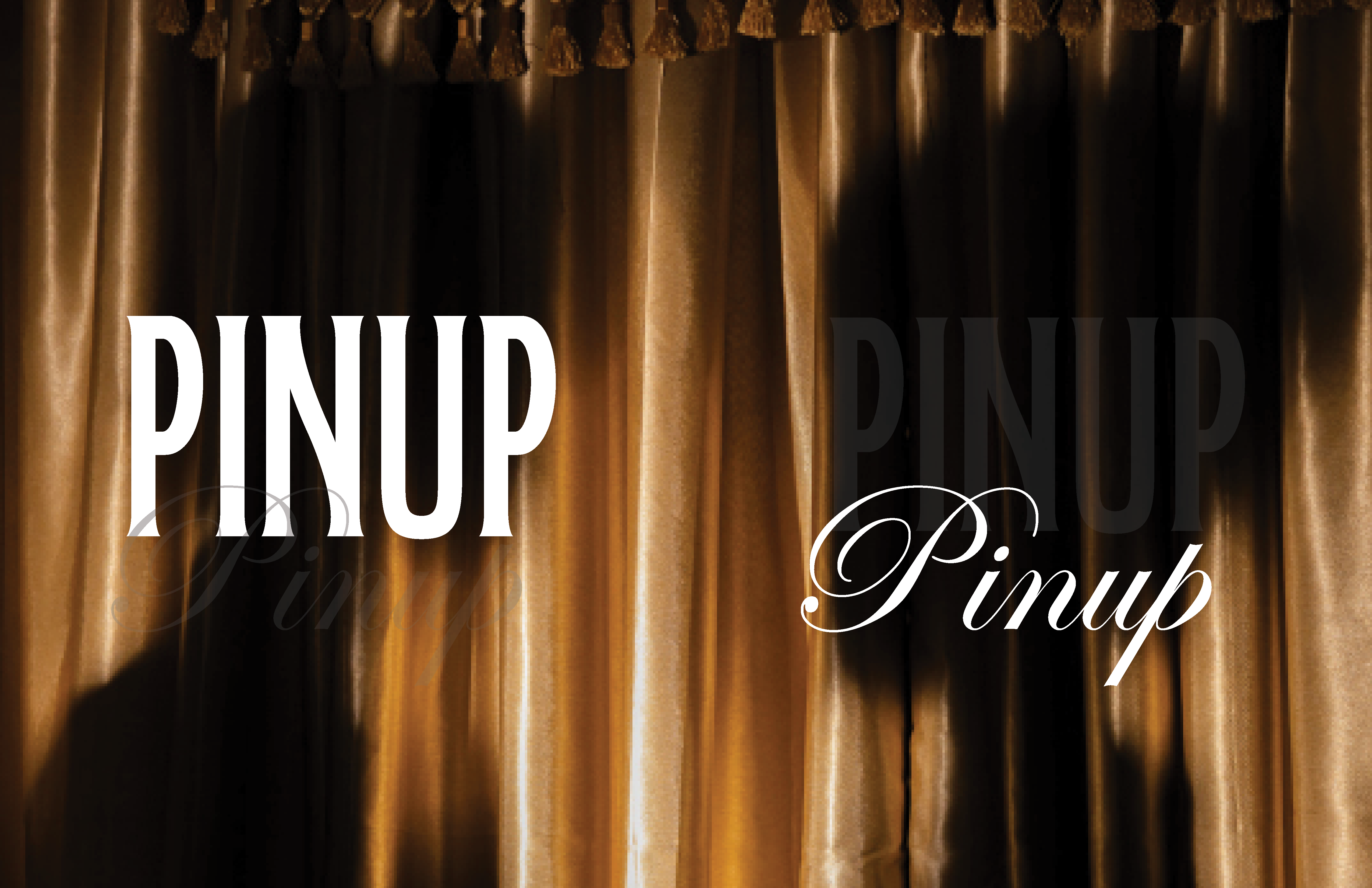
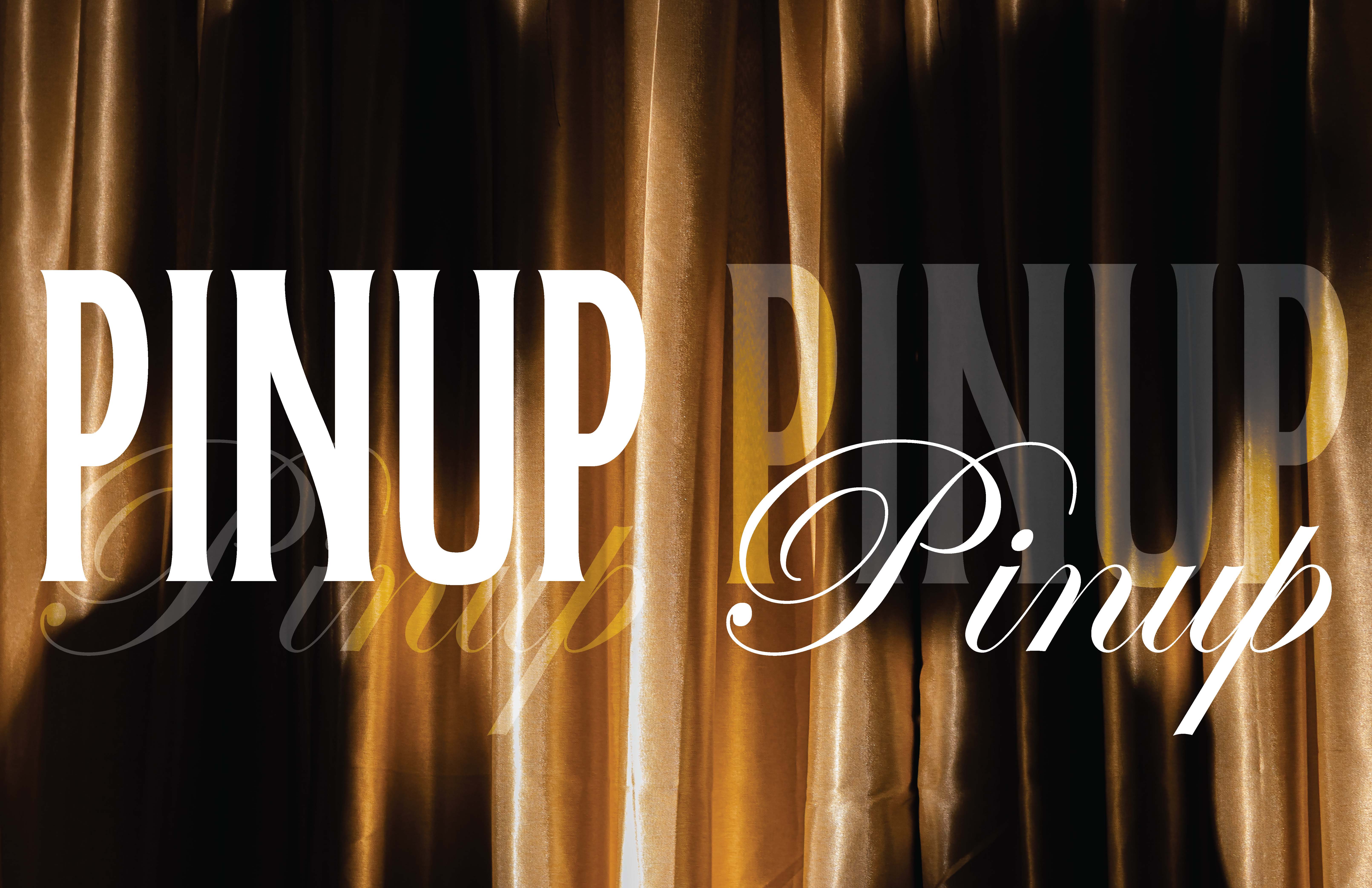
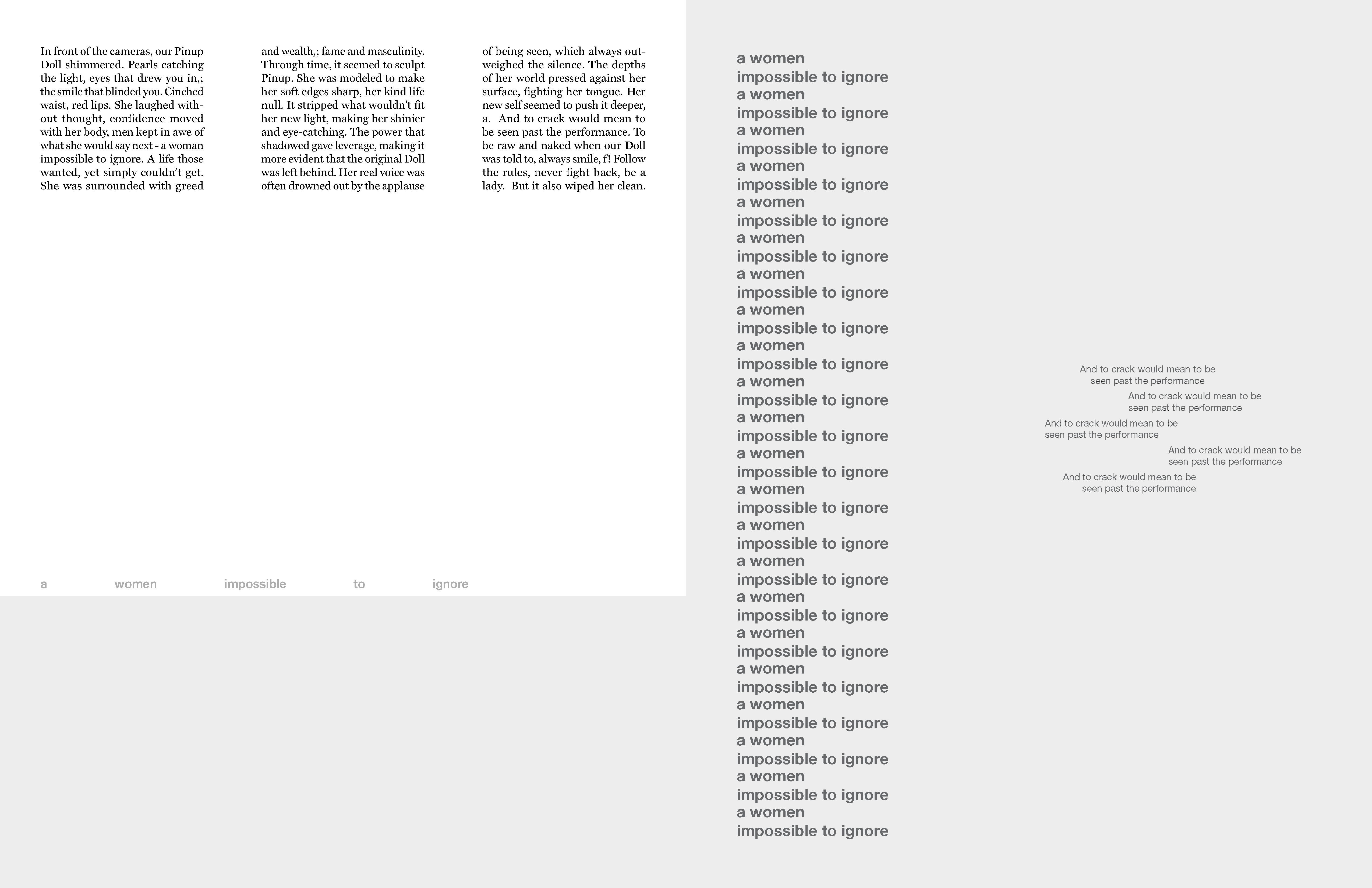
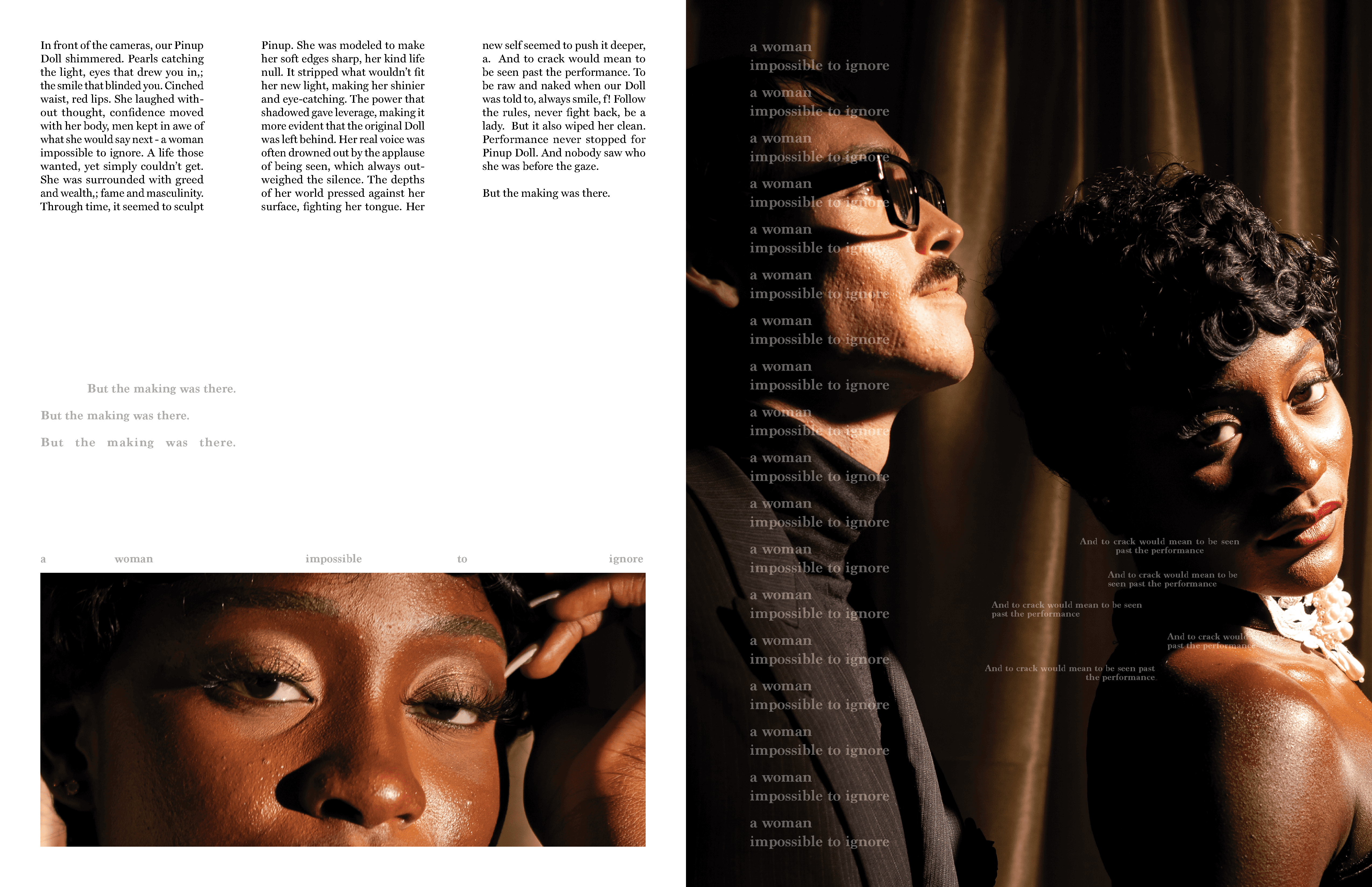
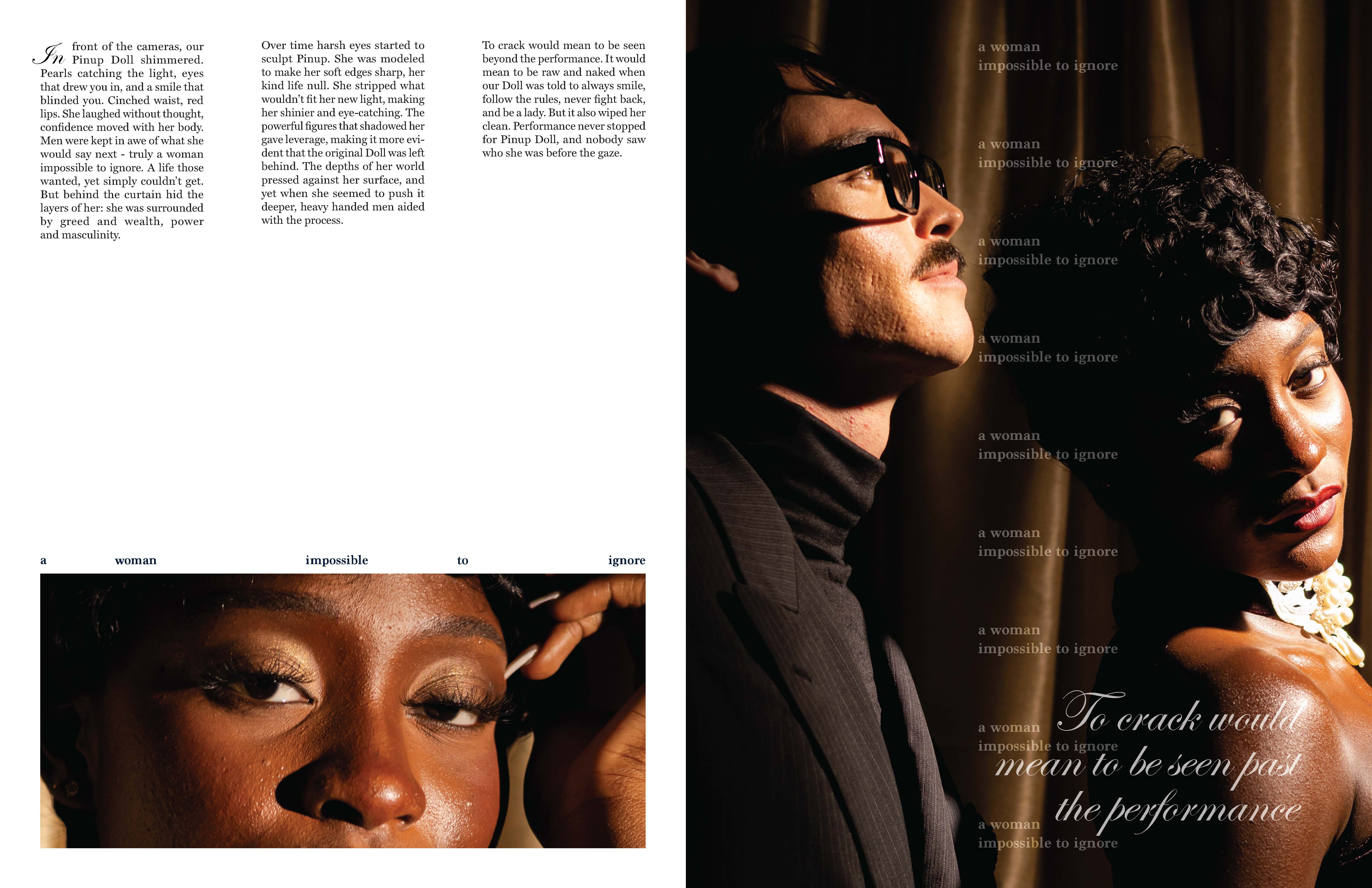
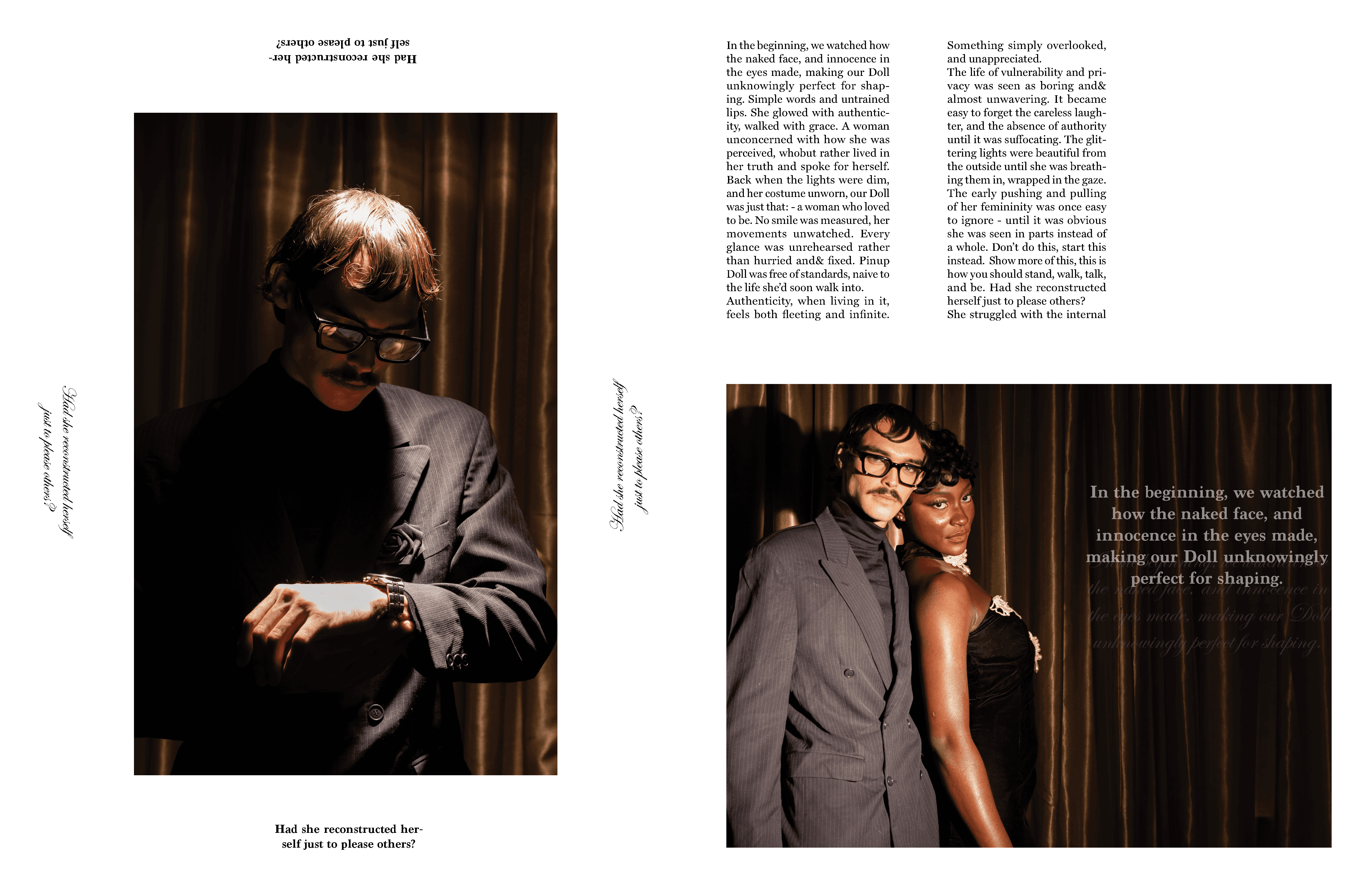
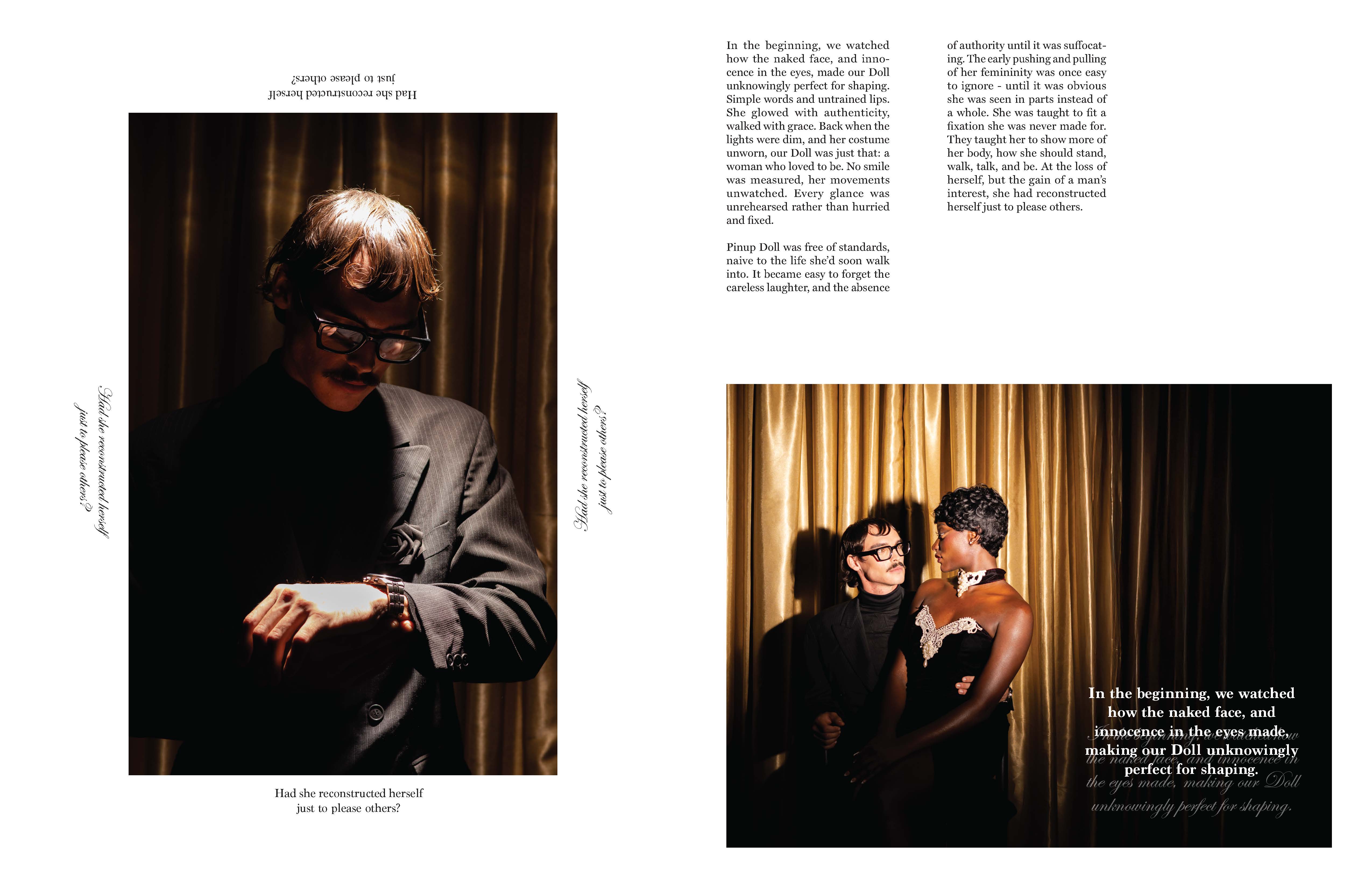
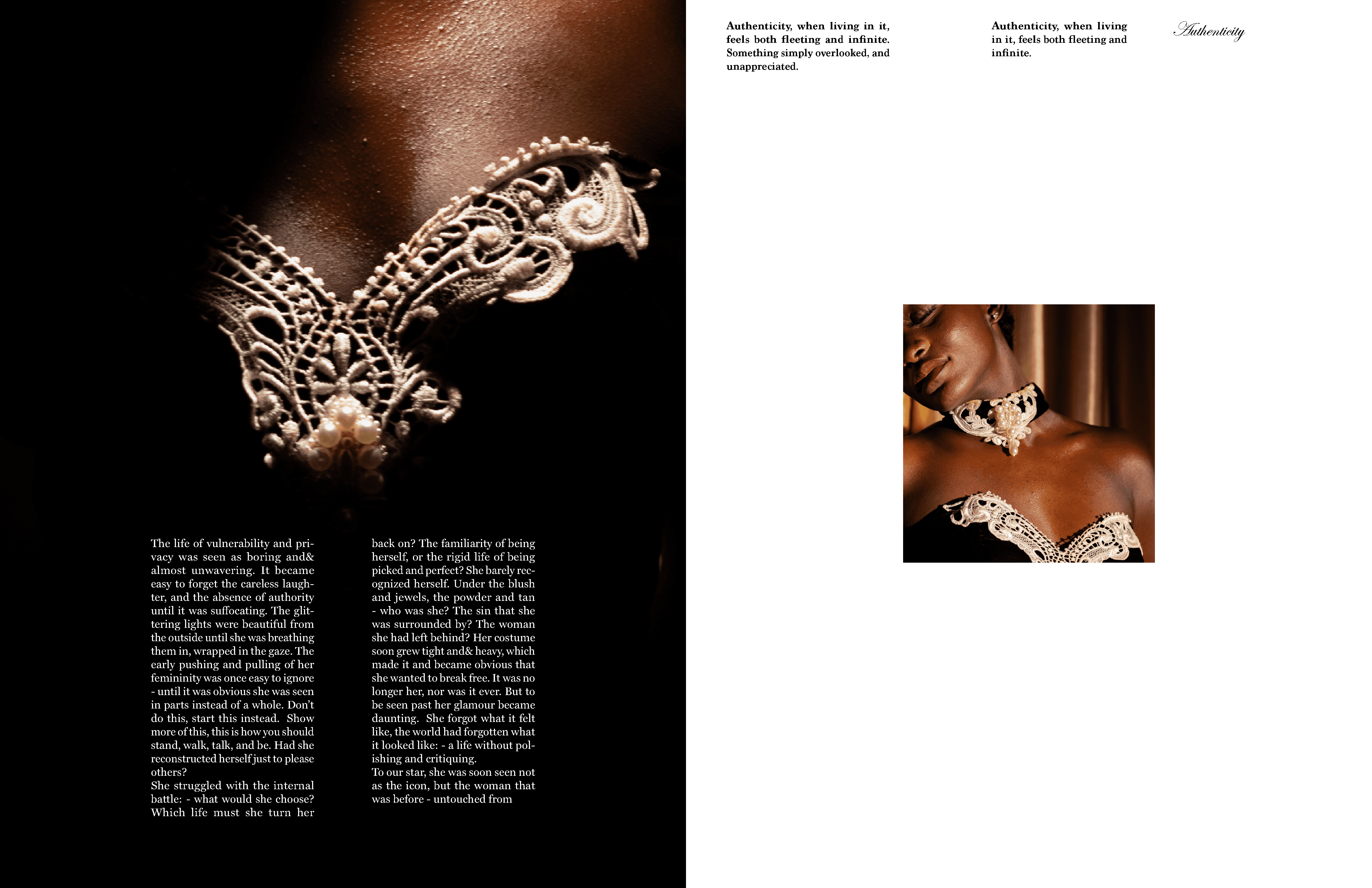
This relationship is expressed primarily through typography: the male figure is represented by bold, repeating sans-serif type, while the female presence is conveyed through a delicate script font. The contrast between these typographic voices reinforces the tension and imbalance within their dynamic.
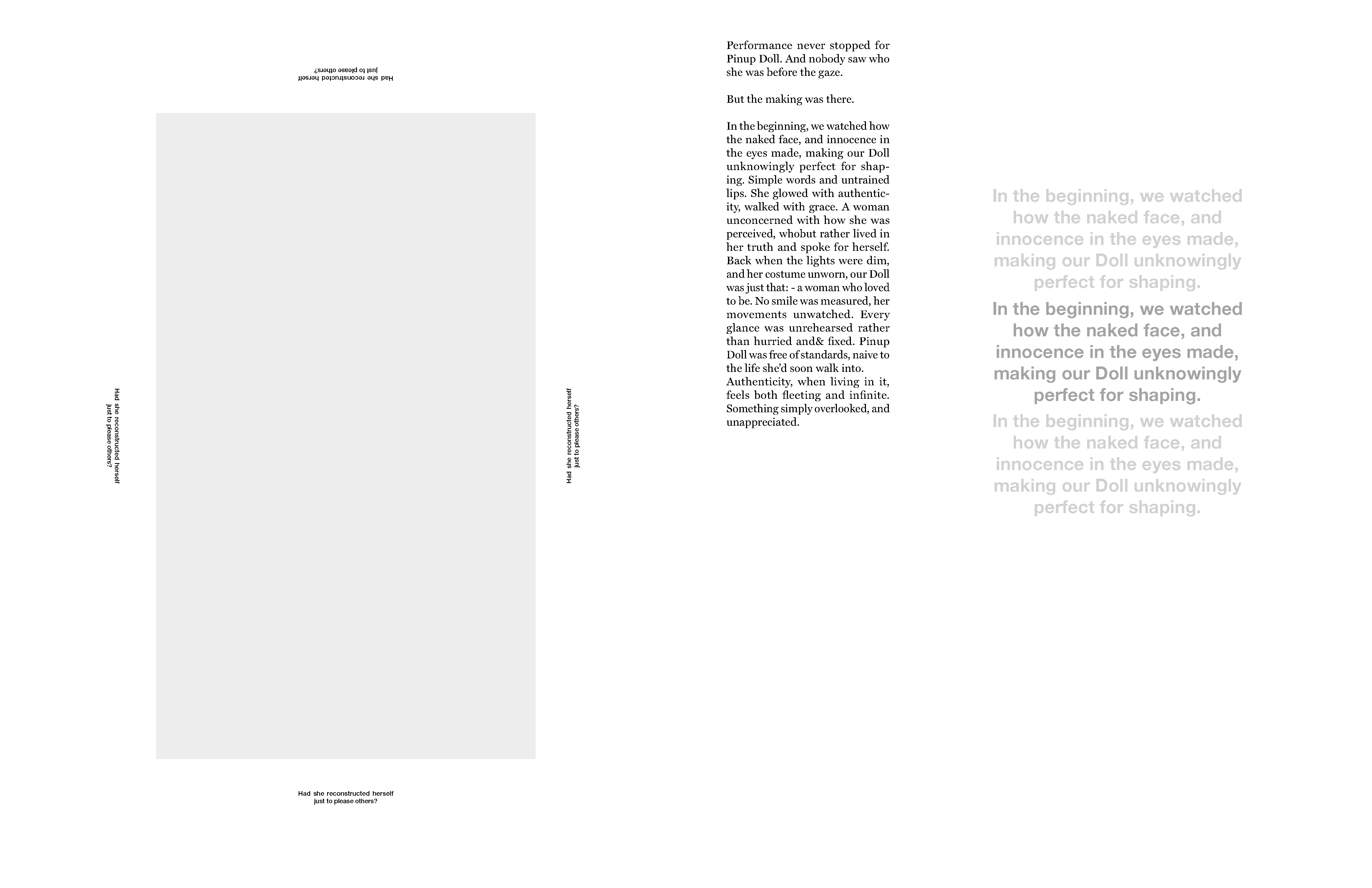
The layouts prioritize negative space and simplicity, allowing the stark lighting and high-contrast imagery to take center stage. This visual restraint supports the conceptual focus of the article, which reflects on the constraining nature of the Pinup doll archetype. Repetition of copy across the spreads is used intentionally to evoke the overwhelming presence of the male figure, visually encroaching on the female form and reinforcing the imbalance within their relationship.
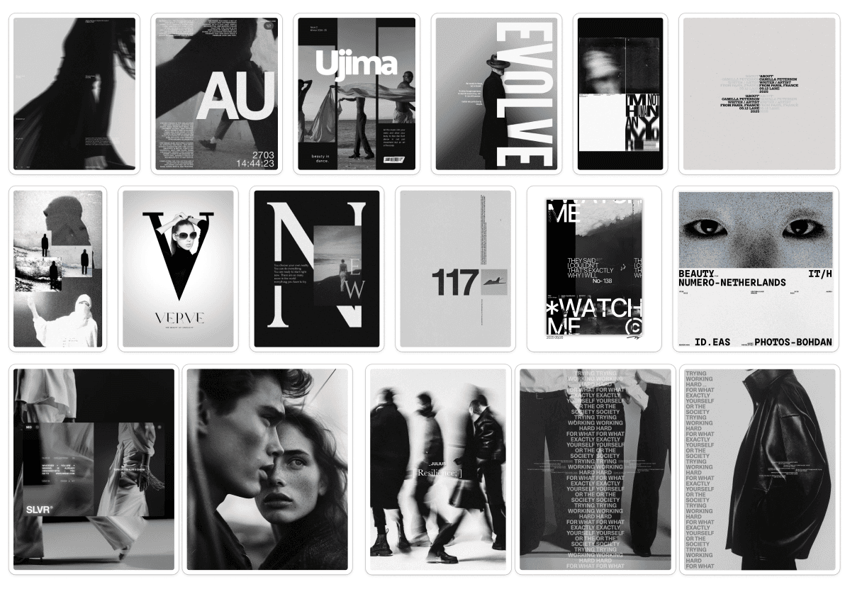
Typefaces and Moodboard and Initial Sketches
Pinup As A Concept
Pinup as a concept:
Lights. Camera. Action.
Our star-studded doll performs under the male gaze: corset cinched, lips glossed, powder flawless. She must be the epitome of femininity even at the cost of herself.
Pinup holds a mirror to the price of being seen. Our Pinup Doll is caught between a man, between performance and authenticity, desire and distortion.
Rough Layouts (Left) Iterations Before Final (Middle) Vs Final (Right)
Rough Layouts (Left) Iterations Before Final (Middle) Vs Final (Right)
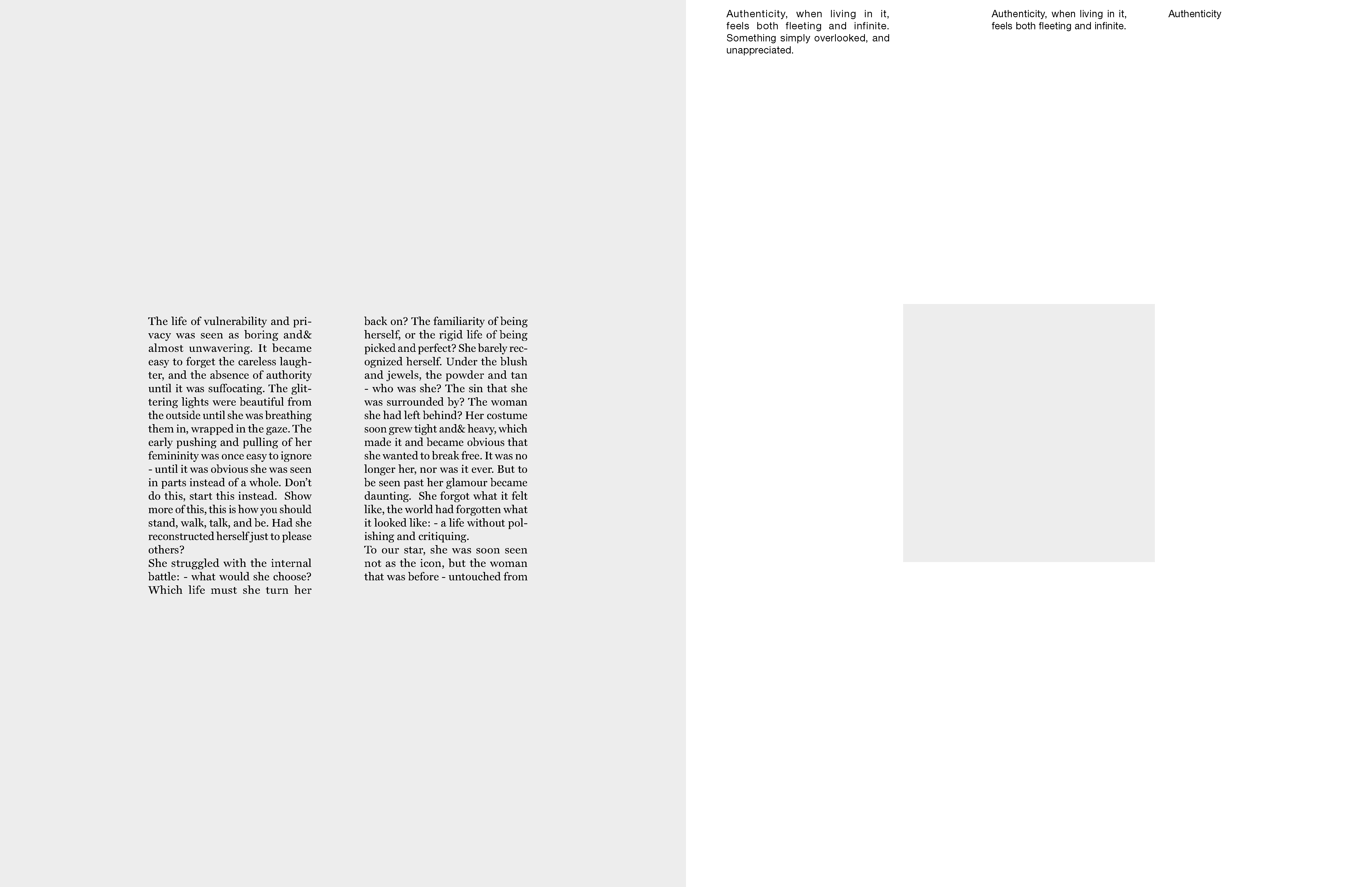
Grids


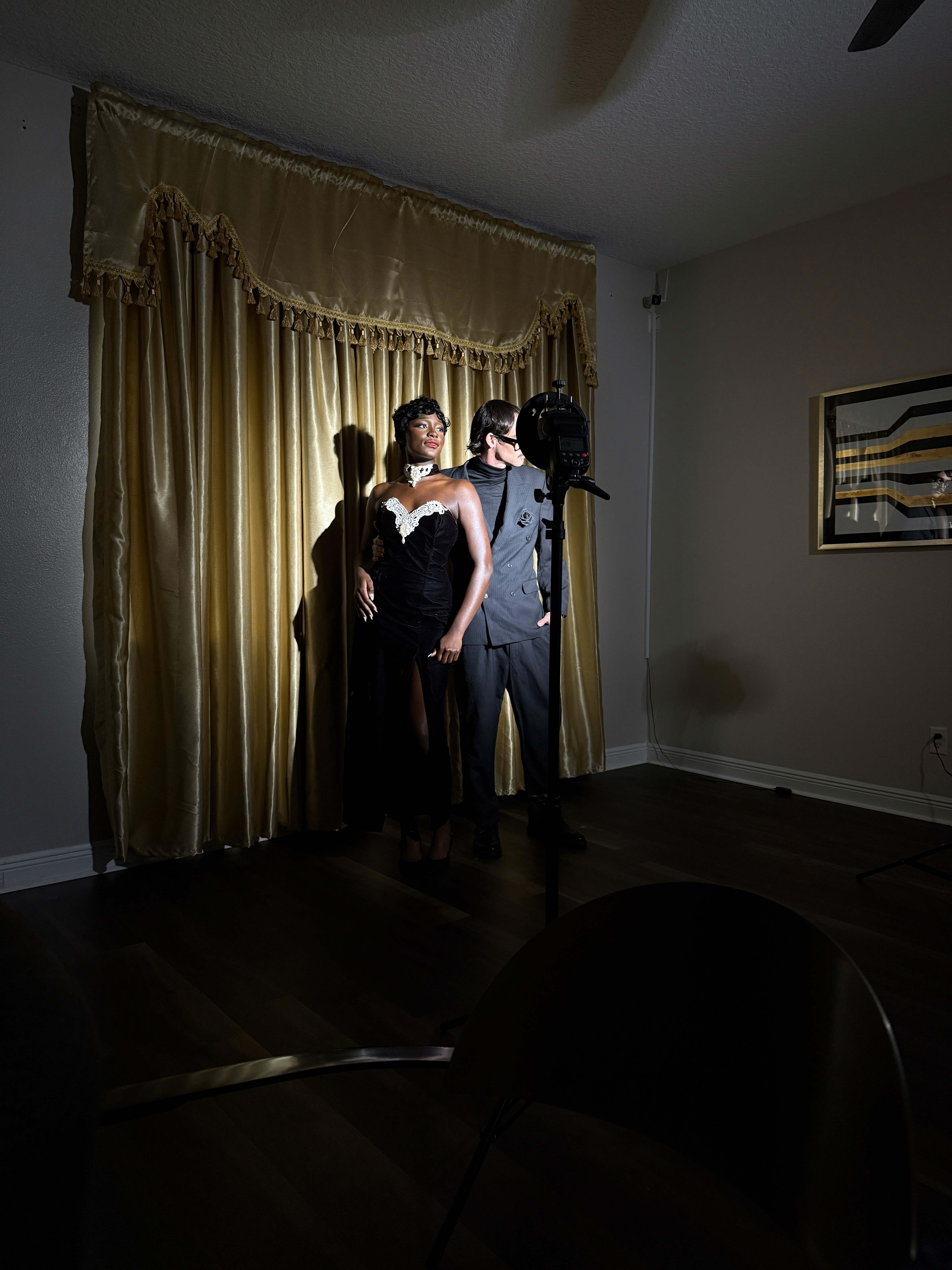
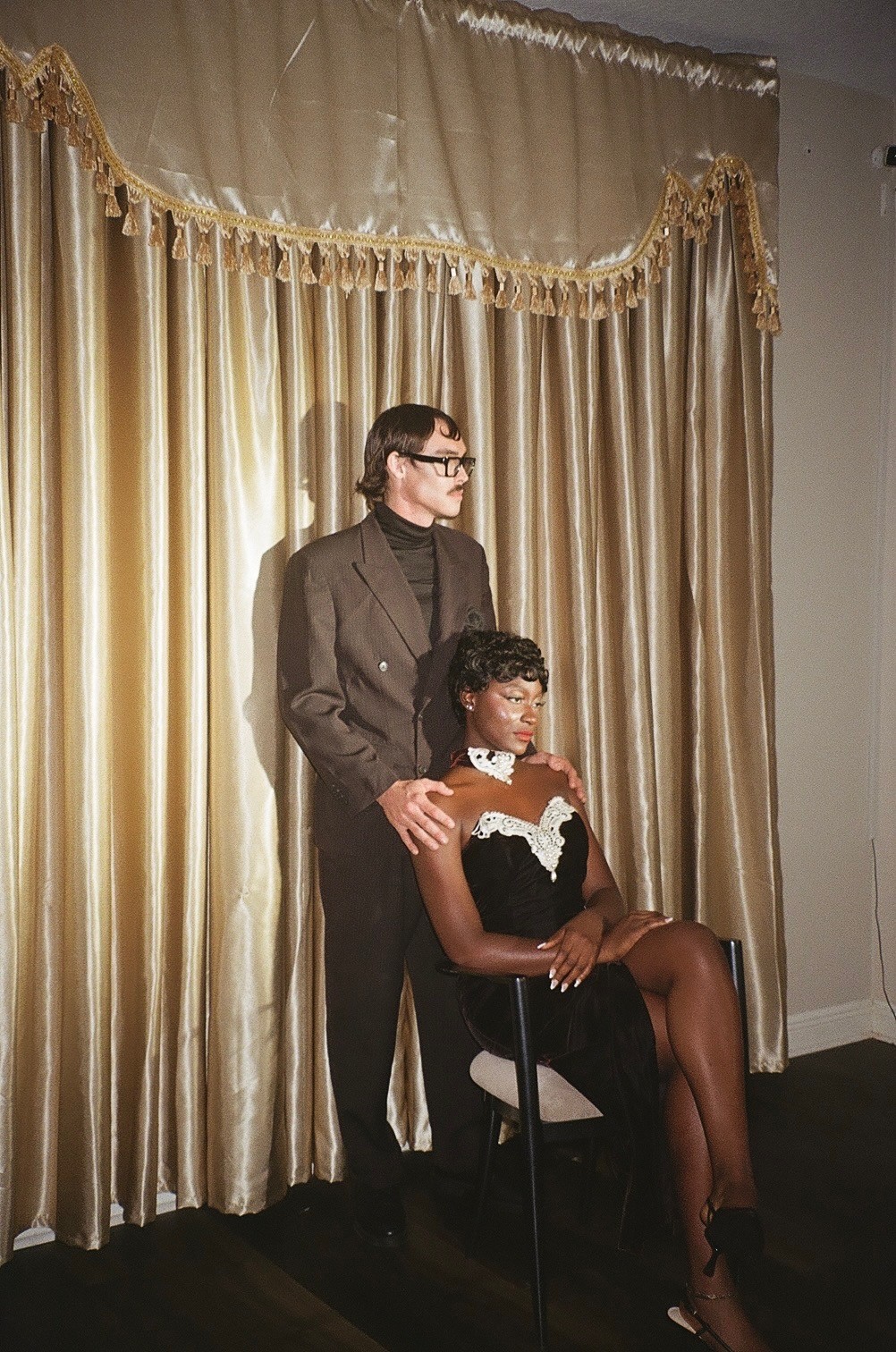
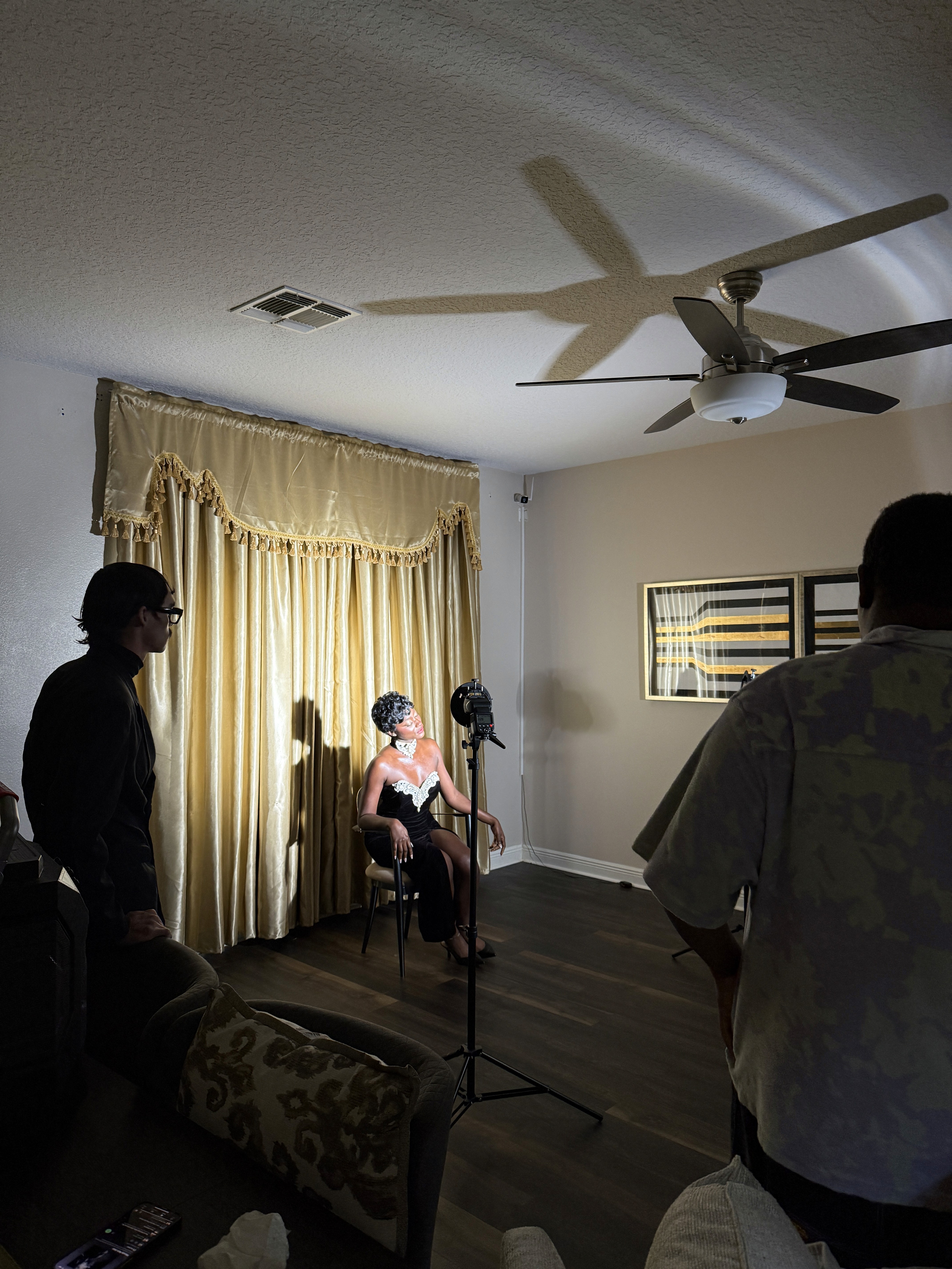
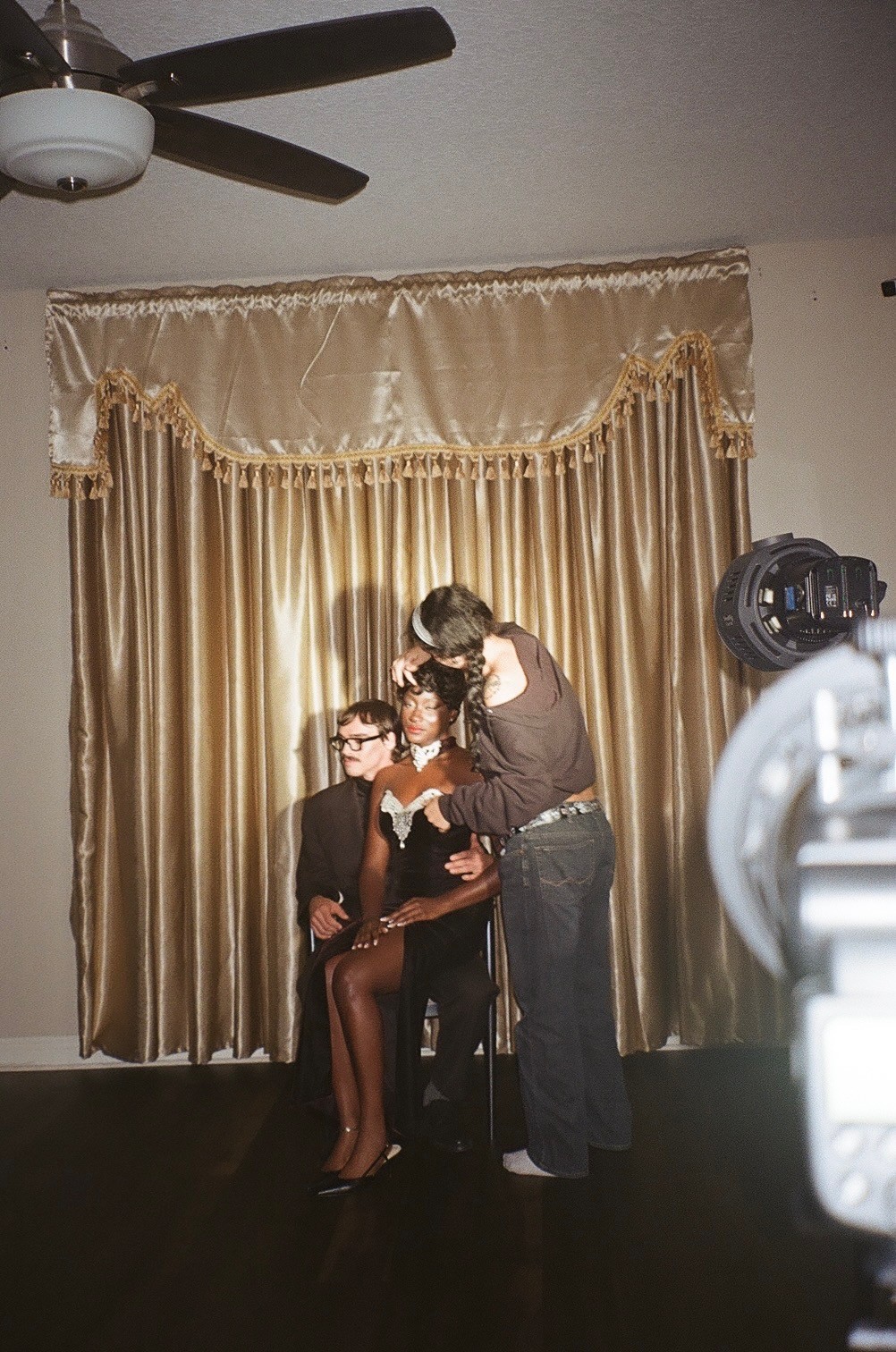
Behind The Scenes
Yarn (Issue 1, Debut)
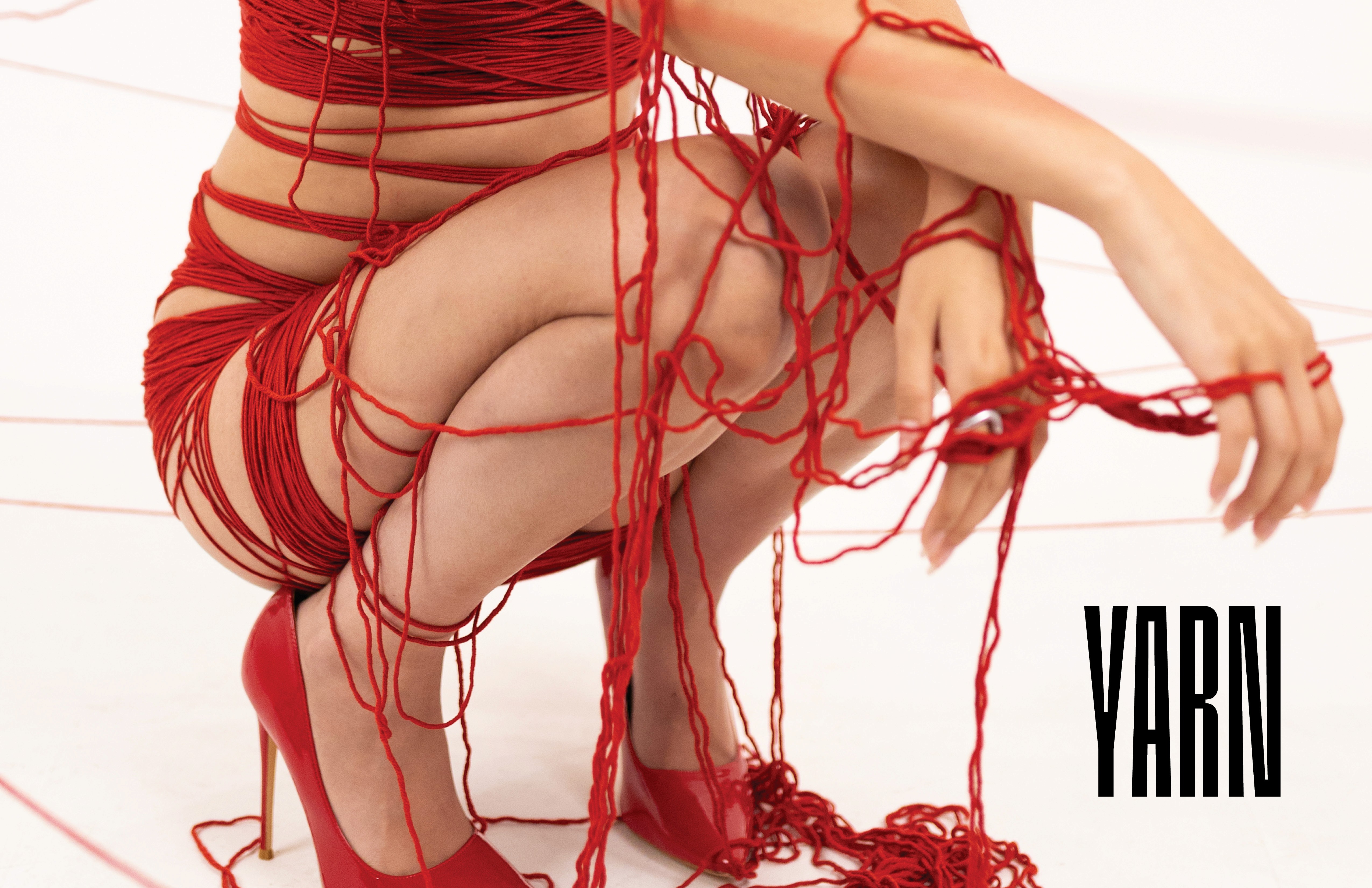
Yarn serves as a visual and thematic break in the magazine, contrasting the more stimulating sections with minimal, Swiss-inspired design. The section features poetry, which presents layout challenges, especially in preserving line integrity and the writer’s intent. Conceptually, Yarn explores the idea of lives being interconnected by fate, while still allowing for individual agency.
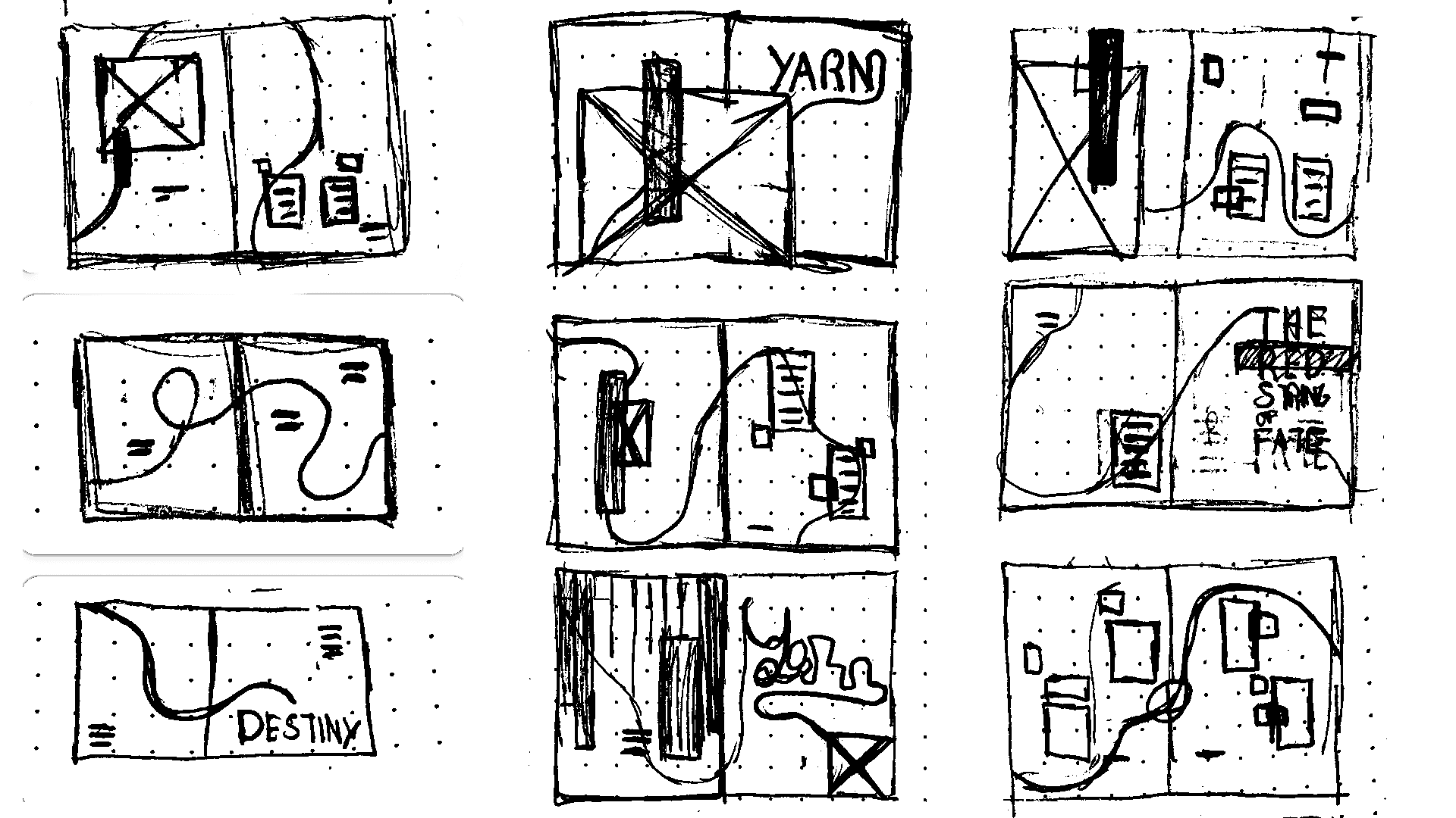
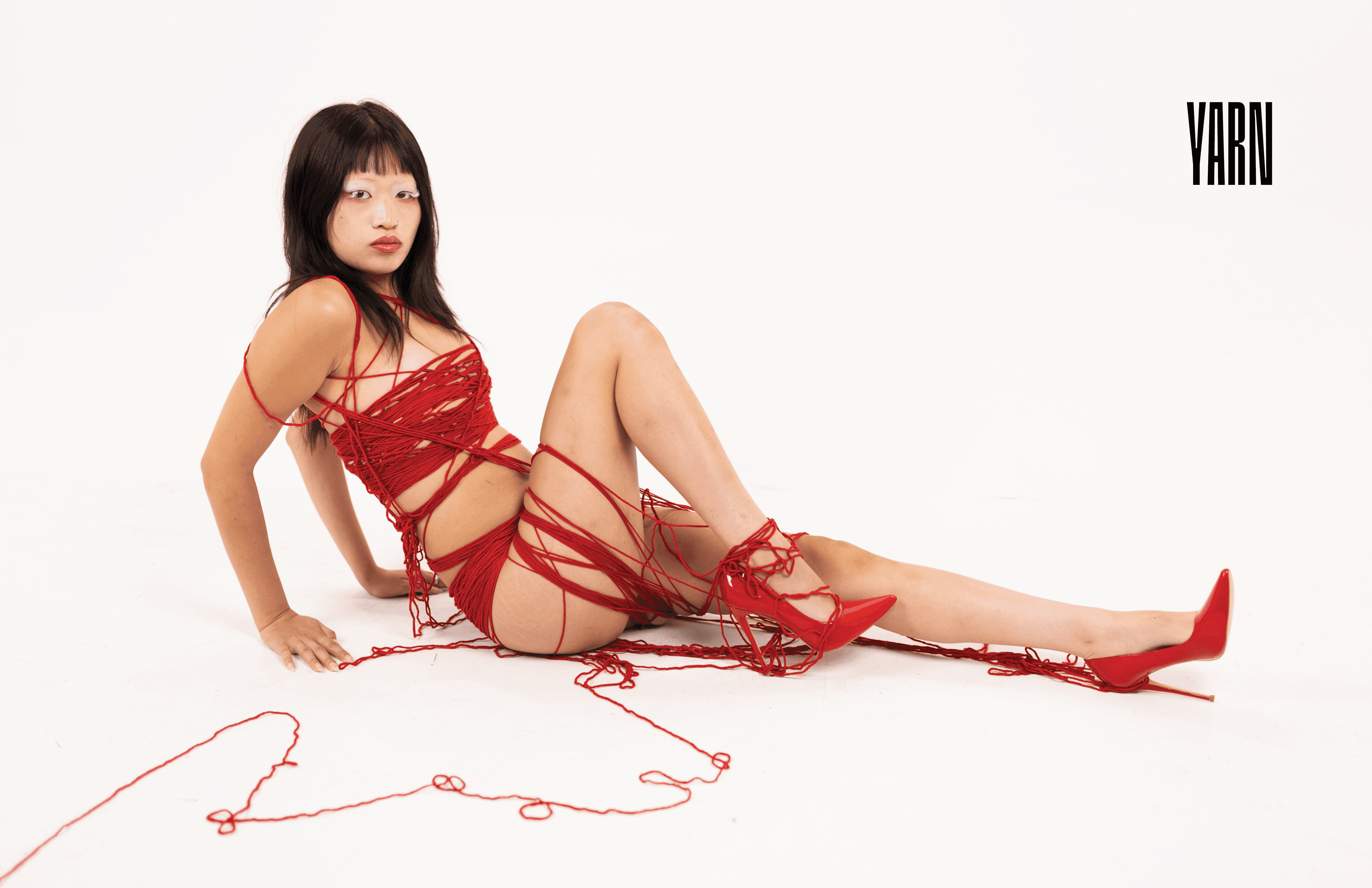
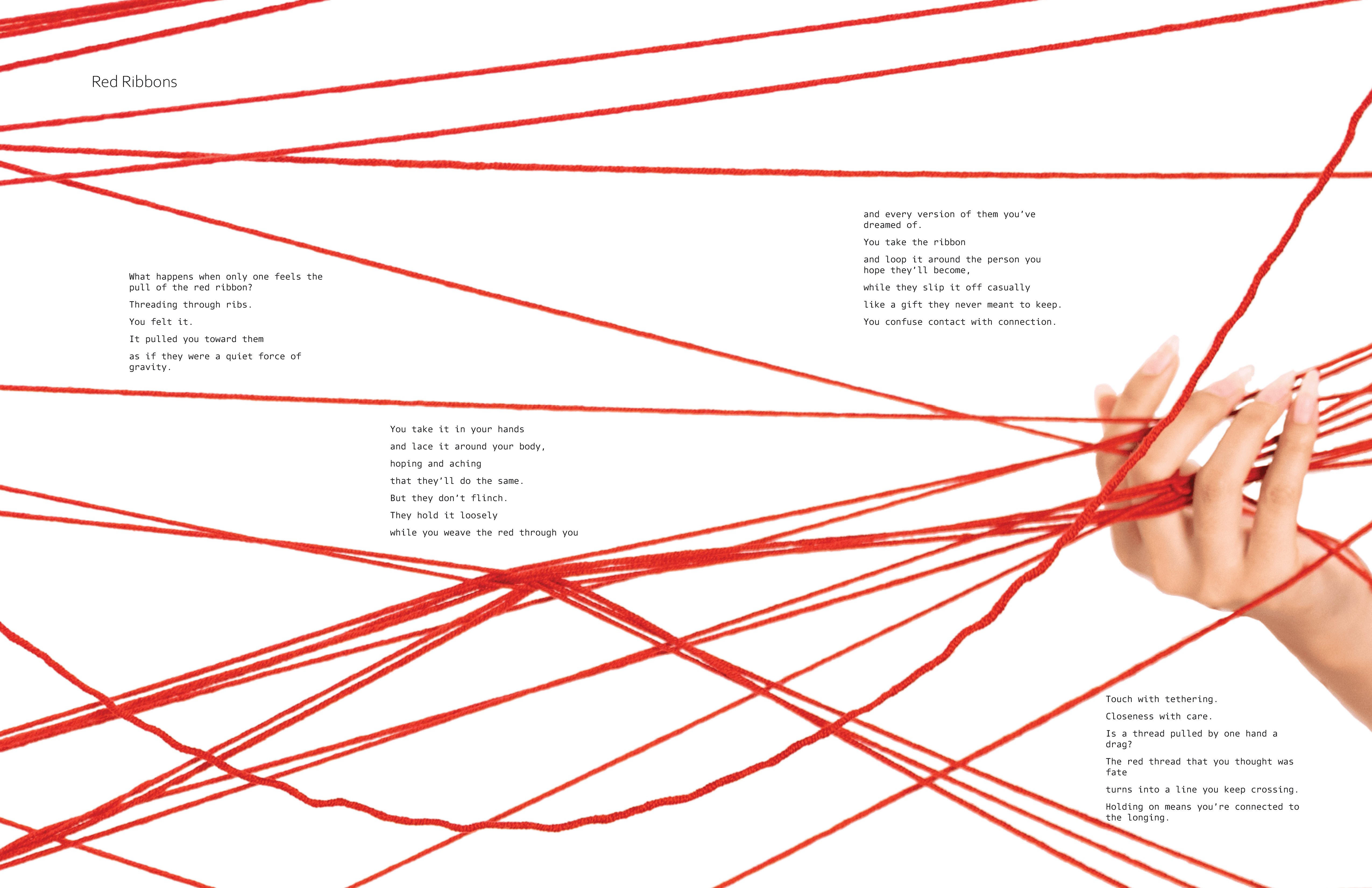
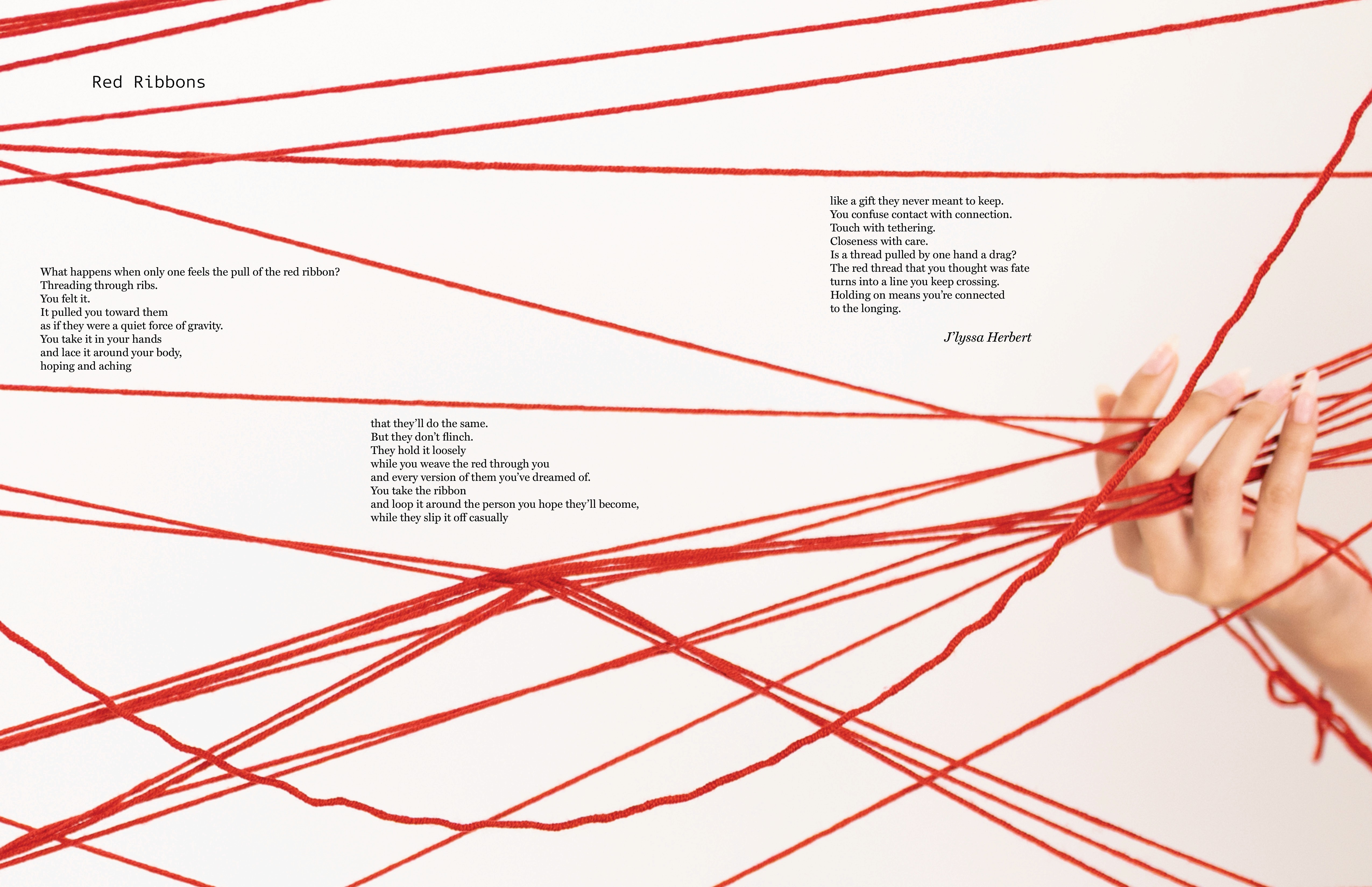
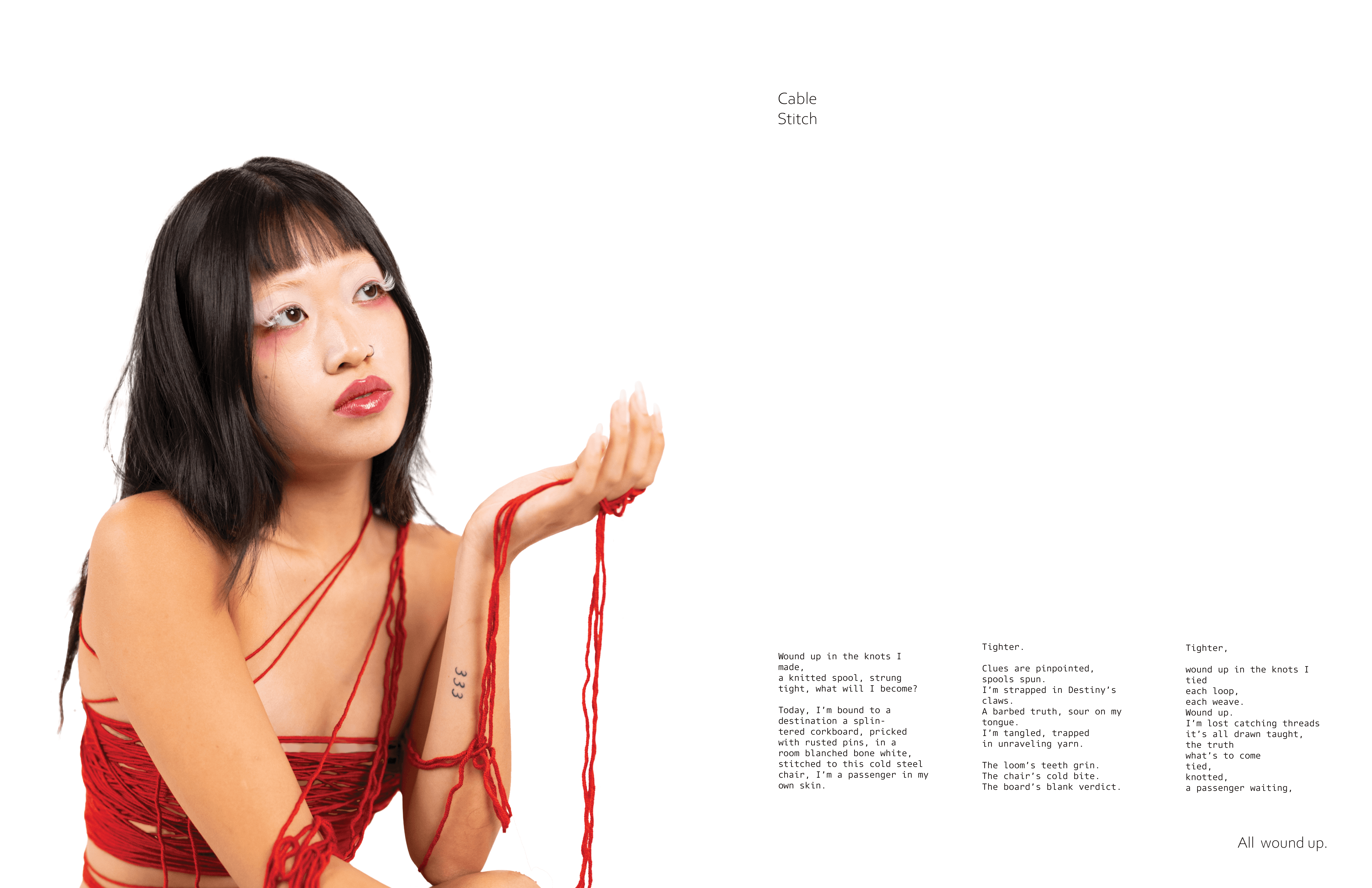
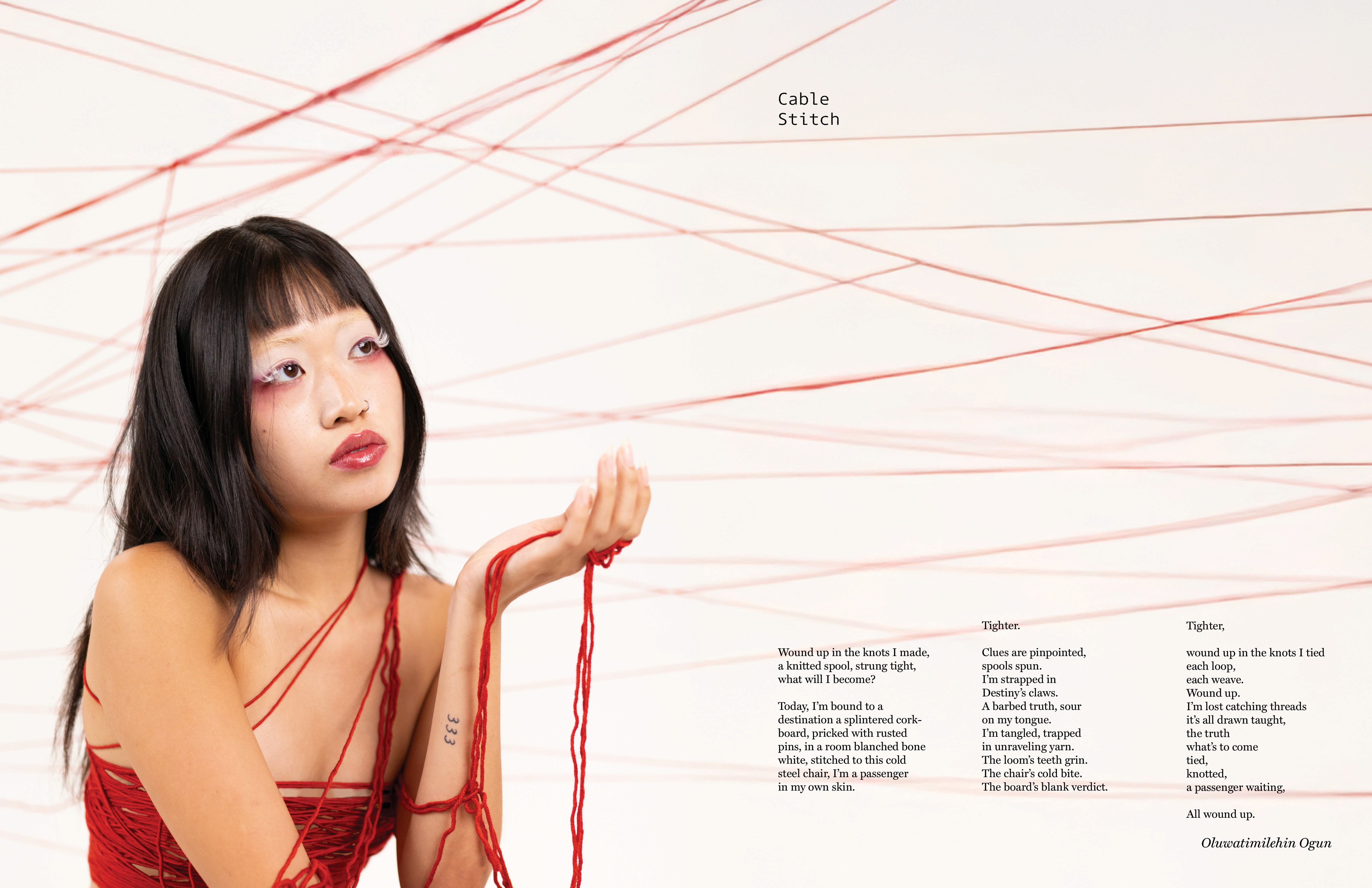
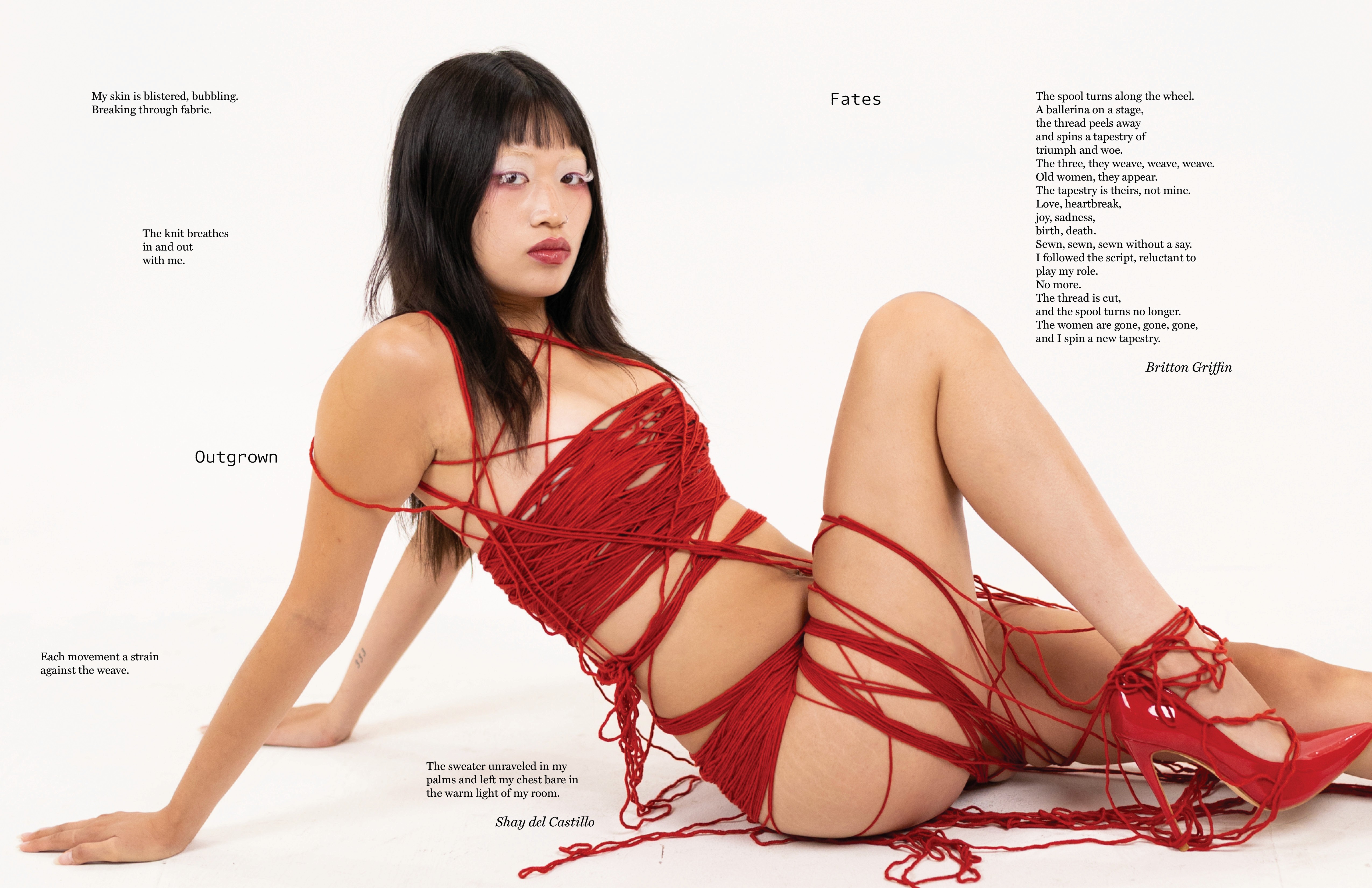
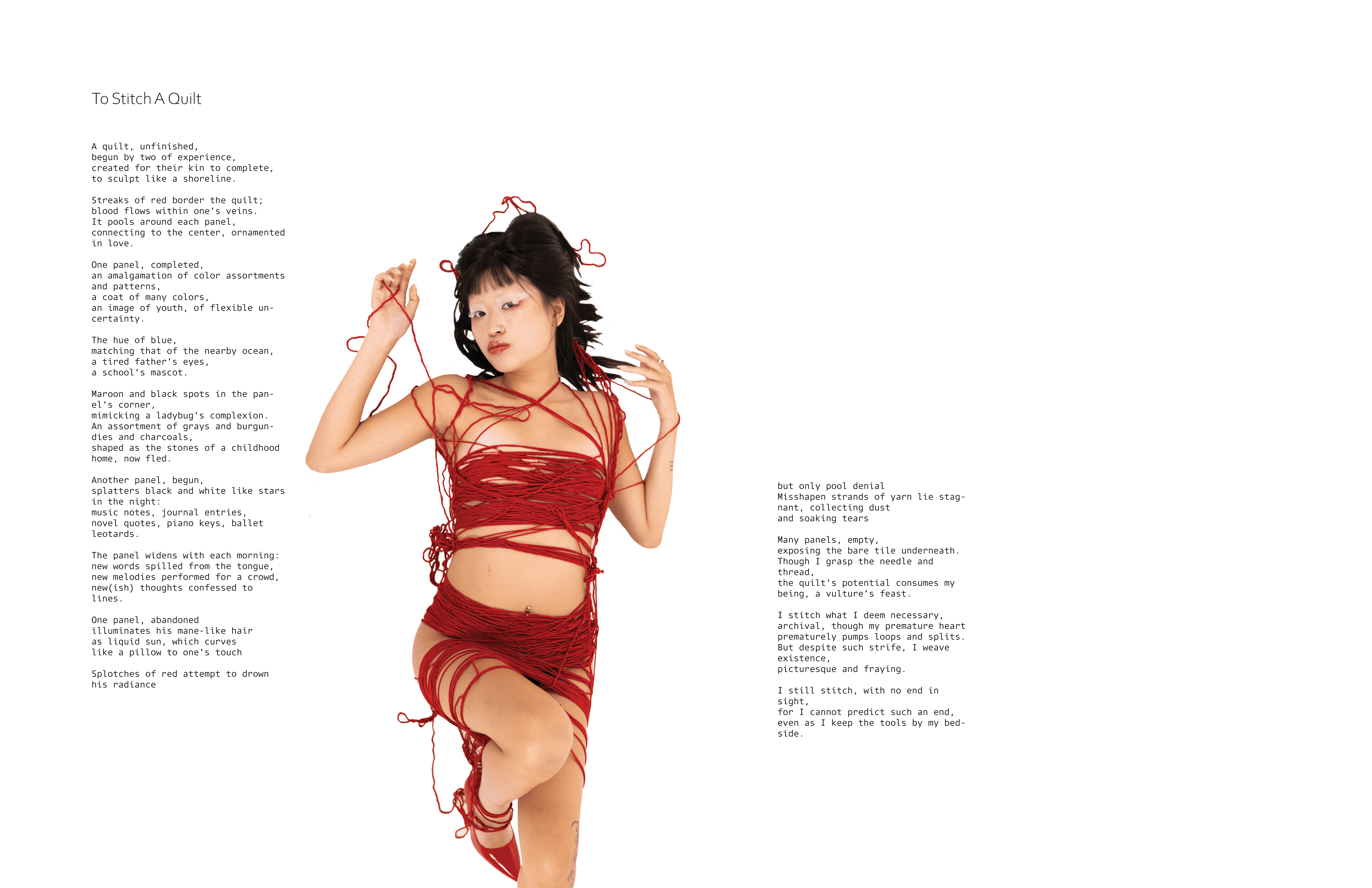
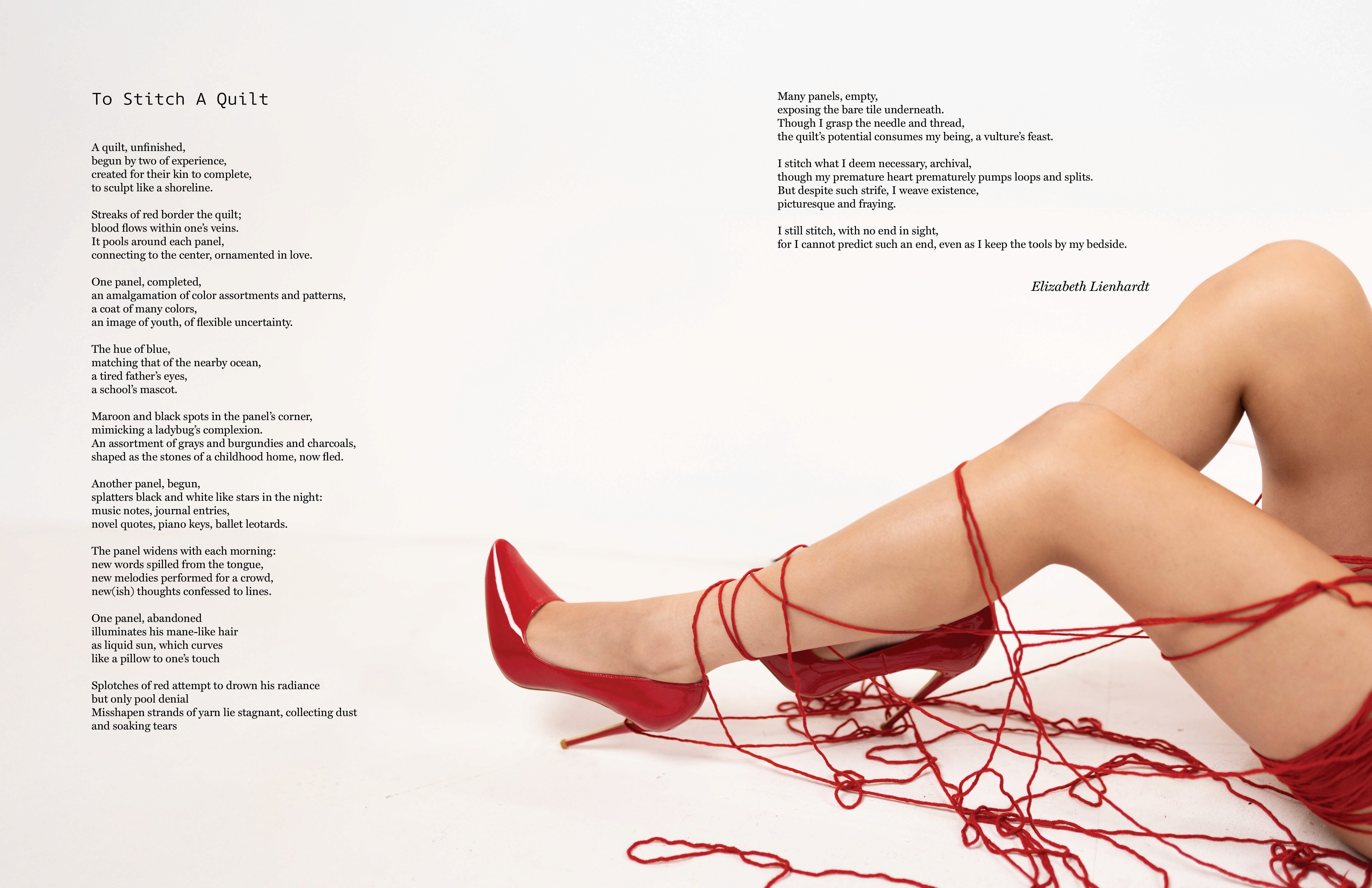
I contributed to the creative direction during the photoshoot, including the second spread concept: a close-up of yarn being stretched between fingers to symbolize tension and space. A white background was chosen for flexibility in poem placement. The fifth spread contrasts a structured, single-stanza poem with a nonlinear one, allowing for dynamic composition. In the third spread, the model’s gaze guides the reader’s eye to the poem title and downward through the text. Yarn represents some of my most thoughtful and refined design work to date.
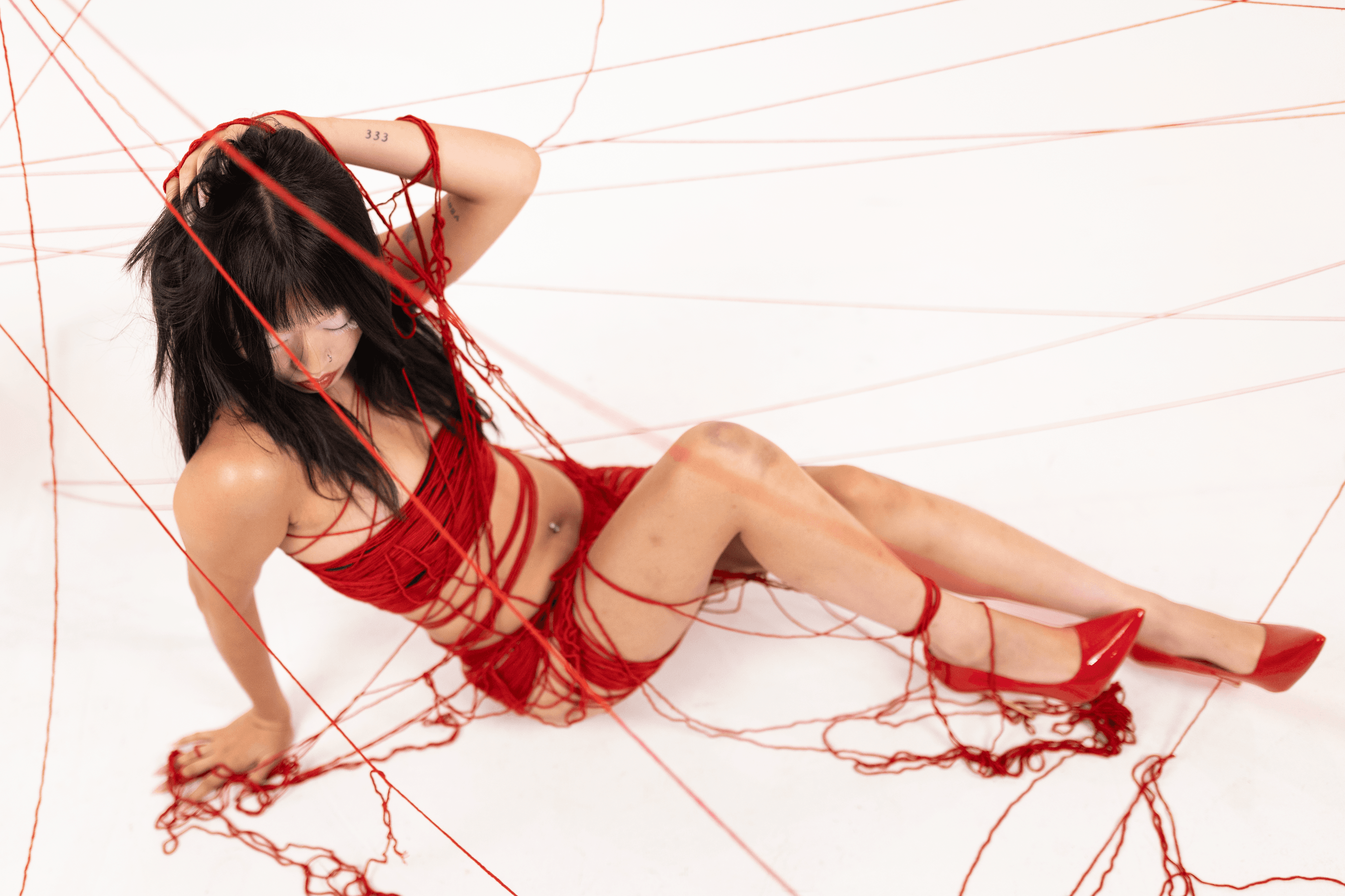
Yarn As A Concept
Yarn unravels the intricate tension between destiny and choice. Set against stark white backgrounds, the scene illuminated by vivid red strings that weave across the space, symbolizing the delicate web of fate that binds us. These strings maps out the paths laid before use each line a tether th what hs been predetermined.
But Yarn dares to ask: What if fate is not a roadmap but a suggestion?
This shoot challenges the notion that we are bound by invisible threads, urging you to defy expectations and forge a path that is uniquely your own. The models move through the tangled maze of red, sometimes following the lines, sometimes cutting through them each action a declaration of autonomy.
The red strings, traditionally a symbol of connection and inevitability, become instruments of rebellion. Some are pulled taut, others frayed or severed, representing moments when we choose to break way from the script and rewrite our stories.
Yarn is not just about questioning fate, its about reclaiming agency. It reminds us that while the threads may suggest a pattern, we hold the power to unravel, reweave, and redefine our own destinies. In the end, Yarn leaves us with one profound message: You are the artists, and your life the loom.
Initial Sketches and Type Face Exploration
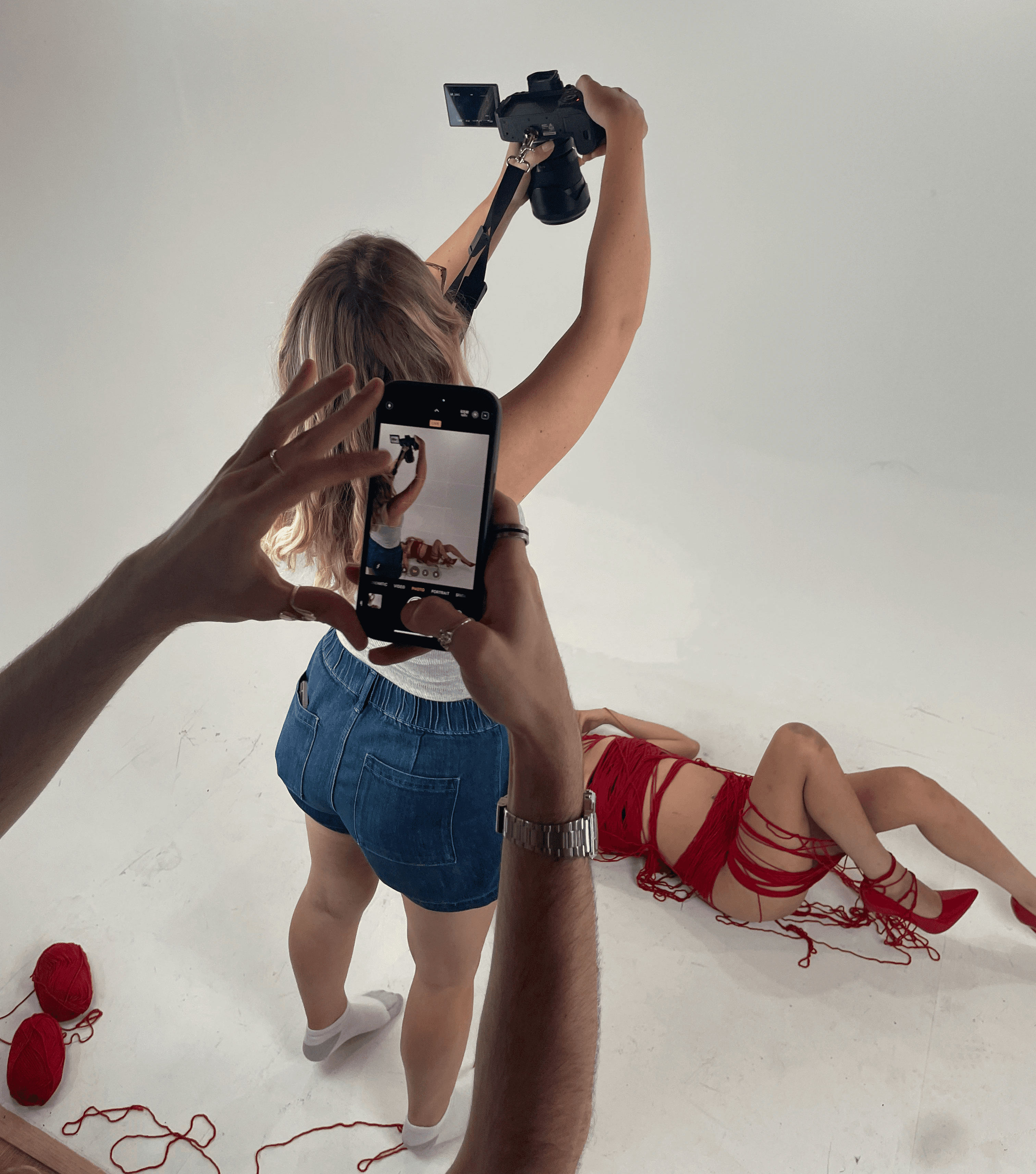
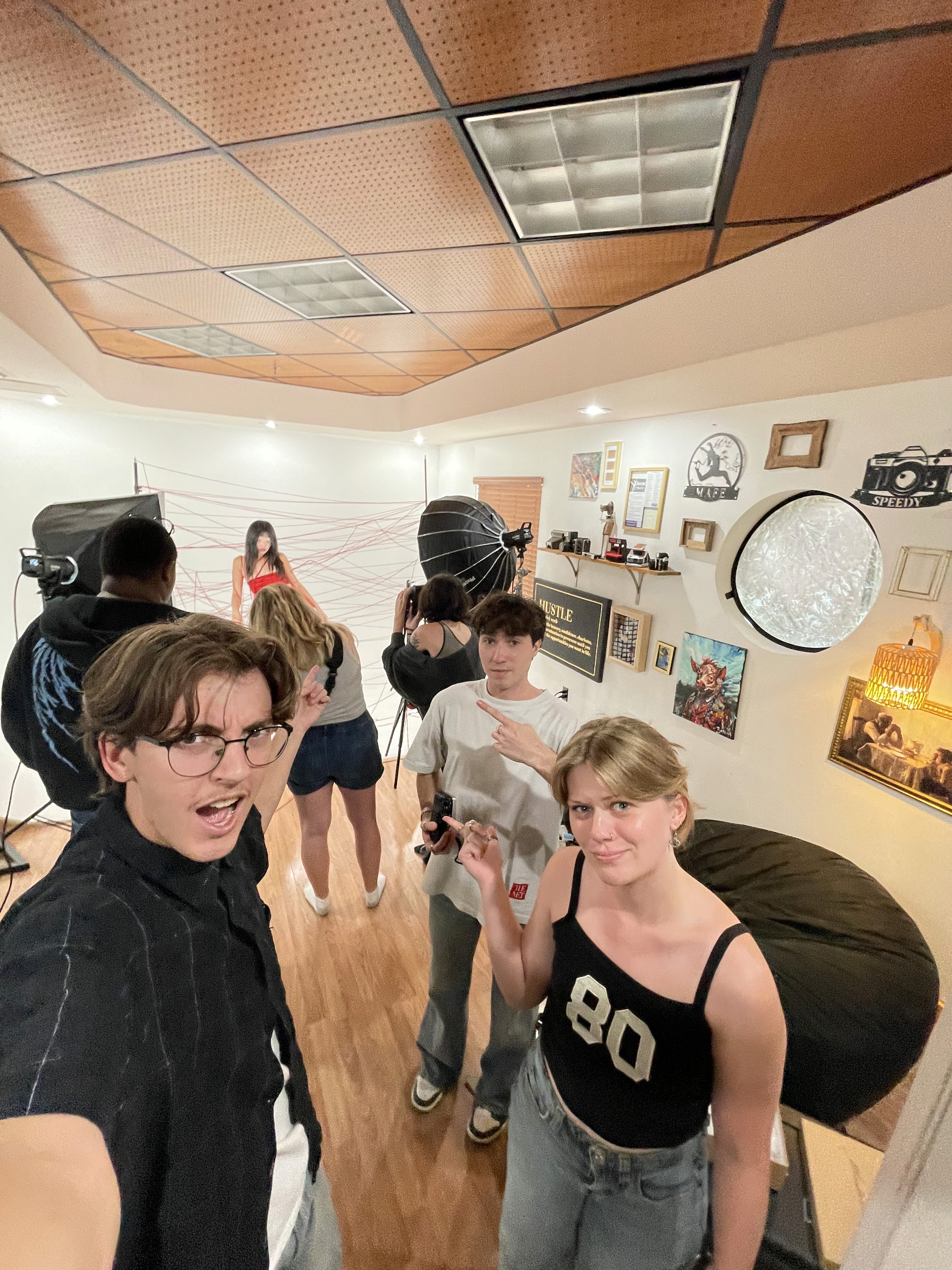
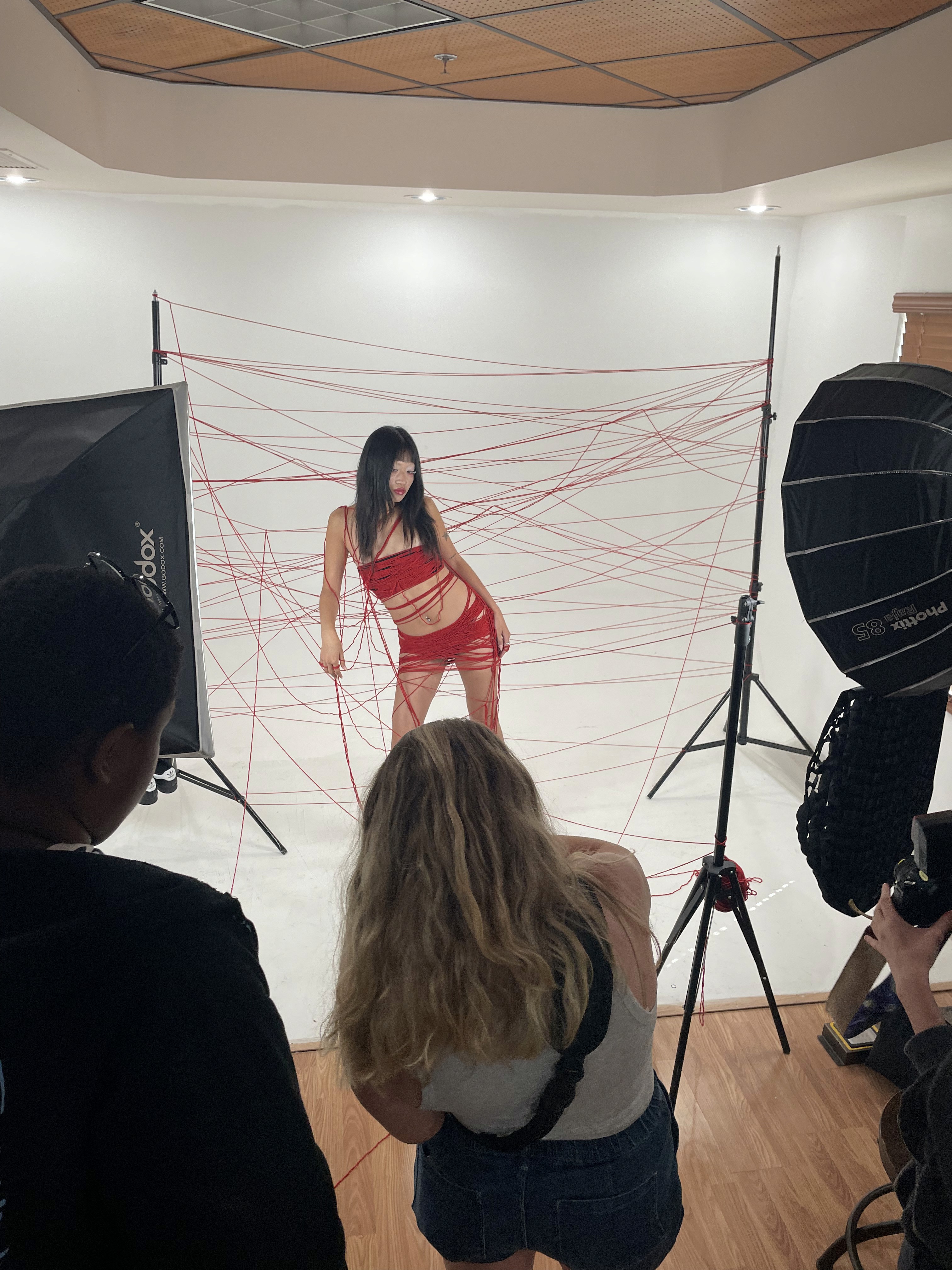
Behind The Scenes and Moodboard
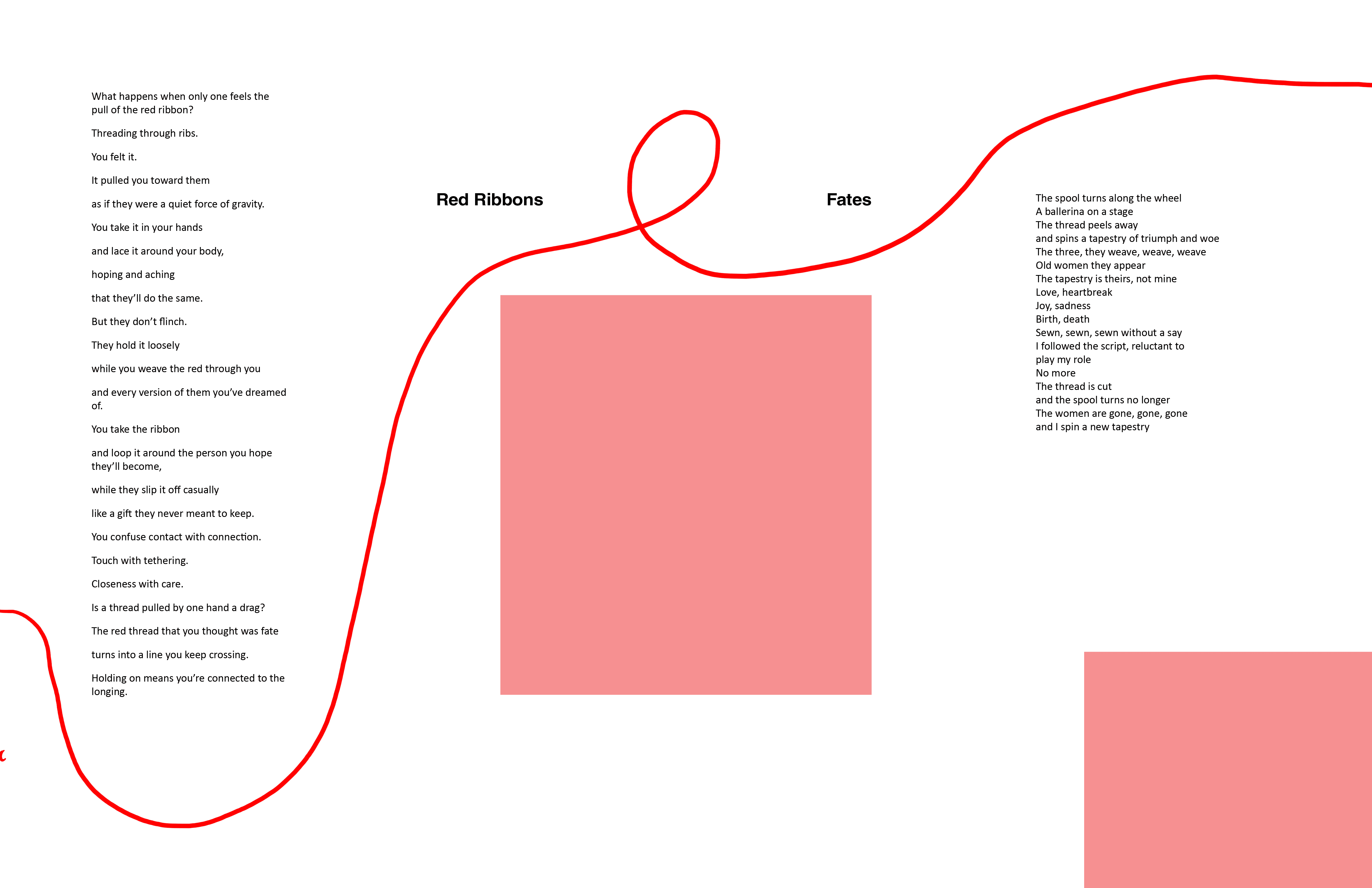
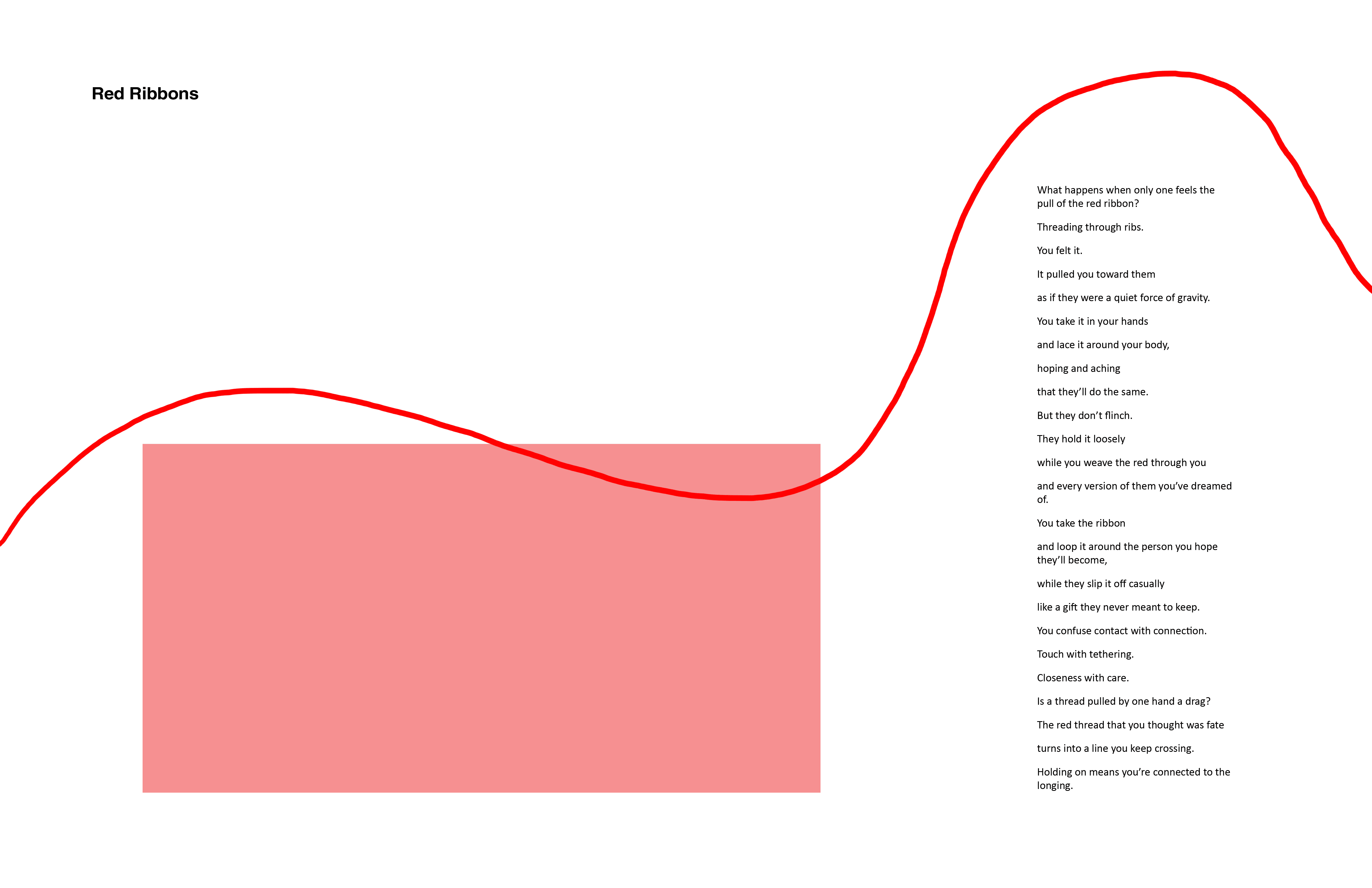
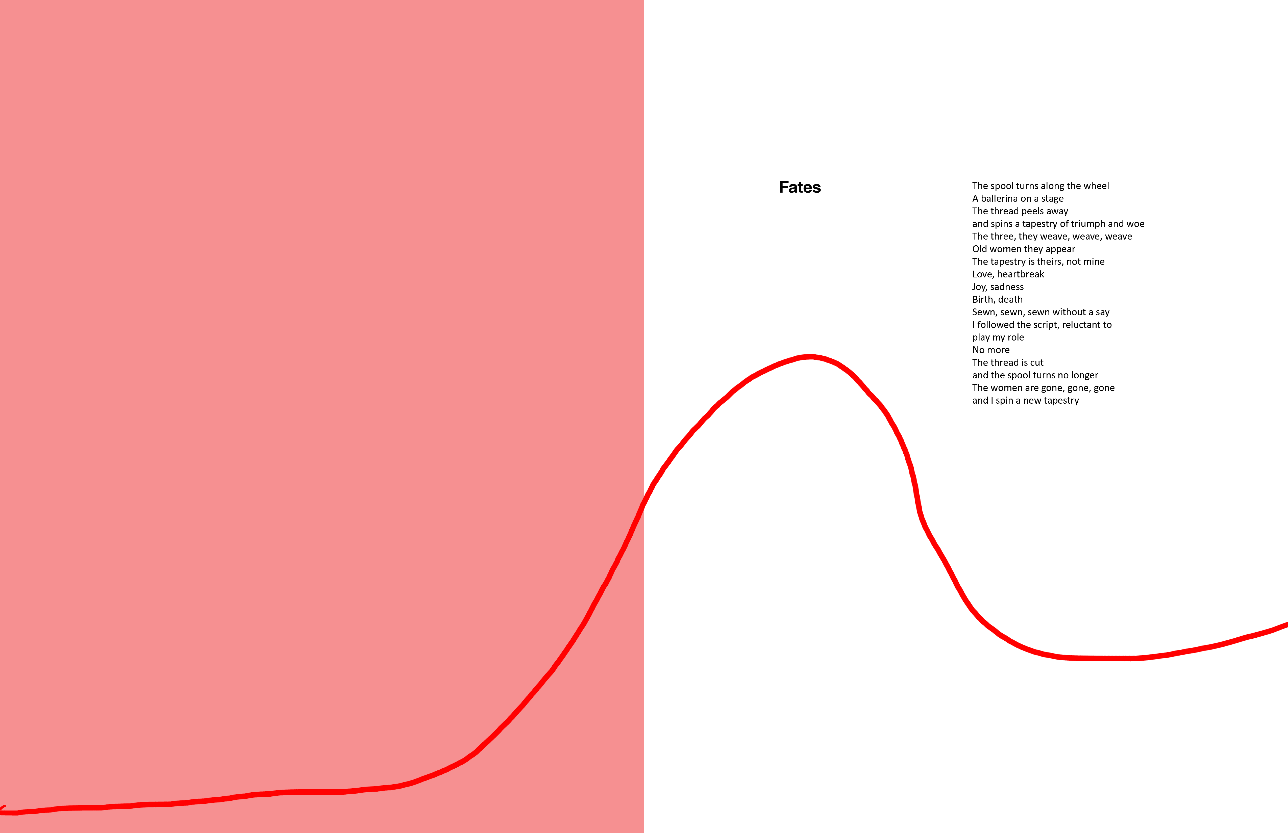
Rough Layouts (No Yarn)
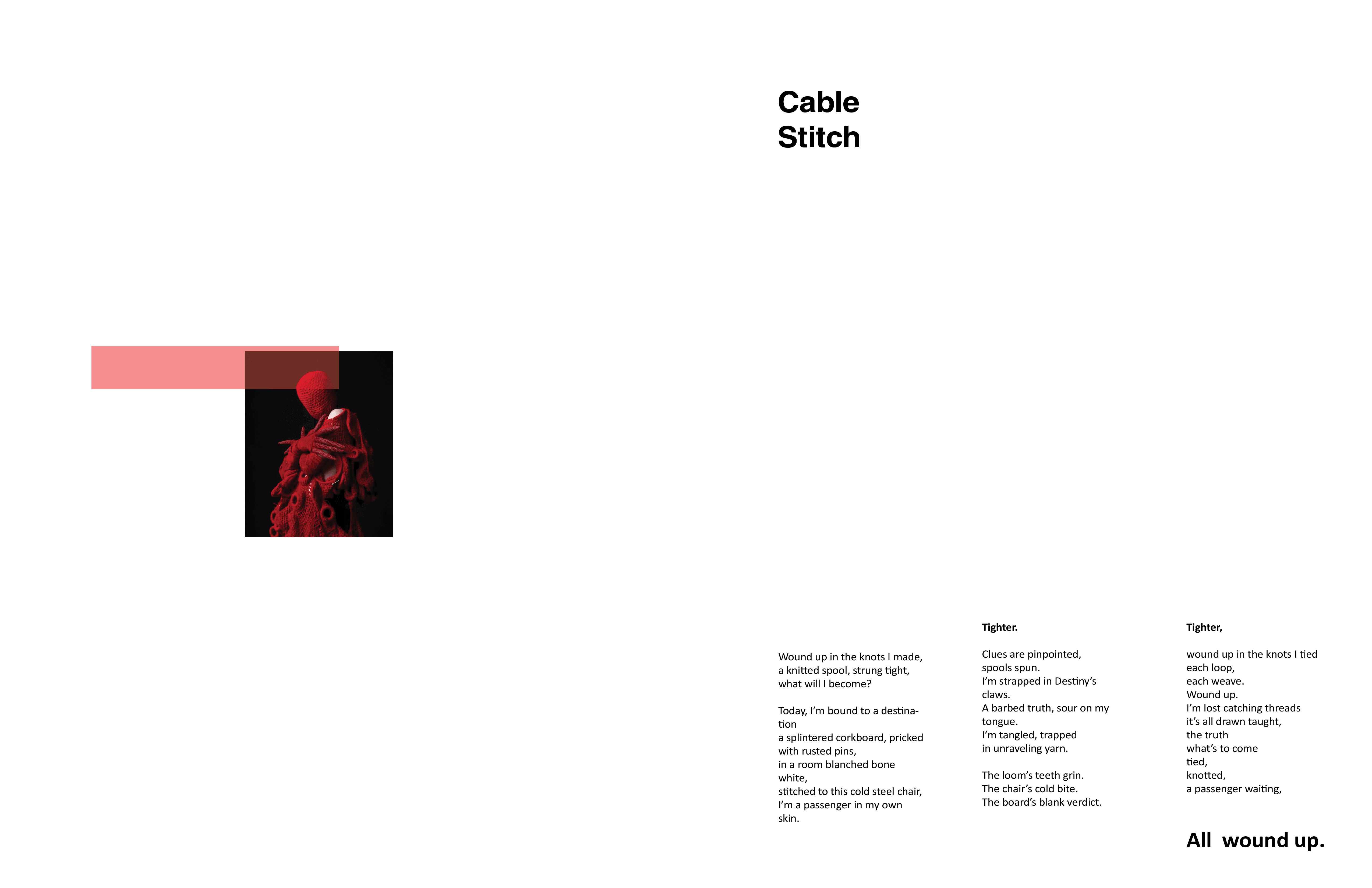
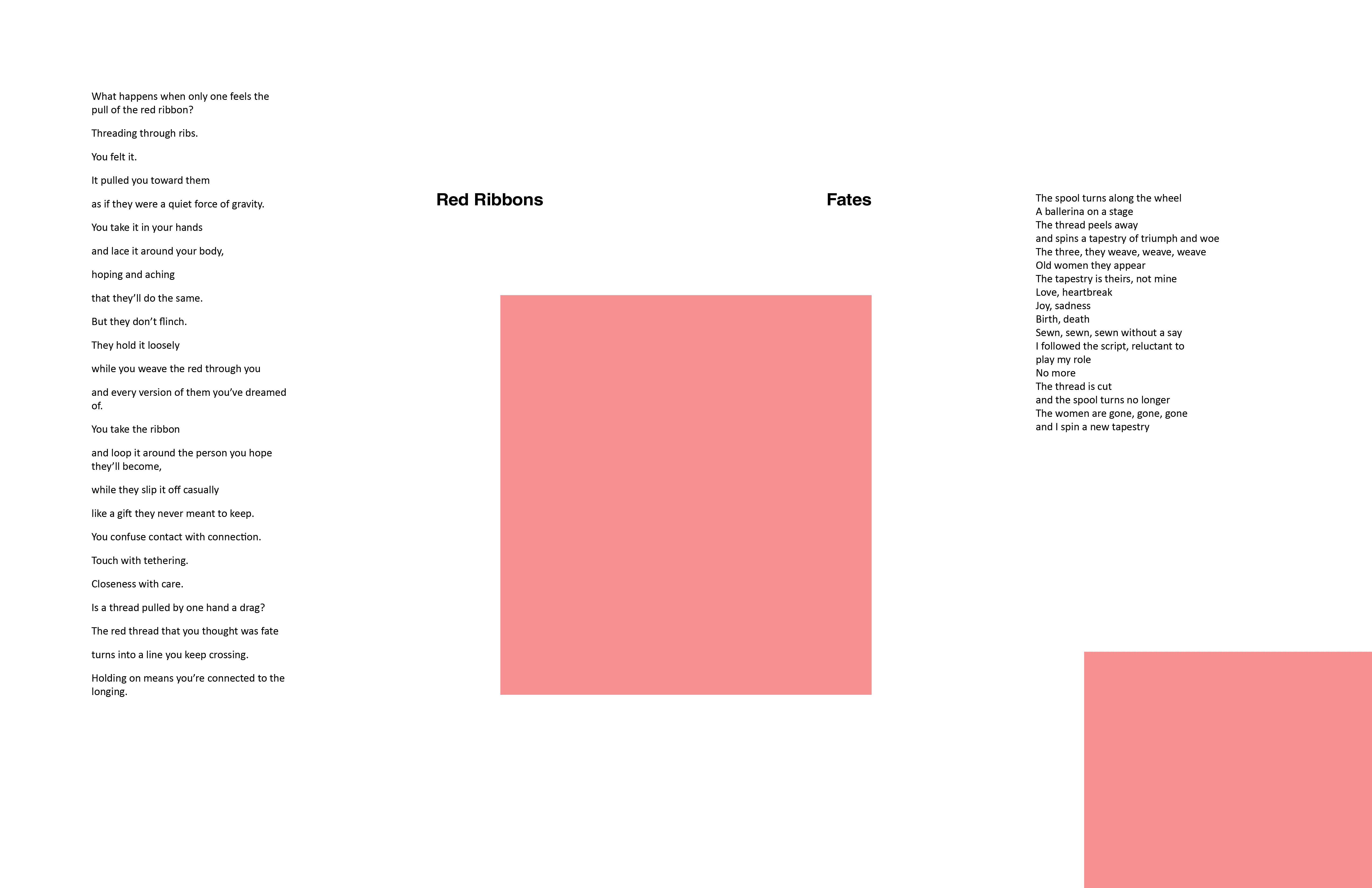
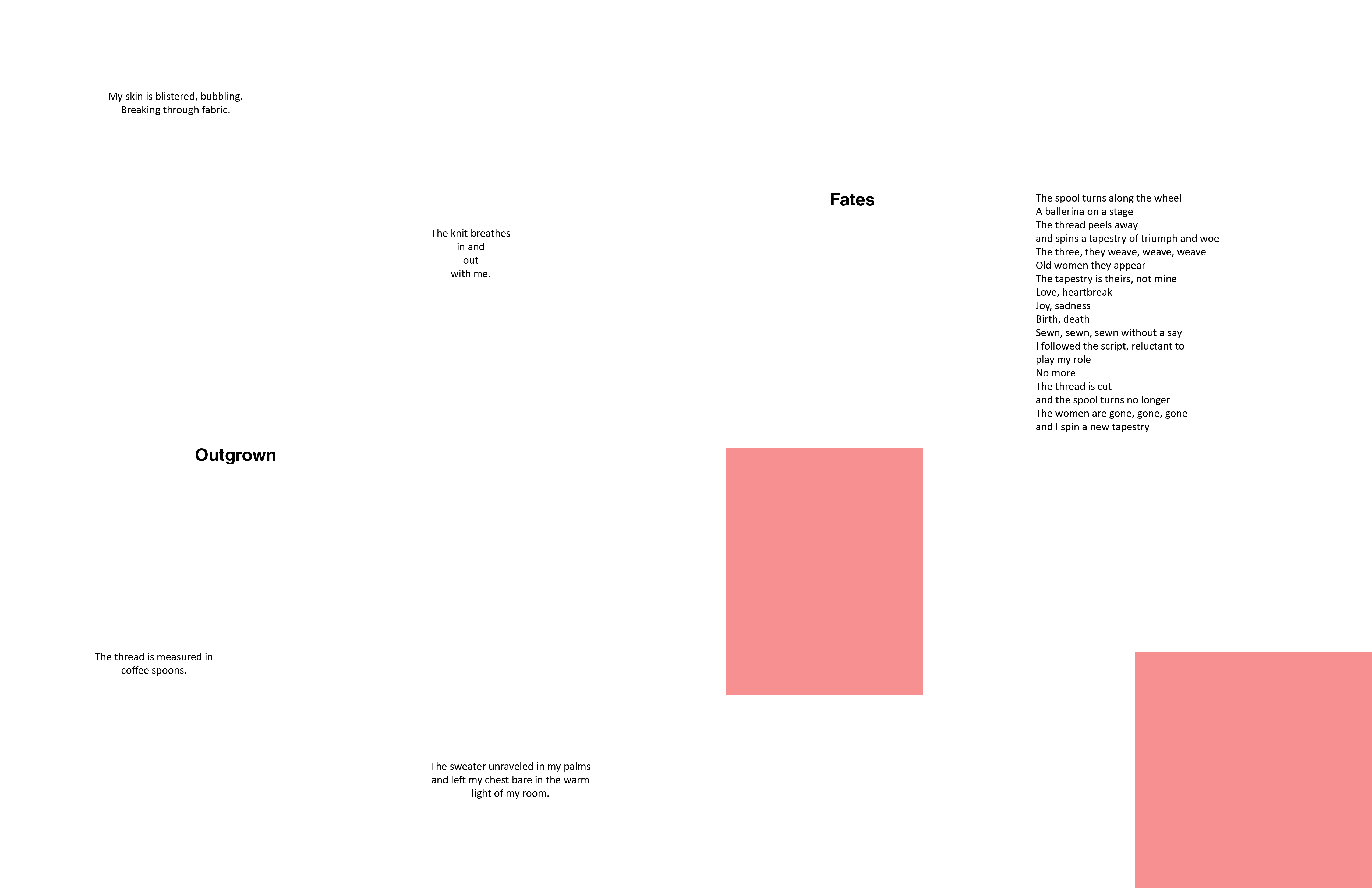
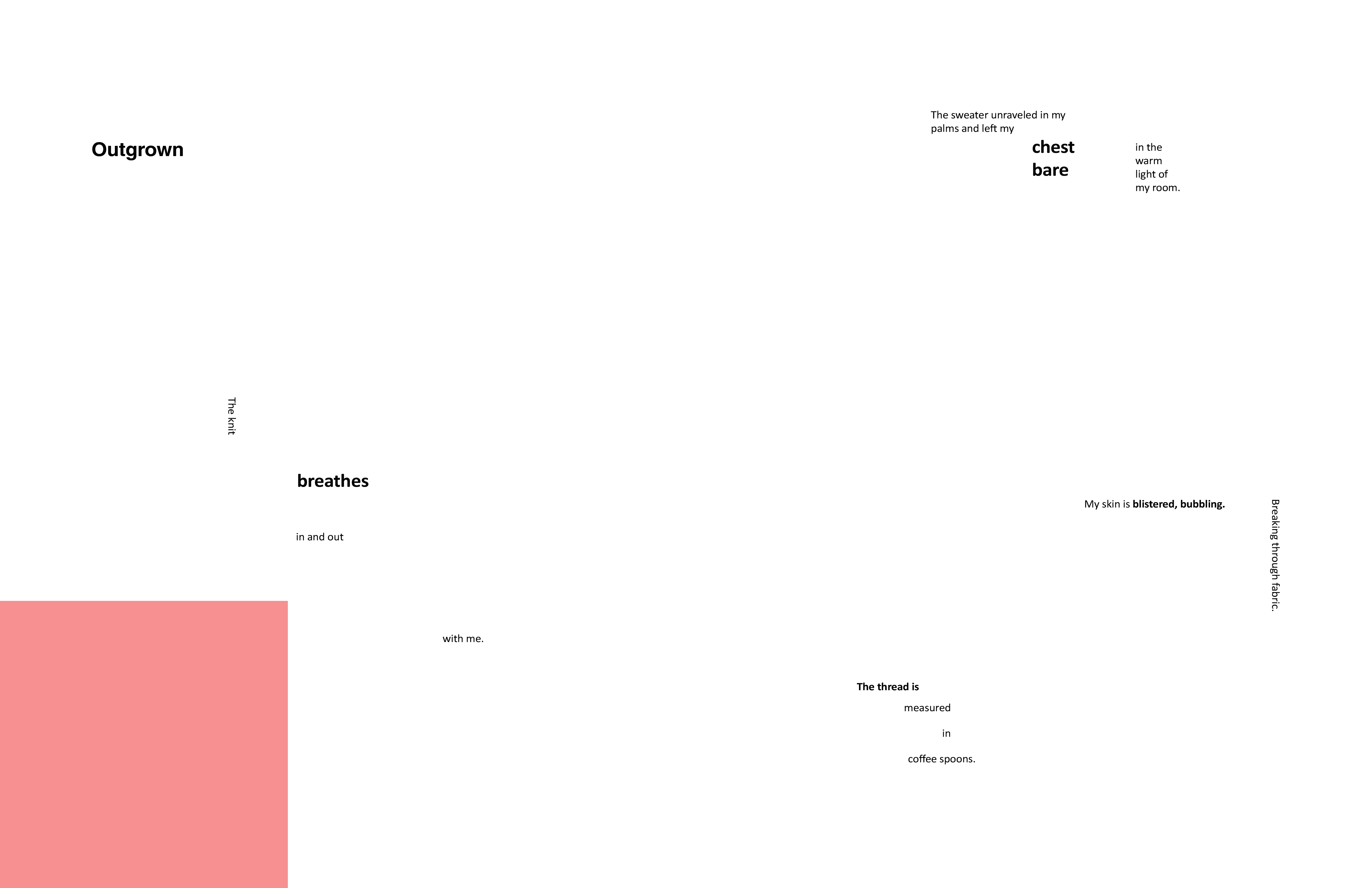
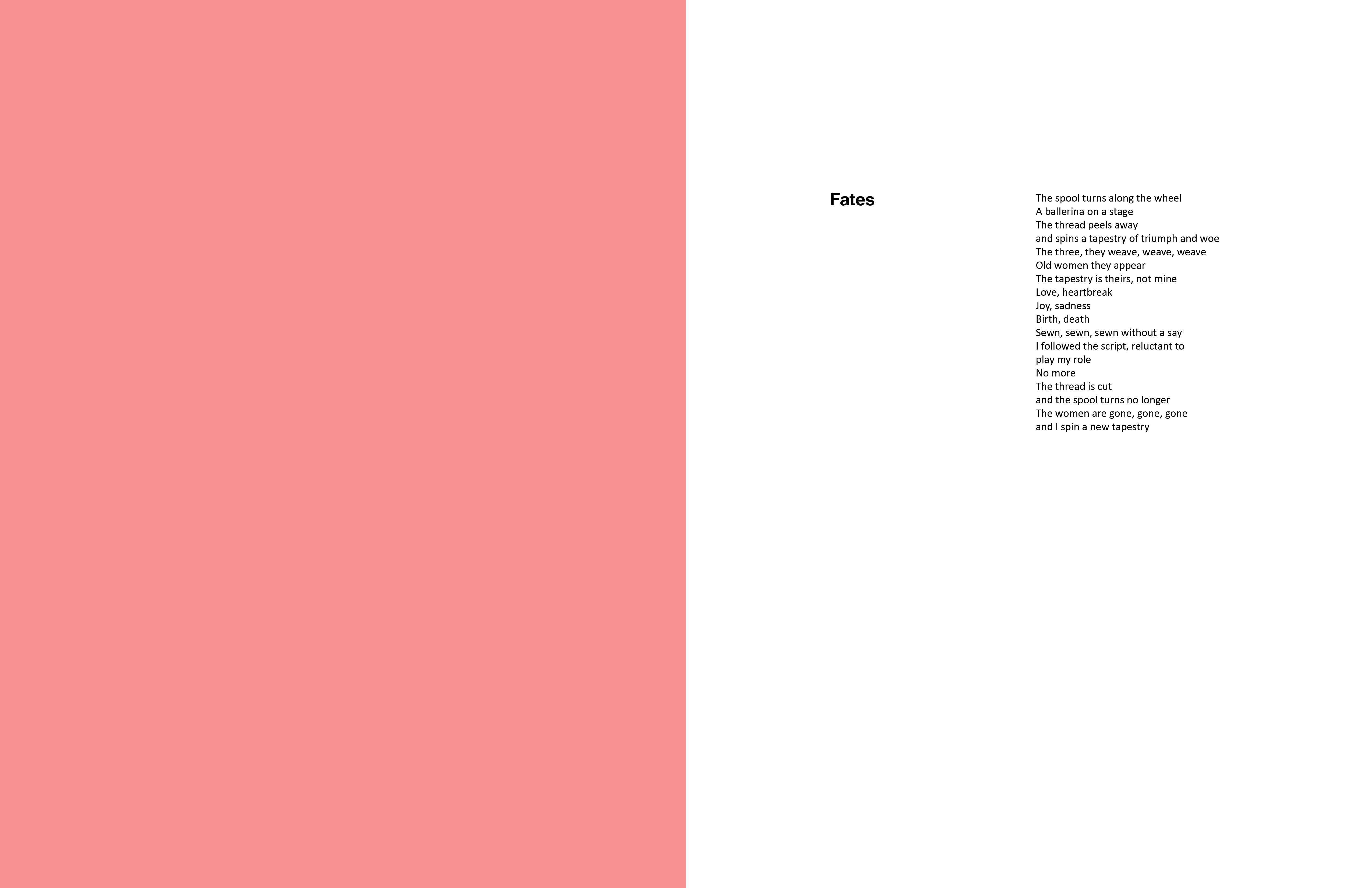
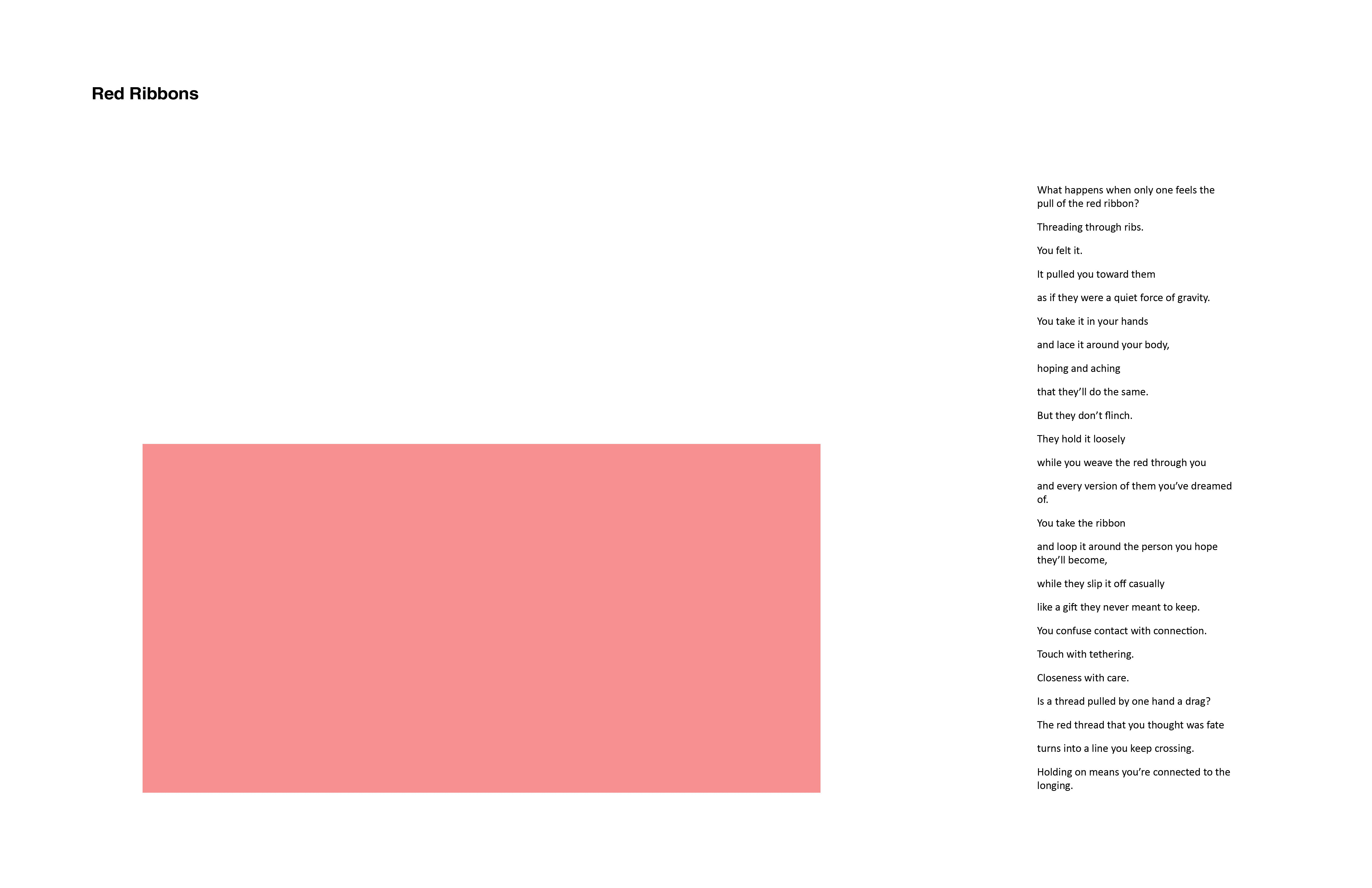
Rough Layouts (Yarn)
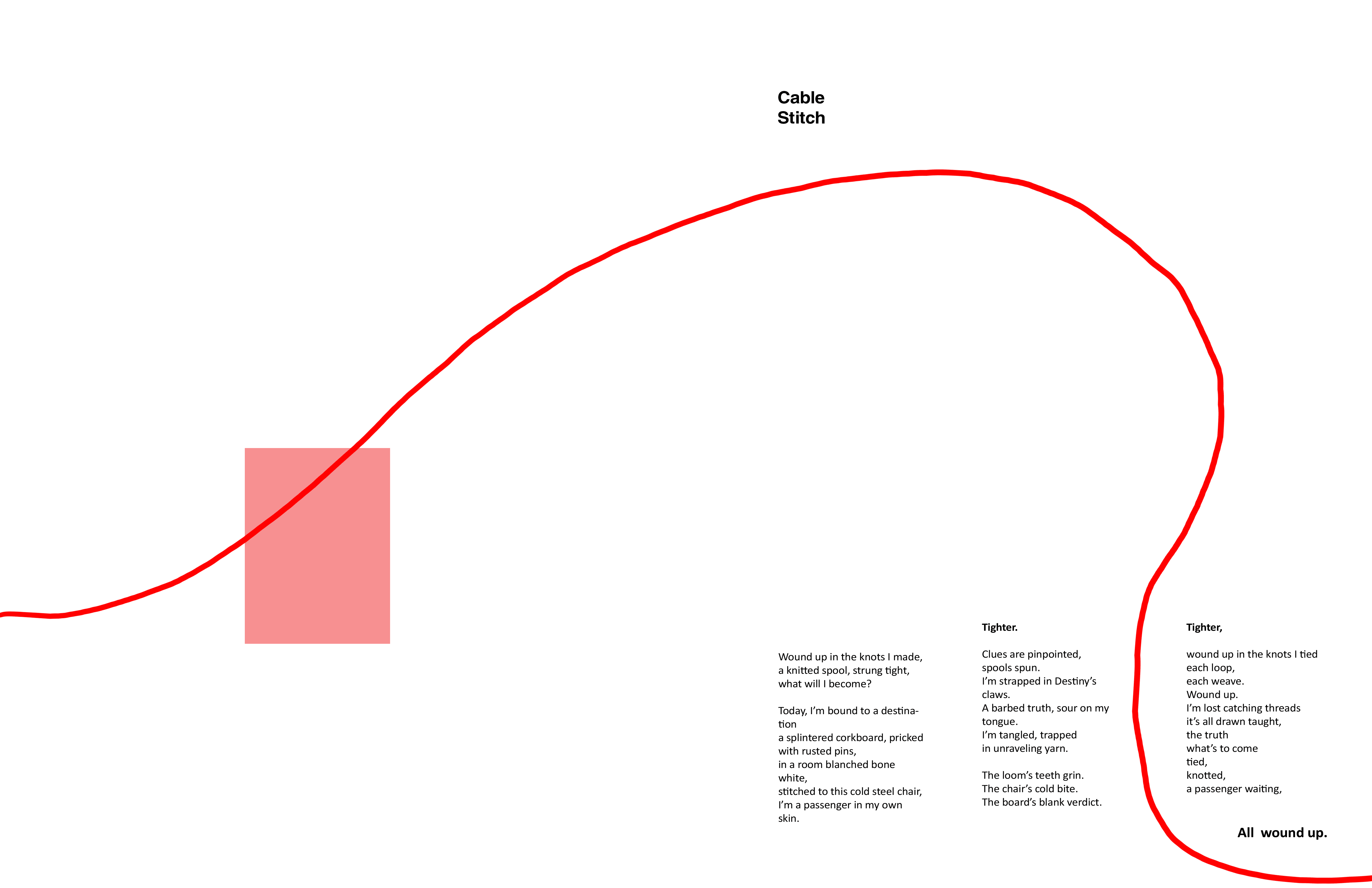
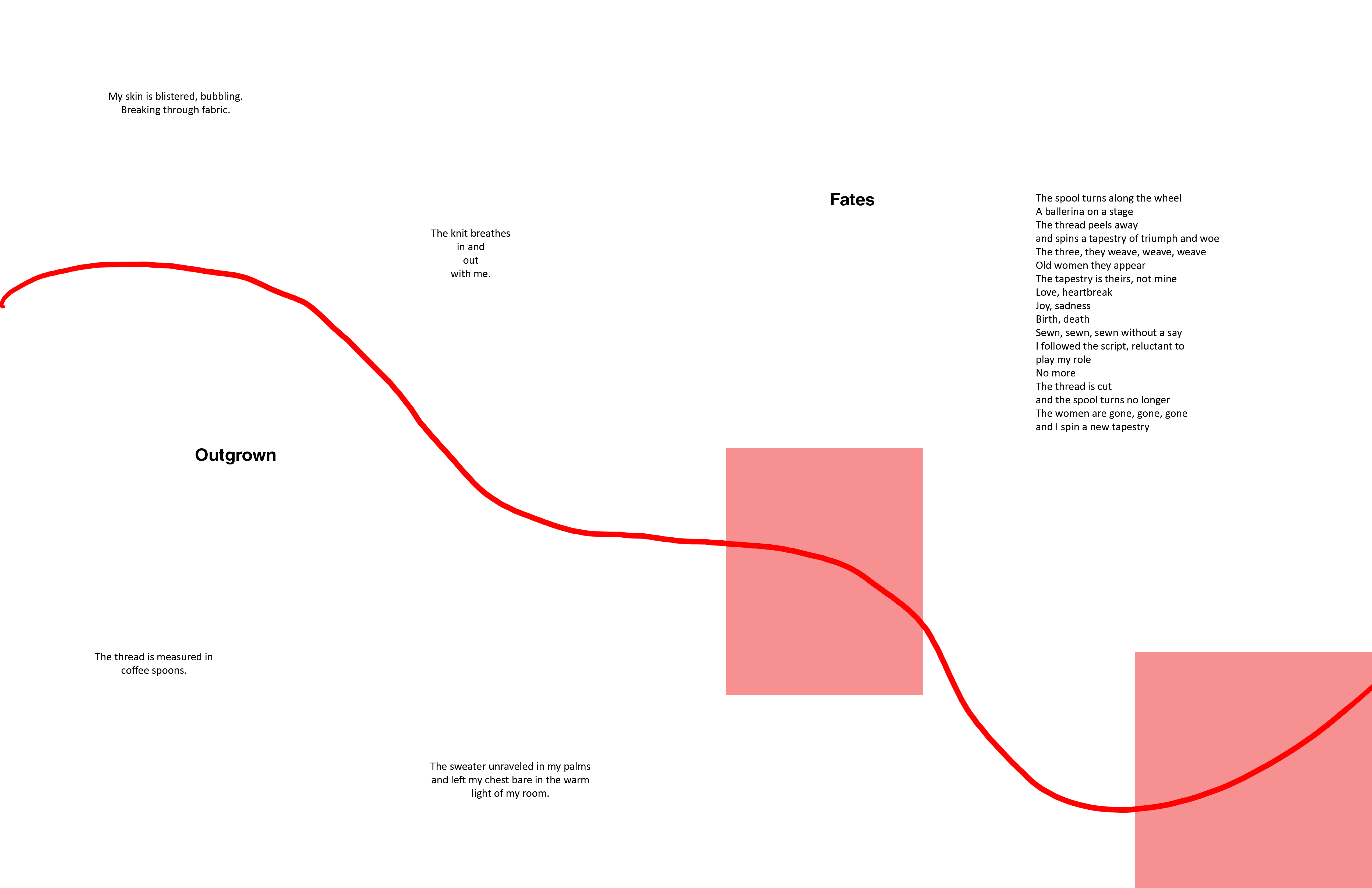
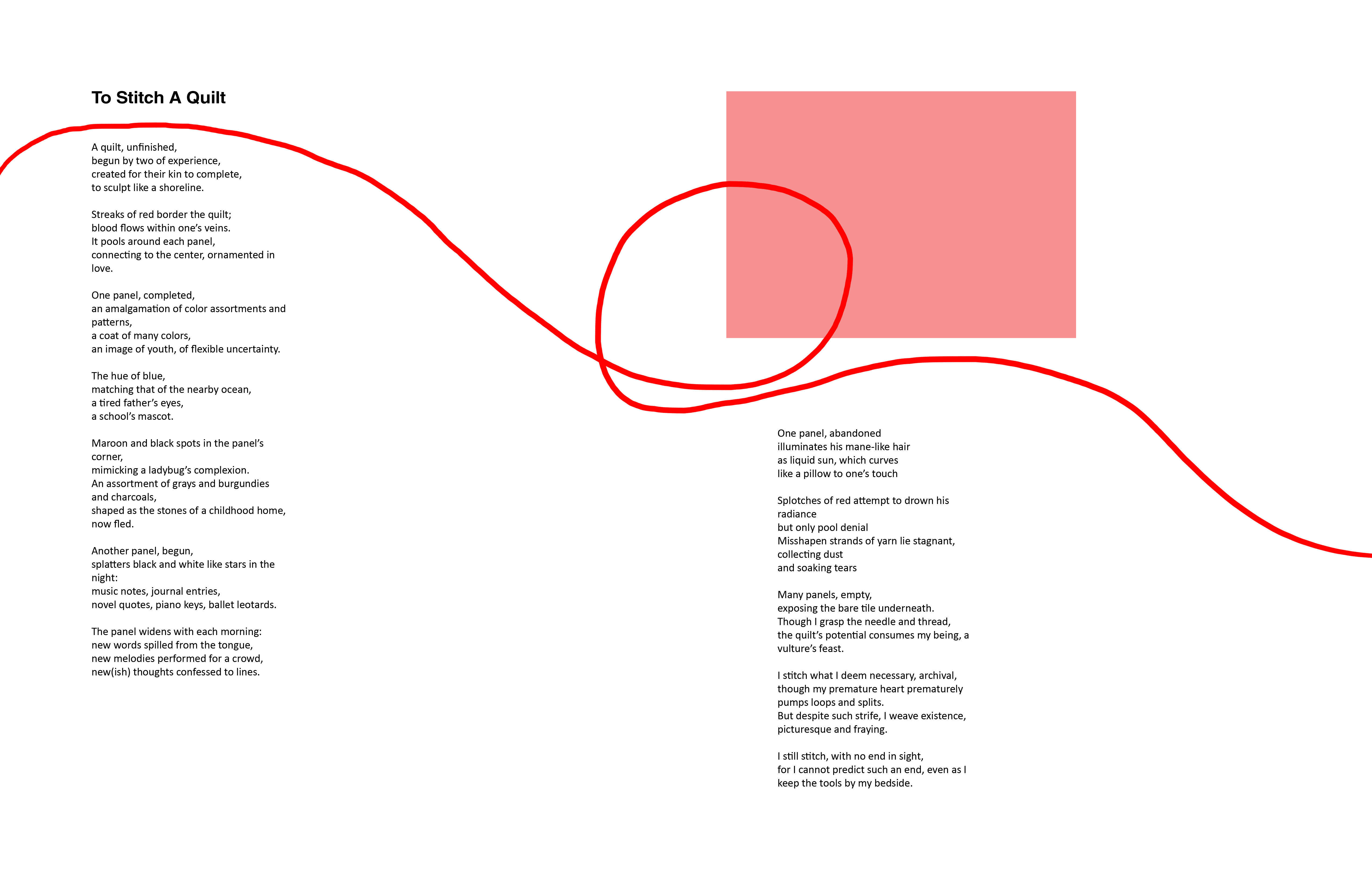
Change In Direction
The concept for Yarn was intended to act as a minimal visual pause within the magazine, emphasizing subtlety, strong layouts, and generous negative space. The initial direction included a scanned piece of yarn that would physically guide the viewer’s eye throughout the spread. However, after receiving the final photos from the shoot, the imagery felt strong enough to stand on its own. The creative director and I decided to remove the yarn element entirely, replacing it with a more invisible visual flow that still guides the viewer’s eye while keeping the focus on the model and photography.
Drafts (Left) vs Finals (Right)

Grids


Photo Editing
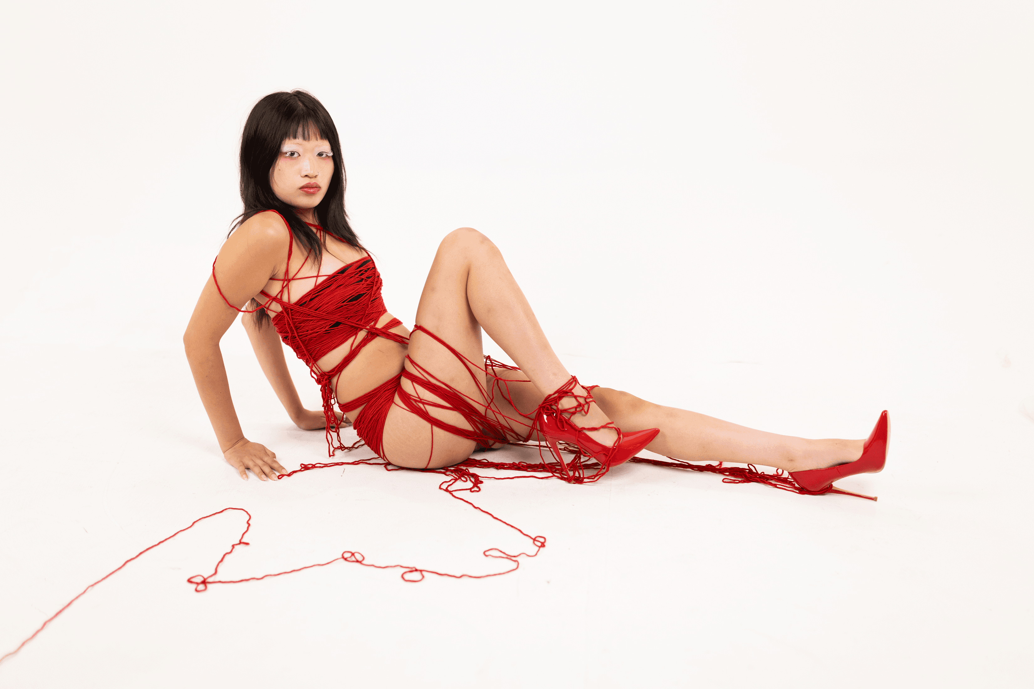
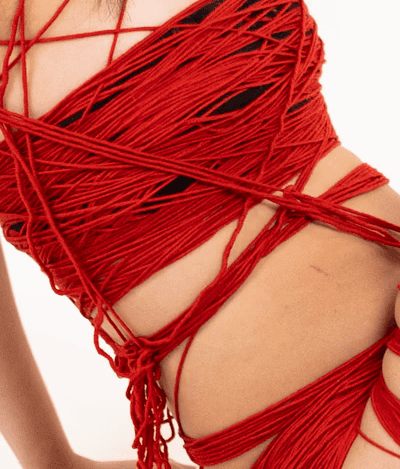
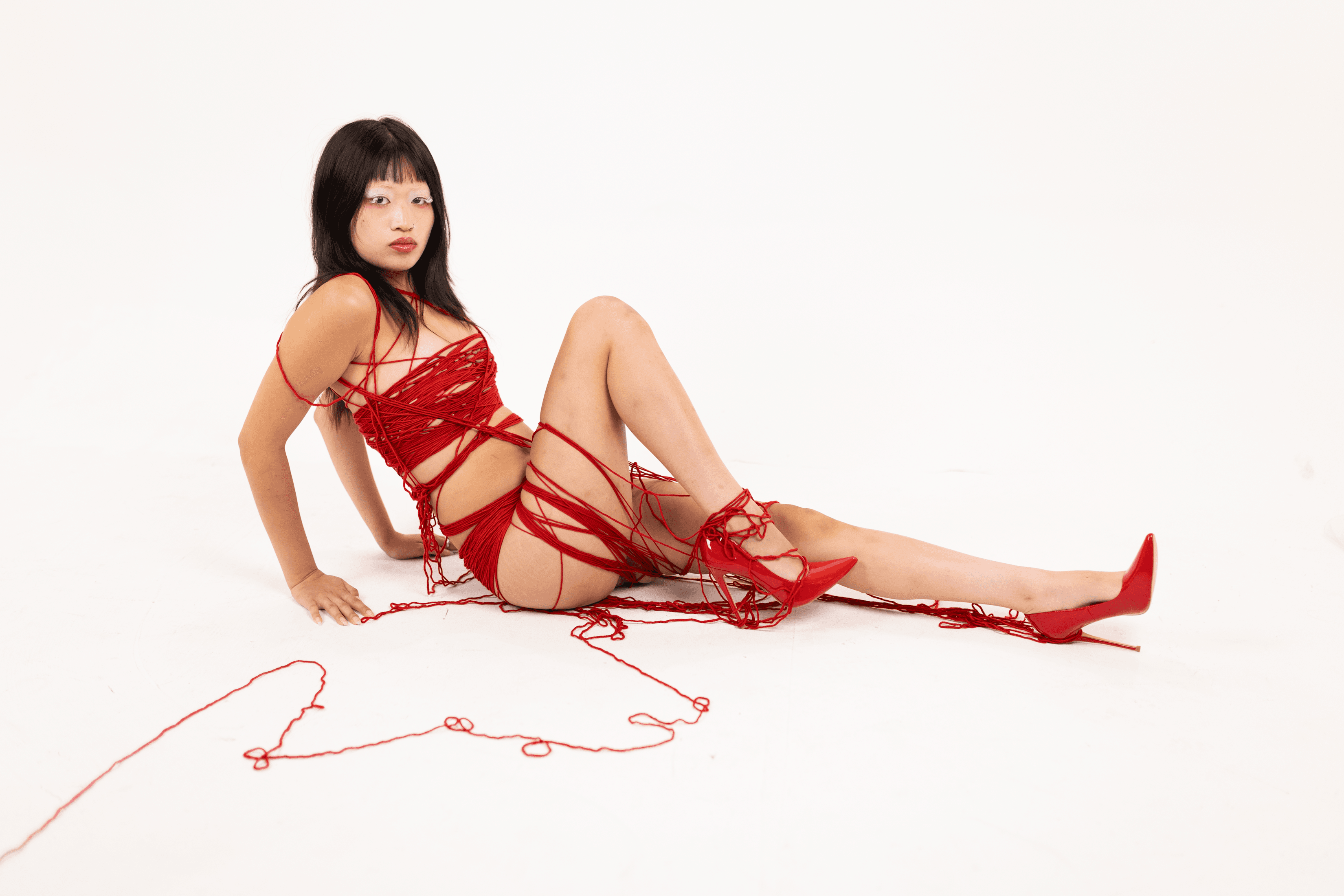
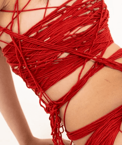
Due to practical limitations, the model for Yarn, Erica Zehng, wore black clothing underneath the yarn garment to remain covered and comfortable during the shoot. However, the creative direction aimed to make the look appear as though the outfit was constructed entirely from yarn. After the photographer, Mary Panitz, completed the initial photo edits, I retouched the selected images for the spreads by blending the black garments to match the model’s skin tone. This helped achieve the intended illusion and final visual direction for the magazine.
Launch Day Poster
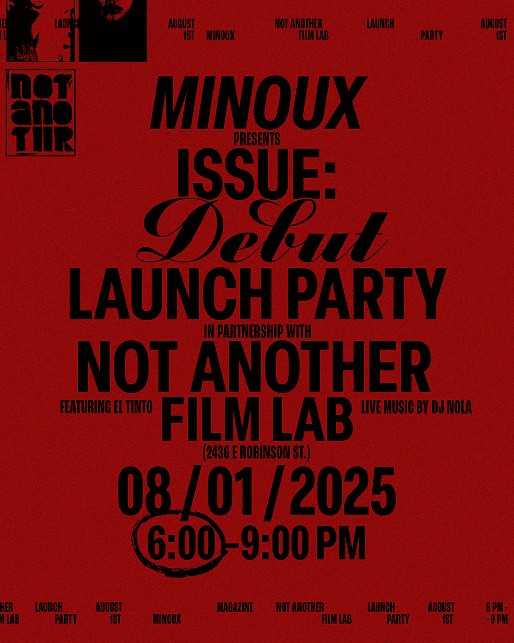
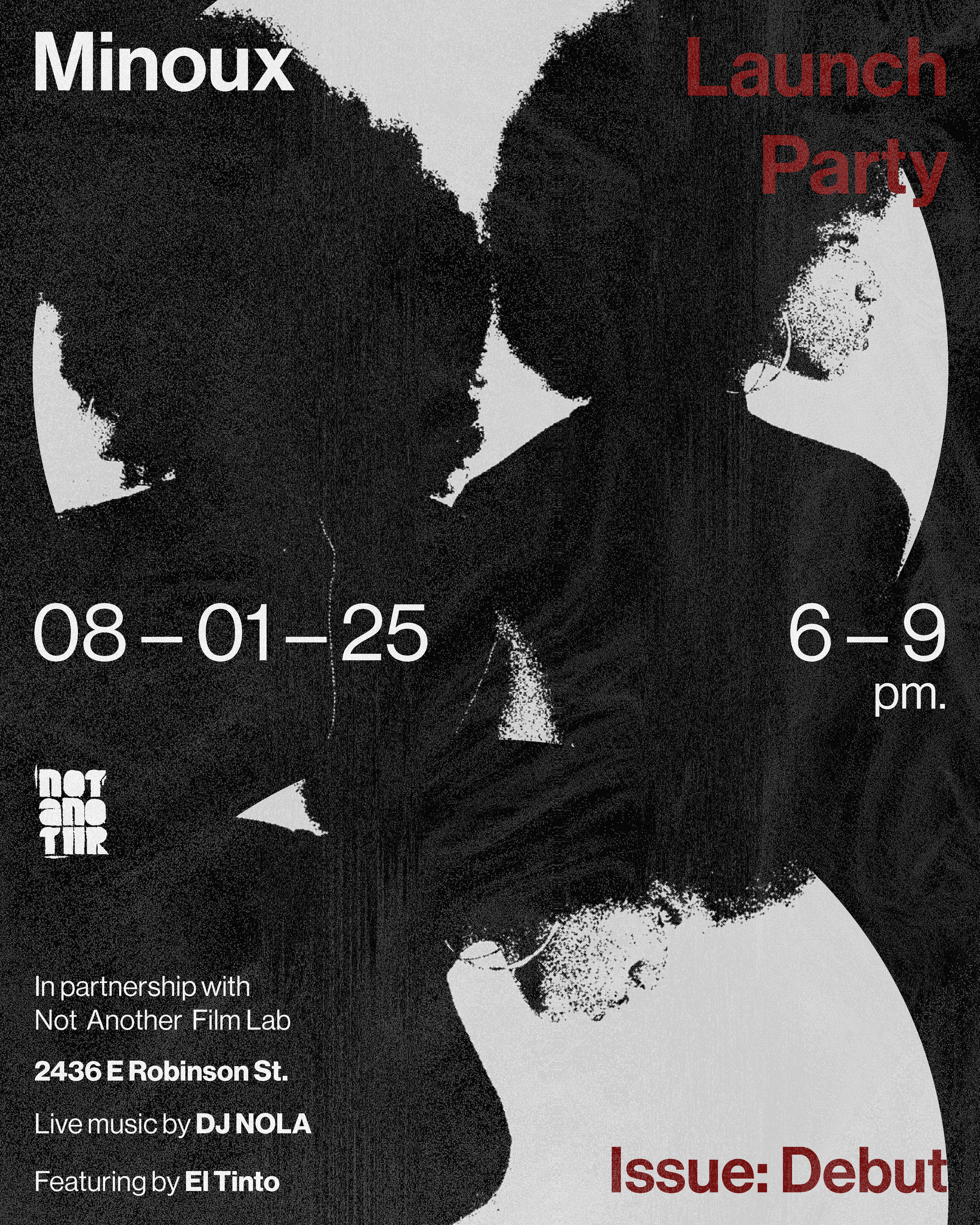
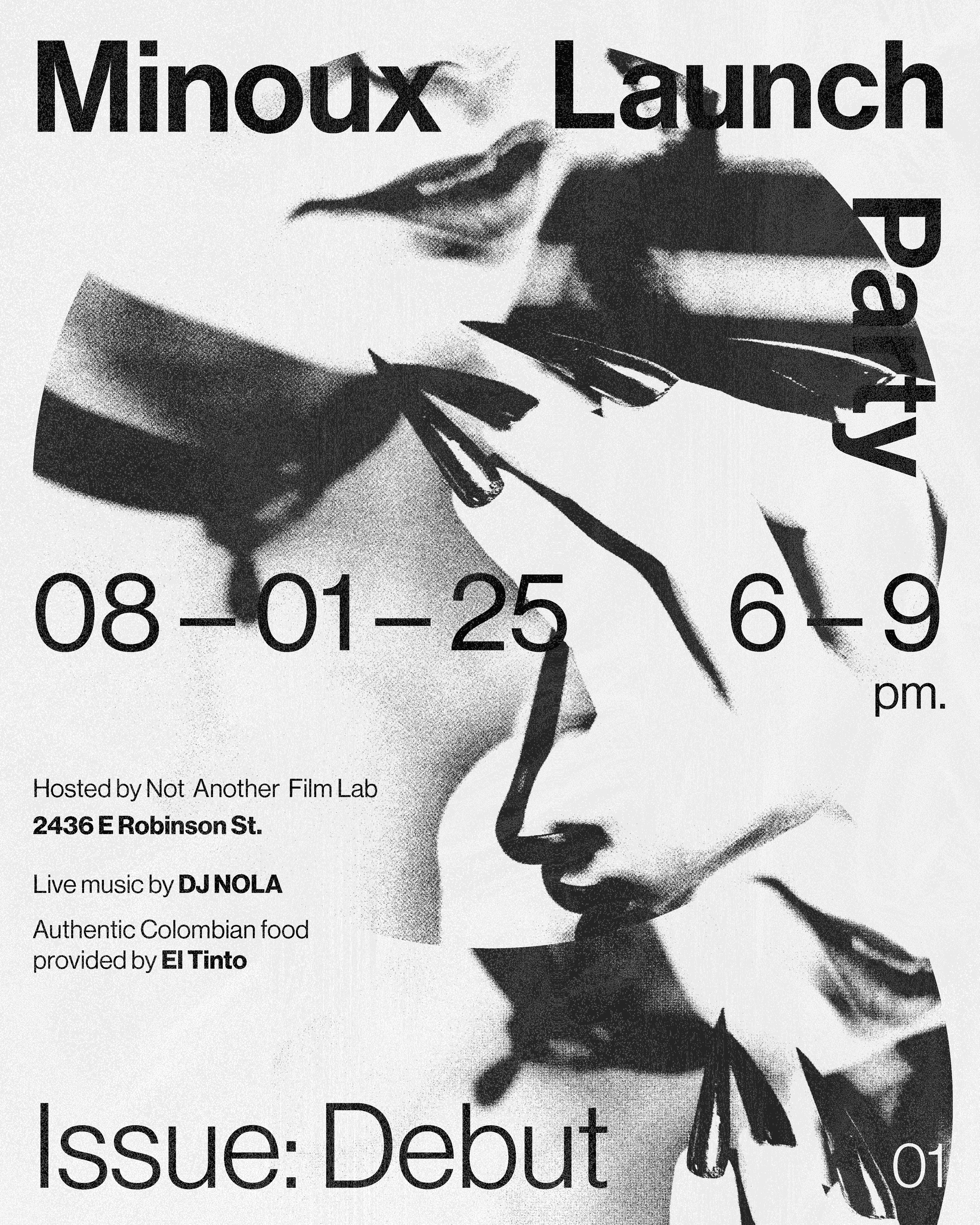
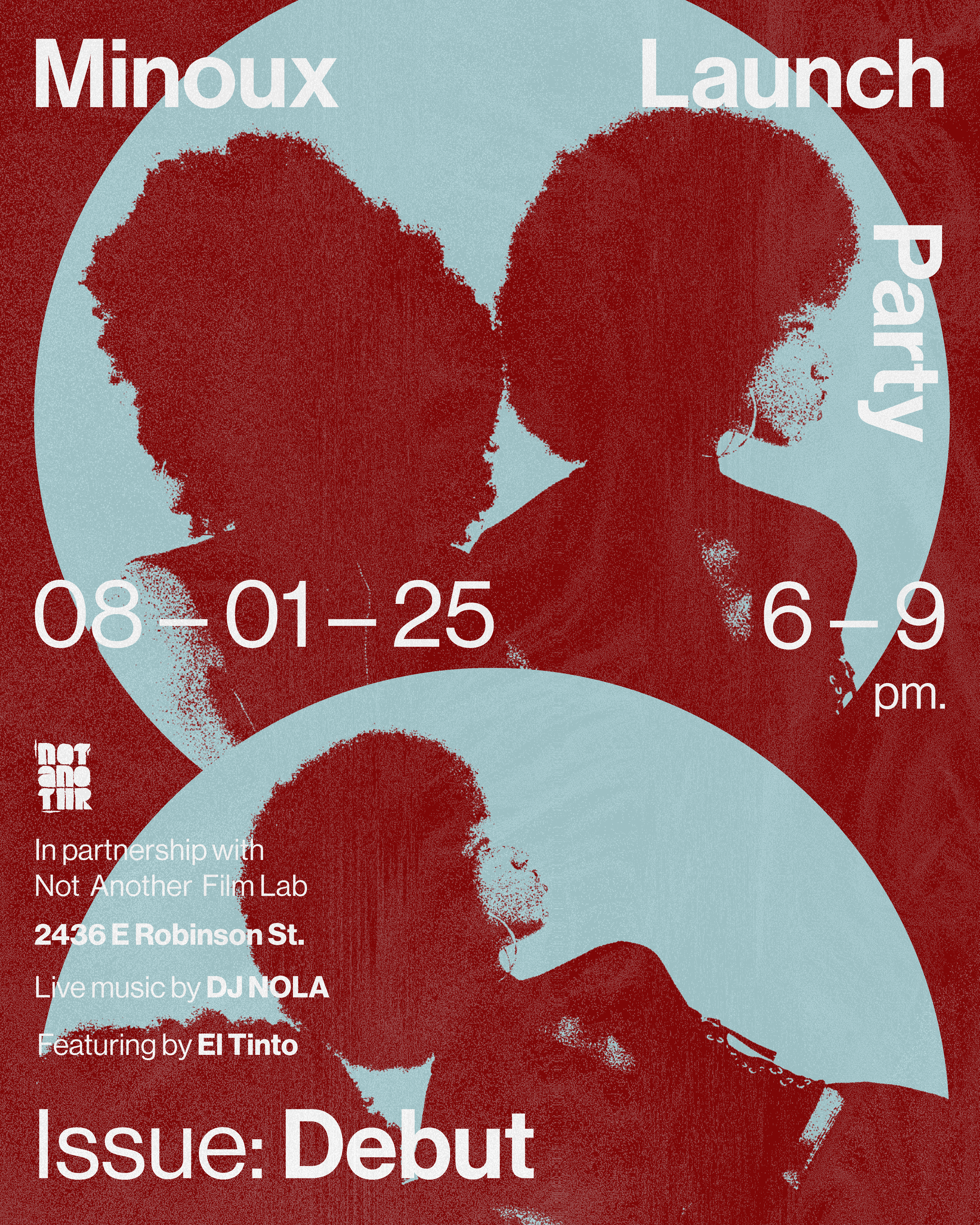
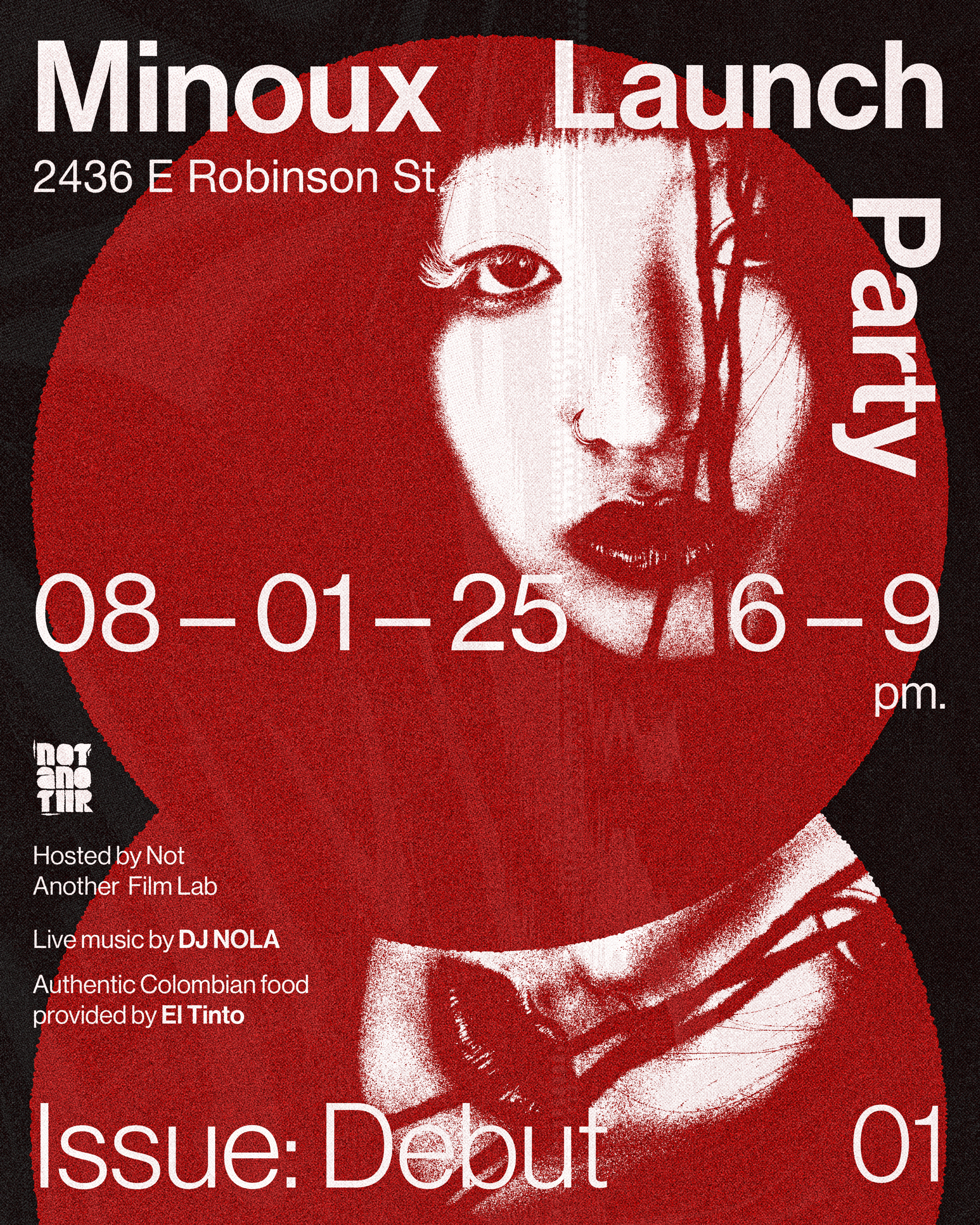
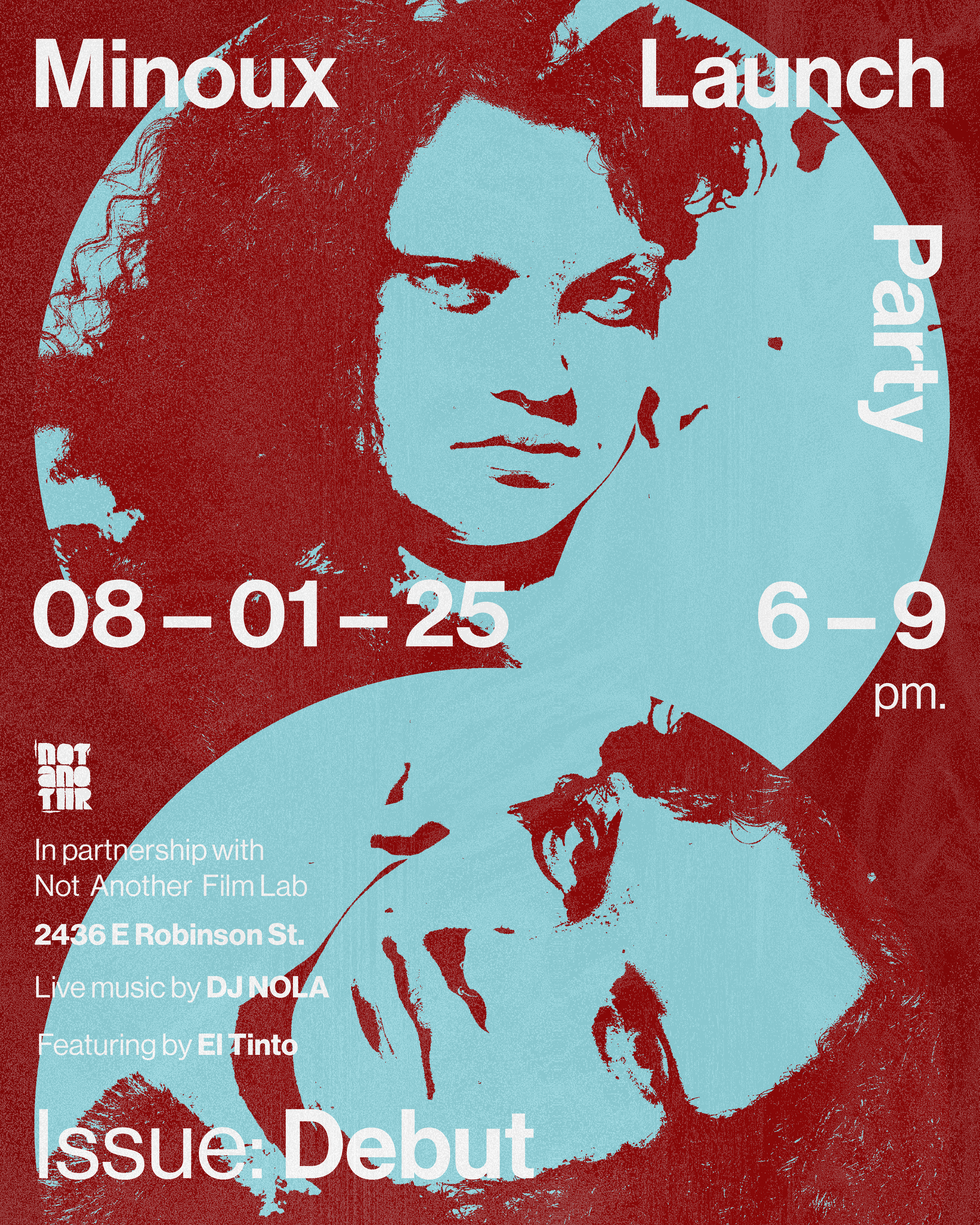
For the launch-day poster (Issue Debut) and social post, I drew inspiration from the raw, DIY energy of grungy concert and fashion flyers. The original concept used overlapping imagery within circular frames, with text wrapping dynamically around the visuals as the images faded into the background. While visually striking, the layout became difficult to read with the amount of information that needed to be included.
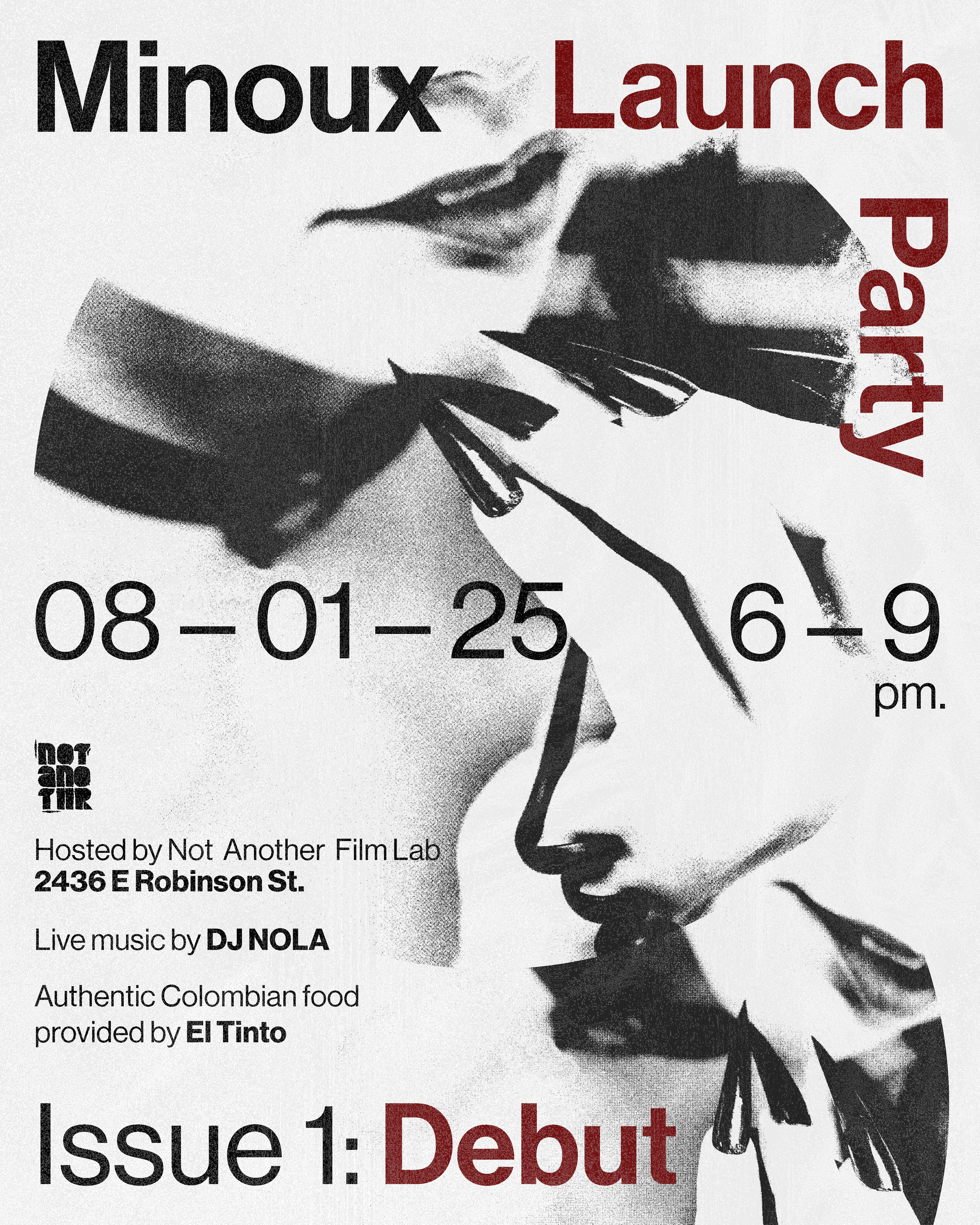
The final design shifted toward a more text-driven composition, using a cascading text flow to create stronger hierarchy and clarity while preserving the layered, chaotic energy of the initial concept. A condensed sans-serif helped manage dense information, while the scripted word “debut” adds contrast and highlights Minoux’s first issue. The project was completed over two days under a tight deadline, with constant iteration and communication alongside the creative directors.
Previous Iterations
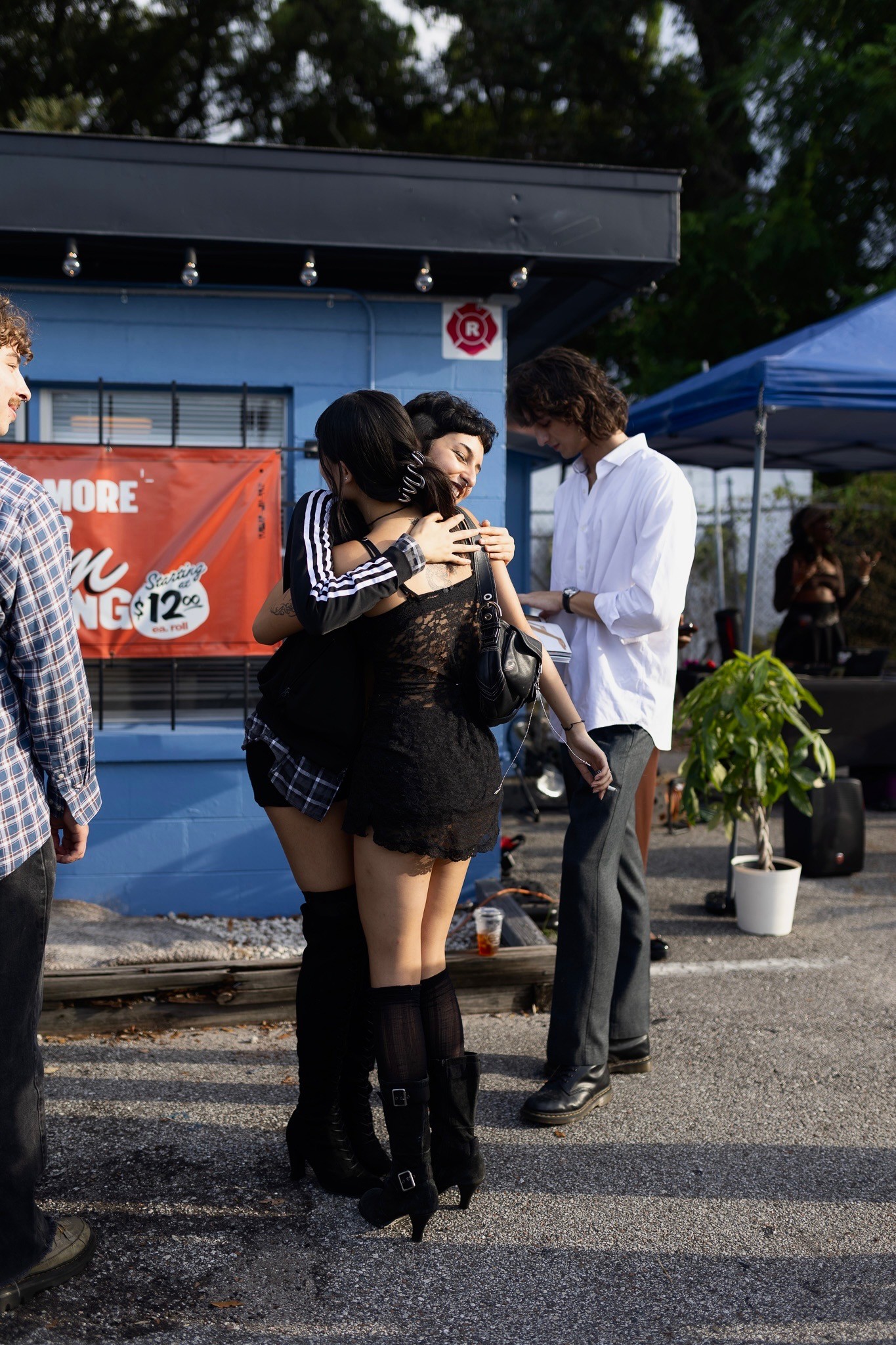
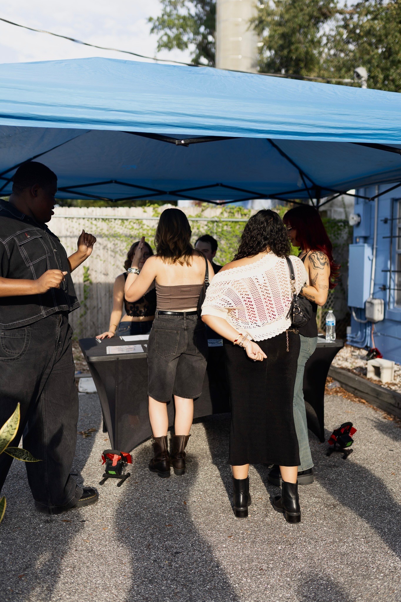
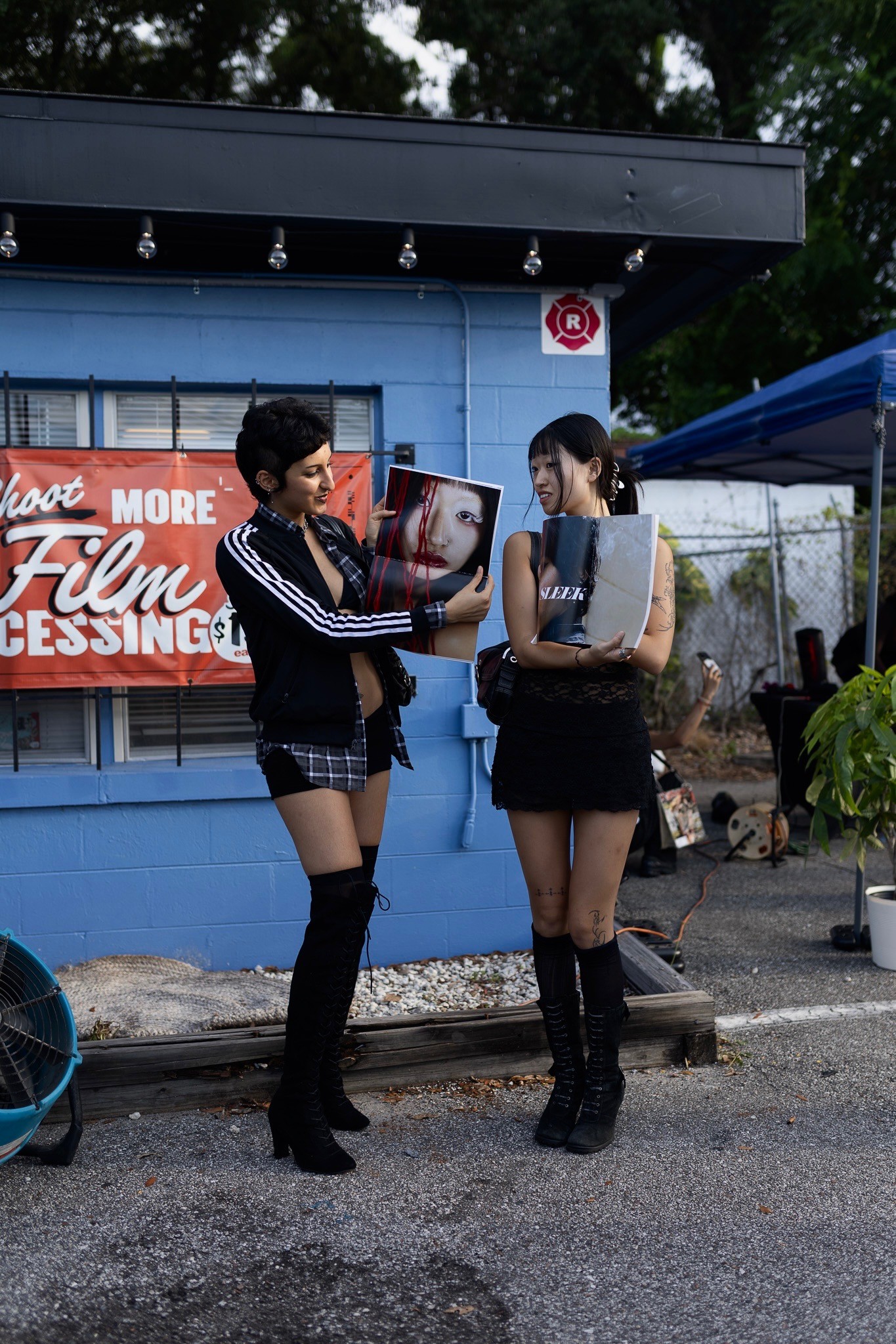
Minoux Launch


LUKE
SALTER
Click Here
Company
Minoux Magazine
Timeline
2025
—
2026
Role
Social Media Designer, Editorial Designer, Merch Designer
Overview
As part of the design team at Minoux, an emerging Orlando-based magazine centered on editorial exploration and fashion-focused storytelling, I contributed to the development of three issues: Debut, Doll House, and Fashionomica. Working alongside other designers, I helped build cohesive layouts and visual systems across each publication while developing assigned editorial sections. The process involved collaborative critiques, assisting with photography on shoots, and creating promotional social media assets that extended the magazine’s visual identity across digital platforms.
Process For Each Concept
For Minoux, the editorial process is highly structured, typically unfolding over the course of about three months from concept to print. Depending on when my photoshoot is scheduled within the production timeline, I occasionally have additional development time to refine concepts and layouts before final production begins. Every designer working gets 4 spreads with copy and 2 full photo spreads to work with.
The process begins with developing a strong visual direction. During the first few weeks, I research and select typefaces that align with the issue’s concept while exploring broader conceptual ideas for the publication. From there, I build moodboards to establish tone, visual references, and styling direction before moving into rough sketches and layout planning.
Once the creative direction is established, I gather pose and composition references to help guide the photography. I work closely with the photographer during the shoot itself, communicating the exact mood, framing, and imagery I want for each spread while still allowing room for creative collaboration on set.
As copy and photography begin coming in, I move into layout development in Adobe InDesign, placing text into rough compositions based on my sketches and mapping out where imagery will ultimately live within the spreads. When final images are delivered, they are integrated into the layouts and refined further.
The final month of production is focused heavily on refinement and critique. Throughout this phase, I meet weekly with the creative director and art director to review progress, discuss the evolving direction of the issue, and make adjustments where needed. Before the magazine is sent to print, the team dedicates a full day to live editing and final corrections to ensure every detail is resolved.
Pinup (Issue 2, Dollhouse)
For Pinup, my goal was to explore the dynamic between an overpowering male presence and an elegant female figure through a restrained, concept-driven editorial approach.
This relationship is expressed primarily through typography: the male figure is represented by bold, repeating sans-serif type, while the female presence is conveyed through a delicate script font. The contrast between these typographic voices reinforces the tension and imbalance within their dynamic.
The layouts prioritize negative space and simplicity, allowing the stark lighting and high-contrast imagery to take center stage. This visual restraint supports the conceptual focus of the article, which reflects on the constraining nature of the Pinup doll archetype. Repetition of copy across the spreads is used intentionally to evoke the overwhelming presence of the male figure, visually encroaching on the female form and reinforcing the imbalance within their relationship.
Typefaces and Moodboard and Initial Sketches
Pinup As A Concept
Pinup as a concept:
Lights. Camera. Action.
Our star-studded doll performs under the male gaze: corset cinched, lips glossed, powder flawless. She must be the epitome of femininity even at the cost of herself.
Pinup holds a mirror to the price of being seen. Our Pinup Doll is caught between a man, between performance and authenticity, desire and distortion.
Rough Layouts (Left) Iterations Before Final (Middle) Vs Final (Right)
Rough Layouts (Left) Iterations Before Final (Middle) Vs Final (Right)
Grids
Behind The Scenes
Yarn (Issue 1, Debut)
Yarn serves as a visual and thematic break in the magazine, contrasting the more stimulating sections with minimal, Swiss-inspired design. The section features poetry, which presents layout challenges, especially in preserving line integrity and the writer’s intent. Conceptually, Yarn explores the idea of lives being interconnected by fate, while still allowing for individual agency.
I contributed to the creative direction during the photoshoot, including the second spread concept: a close-up of yarn being stretched between fingers to symbolize tension and space. A white background was chosen for flexibility in poem placement. The fifth spread contrasts a structured, single-stanza poem with a nonlinear one, allowing for dynamic composition. In the third spread, the model’s gaze guides the reader’s eye to the poem title and downward through the text. Yarn represents some of my most thoughtful and refined design work to date.
Yarn As A Concept
Yarn unravels the intricate tension between destiny and choice. Set against stark white backgrounds, the scene illuminated by vivid red strings that weave across the space, symbolizing the delicate web of fate that binds us. These strings maps out the paths laid before use each line a tether th what hs been predetermined.
But Yarn dares to ask: What if fate is not a roadmap but a suggestion?
This shoot challenges the notion that we are bound by invisible threads, urging you to defy expectations and forge a path that is uniquely your own. The models move through the tangled maze of red, sometimes following the lines, sometimes cutting through them each action a declaration of autonomy.
The red strings, traditionally a symbol of connection and inevitability, become instruments of rebellion. Some are pulled taut, others frayed or severed, representing moments when we choose to break way from the script and rewrite our stories.
Yarn is not just about questioning fate, its about reclaiming agency. It reminds us that while the threads may suggest a pattern, we hold the power to unravel, reweave, and redefine our own destinies. In the end, Yarn leaves us with one profound message: You are the artists, and your life the loom.
Initial Sketches and Type Face Exploration
Behind The Scenes and Moodboard
Rough Layouts (No Yarn)
Rough Layouts (Yarn)
Change In Direction
The concept for Yarn was intended to act as a minimal visual pause within the magazine, emphasizing subtlety, strong layouts, and generous negative space. The initial direction included a scanned piece of yarn that would physically guide the viewer’s eye throughout the spread. However, after receiving the final photos from the shoot, the imagery felt strong enough to stand on its own. The creative director and I decided to remove the yarn element entirely, replacing it with a more invisible visual flow that still guides the viewer’s eye while keeping the focus on the model and photography.
Drafts (Left) vs Finals (Right)
Grids
Photo Editing
Due to practical limitations, the model for Yarn, Erica Zehng, wore black clothing underneath the yarn garment to remain covered and comfortable during the shoot. However, the creative direction aimed to make the look appear as though the outfit was constructed entirely from yarn. After the photographer, Mary Panitz, completed the initial photo edits, I retouched the selected images for the spreads by blending the black garments to match the model’s skin tone. This helped achieve the intended illusion and final visual direction for the magazine.
Launch Day Poster
For the launch-day poster (Issue Debut) and social post, I drew inspiration from the raw, DIY energy of grungy concert and fashion flyers. The original concept used overlapping imagery within circular frames, with text wrapping dynamically around the visuals as the images faded into the background. While visually striking, the layout became difficult to read with the amount of information that needed to be included.
The final design shifted toward a more text-driven composition, using a cascading text flow to create stronger hierarchy and clarity while preserving the layered, chaotic energy of the initial concept. A condensed sans-serif helped manage dense information, while the scripted word “debut” adds contrast and highlights Minoux’s first issue. The project was completed over two days under a tight deadline, with constant iteration and communication alongside the creative directors.
Previous Iterations
Minoux Launch
LUKE
SALTER