
Click Here
Timeline
2025
—
2026
Role
Type Design, Poster Design,
Motion Graphics, Development
Type Design, Poster Design,
Motion Graphics
Overview
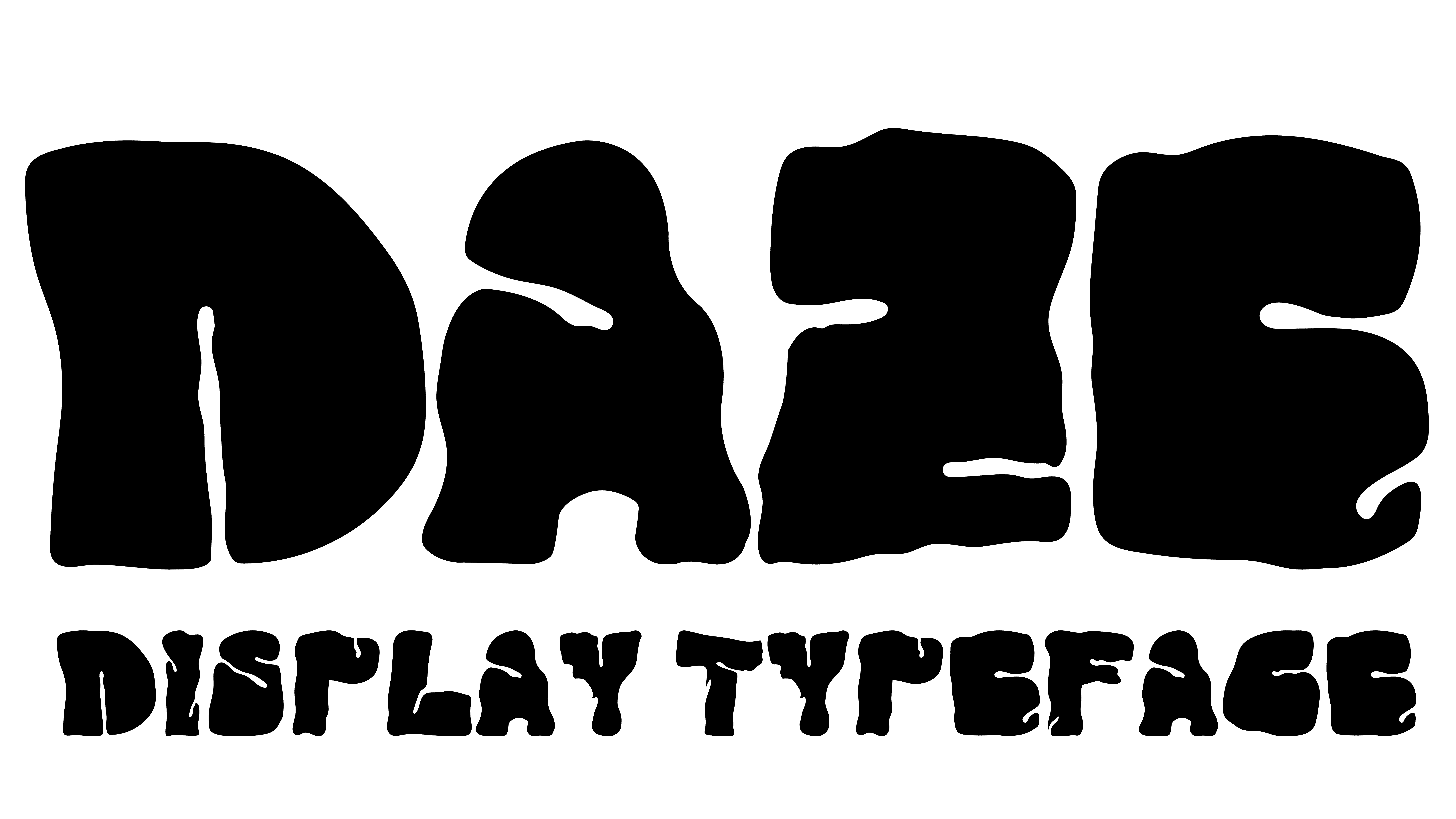
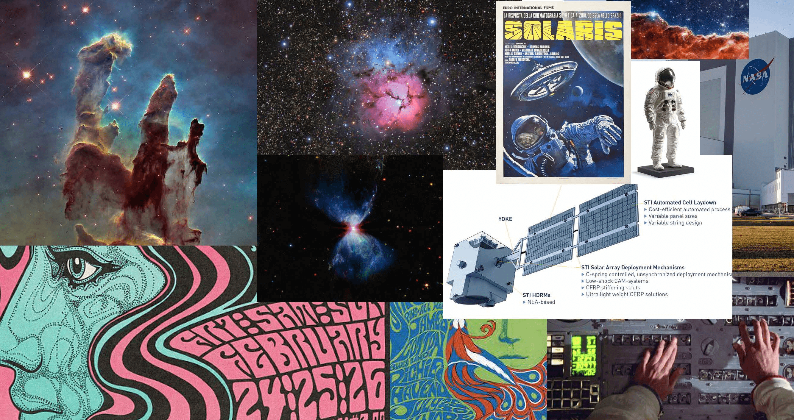
Daze is a typeface that explores the interplay between fluidity and structure, drawing inspiration from the movement of gases, dust, and drifting materials in space. These organic, evolving forms are set against the rigid, engineered systems that make space exploration possible, from satellites to the modular precision of NASA architecture. The result is a visual tension between cosmic unpredictability and geometric control, where natural motion and technical construction exist in constant balance.
The goal of the project was to create a typeface that captures this duality in a clear and usable way. Rather than relying on typical science fiction references, the design process focused on translating real spatial conditions into letterforms, looking at scale, weightlessness, and structural repetition. Forms were developed to feel soft and fluid while still holding a consistent underlying grid, allowing expression and legibility to work together.
The name Daze reflects both the visual language and the emotional tone of the typeface. It refers to the disorienting, suspended feeling of looking into deep space, where scale and direction begin to dissolve. Throughout development, iterations tested how far the forms could stretch and deform while maintaining coherence, ultimately shaping a typeface that sits between drift and precision, capturing a controlled sense of instability.
Moodboard
Sketches
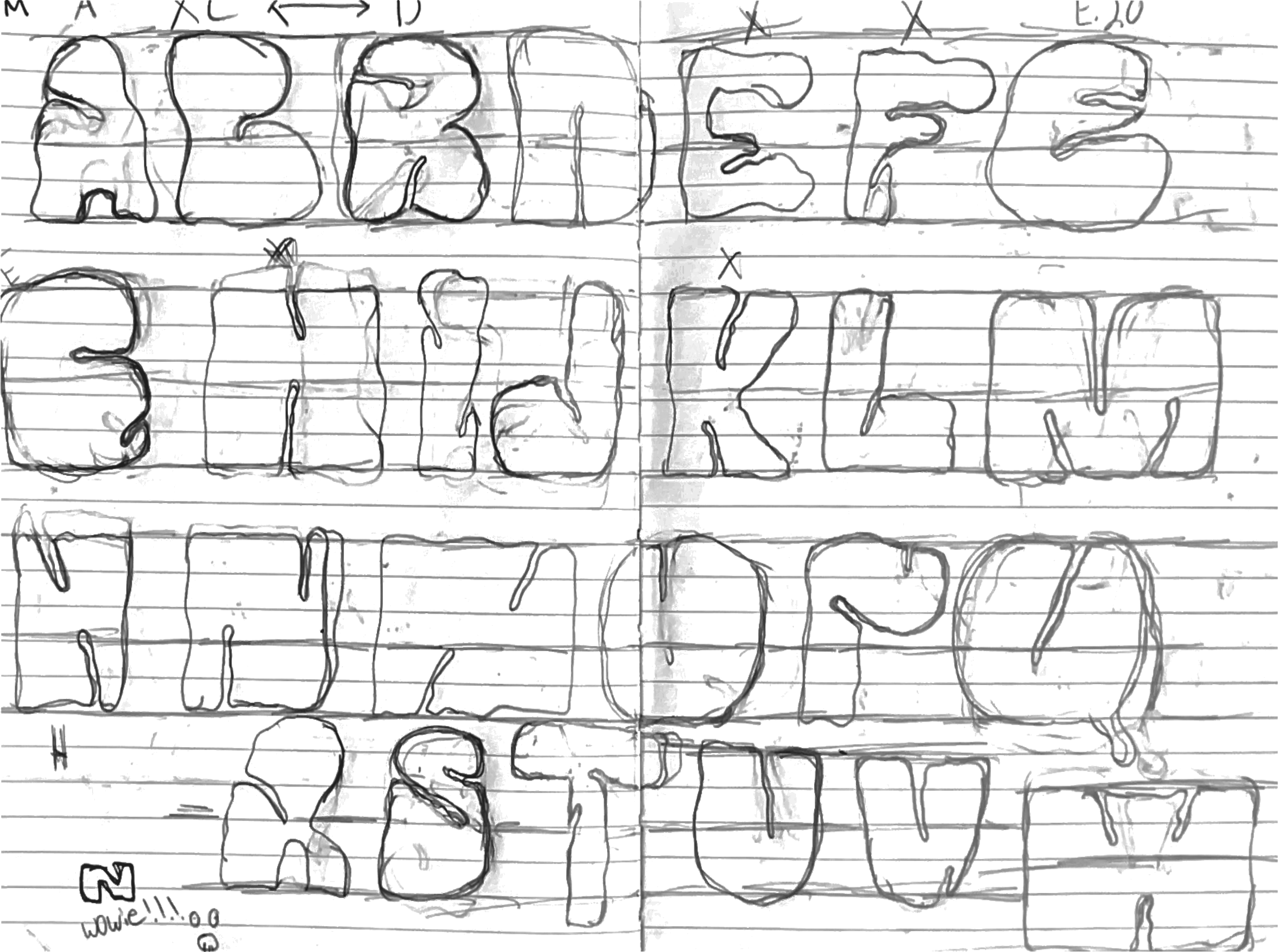
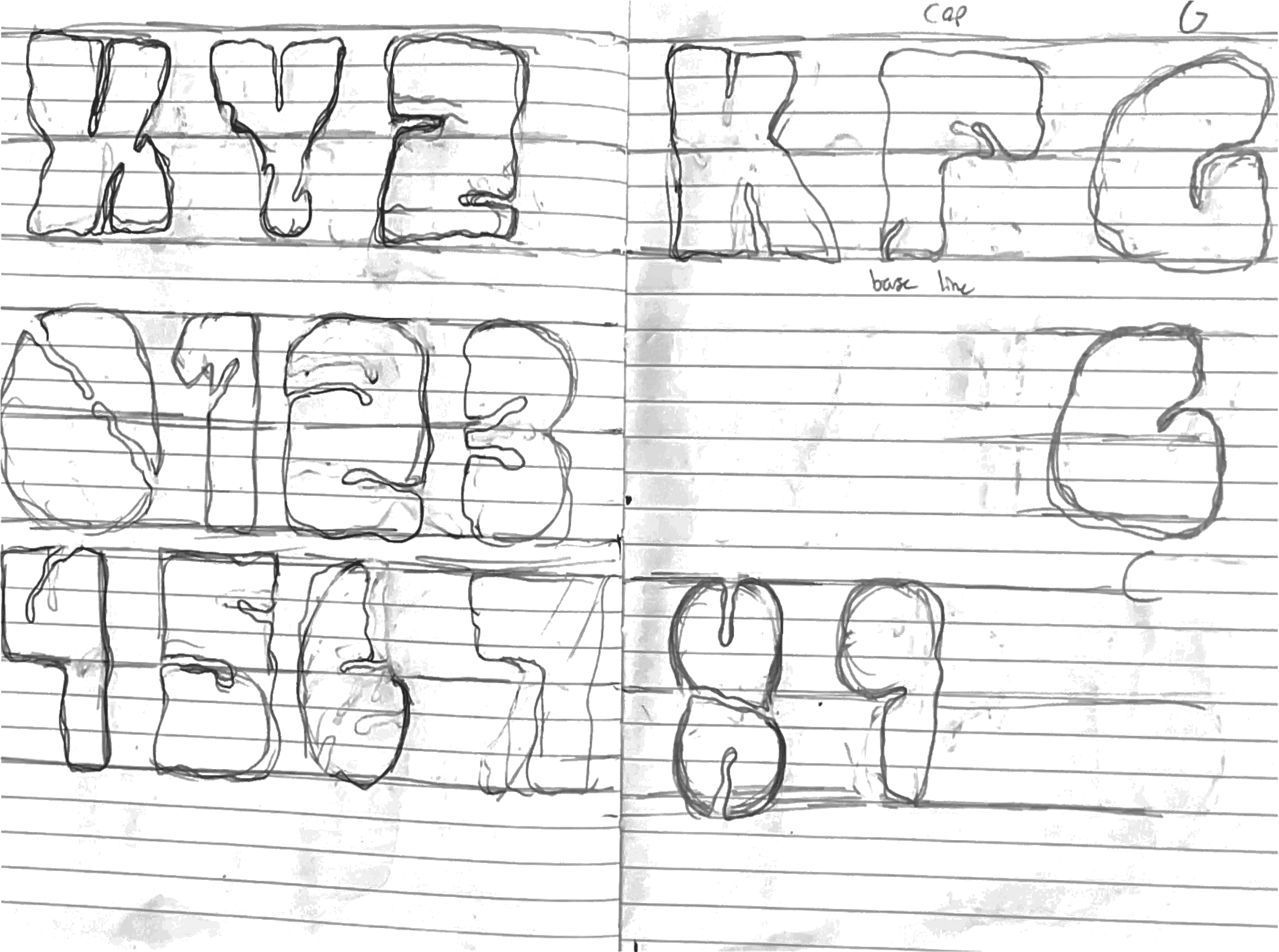

After developing a strong direction and moodboard, the next phase focused on sketching the letterforms to establish an initial sense of structure, rhythm, and proportion for Daze. This stage was used to quickly explore how the concept could translate into individual characters, testing different balances between fluid, drifting forms and more controlled geometric constraints. The process moved back and forth between experimentation and refinement, helping to clarify which shapes supported the idea and which felt too loose or too rigid. Overall, sketching became the bridge between concept and construction, turning the atmosphere of the moodboard into a tangible visual system and laying the groundwork for developing the typeface digitally.
Developing Typeface and Posters
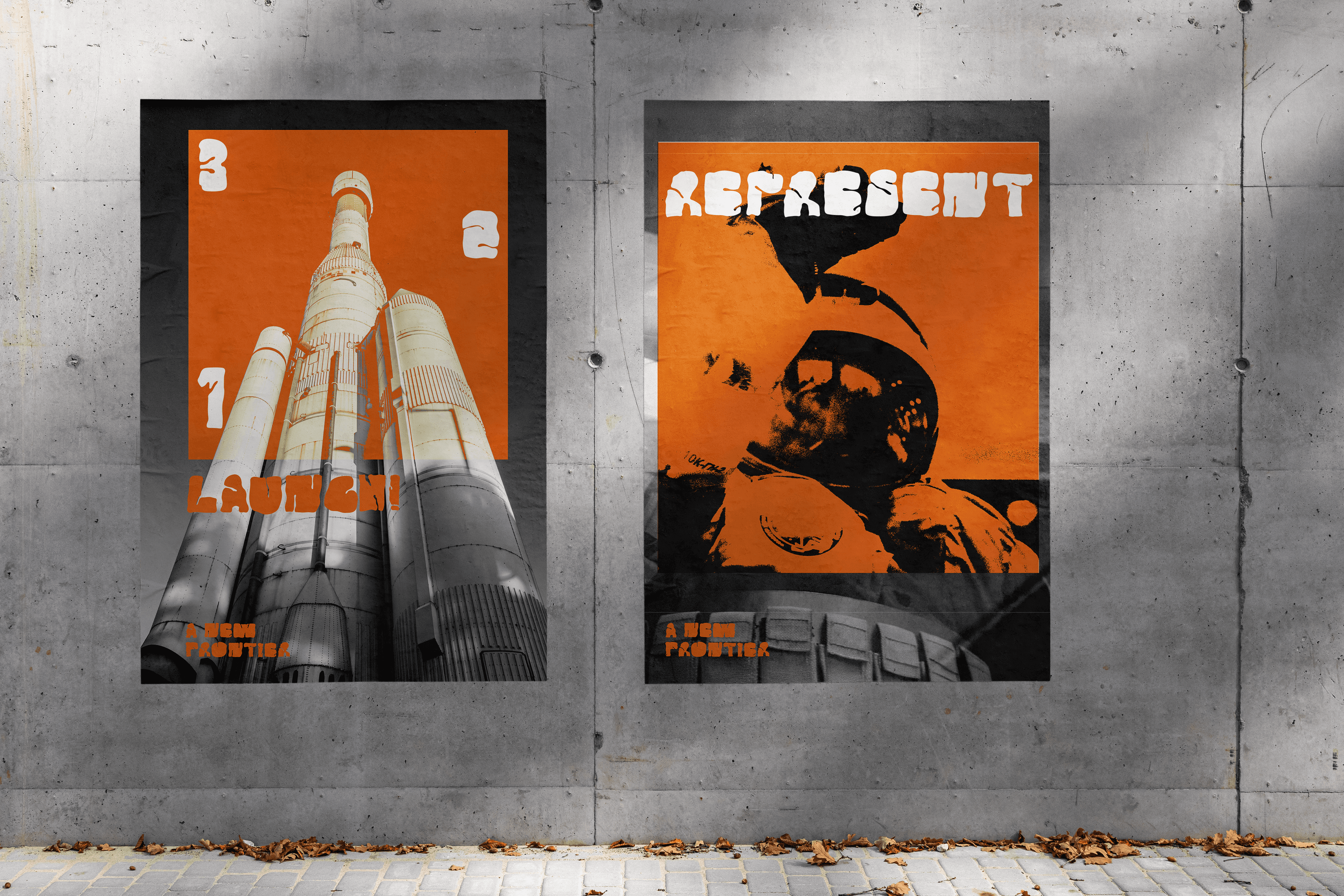
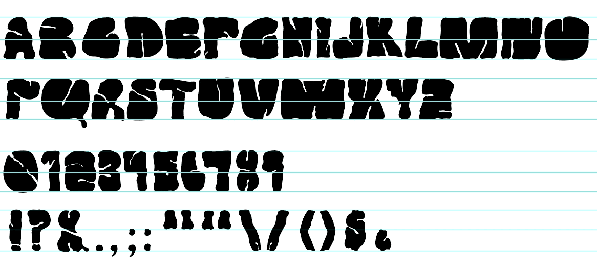
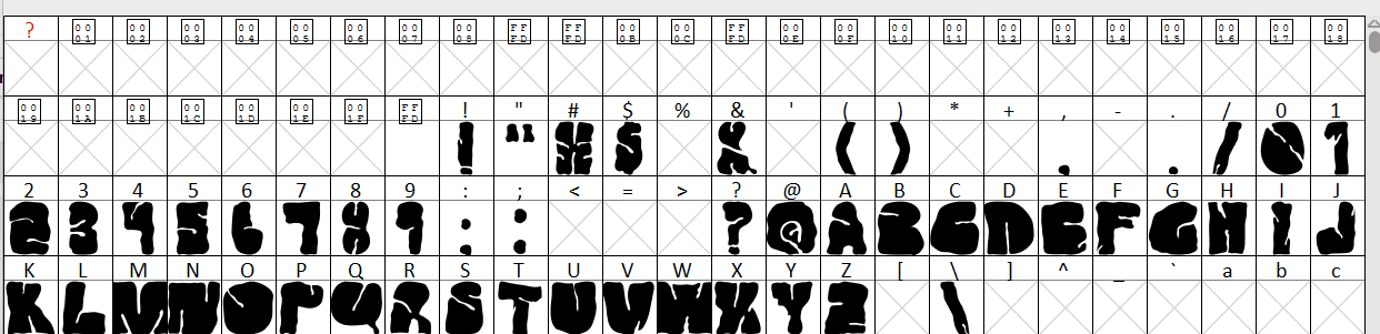
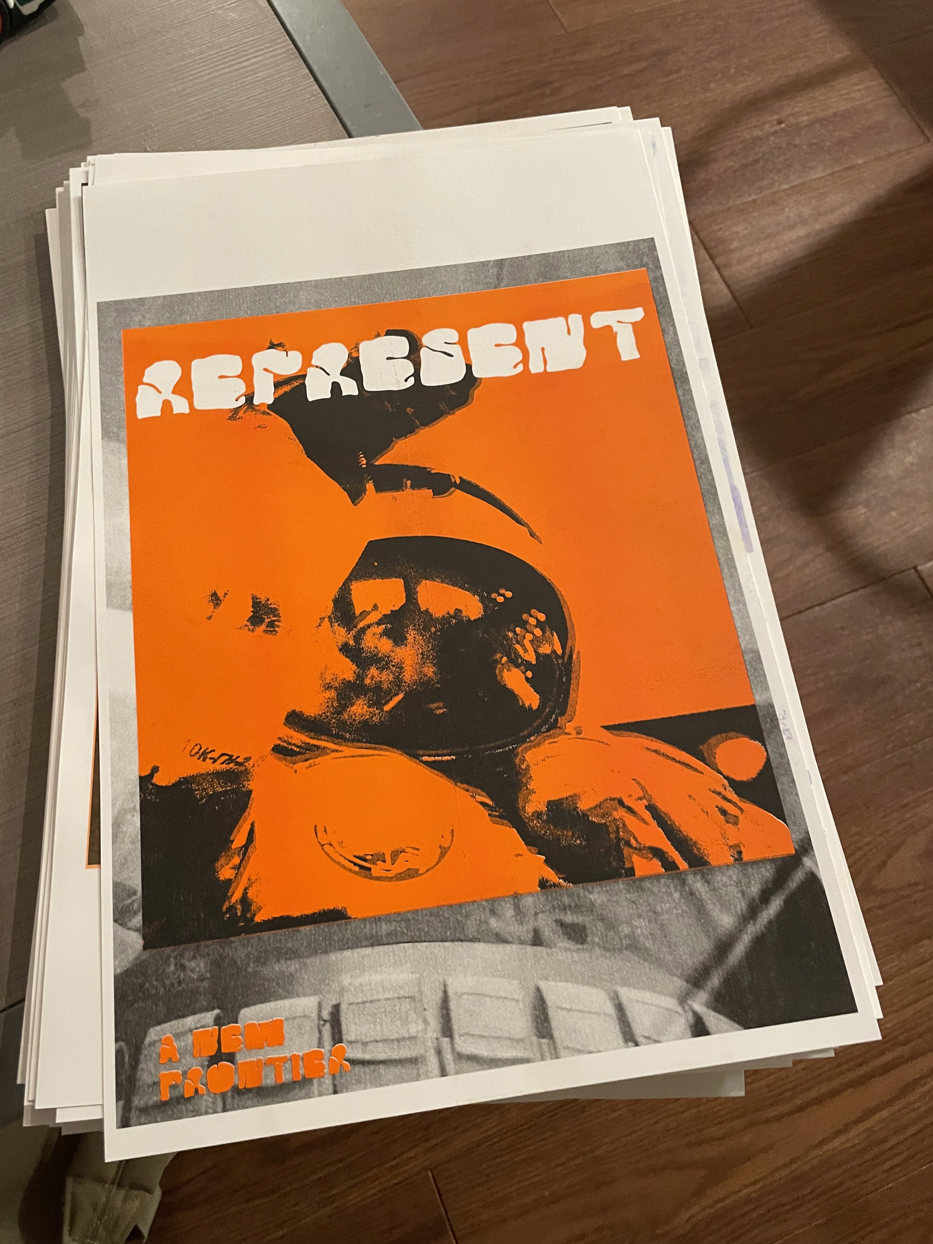
After the sketching phase, the drawings were imported into Adobe Illustrator where each individual character was constructed and refined into a clean, usable type system. This stage focused on translating the loose, expressive energy of the sketches into precise vector forms while maintaining the fluid qualities that define Daze, ensuring consistency across the full character set. The typeface was then developed into a functional font using FontForge, allowing it to operate as a fully usable system beyond the design process. Alongside this, a series of posters was created as a more experimental application of the typeface, driven by a personal interest in space and science fiction. These compositions present Daze as part of a speculative recruitment campaign, framing a “New Frontier” on the horizon and showing the typeface in use within a broader narrative context. The posters were also risograph printed as part of an experimentation process, with animation work planned soon to further explore how the system behaves in motion.
Motion Graphics
After this, the goal was to develop motion graphics that elevated the project by showcasing the typeface in use and communicating what Daze represents conceptually. The intention was to bring the system into motion so its balance of fluidity and structure could be experienced dynamically, reinforcing the “New Frontier” narrative while giving the work a stronger expressive and communicative layer.
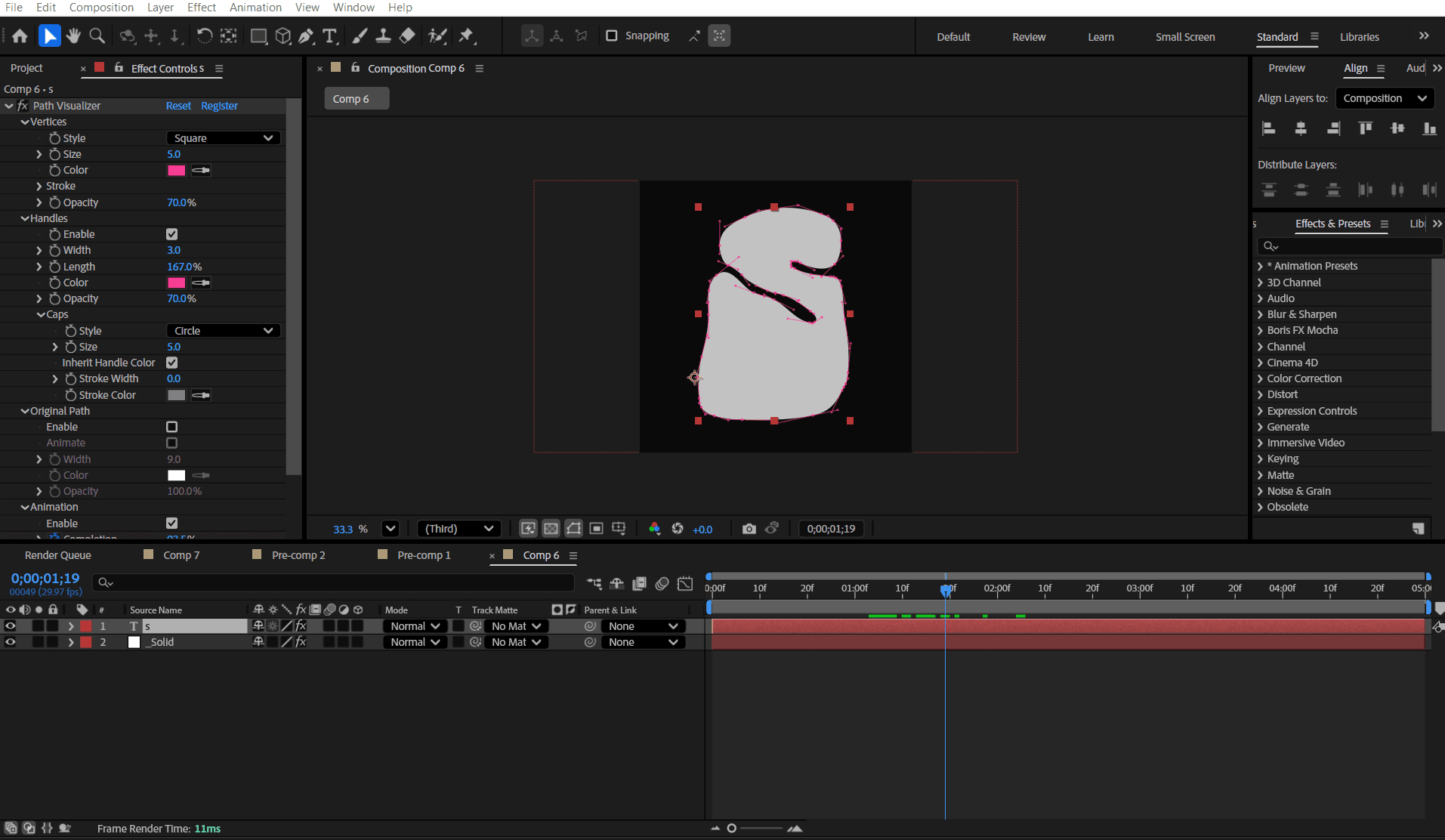
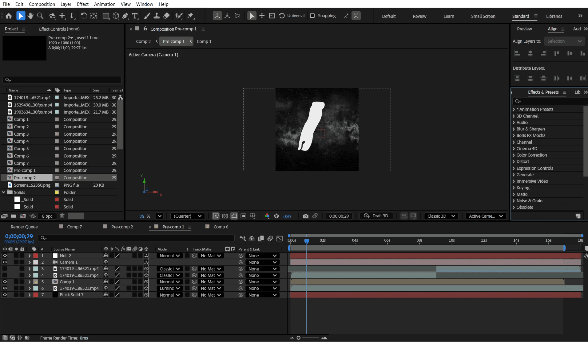
The animations were primarily built in Adobe After Effects, with some experiments using a plugin called Visualize Points to expose the structure of the letterforms and path editing used to refine motion and timing. One piece was created in Photoshop, using frame-based animation to contrast the typeface against royalty-free historic space imagery, creating a visual dialogue between the designed system and real-world exploration visuals. Alongside this, the process was also about improving my motion skills, using the project to experiment with pacing, typographic movement, and how the typeface behaves when activated over time.
LUKE
SALTER
LUKE
SALTER
Click Here
Timeline
2025
—
2026
Role
Type Design, Poster Design,
Motion Graphics, Development
Type Design, Poster Design,
Motion Graphics
Overview
Daze is a typeface that explores the interplay between fluidity and structure, drawing inspiration from the movement of gases, dust, and drifting materials in space. These organic, evolving forms are set against the rigid, engineered systems that make space exploration possible, from satellites to the modular precision of NASA architecture. The result is a visual tension between cosmic unpredictability and geometric control, where natural motion and technical construction exist in constant balance.
The goal of the project was to create a typeface that captures this duality in a clear and usable way. Rather than relying on typical science fiction references, the design process focused on translating real spatial conditions into letterforms, looking at scale, weightlessness, and structural repetition. Forms were developed to feel soft and fluid while still holding a consistent underlying grid, allowing expression and legibility to work together.
The name Daze reflects both the visual language and the emotional tone of the typeface. It refers to the disorienting, suspended feeling of looking into deep space, where scale and direction begin to dissolve. Throughout development, iterations tested how far the forms could stretch and deform while maintaining coherence, ultimately shaping a typeface that sits between drift and precision, capturing a controlled sense of instability.
Moodboard
Sketches
After developing a strong direction and moodboard, the next phase focused on sketching the letterforms to establish an initial sense of structure, rhythm, and proportion for Daze. This stage was used to quickly explore how the concept could translate into individual characters, testing different balances between fluid, drifting forms and more controlled geometric constraints. The process moved back and forth between experimentation and refinement, helping to clarify which shapes supported the idea and which felt too loose or too rigid. Overall, sketching became the bridge between concept and construction, turning the atmosphere of the moodboard into a tangible visual system and laying the groundwork for developing the typeface digitally.
Developing Typeface and Posters
After the sketching phase, the drawings were imported into Adobe Illustrator where each individual character was constructed and refined into a clean, usable type system. This stage focused on translating the loose, expressive energy of the sketches into precise vector forms while maintaining the fluid qualities that define Daze, ensuring consistency across the full character set. The typeface was then developed into a functional font using FontForge, allowing it to operate as a fully usable system beyond the design process. Alongside this, a series of posters was created as a more experimental application of the typeface, driven by a personal interest in space and science fiction. These compositions present Daze as part of a speculative recruitment campaign, framing a “New Frontier” on the horizon and showing the typeface in use within a broader narrative context. The posters were also risograph printed as part of an experimentation process, with animation work planned soon to further explore how the system behaves in motion.
Motion Graphics
After this, the goal was to develop motion graphics that elevated the project by showcasing the typeface in use and communicating what Daze represents conceptually. The intention was to bring the system into motion so its balance of fluidity and structure could be experienced dynamically, reinforcing the “New Frontier” narrative while giving the work a stronger expressive and communicative layer.
The animations were primarily built in Adobe After Effects, with some experiments using a plugin called Visualize Points to expose the structure of the letterforms and path editing used to refine motion and timing. One piece was created in Photoshop, using frame-based animation to contrast the typeface against royalty-free historic space imagery, creating a visual dialogue between the designed system and real-world exploration visuals. Alongside this, the process was also about improving my motion skills, using the project to experiment with pacing, typographic movement, and how the typeface behaves when activated over time.
LUKE
SALTER
LUKE
SALTER